"

10 How should I represent my data?

Read time: 2 minutes

Overview

This chapter discusses options for presenting data, whether in text, a table, or a figure.

Sections in this chapter

  • Text, Table, or Figure?
  • Don’t forget Your audience

Text, Table, or Figure?

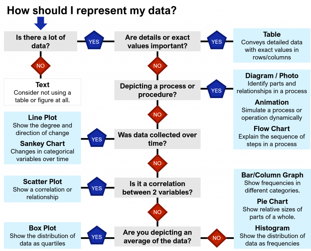
There are many ways to present qualitative or quantitative data to your readers, and this choice can change how well your findings are understood. Simple information can be presented in the text, more data can be laid out into Tables, and complex relationships should be represented as graphs, charts, or other types of Figures. Use the flowchart below (Figure 10.1) to help you decide what is best suited for your data and purpose.

Flow chart entitled "How should I represent my data". The first question to ask is "Is there a lot of data?". If no, use text. If yes, answer the question "Are details or exact values important?". If yes, use a table. If no, answer the question "Depicting a process or procedure?" If yes, use a diagram/photo, animation, or flow chart. If no, answer the question, "Was data collected over time?". If yes, use a line plot or Sankey chart. If no, answer the question "Is it a correlation between 2 variables?". If yes, use a scatter plot. If no, answer the question "Are you depicting an average of the data?". If yes, use a box plot. If no, use a bar/column graph, pie chart, or histogram.
Figure 10.1. Flow chart showing different ways to represent data.

Don’t forget your audience

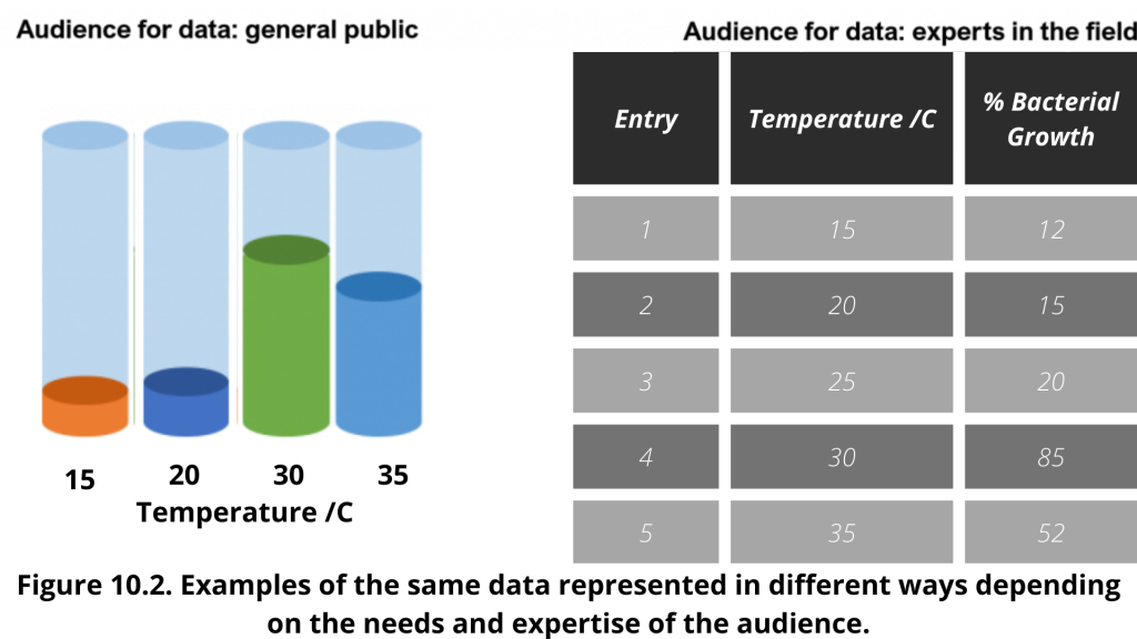
The first thing to consider, as always, is the audience. For a more general audience, like in a popular magazine or website, data can be simplified to the key message and displayed visually (Figure 10.2 left). The same data is better presented in a Table for an audience that wants to know the exact numbers and details (Figure 10.2 right).

Examples of the same data represented in two different ways. On the left, the data is represented for the general public as a simple bar chart. On the right, the data is represented for experts in the field using a table with columns for Entry, Temperature, and % Bacterial Growth.

License

Icon for the Creative Commons Attribution-NonCommercial 4.0 International License

Science Communication Toolkit Copyright © by Aditi Gupta; Katie Harding; and Sree Gayathri Talluri is licensed under a Creative Commons Attribution-NonCommercial 4.0 International License, except where otherwise noted.