11 Tables
Overview
This chapter discusses the use of tables to show data in science.
Sections in this chapter
- Tables in science
- Table or text?
- Table design
Tables in science
As we saw in the flow chart introducing this part, a table is a good option for presenting a large amount of data and when all of the details and exact values are important. If the data is important but too large for the body of an article, it is included in an Appendix or Supplementary Materials. Figure 11.1 shows the format of a typical figure in an article or thesis.
Table 1. Global Age Demographics
| Age Group | Population (millions) | % of Total Population | Annual Growth Rate (%) | Notes ¹² |
| 0–14 years | 2,000.0 | 25.6% | 1.3 | ¹ |
| 15–24 years | 1,200.0 | 15.4% | 0.9 | ¹ |
| 25–54 years | 3,400.0 | 43.5% | 0.5 | ¹ |
| 55–64 years | 800.0 | 10.2% | 0.8 | ² |
| 65+ years | 700.0 | 8.9% | 2.4 | ² |
¹ Growth rates for younger age groups (0–24) reflect continued high birth rates in specific regions. ² Data for older age groups (55+) highlights the global trend of aging populations.
→ Column Headings: | Age Group | Population (millions) | % of Total Population | Annual Growth Rate (%) | Notes ¹² |
→ Footnote References: Located in the “Notes” column: Examples: ¹, ²
→ Footnotes: ¹ Growth rates for younger age groups (0–24) reflect continued high birth rates in specific regions. ² Data for older age groups (55+) highlights the global trend of aging populations.
Figure 11.1. A typical table of age demographics data.
Tables can supplement text and present numbers in a way that conveys meaningful relationships. They should be simple, concise, and use abbreviations or symbols in a way that is consistent with the text. Tables should have at least 3 columns and 4-5 rows, otherwise, the data might be better represented as text.
The title of a table should describe the contents without the reader having to refer to the text. Details that don’t fit in the table can be included in the footnotes.
Column headings should be limited to two lines and can use abbreviations or symbols, but make sure the units are shown in full.
Table or Text?
The small table below (Table 2) contains data that is better conveyed in a single sentence. The sentence provides clarity, compactness, and relevance, making the data easier to digest without the need for a formal table.
“Earth’s atmosphere is composed primarily of nitrogen (78.08%) and oxygen (20.95%), with trace amounts of argon (0.93%) and carbon dioxide (0.04%).”
Table 2. Atmospheric Composition of Earth
| Gas | Percentage by Volume |
| Nitrogen (N₂) | 78.08% |
| Oxygen (O₂) | 20.95% |
| Argon (Ar) | 0.93% |
| Carbon Dioxide (CO₂) | 0.04% |
Table Design
Tables aren’t just cells of rows and columns, they can be designed to help the reader follow and find the most important information. Jon Schwabish published a brilliant guide to better table design (Twitter thread, Article). Let’s see how his data principles were used to create the table below, as outlined in Figure 11.2.
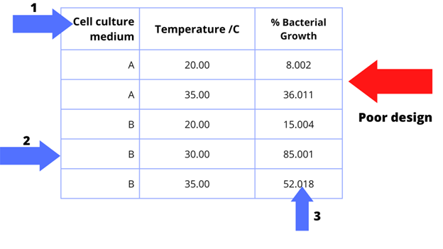
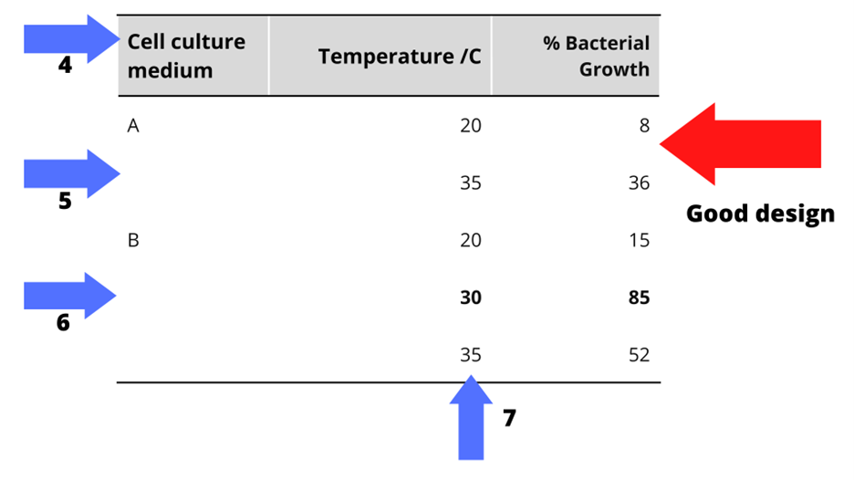

 Figure 11.2. Examples of both good and poor table design.
- Left-align text
- Only use borders when necessary
- Use the right level of precision
- Make your header row stand out
- Remove repetitive data and use white space
- Highlight important results or outliers
- Right-align numbers and always align decimals
