3.5 Data Visualization
Visual elements are referred to as either Tables or Figures. Tables are made up of rows and columns, and the cells usually have numbers in them (but may also have words or images). Figures refer to any visual elements — graphs, charts, diagrams, photos, etc. — that are not Tables.
| Type of Visual | Description and Purpose | |
|---|---|---|
| Tables | Place detailed data/information in categories formatted into rows and columns for comparison; use when exact figures are important. Label column headings (box heads) and/or rows (stubs). | |
| Graphs | Bar Graph | Compare and contrast two or more subjects at the same point in time, or compare change over time. |
| Column Graph | Reveal change in a subject at regular intervals of time. | |
| Line Graph | Show the degree and direction of change relative to two variables; compare items over time, show frequency or distribution, or show correlations. | |
| Charts | Pie Chart | Display the number and relative size of the divisions of a subject; shows the relation of parts to a whole (parts must sum to 100% to make sense). |
| Org. Chart | Map the divisions and levels of responsibility or hierarchy within an organization. | |
| Flow Chart | Show the sequence of steps in a process or procedure. | |
| Gantt Chart | Indicates timelines for multi-stepped projects, especially used in proposals and progress reports. | |
| Illustrations | Diagram | Identify the parts of a subject and their spatial or functional relationship; emphasize detail or show dimensions. |
| Photo | Show what a subject looks like in realistic detail or show it being used. | |
| Animation | Simulate a process, operation, or incident. | |
| Film clip | Depict a process, operation, or incident in realistic detail. | |
Tables
Tables can be used to summarize large amounts of data or data with exact values. For example, nominal data. Recall that nominal data is qualitative data that is categorized by naming or labelling, has no quantitative value, and is grouped by categories. For example, To measure blood types within a group, the only options are A, B, AB, or O. These are distinct categories. A table may be the best visual option to organize this data for results.
In a table, you must include a label, a caption, and a description of what the table represents. If you have multiple tables in a report, they should be numbered Table 1, Table 2, etc.
|
Class: Blood Type |
Frequency |
Percent |
|---|---|---|
|
A |
5 |
20% |
|
B |
7 |
28% |
|
O |
9 |
36% |
|
AB |
4 |
16% |
|
Totals |
25 |
100% |
Charts
The following video is an example of how to use Excel to create charts:
Video: “Excel: Charts” by LearnFree is licensed under the Standard YouTube License [4:30] Transcript and closed captions available on YouTube.
Histograms
Histogram is an example of a type of bar graph that displays data by using bars to show the frequency distribution of continuous data. For example, a Professor may use a histogram to see the distribution of class grades.
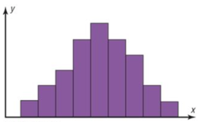
Image Description
This image is a histogram with a series of adjacent purple bars. The x-axis and y-axis are labelled simply as “x” and “y,” respectively. The histogram’s bars vary in height, forming a symmetric distribution that peaks in the center and tapers off towards both ends. It appears as a bell-shaped curve, typically indicative of a normal distribution.
A visual will not tell the entire story but provides a summary for the reader. As in the example above, this is a bell curve and tells the reader that the majority of the class scored a grade in the approximate average of the class. Further details, such as the mean, median and standard deviation, will provide the reader with more accurate information about the overall class evaluation scores.
As a result, Graphs alone can be misleading. It is important for the reader to understand what the data visual is reporting and be aware of misleading data or do further research. This is why the skill of appreciating numbers and data for relevancy is so important from Mathematics. The next section will review a few common ways visuals can be misleading.
Graphs can be used to skew data and spin a narrative like never before, especially with the velocity at which some topics spread across social media. All it takes is a single graph from an unreputable source to spread a false narrative around the world (McCready, 2020).
“3.4 Figures and Tables” from Technical Writing Essentials by Suzan Last is licensed under a Creative Commons Attribution 4.0 International License, except where otherwise noted.—Modifications: Used section Terminology, edited; Used Table 3.1.1.
