3.1 What is Statistics?
Statistics is the science that deals with the collection, analysis and interpretation of numerical data. Statistics has entered almost every aspect of human endeavour. We can use it for better planning, more efficient delivery of services and increased productivity. It is important to improve statistical literacy among scientists, journalists, health care professionals, patients, and the community at large to make informed decisions in the face of uncertainty.
In scientific research, we conduct statistical analyses to help us determine whether datasets differ. When statistical analysis determines that datasets are different, we refer to the datasets as ‘statistically different,’ or the difference as ‘statistically significant’ or that there is ‘a significant difference.’ When statistical analysis reveals that datasets are not different, we say there is ‘no significant difference’ between groups.
In health care, you may see many different types of datasets. For example, if you are working in a scientific lab, you may be comparing the impact of different medications in a controlled setting or tracking a specific ailment in geographic areas.
Examples of Using Statistics in Everyday Life
Cholera map made by John Snow in 1854
The location of reported cases of cholera is shown in Figure 3.1.1. Presentation of the data collected on the number of cases and where they occurred would have been very useful in understanding the spread of the disease and contributing to prevention.
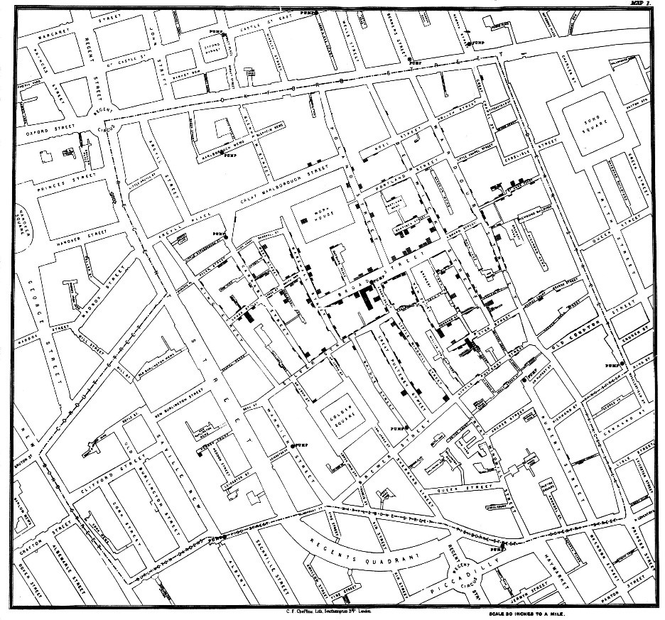
Image Description
The image depicts a detailed black-and-white map of an urban area. The map shows a grid of streets and buildings with some buildings or areas shaded or filled, indicating different types of structures or significant locations. Streets and blocks are numerous and tightly packed, likely representing a city or a dense urban neighbourhood.
Sporting Performance
Figure 3.1.2 summarises the test bowling statistics of cricketer Imran Khan, showing the number of runs conceded each innings and career and last 10-innings averages. Collecting so much information in one figure, combining raw data and averages, is a very economical way to summarise a sportsperson’s career.
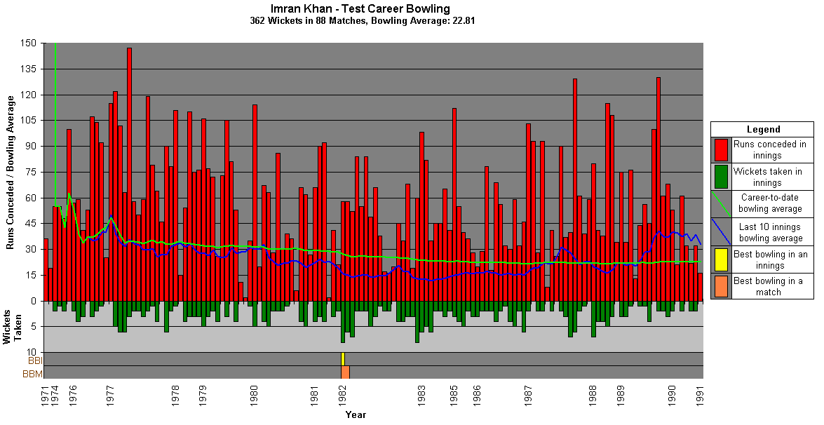
Image Description
This image is a graph titled “Imran Khan – Test Career Bowling.” It displays data on Imran Khan’s performance over his Test cricket career with the title indicating that he took 362 wickets in 88 matches, averaging 22.81 runs per wicket.
The x-axis represents the Year, ranging from 1971 to 1991. The y-axis on the left side represents the Runs Conceded and Bowling Average, with a scale from 0 to 150. The y-axis on the right side represents the Wickets Taken, with a scale from 0 to 10.
There are several data series plotted on the graph:
-
- Red vertical bars: These represent the Runs conceded in innings.
- Green vertical bars: These represent the Wickets taken in innings.
- Blue line: This line indicates the Career-to-date bowling average.
- Yellow line: This line indicates the Last ten innings bowling average.
- Orange vertical bar: This represents the Best bowling in an innings.
- Light brown vertical bar: This represents the Best bowling in a match.
On the right side of the image is a legend that explains the colours and their corresponding data series. The graph provides a detailed view of the fluctuations in Imran Khan’s bowling performance over his Test career, with varying heights of the bars and lines representing different statistical measures.
The health of the population
The bar graph shown in Figure 3.1.3 presents the percentage of the population aged 60 years and over in 41 countries with dementia. This figure provides the reader with details of the percentage of the population diagnosed with dementia while allowing a comparison of the percentages across several countries.
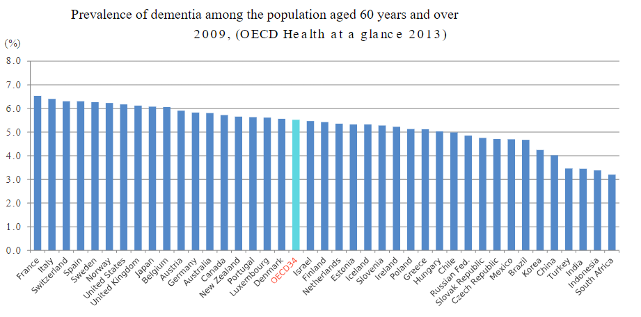
Image Description
The image is a bar graph titled “Prevalence of dementia among the population aged 60 years and over, 2009 (OECD Health at a Glance 2013).” The y-axis represents the percentage (%) of the population with dementia, ranging from 0.0% to 7.0%. The x-axis lists various countries and the OECD34 average, with each country’s prevalence of dementia represented by a vertical bar.
The countries and their respective percentage values (approximated visually from the graph) are:
| Country | Prevalence (%) |
|---|---|
| France | 6.0% |
| Italy | 6.0% |
| Switzerland | 5.8% |
| Spain | 5.7% |
| Sweden | 5.6% |
| Norway | 5.4% |
| United Kingdom | 5.2% |
| Japan | 5.0% |
| Belgium | 5.0% |
| Austria | 4.9% |
| Germany | 4.8% |
| Australia | 4.7% |
| New Zealand | 4.6% |
| Canada | 4.5% |
| Luxembourg | 4.5% |
| Denmark | 4.4% |
| OECD34 | 4.2% |
| Israel | 4.1% |
| Finland | 4.0% |
| Netherlands | 3.9% |
| Slovenia | 3.8% |
| Estonia | 3.8% |
| Ireland | 3.7% |
| Greece | 3.6% |
| Hungary | 3.5% |
| Chile | 3.4% |
| Russia | 3.3% |
| Slovak Republic | 3.2% |
| Czech Republic | 3.2% |
| Mexico | 3.1% |
| Korea | 3.0% |
| China | 2.9% |
| Turkey | 2.8% |
| India | 2.7% |
| South Africa | 2.6% |
France, Italy, and Switzerland have the highest reported prevalence of dementia among the elderly population, each around or above 5.8%. South Africa shows the lowest prevalence at approximately 2.6%. The OECD34 average stands at about 4.2%.
“Using Statistical Analyses” from How To Do Science by Louise Lexis and Brianna Julien is licensed under a Creative Commons Attribution-NonCommercial-ShareAlike 4.0 International License, except where otherwise noted.—Modifications: Used sections Introduction & 3.1 Statistics as a part of everyday life, edited.
