3.7 Using Excel for Descriptive Statistics
Histogram
A histogram consists of contiguous (adjoining) boxes. It has both a horizontal axis and a vertical axis. The horizontal axis is labelled with what the data represents (for instance, distance from your home to school). The vertical axis is labelled either frequency or relative frequency (or percent frequency or probability). The graph will have the same shape with either label. The histogram (like the stemplot) can give you the shape of the data, the center, and the spread of the data.
Histogram in Excel
The following data are the heights (in inches to the nearest half inch) of 100 male semiprofessional soccer players. The heights are continuous data since height is measured.
60; 60.5; 61; 61; 61.5; 63.5; 63.5; 63.5; 64; 64; 64; 64; 64; 64; 64; 64.5; 64.5; 64.5; 64.5; 64.5; 64.5; 64.5; 64.5 66; 66; 66; 66; 66; 66; 66; 66; 66; 66; 66.5; 66.5; 66.5; 66.5; 66.5; 66.5; 66.5; 66.5; 66.5; 66.5; 66.5; 67; 67; 67; 67; 67; 67; 67; 67; 67; 67; 67; 67; 67.5; 67.5; 67.5; 67.5; 67.5; 67.5; 67.5; 68; 68; 69; 69; 69; 69; 69; 69; 69; 69; 69; 69; 69.5; 69.5; 69.5; 69.5; 69.5; 70; 70; 70; 70; 70; 70; 70.5; 70.5; 70.5; 71; 71; 71; 72; 72; 72; 72.5; 72.5; 73; 73.5; 74
- Enter the data into column A. Create Bin Range into column C
- Click Data, Data Analysis, Histogram, and OK
- Specify Input Range ($A$1:$A$101), Bin Range ($C$1:$C$9), and Output Range ($E$1)
- Click Labels, Chart Output, and OK
- Make changes for the Histogram (i.e. delete Frequency, More on the right side)
- Click on one blue rectangle, right-click, and click Format Data Series
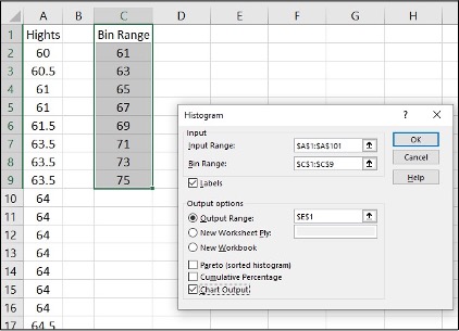
Image Description
The image shows an Excel spreadsheet with a histogram dialogue box open. The spreadsheet contains two columns labelled “Hights” and “Bin Range”. Here is a detailed breakdown:
| Hights | Bin Range |
|---|---|
| 60 | 61 |
| 60.5 | 63 |
| 61 | 65 |
| 61.5 | 67 |
| 63 | 69 |
| 63.5 | 71 |
| 64 | 73 |
| 64.5 | 75 |
The histogram dialogue box titled “Histogram” contains the following fields and options:
- Input:
- Input Range:
- Bin Range:
- Labels
- Output options:
- Output Range:
- New Worksheet Ply
- New Workbook
- Pareto (sorted histogram)
- Cumulative Percentage
- Chart Output
Buttons at the bottom labelled “OK,” “Cancel,” and “Help.”
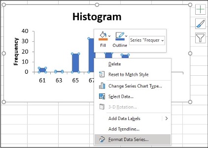
Image Description
An image of a histogram chart within a spreadsheet application. The histogram is titled “Histogram” and displays data in the form of vertical bars representing frequency on the y-axis and a range of numbers on the x-axis. The y-axis is labelled “Frequency” and has values ranging from 0 to 40, with tick marks at intervals of 10. The x-axis has numbers 61, 63, 65, and 67 with corresponding bars of varying heights, each indicating a different frequency.
Each bar is blue in colour, and small blue circles indicate data points. Additionally, a context menu is open within the chart area, showing various options. These options include:
- Delete
- Reset to Match Style
- Change Series Chart Type…
- Select Data…
- 3-D Rotation…
- Add Data Labels
- Add Trendline…
- Format Data Series…
Above the context menu, there is a floating format toolbar with “Fill” and “Outline” options for formatting the chart series. The option selected currently is “Series ‘Frequer.” The entire chart is enclosed within a gray border with adjustable handles indicating it is selected and can be resized or moved.
- To change the ‘gap width,’ click on the slider under Gap Width slide line, hold and slide it to 0%
- Click on the Histogram and icon + to make changes
- Change Axis Titles
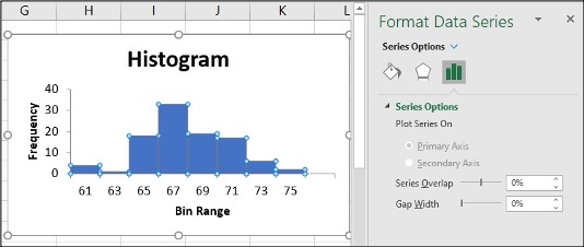
Image Description
The image is a screenshot of an Excel window. The main part of the image displays a histogram chart titled “Histogram,” showing a frequency distribution of data across different bin ranges. The x-axis is labelled “Bin Range” and shows the bins 61, 63, 65, 67, 69, 71, 73, and 75. The y-axis is labelled “Frequency” and shows values from 0 to 40 at intervals of 10.
The histogram features blue bars representing the frequency counts for each bin range as follows:
- 61: 0
- 63: 5
- 65: 20
- 67: 30
- 69: 15
- 71: 10
- 73: 5
- 75: 0
On the right side of the image, there is a “Format Data Series” pane. This pane includes options to customize the chart, including series options where users can choose to plot the series on the primary or secondary axis, adjust series overlap, and set gap width between the bars. The series overlap and gap width both have a setting of 0%.
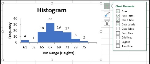
Image Description
The image displays a histogram showing the distribution of heights with the title “Histogram” at the top center. The horizontal axis is labelled “Bin Range (Heights)” and spans from 61 to 75, marked at intervals of 2 (61, 63, 65, 67, 69, 71, 73, 75). The vertical axis is labelled “Frequency” and ranges from 0 to 40, marked at intervals of 10 (0, 10, 20, 30, 40).
The histogram consists of blue bars representing the frequency of heights falling within each bin range:
- 61-63: Frequency 4
- 63-65: Frequency 18
- 65-67: Frequency 33
- 67-69: Frequency 19
- 69-71: Frequency 17
- 71-73: Frequency 6
- 73-75: Frequency 2
To the right of the histogram, there is a “Chart Elements” menu with a list of checkboxes indicating which elements are turned on or off in the chart:
- Axes: Checked
- Axis Titles: Checked
- Chart Title: Checked
- Data Labels: Checked
- Data Table: Unchecked
- Error Bars: Unchecked
- Gridlines: Checked
- Legend: Unchecked
- Trendline: Unchecked
There are also icons for chart formatting and filtering in the “Chart Elements” menu.
To change the bin range on the histogram table, change the values in the x-axis data.

Image Description
The image displays an Excel spreadsheet containing a histogram alongside a data table.
| Heights (Inch) | Frequency |
|---|---|
| 59-61 | 4 |
| 61-63 | 1 |
| 63-65 | 18 |
| 65-67 | 33 |
| 67-69 | 19 |
| 69-71 | 17 |
| 71-73 | 6 |
| 73-75 | 2 |
The histogram graph shows the same data visually. Along the x-axis, it lists height ranges in inches (59-61, 61-63, etc.). The y-axis represents frequency, ranging from 0 to 40.
- 59-61 inches: frequency 4
- 61-63 inches: frequency 1
- 63-65 inches: frequency 18
- 65-67 inches: frequency 33
- 67-69 inches: frequency 19
- 69-71 inches: frequency 17
- 71-73 inches: frequency 6
- 73-75 inches: frequency 2
Next to the graph, there is a menu titled “Chart Elements” with options related to the chart’s components:
- Axes: checked
- Axis Titles: checked
- Chart Title: checked
- Data Labels: checked
- Data Table: unchecked
- Error Bars: unchecked
- Gridlines: unchecked
- Legend: unchecked
- Trendline: unchecked
Line Chart
A line chart is often used to represent a set of data values in which a quantity varies with time. These graphs are useful for finding trends. That is, finding a general pattern in data sets, including temperature, sales, employment, company profit or cost over a period of time.
Line chart in Excel
- Enter the data (Year and Annual) into Column A, B
- Highlight the columns of data, click Insert, Line Chart
- Click “More Line Charts”
- Choose the graph with a single line.
| Year | Aug | Sep | Oct | Nov | Dec | Annual |
|---|---|---|---|---|---|---|
| 2003 | 184.6 | 185.2 | 185.0 | 184.5 | 184.3 | 184.0 |
| 2004 | 189.5 | 189.9 | 190.9 | 191.0 | 190.3 | 188.9 |
| 2005 | 196.4 | 198.8 | 199.2 | 197.6 | 196.8 | 195.3 |
| 2006 | 203.9 | 202.9 | 201.8 | 201.5 | 201.8 | 201.6 |
| 2007 | 207.917 | 208.490 | 208.936 | 210.177 | 210.036 | 207.342 |
| 2008 | 219.086 | 218.783 | 216.573 | 212.425 | 210.228 | 215.303 |
| 2009 | 215.834 | 215.969 | 216.177 | 216.330 | 215.949 | 214.537 |
| 2010 | 218.312 | 218.439 | 218.711 | 218.803 | 219.179 | 218.056 |
| 2011 | 226.545 | 226.889 | 226.421 | 226.230 | 225.672 | 224.939 |
| 2012 | 230.379 | 231.407 | 231.317 | 230.221 | 229.601 | 229.594 |
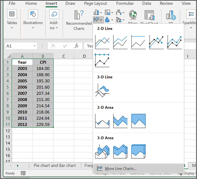
Image Description
The image shows a Microsoft Excel spreadsheet with data in two columns labelled “Year” and “CPI” (Consumer Price Index). The data, starting from row 2, lists the years from 2003 to 2012 and their corresponding CPI values. The cells containing this data are highlighted.
To the right of the spreadsheet, an Insert Chart menu is displayed, showing various chart options. The menu specifically focuses on line charts and area charts with 2-D and 3-D variations. Below the chart icons, there is an option labeled “More Line Charts…”.
Here is the data in table format:
| Year | CPI |
|---|---|
| 2003 | 184.00 |
| 2004 | 188.90 |
| 2005 | 195.30 |
| 2006 | 201.60 |
| 2007 | 207.34 |
| 2008 | 215.30 |
| 2009 | 214.54 |
| 2010 | 218.06 |
| 2011 | 224.94 |
| 2012 | 229.59 |
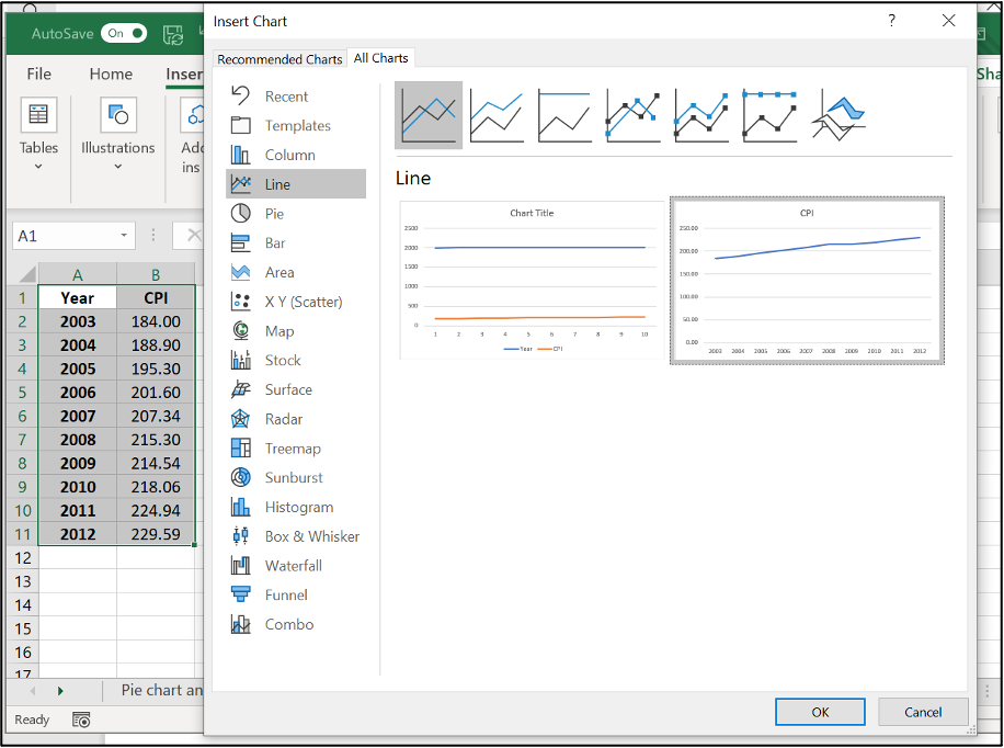
Image Description
The image displays a Microsoft Excel interface for creating a chart. On the left side of the image, there is a spreadsheet with a table containing two columns labelled “Year” and “CPI” (Consumer Price Index). The table includes the following data:
| Year | CPI |
|---|---|
| 2003 | 184.00 |
| 2004 | 188.90 |
| 2005 | 195.30 |
| 2006 | 201.60 |
| 2007 | 207.30 |
| 2008 | 215.30 |
| 2009 | 214.54 |
| 2010 | 218.06 |
| 2011 | 224.94 |
| 2012 | 229.59 |
To the right of the table is the “Insert Chart” pane, where various chart types can be selected. The “Line” chart type is chosen, which is highlighted in gray. Next to the selection pane, there are preview images of line charts, with the rightmost chart being a simple line chart titled “CPI,” representing the data from 2003 to 2012 with a line showing an upward trend.
Below the chart previews are the “OK” and “Cancel” buttons for confirming or cancelling the chart insertion.
- Click on y-axis data, right-click, Format Axis
- Change Minimum and Maximum values which suit your data best, click Enter
- Click on the new bar graph and icon + to make axis title changes
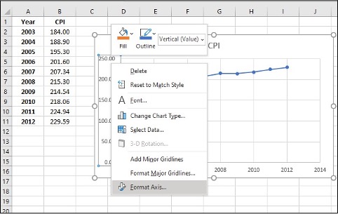
Image Description
This image shows a spreadsheet application with a table and a chart. The table is in columns A and B with the following data:
| Year | CPI |
|---|---|
| 2003 | 184.00 |
| 2004 | 188.90 |
| 2005 | 195.30 |
| 2006 | 201.60 |
| 2007 | 207.34 |
| 2008 | 215.30 |
| 2009 | 214.54 |
| 2010 | 218.06 |
| 2011 | 224.94 |
| 2012 | 229.59 |
To the right of the table, there is a line chart representing the CPI (Consumer Price Index) data over the years. The x-axis shows the years ranging from 2003 to 2012, and the y-axis shows the CPI values. The plotted line on the chart indicates a gradual increase in CPI over the given years.
There is a context menu open on the chart, showing the following options:
- Fill
- Outline
- Delete
- Reset to Match Style
- Font…
- Change Chart Type…
- Select Data…
- 3-D Rotation…
- Add Minor Gridlines
- Format Major Gridlines…
- Format Axis…
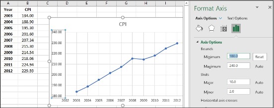
Image Description
The image displays a screenshot of a spreadsheet and a line chart, along with a formatting pane on the right side.
The left part of the image contains a table with two columns and eleven rows. The table includes:
| Year | CPI |
|---|---|
| 2003 | 184.00 |
| 2004 | 188.30 |
| 2005 | 195.30 |
| 2006 | 201.60 |
| 2007 | 207.34 |
| 2008 | 213.00 |
| 2009 | 214.54 |
| 2010 | 218.06 |
| 2011 | 224.14 |
| 2012 | 229.59 |
In the center part of the image, there is a line chart that displays these data points, and the chart is titled “CPI.” The x-axis represents the years from 2003 to 2012, and the y-axis represents the CPI values ranging from approximately 180 to 240.
The right part of the image shows the “Format Axis” pane with options to adjust the axis bounds, units, and other formatting settings. The current settings show the minimum bound set to 180 and the maximum bound to 240, with major units set to 10 and minor units to 2.
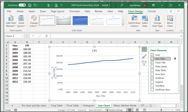
Image Description
The image shows an open Microsoft Excel window titled “OER Excel Instructions_Excel – Saved.” The Excel workbook has multiple tabs (File, Home, Insert, Draw, Page Layout, Formulas, Data, Review, View, Help, Chart Design, Format) visible in the ribbon. Below the ribbon, there are various chart-related options such as Add Chart Element, Quick Layout, Change Colors, and Chart Styles.
A spreadsheet is shown with two columns of data:
| Year | CPI |
|---|---|
| 2003 | 184.00 |
| 2004 | 188.90 |
| 2005 | 195.30 |
| 2006 | 201.60 |
| 2007 | 207.34 |
| 2008 | 215.30 |
| 2009 | 214.54 |
| 2010 | 218.06 |
| 2011 | 224.94 |
| 2012 | 229.59 |
To the right of the data columns, there is a line chart depicting the CPI values over the years from 2003 to 2012. The chart has the title “CPI” above it and the x-axis labelled “Axis Title” with yearly increments from 2003 to 2012.
On the right side of the chart, there is a “Chart Elements” panel with checkboxes for Axes, Axis Titles, Chart Title, Data Labels, Data Table, Error Bars, Gridlines, Legend, Trendline, and Up/Down Bars.
Below the spreadsheet, there is a tab selection area with the active tab labeled “Line Chart”. Other visible tabs include Pie chart and Bar chart, Freq Table, Pivot Table, Histogram, Mean, Median, and Mode.
Mean, Median, & Mode
- Mean: a number that measures the central tendency of the data; a common name for mean is ‘average’.
- Median: a number that separates ordered data into halves; half the values are the same number or smaller than the median, and half the values are the same number or larger than the median. The median may or may not be part of the data.
- Mode: the value that appears most frequently in a set of data.
Mean, Median, & Mode in Excel (Formula tool)
Use the following information to answer the next three exercises: The following data show the lengths of boats moored in a marina. The data are ordered from smallest to largest:
16; 17; 19; 20; 20; 21; 23; 24; 25; 25; 25; 26; 26; 27; 27; 27; 28; 29; 30; 32; 33; 33; 34; 35; 37; 39; 40
- Enter the data into column A
- Create a table for Mean, Median, and Mode
- Enter =AVERAGE(A:A) in cell D2, click Enter
- Enter =MEDIAN(A:A) in cell D3, click Enter
- Enter =MODE(A:A) in cell D4, click Enter
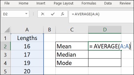
Image Description
The image shows an Excel spreadsheet with the “Home,” “Insert,” “Page Layout,” “Formulas,” “Data,” and “Review” tabs visible at the top. The focus is on a portion of the spreadsheet displaying columns A, B, C, and D from rows 1 to 5.
Column A is labelled “Lengths” in cell A1. Below this, cells A2 to A5 contain the following numbers respectively: 16, 17, 19, and 20.
In column C, there are three rows labelled as follows:
- Cell C2: Mean
- Cell C3: Median
- Cell C4: Mode
In cell D2, there is a formula input box at the top, displaying the formula =AVERAGE(A:A). This indicates that the mean of the values in column A is being calculated.
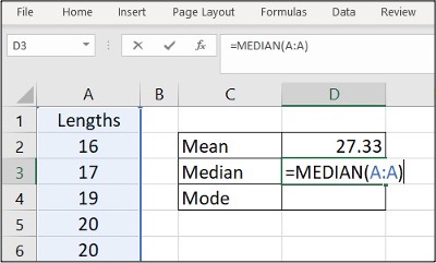
Image Description
The image shows a spreadsheet application with a table and some calculations displayed. There are various tabs like “File,” “Home,” “Insert,” “Page Layout,” “Formulas,” “Data,” and “Review” visible at the top, indicating this is likely a Microsoft Excel interface.
In the content area:
| A | B | C | D |
|---|---|---|---|
| Lengths | Mean | 27.33 | |
| 16 | Median | =MEDIAN(A:A) | |
| 17 | Mode | ||
| 19 | |||
| 20 | |||
| 20 |
On the right side, there is a column with statistical calculations:
- Mean: 27.33
- Median: =MEDIAN(A:A) (shows the formula for calculating the median of column A)
- Mode: (empty, no value provided)
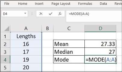
Image Description
The image shows a Microsoft Excel spreadsheet window. The top menu bar contains options like “File,” “Home,” “Insert,” “Page Layout,” “Formulas,” “Data,” and “Review.” Below the menu bar is a formula bar with the function “=MODE(A:A)” entered in it. The spreadsheet contains the following data:
| A | B | C | D |
|---|---|---|---|
| 1 | |||
| Lengths | |||
| 16 | Mean | 27.33 | |
| 17 | Median | 27 | |
| 19 | Mode | =MODE(A:A) | |
| 20 |
Column A contains numeric values 16, 17, 19, and 20. Column C includes statistical functions such as Mean, Median, and Mode, while Column D displays corresponding values: 27.33, 27, and a mode formula “=MODE(A:A)”.
Mean, Median & Mode in Excel (Data Analysis tool)
Use the following information to answer the next three exercises: The following data show the lengths of boats moored in a marina. The data are ordered from smallest to largest:
16; 17; 19; 20; 20; 21; 23; 24; 25; 25; 25; 26; 26; 27; 27; 27; 28; 29; 30; 32; 33; 33; 34; 35; 37; 39; 40
- Enter the data into column A
- Click Data, Data Analysis
- Click Descriptive Statistics, OK
- Specify Input Range ($A$1:$A$28), Output Range ($C$1)
- Click Labels in the first row, Summary statistics, and OK
- Find Mean, Median and Mode in the Summary statistics table
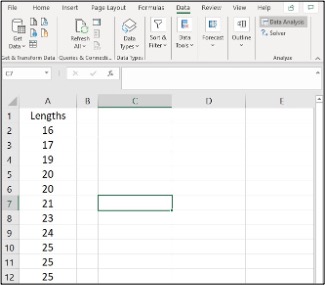
Image Description
This image is a screenshot of a Microsoft Excel spreadsheet. The Excel window is open, displaying the toolbar with various tabs and options. Visible are tabs labelled Home, Insert, Page Layout, Formulas, Data, Review, View, and Help. The Data tab is currently selected.
Under the toolbar, there is an area with options related to data tasks like refreshing data, sorting, filtering, data types, and analysis tools.
Beneath this, there is the spreadsheet area. The spreadsheet consists of rows labelled numerically on the left (1, 2, 3, etc.) and columns labelled alphabetically at the top (A, B, C, etc.).
In this Excel sheet, the column “A” from row 1 to row 12 contains the following data:
| Row | Column A |
|---|---|
| 1 | Lengths |
| 2 | 16 |
| 3 | 17 |
| 4 | 19 |
| 5 | 20 |
| 6 | 21 |
| 7 | 20 |
| 8 | 21 |
| 9 | 23 |
| 10 | 21 |
| 11 | 25 |
| 12 | 25 |
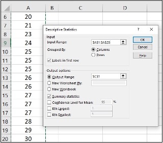
Image Description
The image shows a partial view of a spreadsheet with a statistical analysis tool dialogue box open in the foreground.
The spreadsheet in the background has columns labelled A and B. The columns contain numerical data ranging from 20 to 30.
The dialogue box is titled “Descriptive Statistics” and contains various input fields and options:
Input
- Input Range: Text box containing the value “$A$1:$A$28”.
- Grouped By: Radio buttons for “Columns” (selected) and “Rows”.
- Labels in the first row: Checkbox (unchecked).
Output options:
- Output Range: Radio button (selected) with a text box containing the value “C$1”.
- New Worksheet Ply: Radio button.
- New Workbook: Radio button.
- Summary statistics: Checkbox (unchecked).
- Confidence Level for Mean: Checkbox (unchecked) with a text box containing the value “95” and a percentage symbol.
- Kth Largest: Checkbox (unchecked) with a text box.
- Kth Smallest: Checkbox (unchecked) with a text box.
There are buttons for “OK”, “Cancel”, and “Help”.
By selecting the desired options and columns, this tool can be used to generate descriptive statistics for the data in the spreadsheet.
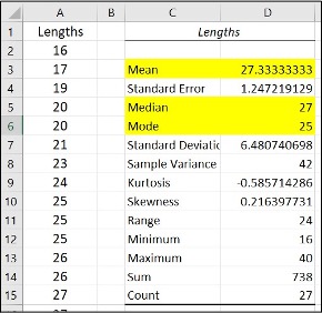
Image Description
| Row | A | B | C | D |
|---|---|---|---|---|
| 1 | Lengths | Lengths | ||
| 2 | 16 | Mean | 27.33333333 | |
| 3 | 17 | Standard Error | 1.247219129 | |
| 4 | 19 | Median | 27 | |
| 5 | 20 | Mode | 25 | |
| 6 | 20 | Standard Deviation | 6.480740698 | |
| 7 | 20 | Sample Variance | 42 | |
| 8 | 21 | Kurtosis | -0.585714286 | |
| 9 | 23 | Skewness | 0.216397731 | |
| 10 | 24 | Range | 24 | |
| 11 | 25 | Minimum | 16 | |
| 12 | 25 | Sum | 738 | |
| 13 | 25 | Count | 27 | |
| 14 | 26 | |||
| 15 | 27 | |||
Variance & Standard Deviation
- The variance is the average of the squares of the deviations.
- If x is a number, then the difference “x minus the mean” is called its deviation. The standard deviation is a number that is equal to the square root of the variance and measures how far data values are
from their mean. - Notation: s for sample standard deviation and σ for population standard deviation.
Variance and Standard Deviation in Excel (Formula tool)
In a fifth-grade class, the teacher was interested in the average age and the sample standard deviation of the ages of her students. The following data are the ages for a SAMPLE of n = 20 fifth-grade students. The ages are rounded to the nearest half year: 9; 9.5; 9.5; 10; 10; 10; 10; 10.5; 10.5; 10.5; 10.5; 11; 11; 11; 11; 11; 11; 11.5; 11.5; 11.5;
- Enter the data into column A
- Create a table for Variance and Standard deviation
- Enter =VAR.S(A:A) in cell D2, click Enter
- Enter =STDEV.S(A:A) in cell D3, click Enter
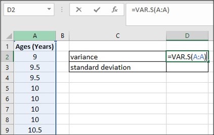
Image Description
The image displays a partial view of an Excel spreadsheet. Below is the description of its content translated into accessible HTML:
| A | B | C | D |
|---|---|---|---|
| 1 | Ages (Years) | ||
| 2 | 9 | variance | =VAR.S(A:A) |
| 3 | 9.5 | standard deviation | |
| 4 | 9.5 | ||
| 5 | 10 | ||
| 6 | 10 | ||
| 7 | 10 | ||
| 8 | 10.5 |
- Column A contains the header “Ages (Years)” and various age values listed from cells A2 to A8.
- Between cells C2 and D2, the word “variance” is written in C2, and the formula “=VAR.S(A:A)” is entered in D2.
- Between cells C3 and D3, the words “standard deviation” are written in C3, and D3 is empty.
The worksheet is designed to calculate the variance of the ages listed in column A using the formula written in cell D2.
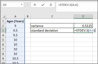
Image Description
| A | B | C | D |
|---|---|---|---|
| Ages (Years) | variance | 0.5125 | |
| 9 | standard deviation | =STDEV.S(A:A) | |
| 9.5 | |||
| 9.5 | |||
| 10 | |||
| 10 | |||
| 10 | |||
| 10.5 | |||
| 10.5 |
The image is a screenshot of an Excel spreadsheet with a table that includes one column of data. Column A is titled “Ages (Years)” and contains the values: 9, 9.5, 9.5, 10, 10, 10, 10.5, and 10.5.
To the right of the table, in column C and D, two statistical calculations are shown:
- Variance is calculated in cell D2 with the result 0.5125.
- Standard deviation is calculated in cell D3 using the formula =STDEV.S(A:A).
Variance and Standard Deviation in Excel (Data Analysis tool)
In a fifth-grade class, the teacher was interested in the average age and the sample standard deviation of the ages of her students. The following data are the ages for a SAMPLE of n = 20 fifth-grade students. The ages are rounded to the nearest half year: 9; 9.5; 9.5; 10; 10; 10; 10; 10.5; 10.5; 10.5; 10.5; 11; 11; 11; 11; 11; 11; 11.5; 11.5; 11.5;
- Enter the data into column A
- Click Data, Data Analysis
- Click Descriptive Statistics, OK
- Specify Input Range ($A$1:$A$21), Output Range ($C$6)
- Click Labels in the first row, Summary statistics, and OK
- Find Variance and Standard Deviation in the Summary statistics table
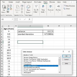
Image Description
The image is a screenshot of an Excel spreadsheet displaying data and tools from the “Data Analysis” dialogue box. The screenshot includes the following key elements:
- Excel Interface:
- The standard Excel tabs are visible at the top (File, Home, Insert, etc.).
- The “Data” tab is selected.
- The “Data Analysis” button is visible in the “Analysis” group on the ribbon.
- Spreadsheet Data:
- A table titled “Ages (Years)” is present in column A, containing age values from 9 to 12.
- There are additional calculations related to the data in columns C and D: “variance” and “standard deviation.”
| Row | A | B | C | >D |
|---|---|---|---|---|
| 1 | 9 | Variance | 0.5125 | |
| 2 | 9.5 | Standard deviation | 0.7158911 | |
| 3 | 9.5 | |||
| 4 | 10 | |||
| 5 | 10 | |||
| 6 | 10 | |||
| 7 | 10 | |||
| 8 | 10.5 | |||
| 9 | 10.5 | |||
| 10 | 10.5 | |||
| 11 | 10.5 | |||
| 12 | 11 | |||
| 13 | 11 | |||
| 14 | 11 | |||
| 15 | 11 | |||
| 16 | 11 | |||
| 17 | 11 | |||
| 18 | 11.5 | |||
| 19 | 11.5 | |||
| 20 | 11.5 |
- Data Analysis Dialog Box:
- A pop-up window titled “Data Analysis” with a list of analysis tools.
- The “Descriptive Statistics” option is highlighted.
- Buttons for “OK”, “Cancel”, and “Help” are visible within the dialog box.
This configuration indicates that the user is leveraging Excel’s statistical tools to analyze the provided age data.
Image Description
The image shows a spreadsheet and a “Descriptive Statistics” dialogue box from Excel. The spreadsheet has data in two columns and at least 20 rows. Column A is labelled “Ages (Years)” and contains the following values:
- Row 2: 9
- Row 3: 9.5
- Row 4: 9.5
- Row 5: 10
- Row 6: 10
- Row 7: 10.5
- Row 8: 10.5
- Row 9: 10.5
- Row 10: 10.5
- Row 11: 11
- Row 12: 11
- Row 13: 11
- Row 14: 11
- Row 15: 11.5
- Row 16: 11.5
- Row 17: 11.5
- Row 18: 11.5
Columns B and D are empty. Column C contains two calculations labelled:
- Row 2: “variance” with a value of “0.5125”
- Row 3: “standard deviation” with a value of “0.7158911”
Columns E and F are empty.
The “Descriptive Statistics” dialogue box, which appears to be floating above the spreadsheet, includes fields and options:
-
- Input
- Input Range:
- Grouped By:
- Columns
- Rows
- Labels in the First Row
- Output options
- Output Range:
- New Worksheet Ply:
- New Workbook
- Summary statistics
- Confidence Level for Mean:
- %
- Kth largest:
- Kth smallest:
- Input
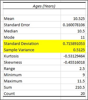
Image Description
The image depicts a table titled “Ages (Years)” with statistical data. Below is the HTML representation of the table. Note that the rows corresponding to Standard Deviation and Sample Variance are highlighted in the table.
| Ages (Years) | |
|---|---|
| Mean | 10.525 |
| Standard Error | 0.160078106 |
| Median | 10.5 |
| Mode | 11 |
| Standard Deviation | 0.715891053 |
| Sample Variance | 0.5125 |
| Kurtosis | -0.53129464 |
| Skewness | -0.45516018 |
| Range | 2.5 |
| Minimum | 9 |
| Maximum | 11.5 |
| Sum | 210.5 |
| Count | 20 |
Quartiles
Quartiles are the numbers that separate the data into quarters; quartiles may or may not be part of the data. The second quartile is the median of the data.
Quartiles in Excel
Use the following data (first exam scores) from Susan Dean’s spring pre-calculus class:
33; 42; 49; 49; 53; 55; 55; 61; 63; 67; 68; 68; 69; 69; 72; 73; 74; 78; 80; 83; 88; 88; 88; 90; 92; 94; 94; 94; 94; 96; 100
- Enter the data into column A, and sort them
- Create a table for Q1, Q2, Q3, and Q3-Q1
- Enter =QUARTILE.EXC($A:$A,1) in cell D2, click Enter
- Enter =QUARTILE.EXC($A:$A,2) in cell D3, click Enter
- Enter =QUARTILE.EXC($A:$A,3) in cell D4, click Enter
- Enter “=” in cell D5, click on cell D4, enter “-“, click on cell D2, click Enter
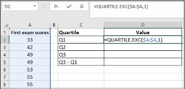
Image Description
The image is a screenshot of an Excel spreadsheet. It features a table listing exam scores and calculations for quartiles.
| First exam scores | Quartile | Value |
|---|---|---|
| 33 | Q1 | =QUARTILE.EXC($A:$A,1) |
| 42 | Q2 | |
| 49 | Q3 | |
| 49 | Q3 – Q1 | |
| 53 | ||
| 55 | ||
| 55 |
Cell A1 contains the header “First exam scores”. Cells A2 to A7 contain the scores 33, 42, 49, 49, 53, 55, and 55.
Column C lists the quartiles: “Q1” in C2, “Q2” in C3, “Q3” in C4, and “Q3 – Q1” in C5.
In column D, D2 contains the formula “=QUARTILE.EXC($A:$A,1)”. The cells D3, D4, and D5 are empty.
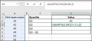
Image Description
The image displays a portion of a spreadsheet containing exam scores and quartile calculations.
| Column A | Column B | Column C | Column D |
|---|---|---|---|
| First exam scores | Quartile | Value | |
| 33 | Q1 | 61 | |
| 42 | Q2 | =QUARTILE.EXC($A:$A,2) | |
| 49 | Q3 | ||
| 49 | Q3 – Q1 | ||
| 53 | |||
| 55 |
The quartile calculations are listed in column D, starting from row 2. The calculated value for the first quartile (Q1) is 61, and the cell containing the formula for the second quartile (Q2) shows “=QUARTILE.EXC($A:$A,2)”. The other quartile values have not yet been computed.
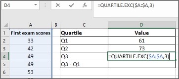
Image Description
The image shows a screenshot of an Excel spreadsheet. The worksheet contains two main areas: a list of exam scores and a computation of quartiles.
The left side of the spreadsheet lists First exam scores in column A:
| Row | Column A |
|---|---|
| 1 | First exam scores |
| 2 | 33 |
| 3 | 42 |
| 4 | 49 |
| 5 | 49 |
| 6 | 53 |
The right side of the spreadsheet is a computation table with two columns: Quartile in column C and Value in column D:
| Column C | Column D |
|---|---|
| Quartile | Value |
| Q1 | 61 |
| Q2 | 73 |
| Q3 | The value is not calculated and shows an Excel formula: =QUARTILE.EXC($A$:$A$,3) |
| Q3 – Q1 |
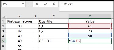
Image Description
The image is a screenshot of an Excel spreadsheet.
- Columns:
- Column A is labelled “First exam scores” and has the following data:
- A2: 33
- A3: 42
- A4: 49
- A5: 49
- A6: 53
- Column B is empty.
- Column C is labelled “Quartile” and has the following data:
- C2: Q1
- C3: Q2
- C4: Q3
- C5: Q3 – Q1
- Column D is labelled “Value” and has the following data:
- D2: 61
- D3: 73
- D4: 90
- D5 contains the formula =D4-D2.
- Column A is labelled “First exam scores” and has the following data:
- Formula Bar: The formula bar shows =D4-D2, indicating that D5 is the result of subtracting the number in D2 (61) from the number in D4 (90).
This data seems to be part of an analysis of exam scores and quartile values.
“Descriptive Statistics – Excel Tools Instruction” from Introduction to Business Statistics Problem Ancillary Materials: Yukon Edition Copyright © by Lisa Kanary is licensed under a Creative Commons Attribution 4.0 International License, except where otherwise noted.
Microsoft Excel screenshots used with permission from Microsoft.
