3.6 Misleading Data Visualizations
Data visualizations can be confusing and misleading when the designer has picked a format that isn’t well suited to the data they are analyzing.
Review Figure 3.6.1. There are 12 categories of television and similar colours used in the graph, as well as white font over the bright colours, making this hard to read.
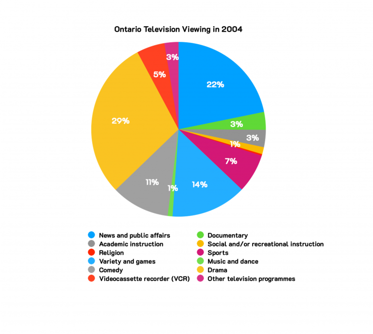
Image Description
The image is a pie chart titled “Ontario Television Viewing in 2004.” It shows the percentages of time spent on various types of television programming. The slices are colour-coded and labelled with percentages as follows:
-
- News and public affairs: 22%
- Academic instruction: 3%
- Religion: 5%
- Variety and games: 14%
- Comedy: 11%
- Videocassette recorder (VCR): 1%
- Documentary: 3%
- Social and/or recreational instruction: 1%
- Sports: 7%
- Music and dance: 3%
- Drama: 1%
- Other television programmes: 29%
False Causation
Correlation does not imply causation.
If you’ve ever taken a statistics or data analysis course, you have almost certainly come across this common phrase. It means that just because two trends seem to fluctuate alongside each other, it doesn’t prove that one causes the other or that they are related in a meaningful way.
Review Figure 3.6.2 below, which shows a line graph of the decrease of Canadian automotive apprenticeship registrations and nectarine production. What do these two things have to do with each other? They are unrelated quantities that appear to decrease at the same rate over a similar time period.
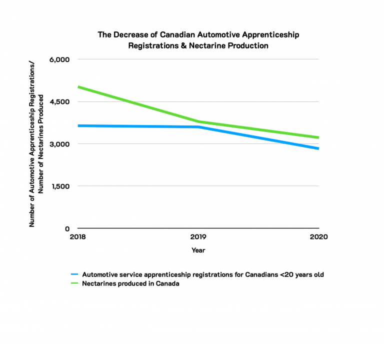
Image Description
The line graph is titled “The Decrease of Canadian Automotive Apprenticeship Registrations & Nectarine Production.” The x-axis represents the years from 2018 to 2020. The y-axis represents the values for the number of automotive apprenticeship registrations and the number of nectarines produced, ranging from 0 to 6,000.
The graph shows two data series:
- A blue line representing “Automotive service apprenticeship registrations for Canadians under 20 years old.”
- A green line representing “Nectarines produced in Canada.”
In 2018, the number of automotive apprenticeship registrations is around 3,500, and the number of nectarines produced is above 4,500. Both lines show a decline over the years. By 2020, both values converge to be just above 3,000.
Inconsistent or Manipulated Scale
It’s important to examine the scales of a data visualization carefully. Compressing or expanding the scale of a graph can make the changes between data points seem either more or less significant than they really are.
Review Figure 3.6.3 below, which shows the cost of sugar in Canada from January to July 2021. Because of the expanded scale on the line graph, there does not appear to be much fluctuation in the cost of sugar in Canada. This makes the data appear less significant than it could really be (see Figure 3.6.4 below for a more compressed scale).
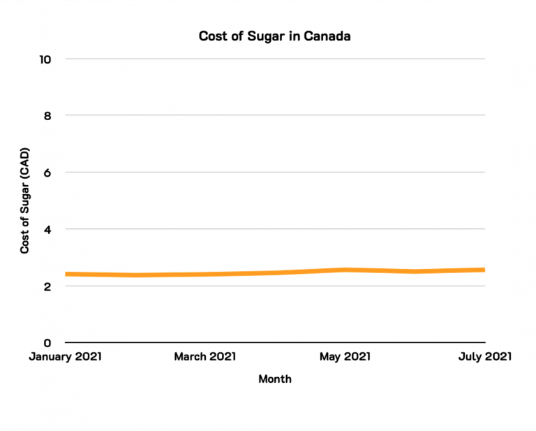
Image Description
The image is a line graph titled “Cost of Sugar in Canada.” The x-axis represents the months, starting from January 2021 on the left and ending at July 2021 on the right. The y-axis represents the cost of sugar in Canadian Dollars (CAD), ranging from 0 to 10. The graph shows a line that is mostly flat, hovering around the $2 mark throughout the entire period, with a slight increase around May 2021. The line is orange in colour. Overall, the cost of sugar remains relatively stable over these months with minimal fluctuations.
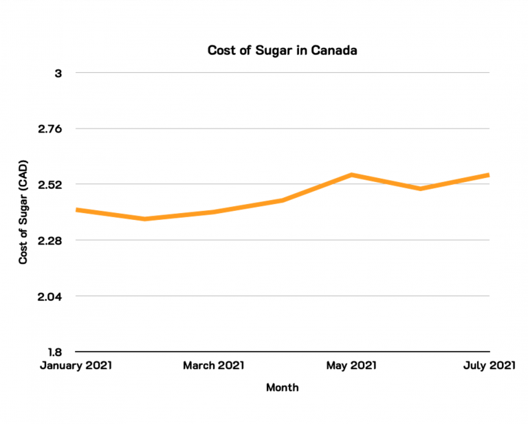
Image Description
The image is a line graph depicting the cost of sugar in Canada from January to July 2021. The x-axis represents the months, with labels for January, March, May, and July 2021. The y-axis represents the cost of sugar in Canadian dollars (CAD), with markers at 1.8, 2.04, 2.28, 2.52, 2.76, and 3.0 CAD.
The title of the graph reads “Cost of Sugar in Canada.” The data line, represented in orange, starts in January 2021 at approximately 2.52 CAD, dips slightly below 2.52 CAD in March 2021, rises to about 2.66 CAD by May 2021, slightly drops to around 2.60 CAD shortly after, and finally ends just above 2.66 CAD in July 2021.
Cherry-picking or Omitting Data
The term “cherry-picking” refers to only presenting the best data and omitting data points which are less favourable in order to reinforce a particular narrative. This can create a false impression of the data. For example, showing an upward sales trend over the first few months of a year, while omitting the data that showed sales declined for the rest of the year.
Review Figure 3.6.5 below, which shows a downward trend on gasoline prices in Canada from May 2019 to February 2020. Because of the carefully selected timeframe (i.e., short timeframe), it appears that the gasoline prices in Canada are decreasing.
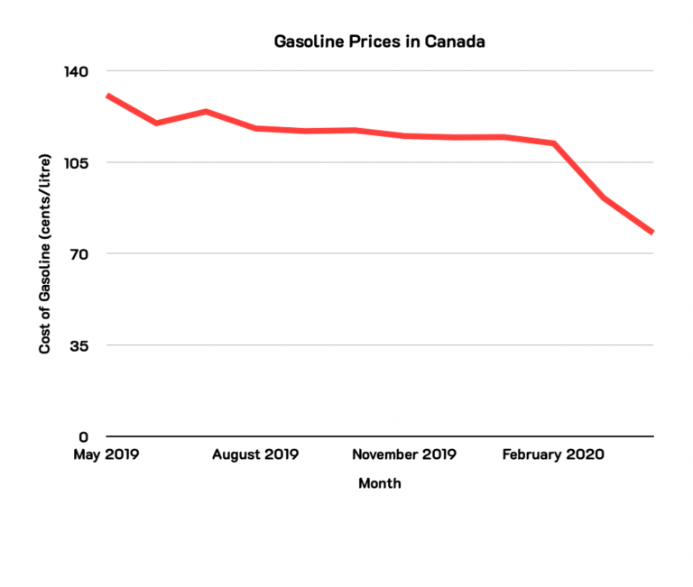
Image Description
The image is a line graph titled “Gasoline Prices in Canada.” The graph tracks the cost of gasoline (in cents per litre) over time, from May 2019 to February 2020. The horizontal axis (x-axis) represents the months, specifically May 2019, August 2019, November 2019, and February 2020. The vertical axis (y-axis) shows the cost of gasoline, ranging from 0 to 140 cents per litre, with markers at intervals of 35 cents (i.e., 0, 35, 70, 105, and 140 cents).
The data is depicted by a red line that generally trends downward over the period. The line starts at around 130 cents per litre in May 2019, initially drops and then fluctuates slightly to around 110 cents per litre until early 2020. From late 2019 to February 2020, the line shows a more significant decline, reaching about 70 cents per litre by the end of the graph.
Now review Figure 3.6.6 below, which shows an overall upward trend on gasoline prices in Canada from May 2019 to November 2021. When looking at the full timeline (i.e., long timeframe), the reader can see that gasoline prices are increasing in Canada.
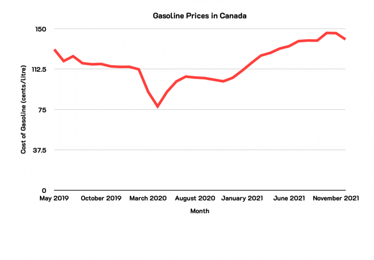
Image Description
The image is a line graph titled “Gasoline Prices in Canada,” which illustrates the cost of gasoline over time from May 2019 to November 2021.
The y-axis represents the “Cost of Gasoline (cents/litre),” ranging from 0 to 150, in intervals of 37.5. The x-axis represents the “Month,” with notable points marked at May 2019, October 2019, March 2020, August 2020, January 2021, June 2021, and November 2021.
The red line on the graph shows how gasoline prices have changed over the specified period. Initially, gasoline prices fluctuated slightly but remained relatively steady around 112.5 cents per litre. In early 2020, there was a significant decline, reaching a low point around March 2020. Following this drop, prices gradually increased, showing a steady upward trend from mid-2020 through January 2021, continuing to rise until they slightly decline again nearing November 2021.
3D Distortion or Occlusion
Three-dimensional (3D) data visualizations may look visually appealing, but they often make it more difficult to interpret the data and spot patterns within them. Two common issues are distortion and occlusion. Distortion happens when objects in the foreground appear larger (and maybe more important) than objects in the background, which appear smaller. Occlusion happens when one 3D graphic partially blocks another one.
The original version of this chapter contained H5P content. You may want to remove or replace this element.
Review Figure 3.6.7 below, which is a 3D bar graph of the percentage of Canadian vs. foreign television programmes watched in Saskatchewan from 2000 to 2003. Because of the tilt of the 3D bar graph, the bars in the front hide the bars in the back, making it hard to read. The reader cannot pinpoint the exact percentage of Canadian vs. foreign programmes by the year it is presented.
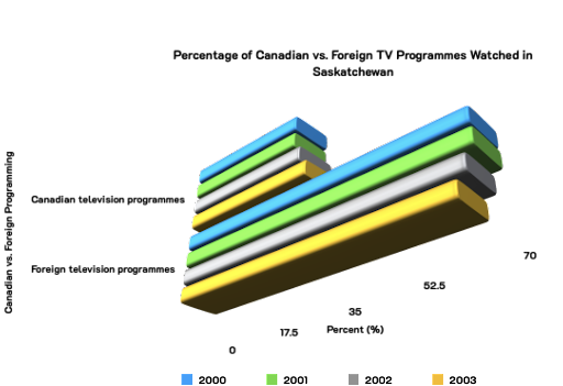
Image Description
The image is a 3D stacked bar chart. It is on an angle, with small text and no lines to show the percentages. Each bar in the chart is composed of multiple layers of different colours. The legend at the bottom indicates the meaning of each colour:
– Blue
– Green
– Gray
– Yellow
Each stack represents a category and is visually separated into segments to indicate the proportions of each subcategory. The stacks are arranged horizontally, with one stack on top of the other, representing different categories with varying proportions of the subcategories.
The chart includes three horizontal stacks, each with five segments:
1. **First stack (bottom)**:
– From top to bottom: blue, green, white, gray, yellow
2. **Second stack (middle)**:
– From top to bottom: blue, green, white, gray, yellow
3. **Third stack (top and shortest)**:
– From top to bottom: blue, green, white, gray, yellow
The bar extends further to the right with descending order from the top to the bottom.
The Colour Scale
When used thoughtfully, colour can make it easier to spot trends and relationships in a data visualization. However, colour can also cause confusion.
Some common issues include using too many colours, using colours with minimal contrast, using colours that aren’t safe for colourblind viewers and using colours in unconventional ways. Review Figure 3.6.8 below, which is a line graph of the percentage of Canadian vs. foreign television programmes watched in New Brunswick from 2000 to 2004. Because of the similar colours of the lines, it is difficult for the reader to understand which line graph corresponds to which colour from the legend.
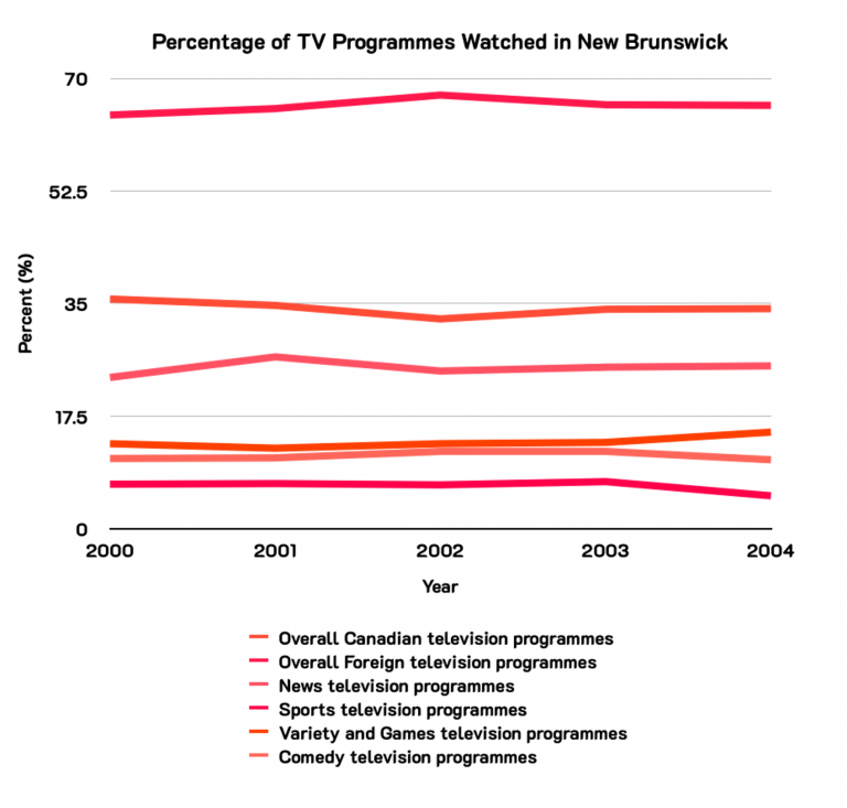
Image Description
Line graph titled ‘Percentage of TV Programmes Watched in New Brunswick’. The x-axis represents the years 2000 to 2004, and the y-axis represents percentage ranging from 0 to 70%. The graph shows six lines representing different categories of television programmes:
- Overall Canadian television programmes: stays around 52.5% from 2000 to 2004.
- Overall Foreign television programmes: starts at around 35% in 2000, dips slightly in 2002, and then returns to around 35% by 2004.
- News television programmes: starts and ends at around 17.5% with no significant changes.
- Sports television programmes: remains at about 10% throughout the years with a slight upward trend.
- Variety and Games television programmes: starts below 7% and remains fairly stable.
- Comedy television programmes: starts at about 5%, increases slightly in 2002 and 2003.
“Misleading Data Visualizations” from Critical Data Literacy Copyright © 2022 by Nora Mulvaney and Audrey Wubbenhorst and Amtoj Kaur is licensed under a Creative Commons Attribution 4.0 International License, except where otherwise noted.—Modifications: edited.
