Type B Part 2: Distributions
Part 2: Distributions
Exercise 1
Rolling a pair of dice will produce an integer somewhere between 2 and 12. You are going to roll a pair of dice 36 times, record the integer sum of each trial in Excel, and then create a histogram (bar chart) to summarize your results. A possible way to proceed in Excel is...
In cell A1, type “dice rolls”. As you go, record your dice roll sum in column A, cells 2 to 37.
When you have your 36 rolls entered, sort the values in the column A in ascending order. (Click on the “A” of column A to choose the whole column. Click on the Data tab at the top of the sheet and choose the Sort function. The default sort is usually smallest to largest. At the top of the dialogue box, make sure “My list has headers” is checked so that Excel won’t try to include cell A1 in the sort. Click OK.)
In cell C1, type the header “dice roll” and then enter the integers 2 to 12 in the cells below. (Auto-fill...)
In cell D1, type the header “frequency”.
Back in column A, count the number of times you rolled each of the integers in column C. (How many times did you roll 2? How many times did you roll 3? etc.) Record the number of times in column D, beside the result in column C. You can do this manually, or you can use a “COUNTIF” function: =COUNTIF(A2:A37,C2), the first part is the data range you want to look at (select this by using your mouse to highlight the range), the second part is the criteria you want to match, in this case I want to count how many times the value in C2 appears in the data from A2 to A37.
As a check that you counted correctly, sum the values in column D. (Choose an empty cell, type =sum( and then use your mouse to choose the data you want to sum (in this case, all of the frequencies). Once those are entered in the sum, close the bracket. The result should of course be 36.
Produce a column plot of the results, as follows:
Highlight the frequency data in column D. Click on the Insert tab at the top of the spreadsheet. Choose the bar chart (or column plot) option – it’s likely the first option on the graphing menu.
Check the x-axis on your plot -- it is likely incorrect. (Excel simply labels the x-axis as first data point, second data point, etc.) You can change the labels to the values in column C as follows: click on (or near) the x-axis to choose it, and then right click for the axis menu. Choose Select Data. Click Edit on the Horizontal (Category) Axis Labels. When the dialogue box comes up, use your mouse to choose the data in column C.
Make sure that you save your data file.
Exercise 2
Distributions can be characterized by two variables: the average and the standard uncertainty. Most people have an intuitive feel for what an average is -- you might describe it as the “middle” of the distribution. The other important feature of any distribution is how “wide” it is. Consider the two graphs below. Although, they have the same average position, the second has a much narrower distribution of measurements. If you were to consider these graphs as two separate measurements of the same quantity, you would intuitively understand that the second measurement gives a better defined result, i.e. it has a smaller standard uncertainty.
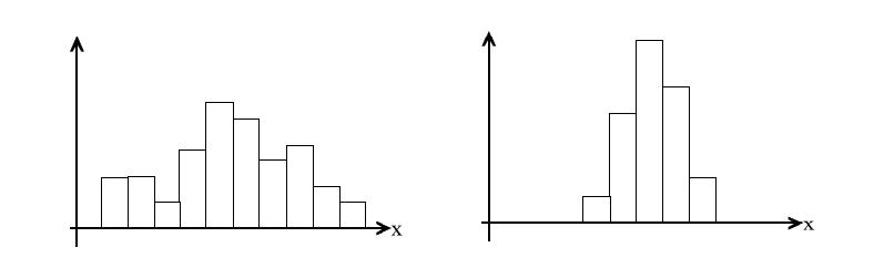
The quantity on the horizontal axis is labeled x, but it could represent any measured quantity: height, weight, time, etc. Suppose that x is measured in units of kg. What units would you expect the standard uncertainty to have?
Rather than using the entire range of the measurements to specify the width, it is more common to use a measure of the average deviation of each measurement from the average value. (Read the last sentence again. Do you understand what it is saying? Be prepared to explain it to your lab instructor.)
We’ll try a simple formulation first...
a) Copy the first column of your dice roll data to a new sheet in your file. (Choose all of column A, by clicking on the “A” at the top, then right click to pull up an options menu. Choose Copy. Go to the bottom of the spreadsheet and choose Sheet2. Click on cell A1, and then right click to use the Paste option.) In F1, type “average”. In F2, use Excel to calculate the average value of the dice rolls in column A, x̅.
b) Type “deviation” into cell B1. Then for each of your measurements, [latex]x_i[/latex], calculate the deviation from the average,
[latex]\Large{ d_i = x_i - \overline{x}}[/latex]
(Remember that you can hold a cell fixed while autofilling if you put dollar signs “$” in front of the row and column in the equation. ex. $F$2)
c) Now calculate the average deviation. What does it tell you about the width of the distribution? Why?
d) Since the average deviation isn’t going to be that useful, we resort to a quantity called the variance, [latex]\nu[/latex], which uses the square of the deviation instead. (You can see why this is an improvement…) Calculate the average square deviation of your dice roll measurement.
e) You won’t be able to use the variance directly as a measure of the width of the distribution. (Essentially, the units are wrong because of the squaring.) The standard uncertainty will be given by
[latex]\Large{ u = \sqrt{\nu}}[/latex]
How does your calculated standard uncertainty compare to the “width” of your distribution? Roughly what fraction of your measurements are within ±u of the average value? (We’ll have more to say about this later.)
The full definition of the variance is actually…
[latex]\Large{ \nu = \frac{1}{N-1}\sum_id^2_i}[/latex]
How is it different from your calculation?
Notice that because of the N-1 in the denominator, you cannot calculate a variance if all you have is one measurement. (That makes sense, right?) Also, if you have a large number of measurements (i.e. N >> 1), then the denominator is ≃ N and the variance is simply the average of the square deviations (which is what you originally calculated).
For future reference, if you have your data tabulated in Excel, you can use the built-in average and variance functions to do the calculations for you. (Your lab instructor can show you how.) Check your values against the built-in functions.
Exercise 3
The statistics of dice-rolling are well known: you can make the argument yourself, as follows:
If a die is true, then any of its 6 faces occur with equal probability. That means that for a two-dice roll, there are 36 possible combinations (any of 6 possibilities on the first dice combined with any of 6 possibilities on the second dice.)
Only one of those combinations sums to 2:

There are 2 combinations that sum to 3:
There are 3 combinations that sum to 4:
etc.
Create a table, similar to the one below, in Excel.
|
sum |
combinations |
number of combinations |
|
1 |
not possible |
0 |
|
2 |
1-1 |
1 |
|
3 |
1-2 2-1 |
2 |
|
4 |
1-3 3-1 2-2 |
3 |
|
5 |
|
|
|
… |
|
|
|
13 |
not possible |
0 |
Complete the table and check that the number of combinations sums to 36.
Make a scatter plot which shows both your own data and the theoretical result. (The easiest way would be to copy your number of combinations data into the column beside your frequency data.) Show your data as data points and the theoretical result as a solid line. (You can do this by right-clicking on any of the theoretical data points and choosing Format Data Series. Change the marker option to none and the line colour to solid.)