10 Chapter 10
In this chapter we will work with some Excel Charts. We will work with the Hours.xlsx file. We will look at 3 different kinds of charts: Bar Charts, Pie Charts, and Line Charts.
- Open the Hours.xlsx file – you should have Mon – Sun in cells B1 to H1
- Type Week 1 in cell A2. You should already have hours in B2 to H2
- Type Week 2 in cell A3. Type hours into cells B3 to H3 (5, 8, 7. 7. 8. 5. 0)
- Type Week 3 in cell A4. Type hours in cells B4 to H4 (3, 3, 3, 4, 6, 8. 7)
- Type Week 4 in cell A5. Type hours in cells B5 to H5 (8, 8, 3, 9, 4, 6, 7)
- Save the document so we don’t lose our work
- Adding in a Bar Chart:
- Select cells A1 through H5
- Go to the Insert tab and look for the Charts grouping
- Look for the Bar Chart icon:

- Click on it and choose under 2D Column the first icon Clustered Column:

- You should end up with a chart that looks like this:
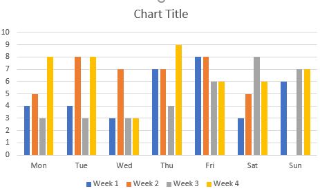
You can see on the left hand side the number starts at 0 in the bottom left and goes up to 10 at the top left. This is the X Axis and it represents the number of hours worked.You can see on the bottom that the days of the week start at Mon and go to Sun. This is the Y axis.Below the days of the week you can see that the bars are divided into weeks – in our case weeks 1 to 4. And each bar is colour coded by week.Finally in the center part you can see each coloured bar representing each week for each day of the week. So on Monday of Week 1 we can see we worked 4 hours. On Monday of Week 2 we worked 5 hours. So the bars represent the number of hours we worked each day of the week over 4 weeks.
- Click where it says “Chart title” in the chart and type “Weekly Hours”
- Adding a Pie Chart
- Select cells A1 through H2
- Go to the Insert Tab and look for the Pie Chart icon:

- Under 3D choose 3D Pie:

- You should end up with a pie chart that looks like this:
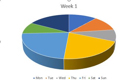
You will see that Week one is divided into the days of the week, and each day’s hours are represented by a ‘piece of pie’. The pie chart is more of a representational tool, so you can visually see that you worked the most hours on Friday that week. It won’t show the number of hours unless you change the chart style (which we won’t cover in this text).
- Selecting non-adjacent rows and adding in a Line Chart
- Select cells A1 through H1 as you normally would
- Now press down and hold the ctrl key on your keyboard
- With your mouse click on cell A3 and then drag over to cell H3 – this will select the non-adjacent rows 1 and 3 for us to chart Week 2 hours!
- Go to the Insert tab and click on the Line Chart icon:

- Under 2D Line choose the first icon Line
- This will add a line chart that looks like the following:
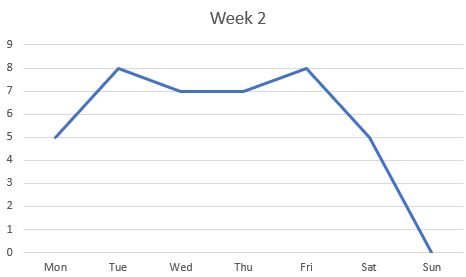
Line Charts are similar to bar charts in that you’ll see specific hours for specific days. However this gives you a better idea of the fluctuation of hours throughout the week than a bar chart would.
All screenshots and icons from Microsoft Excel, used with permission from Microsoft.
