HTML/CSS Code Snippets


Fix Padding/Margins Around Headings
The amount of spacing around headings is dictated by the Pressbooks theme you have chosen, and may contain more padding than you would like. Remember when editing the Custom Styles Sheet, you can customize the Web, PDF, and eBook versions. If you want the change to occur across all three formats, you will need to copy the code to each drop-down (top).
The amount of padding around a heading can be adjusted using Custom Styles. Changes will remain consistent throughout the text.
- On the Dashboard, select Appearance then Custom Styles
- In the Your Web Styles box, add the CSS shown below
- Adjust the padding size by increasing or decreasing the number after margin-bottom: and margin-top:
/* Bold heading h3 */
.chapter h3{
margin-bottom:0.5;
}
main *+p {
margin-top: 0em;
}
NOTE: This particular code adjusts heading 3. Change the heading number to adjust a different heading (.chapter h1, .chapter h2 etc.). If you would like to change the spacing around every heading, use the code below.
/* bold headings h1 - h4 */
.chapter h1, .chapter h2, .chapter h3, .chapter h4 {
margin-bottom: 1em ;
}
main *+p {
margin-top: 0em;
}
Heading Colours
Use the following custom styles code to style the h1 headings across the entire book (the same approach can be used for any heading level):
.front-matter h1, .part h1, .chapter h1, .back-matter h1 {
color: black !important;
}
Rounded Textbox Corners
Place the following in Custom Styles:
.textbox, .textbox p {
hyphens: none;
border-radius: 1.5em !important;
}
.textbox__header {
border-radius: 1.5em 1.5em 0 0 !important;
}
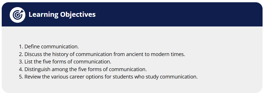
Icons in Textbox Headers
Place the code below in Custom Styles. Note the use of ::before (known as a pseudo-element). A full list of CSS pseudo-elements can be found here: https://developer.mozilla.org/en-US/docs/Web/CSS/Pseudo-elements
/*Icons in textbox headers*/
h2.textbox__title {
margin: 0;
}
.textbox--learning-objectives .textbox__header::before,
.textbox--exercises .textbox__header::before,
.textbox--examples .textbox__header::before,
.textbox--key-takeaways .textbox__header::before {
content: "";
display: block;
background-size: contain;
width: 50px;
height: 50px;
background-position: center;
}
/* Learning Objectives Box */
.textbox--learning-objectives .textbox__header::before {
background-image: url("IMG_URL_HERE");
}
/* Question/Exercises Box */
.textbox--exercises .textbox__header::before {
background-image: url("IMG_URL_HERE");
}
/* Examples Box */
.textbox--examples .textbox__header::before {
background-image: url("IMG_URL_HERE");
}
/* Key Takeaways Box */
.textbox--key-takeaways .textbox__header::before {
background-image: url("IMG_URL_HERE");
}
/* No-Icon */
.textbox-no-icon::before {
display: none !important;
background: none !important;
}
/*End of icons in textbox headers*/
Basic Accordion
The following HTML element allows for content to hidden and displayed when a user clicks on it:
Accordion Header (could be a question)
Hidden text (could be the answer to the question posed above).
To include this accordion, use the following HTML in your page at the desired spot using the Text Editor:
<details>
<summary><strong>Accordion Header (could be a question)</strong></summary>
Hidden text (could be the answer to the question posed above).
</details>
Fancy Accordion
Header Content Here
HIDDEN TEXT HERE
To apply the styling above, apply the following HTML page code in the Text Editor:
<div class="fancy-accordion-wrapper">
<details class="fancy-accordion"><summary> Header Content Here </summary>
<div class="collapsed">
HIDDEN TEXT HERE
</div>
</details>
</div>
Then copy/paste the following into Custom Styles:
/*Fancy Accordion*/
.fancy-accordion-wrapper {
margin-bottom: 60px;
position: relative;
}
.fancy-accordion {
margin-bottom: -45px;
border-radius: 15px;
border: 1px solid #0b6396;
background-color: #fff;
color: #000;
padding: 0;
overflow: visible;
}
.fancy-accordion > summary, .fancy-accordion > .summary {
padding: 10px;
font-size: 1.25em;
text-indent: 30px;
background-color: #0b6396;
list-style: none;
color: #fff;
border: none;
cursor: pointer;
border-radius: 10px 10px 10px 10px; }
.fancy-accordion > .summary {
border-radius: 10px 10px 0px 0px;
font-weight: bold;
}
details.fancy-accordion[open] > summary {
border-radius: 10px 10px 0 0;
}
.fancy-accordion > .collapsed {
padding: 20px;
margin-bottom: 10px;
}
details.fancy-accordion > .collapsed {
display: hidden;
}
details.fancy-accordion[open] > .collapsed {
display: block;
animation: details-show 750ms ease-in-out;
}
// The Rotating Marker
details.fancy-accordion > summary::marker {
display: none;
content: ""; }
details.fancy-accordion > summary::before {
content: "▶";
left: -0.6em;
position: absolute;
transform: rotate();
transform-origin: 70% 50%;
transition: 0.2s transform ease; }
details.fancy-accordion[open] > summary:before {
transform: rotate(90deg);
transform: ease 1s; }
// The Sliding Summary
@keyframes details-show {
from {
opacity: 0;
transform: var(--details-translate, translateY(-0.5em)); } }
/* End of Fancy Accordion */
Left Bar Text Decoration
The above effect can be achieved applying a custom class to the page HTML and then using a global style in Custom Styles. In the Text Editor, apply the class to any text you want to accentuate with the left bar, for example:
<div class="leftbar">Left Bar Text</div>/*Text accent - indent & left coloured bar*/
.leftbar {
border-left: 10px solid teal; /* the bar */
padding-left: 10px;
margin-left: 10px;
}
Note that you can control the colour and width of the bar using the “border-left” property. You could even have several different bars with varying colours, for example, by defining a custom class for each.
Left Bar Box Text
Below is the implementation for a left bar decoration with the text enclosed in a box (remember to apply the class in the page HTML):
/*Box with left accent bar*/
.box {
border-top: 1px solid teal;
border-right: 1px solid teal;
border-bottom: 1px solid teal;
border-left: 15px solid teal;
padding: 10px;
}
Figure Caption
To use the Figure element, place the following HTML in your page using the Text Editor:
<figure>
<img src="YOUR_IMAGE.jpg" alt="ALT-TEXT" style="width:100%">
<figcaption>Fig.1 - MY IMAGE</figcaption>
</figure>
The <figure> tag will house the <figcaption> tag and you can choose where you would like to place the caption (above or below) in relation to the content. You can place an image, but remember the image caption is different from the figcaption. The figure doesn’t have to be an image, the figure could be a table, just move whatever HTML pertains to the figure inside the figure tags. Styles can be applied to the <figure> and <figcaption> elements using CSS, either inline or in Custom Styles. See https://www.w3schools.com/tags/tag_figure.asp for more details.
Hanging Indent
In order to list references with hanging indents, for example:
Anthony, S. (2009). Major League Innovation. Harvard Business Review. https://hbr.org/2009/10/major-league-innovation
Format each reference like this in the page Text Editor:
<p class="hanging-indent" style="text-align: left;">REFERENCE TEXT</p>
Rounded Images
Rounding the corners on images is achieved the same way as with any other HTML element – by using the border-radius CSS property. You can do this either inline to apply to a single image, or in the Custom Styles editor using a custom class or applied to all images using the img selector. For example, the following would be placed in the page HTML Text Editor to round the corners of a single image and apply a grey border:
<img src="IMAGE SOURCE" style="border-radius: 10%; padding: 3px; border: 1px solid grey;" />
For the above style to apply to all images in the book, place the following in the Custom Styles editor:
img {
border-radius: 10%;
padding: 3px;
border: 1px solid grey;
}
Rounded Alternating Table
| Example Header |
|---|
| Example Content… |
| Example Content… |
| Example Content… |
If you are not familiar with how tables are represented in HTML, please check out the article at https://www.freecodecamp.org/news/html-tables-table-tutorial-with-css-example-code/ before applying advanced styling to tables.
To apply the above template, first add the tableDesign1 custom class to your table in the page HTML Text Editor:
<table class="tableDesign1">
. . .
</table>
Copy and paste the CSS below into the Custom Styles (take note of style options indicated by the comments):
/* tableDesign1 template */
table.tableDesign1{
border: none !important;
width: 100% !important;
border-radius: 1em !important;
margin: 0 !important;
}
/* this formats the first row as a header row, with blue background and white text */
table.tableDesign1 th, table.tableDesign1 tr:first-of-type td {
color: white !important;
background-color: #0b6396 !important;
padding-left: 1.5em;
}
.tableDesign1 tr:first-of-type{
border-bottom: solid black 1px;
background-color: #0b6396 !important;
}
/* apply rounded corners to table */
.tableDesign1 th:first-of-type{
border-top-left-radius: 1.5em;
}
.tableDesign1 tr:last-of-type td:first-of-type{
border-bottom-left-radius: 1.5em;
}
.tableDesign1 tr:last-of-type td:last-of-type{
border-bottom-right-radius: 1.5em;
}
.tableDesign1 tr:first-of-type td:first-of-type{
border-top-left-radius: 1.5em;
}
.tableDesign1 tr:first-of-type th:last-of-type, .tableDesign1 tr:first-of-type td:last-of-type{
border-top-right-radius: 1.5em;
}
.tableDesign1 td{
padding-left: 1.5em !important;
}
/* alternating row colours */
.tableDesign1 tr:nth-child(even), .giveMePretty {background: #CCC};
.tableDesign1 tr:nth-child(odd), .giveMePretty {background: #f0f6ff}
/* End of tableDesign1 */
Rounded Video Embeds
To apply the above style to videos (only works with YouTube embeds), use the following code in your page HTML (Text Editor):
<div style="border: solid black 5px; border-radius: 1.5em;">
<div style="border-radius: 1.1em; overflow: hidden; background-color: #f0f6ff;">
YOUTUBE EMBED LINK GOES HERE
<p style="text-align: center; margin: 1em;">Video: "<a href="LINK TO YOUTUBE VIDEO">VIDEO TITLE</a>" By VIDEO AUTHOR [VIDEO DURATION]</p>
</div>
</div>
Editing Marks
The following will allow you to mark text as crossed out or deleted in a way that is accessible to people using screen readers.
- Signify text that has been crossed out:
<span role="deletion">The deleted text.</span> - Signify text that has been inserted:
<span role="insertion">The inserted text.</span>
In addition, the following must be added to the Custom Styles:
/*Editing Marks*/
[role="insertion"] {
color: #1215b0;
text-decoration: underline;
}
[role="deletion"] {
color: #be0000;
text-decoration: line-through;
}
It would look as follows:
- This is the deleted text.
- This is the inserted text
Circled Text
Here is how you can have a word or section of text circled:
<span style="border: 1px solid; border-radius: 30px; padding: 3px;">This text is circled.</span>
It would look like this:
This text is circled.
Note that if you want to be able to apply this style in multiple places, you should apply a custom class to the text being circled and put the CSS styling in the Custom Styles. For example, on the page in the Text Editor you would have:
<span class="circled">This text is circled</span>
And in Custom Styles, add:
/*Circled Text*/
.circled{
border: 1px solid black;
border-radius: 30px;
padding: 3px;
}
/*End of Circled Text*/
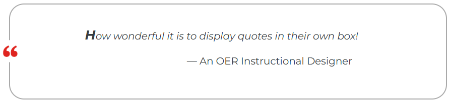
Quote Box
How wonderful it is to display quotes in their own box!
— An OER Instructional Designer
To achieve the above effect, use code following this format on the page:
<div class="textbox quote-box"><div class="quote-box_icon" ></div><p style="text-align:left;">How wonderful it is to display quotes in their own box!</p> <p style="text-align:left; font-style:normal"> -- An OER Instructional Designer</p></div>You’ll need to add the quote icon you wish to use to the Media Library and make a copy of its Pressbooks URL. Add the following CSS in the Custom Styles (note where you need to paste the URL for your icon):
/* quote-box styling */
.quote-box {
position: relative;
border-color: darkgray !important;
border-width: 2px;
}
.quote-box_icon {
content: url("[PASTE ICON URL HERE]");
position: absolute;
display: inline-block;
width: 45px;
left: -22px;
top: 50%;
transform: translateY(-50%);
}
.quote-box p {
font-style: italic;
/*You may have to play with margin and padding values for desired look*/

margin-left: 5em;

padding: 2em;
}
.quote-box p:first-of-type:first-letter {
font-size: 24px;
font-weight: bold;
line-height: 0.2em;
}
/* end of quote-box */
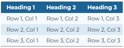
Table with Alternating Row Colours
| Heading 1 | Heading 2 | Heading 3 |
|---|---|---|
| Row 1, Col 1 | Row 1, Col 2 | Row 1, Col 3 |
| Row 2, Col 1 | Row 2, Col 2 | Row 2, Col 3 |
| Row 3, Col 1 | Row 3, Col 2 | Row 3, Col 3 |
To achieve the above effect, apply the alternating class inside your <table> tag, then paste the following into the Custom Styles:
/* Table with alternating row colours */table.alternating tr:nth-child(even){background: #f5faff !important;}
table.alternating tr td:first-child{
padding-left: 1em;
}
table.alternating tr:nth-child(odd){
background: #daeaf5 !important;
}table.alternating td {
padding-left: 1em;
}
table.alternating th {
background: #0b6396;
color: #fff;
padding-left: 1em;
}
TablePress to HTML Instructions
Since there are issues with exporting TablePress tables to PDF, it is often desirable to convert tables generated in TablePress to HTML. Many designers may use TablePress because of its ability to autogenerate tables from imported datasets and the convenience of its visual editor. Using the alternating coloured HTML table, we can provide a similar look to the tables created in TablePress while overcoming the PDF export issues. Simply navigate to the table in the TablePress editor and export it to HTML. Add the generated HTML in the Text editor at the desired position and remember to add the alternating class to the table and the accompanying styling in the Custom Styles as detailed above.
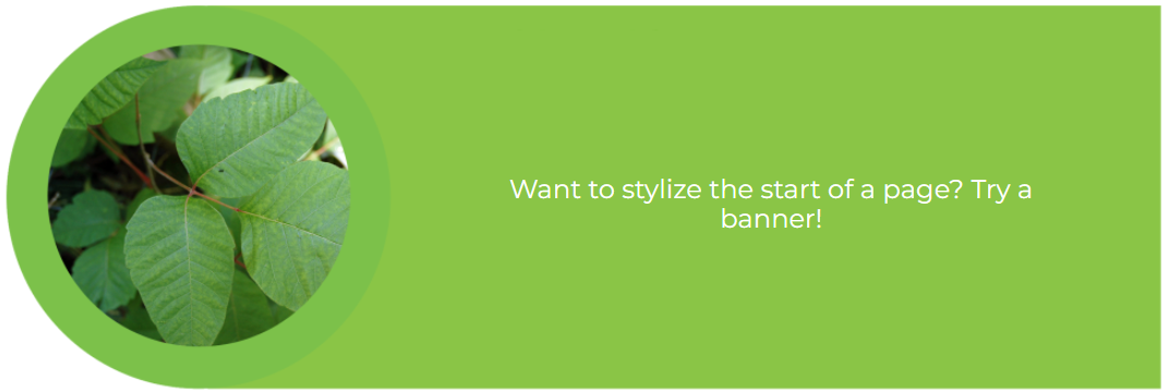
Banner Image with Text

To Achieve the above effect add the following HTML and embed the desired banner image.
<div class="image-container">
EMBED YOUR BANNER IMAGE HERE
<div class="overlay-text">YOUR BANNER TEXT GOES HERE</div>
</div>
You will need to add the desired banner image to the media library. Additionally, add the following CSS to the books custom styling and potentially adjust the colour of the banner text to make it legible, and/or adjust the CSS properties to move the text to an appropriate spot above the image.
.image-container {

position: relative;

display: inline-block;

}
.image-container img {

display: block;

width: 100%;

height: auto;

}
.overlay-text {

//These values will adjust the space above the image which the text lies on, they will have to be adjusted to fit the banner you are making use of
//background-color: #000000; //this line can be uncommented to better display the space in which the text will lie above the image
position: absolute;
top: 50%;
left: 50%;
transform: translate(-26.5%, -55%);
width: 63.5%;
height: 73.5% fit-content !important; //fit-content will vertically align the text within the alloted space. It can be removed if this effect is undesired
//these values can be adjusted to change the appearance of the text
color: #fff;
font-size: 1.20em;
font-family: "Montserrat", sans-serif;
padding: 10px 20px;
font-weight: bold;
line-height: 1.2857142857em;
text-align: center;
hyphens: none !important; //this line will disable hyphenation across lines and can be disabled if this effect is undesired
}
@media only screen and (max-width: 600px) {
//You will also need to make adjustments for how the text will appear and overlay the image on a mobile setup. Again, all of these values will need to be adjusted to fit the banner image you are making use of.
.overlay-text {
width: 70%;
font-size: 0.58em;
line-height: 1.1em;
}
}
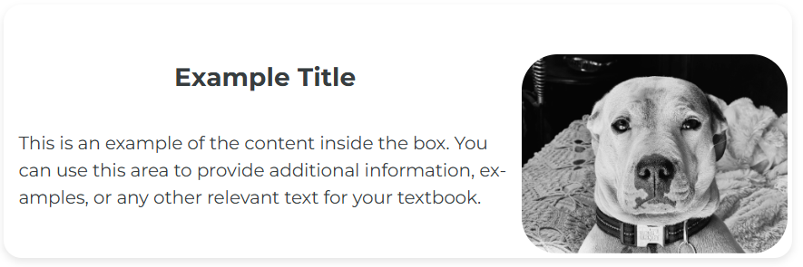
Image Info Box
Example Title
This is an example of the content inside the box. You can use this area to provide additional information, examples, or any other relevant text for your textbook.
HTML
<div class="info-box">

<div class="content">

<h2>Example Title</h2>

<p class="example-content">This is an example of the content inside the box. You can use this area to provide additional information, examples, or any other relevant text for your textbook.</p>

</div>

<div class="example-image"><a href="https://ecampusontario.pressbooks.pub/app/uploads/sites/3671/2024/01/bw-dog.png"><img class="rounded-image wp-image-890 alignnone" src="https://ecampusontario.pressbooks.pub/app/uploads/sites/3671/2024/01/bw-dog.png" alt="A black and white photo of a dog looking at the camera used as an example of a image info box." width="177" height="133" /></a></div>

</div>
CSS
.info-box {

width: 100%;

border-radius: 1em;

box-shadow: 0 4px 8px rgba(0, 0, 0, 0.1);

padding: 5px;

display: flex;

align-items: center;

justify-content: space-between;

margin: 20px auto;

flex-direction: row;

}
.info-box h2 {
margin: 10px !important;
text-align: center !important;
}
.info-box .content {
flex: 1;
display: flex;
flex-direction: column;
justify-content: center;
}
.content {
padding: 10px;
}
.rounded-image {
border-radius: 2em;
width: 200px;
}
@media (max-width: 768px) {
.info-box {
flex-direction: column;
margin: 10px auto;
align-items: center;
}
.info-box .content {
margin-left: 0;
margin-top: 10px;
text-align: center !important;
}
.content p {
text-align: center !important;
}
.example-image {
width: 100%;
display: flex;
align-items: center;
justify-content: center;
}
.rounded-image {
margin: auto;
width: auto;
max-height: 200px;
}
}
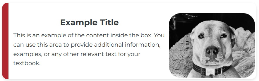
Image Highlight Box
Example Title
This is an example of the content inside the box. You can use this area to provide additional information, examples, or any other relevant text for your textbook.
HTML
<div class="highlight-box">

<div class="content">

<h2>Example Title</h2>

<p class="example-content">This is an example of the content inside the box. You can use this area to provide additional information, examples, or any other relevant text for your textbook.</p>

</div>

<div class="example-image"><a href="https://ecampusontario.pressbooks.pub/app/uploads/sites/3671/2024/01/bw-dog.png"><img class="rounded-image alignnone wp-image-890" src="https://ecampusontario.pressbooks.pub/app/uploads/sites/3671/2024/01/bw-dog.png" alt="A black and white photo of a dog looking at the camera." width="183" height="137" /></a></div>

</div>
CSS
.highlight-box {

width: 100%;

border-radius: 1em;

box-shadow: 0 4px 8px rgba(0, 0, 0, 0.1);

padding: 5px;

display: flex;

align-items: center;

justify-content: space-between;

margin: 20px auto;

flex-direction: row;

border-left: 20px solid #b3272d; /* Change this to change highlight colour */

}.highlight-box h2 {

margin: 10px !important;

text-align: center !important;

}.highlight-box .content {

flex: 1;

display: flex;

flex-direction: column;

justify-content: center;

}.content {

padding: 10px;

}.highlight-box p {

margin: 0;

line-height: 1.6;

font-size: 1em;

}.rounded-image {

margin: auto;

width: auto;

max-height: 200px;

border-radius: 2em;

}.highlight-box .example-image figure {

display: flex;

flex-direction: column;

align-items: center;

justify-content: flex-start;

margin: 0 !important;

}@media (max-width: 768px) {.highlight-box {

flex-direction: column;

margin: 10px auto;

align-items: center;

}.highlight-box .content {

margin-left: 0;

margin-top: 10px;

text-align: center !important;

}.content p {

text-align: center !important;

}.example-image {

width: 100%;

display: flex;

align-items: center;

justify-content: center;

}.rounded-image {

margin: auto;

width: auto;

max-height: 200px;

border-radius: 2em;

}

}Idea Box
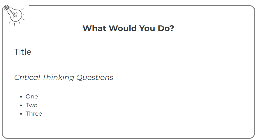
What Would You Do?
Title
Critical Thinking Questions
- One
- Two
- Three
HTML
<div>

<div class="w-w-y-d">

<div class="wwyd_icon"></div>

<div class="wwyd_title">

<h2>What Would You Do?</h2>

</div>

<div class="wwyd_body">

<h3>Title</h3>

<h4>Critical Thinking Questions</h4>

<ul>

<li>One</li>

<li>Two</li>

<li>Three</li>

</ul>

</div>

</div>

</div>
CSS
/* What Would You Do*/

.w-w-y-d {

border-right: 3px solid gray !important;

border-bottom: 3px solid gray !important;

border-left: 3px solid gray !important;

position: relative;

padding: 2em;

padding-top: 3em;

border-radius: 1em;

}
.w-w-y-d::before {
content: "";
position: absolute;
top: 0;
right: -0.4%;
width: 90%;
height: 20%;
border-top: 3px solid gray !important;
border-right: 3px solid gray !important;
border-radius: 0 1em 0 0;
}
position: absolute;
top: 0px;
left: 50%;
transform: translateX(-50%);
}.wwyd_body {
padding-top: 20px;
}.wwyd_icon {
content: url("https://ecampusontario.pressbooks.pub/app/uploads/sites/4058/2024/05/d37f39b2-ddee-4cfe-a7e1-0e8a1a4db818.png"); //Get the local link after uploading the icon to textbook
position: absolute;
display: inline-block;
width: 65px;
left: 2px;
top: -10px;
transform: rotate(-50deg);
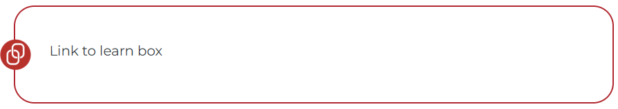
}Link Box
Link to learn box
HTML
<div class="textbox link-to-learning">

Link to learn box
</div>CSS
/* Link to learning boxes */

.link-to-learning {

border: 2px solid #65483d !important;

position: relative;

&::before {

content: '';

background-image: url("https://ecampusontario.pressbooks.pub/app/uploads/sites/4475/2024/10/linktolearn_cdp.png"); //replace with an image from the correct book

background-size: contain; /* Control size */

background-repeat: no-repeat;

position: absolute;

display: inline-block;

width: 45px;

height: 45px;

left: -22px;

top: 50%;

transform: translateY(-50%);

}

& > h3 {

text-align: center;

}
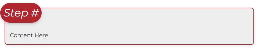
}Step Box (Text Label)
Step #
Content Here
HTML
<div class="stepbox">

<div class="step-number"><h4>Step # Here</h4></div>

Content Here

</div>
CSS
.stepbox {

border: 2px solid #b3272d; //Step content border color

padding: 15px;

margin: 30px 0;

display: flex;

flex-direction: column;

border-radius: 10px;

position: relative;

background-color: #ededed; //Step content background color

box-shadow: 0 4px 8px rgba(0, 0, 0, 0.1);

}

.step-number h2, .step-number h3, .step-number h4 {

margin: 0;

}
.step-number > :first-child {
font-size: 1.3em; //optionally resize the font
color: white; //heading color
margin: 0 !important;
padding: 0 !important;
}
.step-number {
//font-size: 1.5em; //use this to adjust the font size
color: white;
background-color: #b3272d; //Step number background color
width: fit-content; // optionally use a fixed width for uniform size
z-index: 1;
line-height: 40px;
text-align: center;
border-radius: 2em;
display: flex;
align-items: center;
justify-content: center;
margin-top: -32px;
margin-left: -30px;
padding: 2px 15px;
box-shadow: 0 4px 8px rgba(0, 0, 0, 0.2);
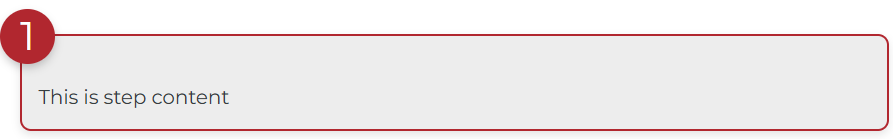
}Step Box (Number Labels)
This is step content
HTML
<div class="stepbox-no-text">

<div class="step-number-no-text">1</div>

This is step content

</div>
CSS
/////////////////////Steps Box No Text

.stepbox-no-text {

border: 2px solid #b3272d; //Step content border color

padding: 15px;

margin: 10px 0;

border-radius: 10px;

position: relative;

background-color: #ededed; //Step content background color

box-shadow: 0 4px 8px rgba(0, 0, 0, 0.1);

}

.step-number-no-text {

font-size: 2em;

color: white;

background-color: #b3272d; //Step number background color

width: 50px;

height: 50px;

line-height: 50px;

text-align: center;

border-radius: 50%;

position: absolute;

top: -25px;

left: -20px;

box-shadow: 0 4px 8px rgba(0, 0, 0, 0.2);

}
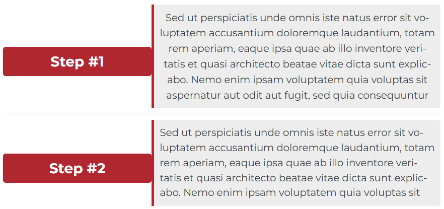
Step Box (Side Labels)
Step #1
Step #2
Sed ut perspiciatis unde omnis iste natus error sit voluptatem accusantium doloremque laudantium, totam rem aperiam, eaque ipsa quae ab illo inventore veritatis et quasi architecto beatae vitae dicta sunt explicabo. Nemo enim ipsam voluptatem quia voluptas sit
HTML
<div class="side-step-container">
<div class="side-step">
<h2 class="side-step-header"><span class="side-step-number">Step #1</span></h2>
<div class="side-step-content">Sed ut perspiciatis unde omnis iste natus error sit voluptatem accusantium doloremque laudantium, totam rem aperiam, eaque ipsa quae ab illo inventore veritatis et quasi architecto beatae vitae dicta sunt explicabo. Nemo enim ipsam voluptatem quia voluptas sit aspernatur aut odit aut fugit, sed quia consequuntur</div>
</div>
<div class="side-step">
<h2 class="side-step-header"><span class="side-step-number">Step #2</span></h2>
<div class="side-step-content">
Sed ut perspiciatis unde omnis iste natus error sit voluptatem accusantium doloremque laudantium, totam rem aperiam, eaque ipsa quae ab illo inventore veritatis et quasi architecto beatae vitae dicta sunt explicabo. Nemo enim ipsam voluptatem quia voluptas sit
</div>
</div>
</div>
CSS
/////Side Step Containers.side-step-container {.side-step {margin-bottom: 0px;display: flex;align-items: center;padding: 10px 0;border-bottom: 1px solid #ddd;}.side-step .side-step-header {background-color: #b3272d; //Step number background colorcolor: white;padding: 10px;border-radius: 5px;text-align: center;flex: 0.5; //adjust this to control the width of the headers}.side-step .side-step-number {color: white;}.side-step .side-step-content {border-left: 5px solid #b3272d;//Step content left border colortext-align: center;padding: 10px;background-color: #ededed; //Step content background colorborder-radius: 0 5px 5px 0;flex: 1;}Video Drop Shadow
Video: “Rick Astley – Never Gonna Give You Up (Official Music Video)” by Rick Astley 3:33 is licensed under the Standard YouTube License. Transcript and closed captions available on YouTube.
CSS
#oembed-1 {

box-shadow: 0 4px 6px rgba(0, 0, 0, 0.5);

}
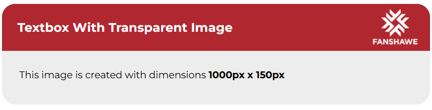
Transparent Image Textbox
Textbox With Transparent Image
This image is created with dimensions 1000px x 150px
For this styling, you are targeting the built-in press books classes. The example above was achieved like this (note the background property):
CSS
.textbox.textbox--examples .textbox__header, .bcc-box.textbox--examples .textbox__header {background: url('https://ecampusontario.pressbooks.pub/app/uploads/sites/3671/2025/01/Fanshawe-Banner-1.png'), #b3272d;background-size: cover;background-repeat: no-repeat;background-position: center;}Transparent Pattern Textbox
Textbox With Transparent Pattern
This image is created with dimensions 1000px x 150px
For this styling, you are targeting the built-in press books classes. The example above was achieved like this (note the background property):
CSS
.textbox.textbox--exercises .textbox__header, .bcc-box.textbox--exercises .textbox__header {
background: url('https://ecampusontario.pressbooks.pub/app/uploads/sites/3671/2025/01/Excerises.png'), $exer-color-primary;
background-size: cover;
background-repeat: no-repeat;
background-position: center;
}
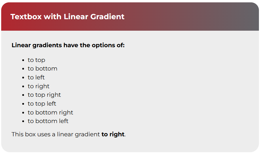
Linear Gradient Textbox
Textbox with Linear Gradient
Linear gradients have the options of:
- to top
- to bottom
- to left
- to right
- to top right
- to top left
- to bottom right
- to bottom left
This box uses a linear gradient to right.
For this styling, you are targeting the built-in press books classes. The example above was achieved like this (note the background property):
CSS
.textbox.textbox--key-takeaways .textbox__header, .bcc-box.textbox--key-takeaways .textbox__header {
background: linear-gradient(to right, $primary-color, $secondary-color);
background-size: cover;
background-repeat: no-repeat;
background-position: center;
}
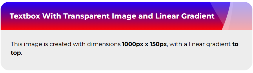
Image + Gradient Textbox
Textbox With Transparent Image and Linear Gradient
This image is created with dimensions 1000px x 150px, with a linear gradient to top.
For this styling, you are targeting the built-in press books classes. The example above was achieved like this (note the background property):
CSS
.textbox.textbox--learning-objectives .textbox__header, .bcc-box.textbox--learning-objectives .textbox__header {
background: url('https://ecampusontario.pressbooks.pub/app/uploads/sites/3671/2025/01/Excerises.png'), linear-gradient(to top, red, blue);
background-size: cover;
background-repeat: no-repeat;
background-position: center;
}
Horizontal Scroll Container
HTML
<div class="scroll-container">

<div>

/*Content to scroll goes here*/

</div>

</div>
CSS
.scroll-container {overflow-x: auto;white-space: nowrap;width: 100%;padding: 10px;}.scroll-container::-webkit-scrollbar {height: 8px;background-color: rgba(0,0,0,0.5);border-radius: 1em;}.scroll-container::-webkit-scrollbar-thumb {background:white;border-radius: 1em;}////////End of scroll box
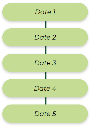
Vertical Timeline
Date 1
Date 2
Date 3
Date 4
Date 5
USEFUL FOR CAPTIONS
HTML
<div class="timeline-content"><div class="timeline-lineoffun"><div class="timeline-box"><h4 style="text-align: left;">Date 1</h4></div><div class="timeline-box" style="text-align: left;"><h4>Date 2</h4></div><div class="timeline-box"><h4 style="text-align: left;">Date 3</h4></div><div class="timeline-box" style="text-align: left;"><h4>Date 4</h4></div><div class="timeline-box" style="text-align: left;"><h4>Date 5</h4></div></div></div><p style="margin-top: 0; padding-right: 20px; padding-bottom: 20px;">USEFUL FOR CAPTIONS</p></div>
CSS
/* TIMELINE START */
.timeline-container {
width: 40%;
height: max-content;
isolation: isolate;
}
.timeline-content {
display: flex;
flex-direction: column;
align-items: left;
justify-content: space-between;
margin-right: 20px; // adjusts space between the timeline and content on right side. (Comment one of them if necessary).
// margin-left: 20px; // adjusts space between the timeline and content on right side.
}
.timeline-box {
color: white;
background-color: #C6DC93; // Timeline box background color
line-height: 40px;
text-align: center;
border-radius: 2em;
display: flex;
justify-content: center;
margin-bottom: 25px;
padding: 2px 5px;
box-shadow: 0 4px 8px rgba(0, 0, 0, 0.2);
}
.timeline-box h4 {
color: #000; // timeline box text colour.
margin: 0;
padding: 15px;
}
.timeline-lineoffun {
position: relative;
}
.timeline-lineoffun:before
{
content: "";
background-color: #1a512e; // you can change line colour here.
position:absolute;
width: 5px;
left: 50%;
top:0;
bottom:50px;
z-index: -1;
}
// END OF TIMELINE
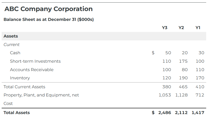
Financial Statement Table
For making balance sheets and other financial statements with this look:
| ABC Company Corporation | ||||
|---|---|---|---|---|
| Balance Sheet as at December 31 ($000s) | ||||
| Y3 | Y2 | Y1 | ||
| Assets | ||||
| Current | ||||
| Cash | $ | 50 | 20 | 30 |
| Short-term Investments | 110 | 175 | 100 | |
| Accounts Receivable | 100 | 80 | 110 | |
| Inventory | 120 | 190 | 170 | |
| Total Current Assets | 380 | 465 | 410 | |
| Property, Plant, and Equipment, net | 1,053 | 1,128 | 712 | |
| Cost | ||||
| Total Assets | $ | 2,486 | 2,112 | 1,417 |
| Liabilities | ||||
| Current | ||||
| Borrowings | $ | 825 | 570 | 100 |
| Accounts Payable | 382 | 295 | 219 | |
| Income Taxes Payable | 48 | 52 | 50 | |
| Total Current Liabilities | 1,255 | 917 | 369 | |
| Equity | ||||
| Share Capital | 1,063 | 1,063 | 963 | |
| Retained Earnings | 168 | 132 | 85 | |
| Total Equity | 1,231 | 1,195 | 1,048 | |
| Total Liabilities & Equity | $ | 2,486 | 2,112 | 1,417 |
Copy/paste this CSS to Custom Styles (don’t forget PDF):
CSS
/*Financial Statement Table*/
table.financial-statement {
width: 100%;
border-collapse: collapse;
table-layout: auto;
colgroup {

col:first-child {

width: auto; // first column stretches

}
col:not(:first-child) {

width: 1%; // other columns shrink to fit

}

}
th:first-child, td:first-child {

text-align: left;

width: auto; /* stretches */

}
th:not(:first-child), td:not(:first-child) {

white-space: nowrap; /* fit content */

width: 1%; /* minimal width so it fits content */

text-align: center;

}
tr.section-heading {

font-weight: bold;

background-color: #f0f0f0;

text-align: left;
td { text-align: left; }

}
th.company-name {

font-size: 1.5em;

}
td.currency, th.currency {

text-align: right;

font-variant-numeric: tabular-nums; // makes numbers align vertically

}
td.line-item {

padding-left: 2em;

}
tr.subtotal {

border-top: 2px solid #ccc;

}
tr.total {

font-weight: bold;

border-top: 3px double #000;

//background-color: #e0e0e0;

}
}
Here’s an example implementation in HTML (this is the code for the balance sheet above):
HTML
<table class="financial-statement"><colgroup> <col /> <col /> <col /> <col /> <col /> </colgroup>

<thead>

<tr>

<th class="company-name" colspan="5">ABC Company Corporation</th>

</tr>

<tr>

<th colspan="5">Balance Sheet as at December 31 ($000s)</th>

</tr>

<tr>

<td></td>

<td></td>

<th>Y3</th>

<th>Y2</th>

<th>Y1</th>

</tr>

</thead>

<tbody>

<tr class="section-heading">

<td colspan="5">Assets</td>

</tr>

<tr>

<td colspan="5"><i>Current</i></td>

</tr>

<tr>

<td class="line-item">Cash</td>

<td>$</td>

<td class="currency">50</td>

<td class="currency">20</td>

<td class="currency">30</td>

</tr>

<tr>

<td class="line-item">Short-term Investments</td>

<td></td>

<td class="currency">110</td>

<td class="currency">175</td>

<td class="currency">100</td>

</tr>

<tr>

<td class="line-item">Accounts Receivable</td>

<td></td>

<td class="currency">100</td>

<td class="currency">80</td>

<td class="currency">110</td>

</tr>

<tr>

<td class="line-item">Inventory</td>

<td></td>

<td class="currency">120</td>

<td class="currency">190</td>

<td class="currency">170</td>

</tr>

<tr class="subtotal">

<td>Total Current Assets</td>

<td></td>

<td class="currency">380</td>

<td class="currency">465</td>

<td class="currency">410</td>

</tr>

<tr>

<td>Property, Plant, and Equipment, net</td>

<td></td>

<td class="currency">1,053</td>

<td class="currency">1,128</td>

<td class="currency">712</td>

</tr>

<tr>

<td>Cost</td>

<td></td>

<td></td>

<td></td>

<td></td>

</tr>

<tr class="total">

<td>Total Assets</td>

<td>$</td>

<td class="currency">2,486</td>

<td class="currency">2,112</td>

<td class="currency">1,417</td>

</tr>

<tr>

<td colspan="5"></td>

</tr>

<tr>

<td colspan="5"></td>

</tr>

<tr class="section-heading">

<td colspan="5">Liabilities</td>

</tr>

<tr>

<td colspan="5"><i>Current</i></td>

</tr>

<tr>

<td class="line-item">Borrowings</td>

<td>$</td>

<td class="currency">825</td>

<td class="currency">570</td>

<td class="currency">100</td>

</tr>

<tr>

<td class="line-item">Accounts Payable</td>

<td></td>

<td class="currency">382</td>

<td class="currency">295</td>

<td class="currency">219</td>

</tr>

<tr>

<td class="line-item">Income Taxes Payable</td>

<td></td>

<td class="currency">48</td>

<td class="currency">52</td>

<td class="currency">50</td>

</tr>

<tr class="subtotal">

<td>Total Current Liabilities</td>

<td></td>

<td class="currency">1,255</td>

<td class="currency">917</td>

<td class="currency">369</td>

</tr>

<tr>

<td colspan="5"></td>

</tr>

<tr class="section-heading">

<td colspan="5">Equity</td>

</tr>

<tr>

<td>Share Capital</td>

<td></td>

<td class="currency">1,063</td>

<td class="currency">1,063</td>

<td class="currency">963</td>

</tr>

<tr>

<td>Retained Earnings</td>

<td></td>

<td class="currency">168</td>

<td class="currency">132</td>

<td class="currency">85</td>

</tr>

<tr class="subtotal">

<td>Total Equity</td>

<td></td>

<td class="currency">1,231</td>

<td class="currency">1,195</td>

<td class="currency">1,048</td>

</tr>

<tr class="total">

<td>Total Liabilities & Equity</td>

<td>$</td>

<td class="currency">2,486</td>

<td class="currency">2,112</td>

<td class="currency">1,417</td>

</tr>

</tbody>

</table>
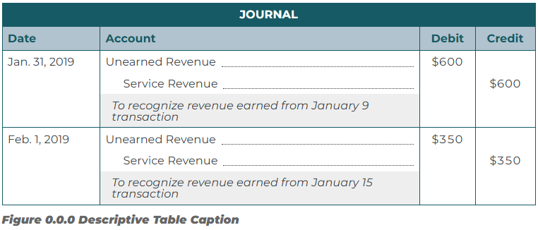
Journal Entry Table (Financial)
For making journal entry tables sheets and other alternative financial statements with this look:
| JOURNAL | ||||
|---|---|---|---|---|
| Date | Account | Debit | Credit | |
| Jan. 31, 2019 | Unearned Revenue | $600 | ||
| Service Revenue | $600 | |||
| To recognize revenue earned from January 9 transaction | ||||
| Feb. 1, 2019 | Unearned Revenue | $350 | ||
| Service Revenue | $350 | |||
| To recognize revenue earned from January 15 transaction | ||||
Copy/paste this CSS to Custom Styles (don’t forget PDF):
CSS
/* Journal Entry Table */
table.journal-entry {
–dark-grn: #124b54;
–light-grn: #b1c3ce;
width: 100%;
border-collapse: collapse;
table-layout: auto;
border: 1px solid var(–dark-grn);
th {
border: 1px solid var(–dark-grn);
}
tr, td {
border-right: 1px solid var(–dark-grn);
line-height: 1em;
}
thead {
background-color: var(–dark-grn);
color: white;
}
colgroup {
col:first-child {
width: auto; // first column stretches
}
}
th:first-child, td:first-child {
text-align: left;
// width:15%;
}
th:not(:first-child), td:not(:first-child) {
white-space: nowrap; /* fit content */
// width: 1%; /* minimal width so it fits content */
text-align: left;
}
td:nth-child(2) {
white-space: normal;
width: 60%;
}
th:nth-child(n+3) { // applies to the third column and beyond
text-align: center;
}
tr.section-heading {
font-weight: bold;
background-color: #f0f0f0;
text-align: left;
td { text-align: left; }
}
th.company-name {
font-size: 1.5em;
}
tr.journal-headers {
background-color: var(–light-grn);
color: var(–dark-grn);
}
th.journal-title {
text-align: center;
}
td.currency, th.currency {
text-align: center;
font-variant-numeric: tabular-nums; // makes numbers align vertically
span {
padding-right: 1em;
}
}
td.line-item, td.sub-item {
display: flex;
// align-items: baseline;
width: 100%;
}
td.line-item:after, td.sub-item:after { // adds a trail of dotted lines after the line item text eg. Text ….
content: “”;
flex-grow: 1;
border-bottom: 1.5px dotted;
margin-left: 8px;
}
td.sub-item {
padding-left: 2em;
}
td.description {
padding-left: 1em;
font-style: italic;
}
tr.subtotal {
border-top: 2px solid #ccc;
}
tr.total {
font-weight: bold;
border-top: 3px double #000;
}
tbody tr.entry {
border-top: 1px solid var(–dark-grn);;
}
}
Here’s an example implementation in HTML (this is the code for the balance sheet above):
HTML
<!– Begin Journal Entry Table –>
<table class=”journal-entry”><colgroup> <col /> <col /> <col /> <col /> </colgroup>
<thead>
<tr>
<th class=”journal-title” colspan=”5″>JOURNAL</th>
</tr>
<tr class=”journal-headers”>
<th>Date</th>
<th>Account</th>
<th>Debit</th>
<th>Credit</th>
</tr>
</thead>
<tbody>
<!– Beginning of Entry –>
<!– Account –>
<tr class=”entry”>
<td>Jan. 31, 2019</td>
<td class=”line-item”>Unearned Revenue</td>
<td class=”currency”>$600</td>
<td class=”currency”></td>
</tr>
<!– Account –>
<tr>
<td></td>
<td class=”sub-item”>Service Revenue</td>
<td class=”currency”></td>
<td class=”currency”>$600</td>
</tr>
<!– Description –>
<tr>
<td></td>
<td class=”description”>To recognize revenue earned from January 9 transaction</td>
<td class=”currency”></td>
<td class=”currency”></td>
</tr>
<!– End of Entry –>
<!– Beginning of Entry –>
<!– Account –>
<tr class=”entry”>
<td>Feb. 1, 2019</td>
<td class=”line-item”>Unearned Revenue</td>
<td class=”currency”>$350</td>
<td class=”currency”></td>
</tr>
<!– Account –>
<tr>
<td></td>
<td class=”sub-item”>Service Revenue</td>
<td class=”currency”></td>
<td class=”currency”>$350</td>
</tr>
<!– Description –>
<tr>
<td></td>
<td class=”description”>To recognize revenue earned from January 15 transaction</td>
<td class=”currency”></td>
<td class=”currency”></td>
</tr>
<!– End of Entry –>
</tbody>
<caption><em><strong>Figure 0.0.0 Descriptive Table Caption</strong></em></caption>
</table>
<!– End Journal Entry Table –>
