Social Network Simulation
INTRODUCTION
Network visualizations are increasingly important in the digital humanities, as they exhibit relationships between people, groups, ideas, places, and things. For instance, social network analysis is an active area of research, and applications abound in humanities scholarship. Networks are a type of graph. A graph is mathematical model consisting of nodes, which represent entities (or people, groups, places, ideas, and other objects objects), and edges, or links, which represent the relationships between and among these nodes. This section discusses networks, and specifically visualizing networks using Python. Throughout this section, the focus is on social networks, representing them mathematically with an adjacency matrix, visualizing the adjacency matrix, and visualizing the network.
READING, GENERATING, AND PROCESSING THE DATA FOR THE NETWORK VISUALIZATION
To illustrate the concepts of a social network visualization, a simple example will be demonstrated. For simplicity, it is assumed that the names of individuals in the network are stored in CSV format. The weights, or social connections between these individuals, will be assigned randomly, providing additional experience in working with random numbers, which is essential in simulation. After importing Numpy for numerical calculations and Pandas for data frames and data manipulation, the names are read from the CSV file. Ensure that the correct file path is specified so that the CSV file can be located.
import numpy as np
import pandas as pd
## File path/directory. Add the correct path to the input CSV file...
path = 'File Path'
## File name....
fn0 = 'firstNames.csv'
## Full file path....
fpath = path + fn0
## Read the CSV file into a dataframe.
names_df = pd.read_csv(fpath)
## Get the number of names in total....
NNAMES_TOTAL = len(names_df)
The names are shuffled to increase randomness.
## Get a random permutation of the names. The permutation ranges from 0 to NNAMES_TOTAL - 1.
randomIndex = np.random.permutation(NNAMES_TOTAL)
For illustrative purposes, only a subset of the names will be used in the network – 12 individuals in this case. The names are then extracted from the data frame.
## Number of people/names in the social network....
NNames = 12
## Get the first NNames names from the random permutation....
NAMES = names_df.iloc[0:NNames]
Now, weights will be assigned randomly. A minimum weight and maximum weight are first specified.
## Minimum and maximum weights....
minWT = 0.5
maxWT = 3.0
ADJANCENCY MATRIX
An adjacency matrix is then generated. An adjacency matrix is a 2D grid of values, or matrix, that is used to denote a relationship between a row element and its corresponding column element, as will be seen below. Each element in the adjacency matrix has a row position and column position that denotes the strength of the relationship (randomly generated in this example) between the person indicated in the row and the person indicated in the column of the element. For clarity, these weights for the adjacency matrix are assigned in a nested loop. An additional variable, RELATIONS, is instantiated as a list to store the names of the individuals in each relationship and the randomly generated weight. In this simulation, an individual has a 60% chance of being related to another one, as indicated by the condition if (np.random.rand(1)[0] < 0.6).
###################################################
##
## Construct adjacency matrix.
##
###################################################
ADJ_MATRIX = np.zeros((NNames, NNames))
RELATIONS = []
for i in range(0, NNames):
for j in range(0, i):
if (np.random.rand(1)[0] < 0.6):
w = np.random.uniform(low = minWT, high = maxWT)
ADJ_MATRIX[i][j] = w
ADJ_MATRIX[j][i] = w
RELATIONS.append((NAMES['FIRST_NAME'].iloc[i],
NAMES['FIRST_NAME'].iloc[j],
w))
RELATIONS.append((NAMES['FIRST_NAME'].iloc[j],
NAMES['FIRST_NAME'].iloc[i],
w))
After the weights have been generated, the results can be stored in a new data frame, and written to a CSV file for future use.
df_out = pd.DataFrame(RELATIONS, columns = ['SOURCE', 'DESTINATION', 'WEIGHT'])
fn1 = '(Output File Name).csv'
fnout = path + fn1
df_out.to_csv(fnout, index = False)
For example, if the output file is to be named “socialNetworks_Example0.csv” saved in the same directory as the input data, the following code can be run.
fn1 = 'socialNetworks_Example0.csv'
fnout = path + fn1
df_out.to_csv(fnout, index = False)
ANALYZING AND VISUALIZING THE SOCIAL CONNECTIONS WITH HEATMAPS
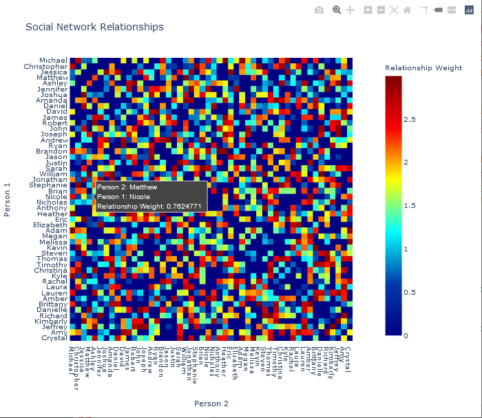
To study the social relationships that were calculated above, a heat map (or heatmap) will be generated and displayed. Heatmaps are particularly useful for displaying 2D matrix data and provides an easily interpreted view of the matrix – in this case, relationships between two people. The numeric values of each element of the matrix, or cell, is indicated by the colour of the element. For the purposes of this particular social network, assuming that an individual is not directly self-related, the values in the diagonal elements (from upper-left to lower-right) will be zero and coloured correspondingly. For instance, Michael is not self-related to Michael, and therefore the weight of the connection between Michael and Michael is zero.
Plotting the adjacency matrix in Python will performed in two ways, using the two graphing libraries Matplotlib and Plotly. Note that practice and experience is required to become familiar with these libraries, their functions, the parameters of the functions, and how to use them. The syntax of the functions may also seem complicated when it is first encountered. As the libraries are quite large and supply many functions, and because these functions sometimes take a large number of arguments, programmers may frequently need to refer to the online documentation for these libraries. However, the examples presented here provide a foundation on which other, related, and more complex visualizations can be constructed.
To display the matrix in Matplotlib, import the library.
import matplotlib.pyplot as plt
Get the objects for adjusting the plot itself (fig) and for the specific axes where the adjacency matrix that was calculated above (ADJ_MATRIX) will be displayed (ax).
## Get the figure and axis objects.
fig, ax = plt.subplots()
Next, create an image of the adjacency matrix so that it can be displayed. Note that the matrix is displayed on the axes, and therefore the image is generated through the function call imshow on the ax object.
## Create an image of the adjacency matrix to be displayed.
im = ax.imshow(ADJ_MATRIX)
Now, attributes of the plot will be added or modified. First, since the matrix is discrete (it consists of a number of individual elements), and each discrete element corresponds to a relationship between two people, the ticks on both axes will be set to range from 0 to the number of names, less 1, so that there is a tick mark for every name, starting the numbering at 0. The Numpy function arange returns a list – specifically a Numpy array – of values from 0 to one minus the value in its argument. For example:
>>> np.arange(0,5)
array([0, 1, 2, 3, 4])
To set the ticks for this visualization, the following code is used.
## Set the ticks from 0 to NNames - 1 on both axes.
ax.set_xticks(np.arange(NNames))
ax.set_yticks(np.arange(NNames))
For the plot to be easily readable, the names of the people in the relationship will be displayed on the resulting colour heatmap. Recall that the variable NAMES is a data frame that contains the names of the individuals in this social network. Within the NAMES data frame, the individual names are stored in a column with the column header (variable name) FIRST_NAME. Consequently, the ticks on both axes are labeled with the names of people in this social network.
## Label the ticks with the names on both axes.
ax.set_xticklabels(NAMES['FIRST_NAME'])
ax.set_yticklabels(NAMES['FIRST_NAME'])
To improve the readability of the names on the x-axis (horizontal axis), the names may be displayed vertically. This can be done with the following code.
## To improve readability, rotate the tick labels on the x-axis.
plt.setp(ax.get_xticklabels(), rotation = 90, ha = 'right',
rotation_mode = 'anchor')
All figures and plots should contain an appropriate title. One such title is added to the plot.
## Set the title of the plot.
ax.set_title('Social Network Relationships')
As the adjacency matrix is square, displaying the heatmap as a square is the most natural representation. Ensure that there is no overlapping between the axes objects and labels on the axes is performed through a function call to tight_layout on the fig object.
## Ensure that the dimension lengths are correct (a square plot, in this case).
fig.tight_layout()
Although Matplotlib provides interactivity by displaying the adjacency matrix values for each element when the user hovers over the element, a colour bar, indicating the full range of values, aids in interpretation.
## Add the colour bar.
plt.colorbar(im)
Finally, the plot will be shown in a non-blocking way, so that the user can continue to use the Python console while the plot is displayed.
## Display the non-blocking plot.
plt.show(block = False)
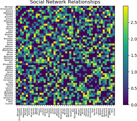
Examples of the plot of the adjacency matrix showing the relationships between 5 people is shown below. In each plot, weight information for the elements over which the user is hovering are shown.
![Two heat maps are shown as a Matplotlib figures. Each heat map has the title “Social Network Relationships” displayed at the top of the plot. The x-axis is labeled with the names: “Michael”, “Christopher”, “Jessica”, “Matthew, and “Ashley”. The y-axis is labeled with the same names. The colour scale ranges from 0.00 (blue) to over 1.75 (yellow), passing through cyan and green. Colour bars for each heat map are shown at the right of the heat map. Each individual cell is coloured. The heat map is symmetric. In the first heat map, the user is hovering over a cell, and the value is shown as “x = y = [1.76257]”. In the second heatmap, the user is hovering over a cell, and the value is shown as “x = y = [0]”. The Matplotlib figure interface is shown in the bottom left part of the window.](https://ecampusontario.pressbooks.pub/app/uploads/sites/2438/2022/02/DIGI-3xxx-2_8_p5_C1-300x255.png)
![Two heat maps are shown as a Matplotlib figures. Each heat map has the title “Social Network Relationships” displayed at the top of the plot. The x-axis is labeled with the names: “Michael”, “Christopher”, “Jessica”, “Matthew, and “Ashley”. The y-axis is labeled with the same names. The colour scale ranges from 0.00 (blue) to over 1.75 (yellow), passing through cyan and green. Colour bars for each heat map are shown at the right of the heat map. Each individual cell is coloured. The heat map is symmetric. In the first heat map, the user is hovering over a cell, and the value is shown as “x = y = [1.76257]”. In the second heatmap, the user is hovering over a cell, and the value is shown as “x = y = [0]”. The Matplotlib figure interface is shown in the bottom left part of the window.](https://ecampusontario.pressbooks.pub/app/uploads/sites/2438/2022/02/DIGI-3xxx-2_8_p5_C2-300x255.png)
Note that the upper-left to bottom-right diagonal contains zero values, due to the absence of self-relationships. Also notice that the matrix and corresponding heatmap are symmetric, as if person A is related to person B with a specific weight of the relationship, say w, then the weight of the relationship person B is related to person A with the same weight, w. The absence of relationships can also be seen from the heatmap. In this example, it can be seen that Michael does not have a relationship to and Christopher and Matthew, and Jessica has no relationship with Ashley.
EXERCISE: As explained above, the variable name NNames indicates the number of people (names) that are included in the social network. As currently written, the code uses the first NNames in the names_df data frame. Modify the code so that NNames are randomly chosen from the list.
Hint: Use the np.random.permutation function to generate a list of NNAMES_TOTAL random integers ranging from 0 to NNAMES_TOTAL – 1. Then, use the first NNames indices from this permutation to select the persons who will participate in the social network.
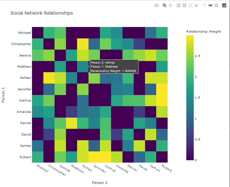
The adjacency matrix for a larger network will now be calculated. First, re-run the code to generate the random relationships, but set NNames be larger; for example, 50:
## Number of people/names in the social network....
NNames = 50
The resulting plot of the adjacency matrix is shown below.
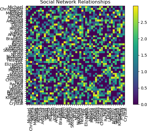
The plot is interesting and provides a view of the relationship structure among 50 persons. However, using the default Matplotlib settings, the names are difficult to read. Reducing the font size for the tick labels on both axes improves readability. This operation is performed by running the tick_params function on the axis object.
>>> ## Adjust the font size. A size of 5.5 was empirically found to be
acceptable.
>>> ax.tick_params(axis = 'both', which = 'major', labelsize = 5.5)
>>> plt.show(block = False)
The resulting plot is shown below.
Additional options are available in Matplotlib to customize the plot. The reader is referred to the Matplotlib online documentation and examples.
For Plotly, either Plotly Express or graphics objects can be used. This example employs Plotly Express.
First, the Plotly Express library must be imported.
import plotly.express as px
The function to generate a heat map is shown below. Note the labels option, which sets alternate label names for the text as the user hovers over an element. Additionally, the colour map was set to the Viridis map. The title of the plot is also specified in this function call, which returns a figure object, fig.
fig = px.imshow(ADJ_MATRIX,
x = NAMES['FIRST_NAME'],
y = NAMES['FIRST_NAME'],
title = 'Social Network Relationships',
labels = dict(x = 'Person 2',
y = 'Person 1',
color = 'Relationship Weight'
),
color_continuous_scale = px.colors.sequential.Viridis
)
The fig object is then updated for formatting. Note that these formatting operations can be performed in any order. The plot title is added.
fig.update_layout(legend_title_text = "Relationship Weight")
The x-axis and y-axis are then labeled.
fig.update_xaxes(title = 'Person 2')
fig.update_yaxes(title = 'Person 1')
To ensure that all names are displayed, a tick is enforced on both axes by explicitly specifying the spacing between elements, which is the same as specifying the spacing between ticks (dtick). The spacing is therefore set to 1.
fig.update_layout(xaxis = dict(dtick = 1))
fig.update_layout(yaxis = dict(dtick = 1))
Finally, the plot is displayed, or shown.
fig.show()
The x-axis tick labels for the names can be displayed as read top-to-bottom vertically, or bottom-to-top vertically. The orientation of the labels, as well as many other options, can be set using Plotly functions. The reader is encouraged to experiment with these options, and to create intuitive and insightful plots appropriate for the application and for the questions being investigated.
Plots from two colour maps, Viridis and Jet, respectively, are shown below.
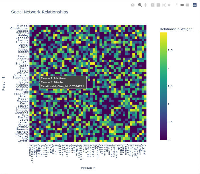
Note that the input data to the plotting function, the adjacency matrix, can be represented either as a standard array (list of lists), or as a Numpy array. The latter representation was used in the preceding examples.
Graph Visualization
In this example, 12 people were used in the simulation. That is, the following assignment was made:
## Number of people/names in the social network....
NNames = 12
The adjacency matrix was plotted with Plotly, and shown below.
NETWORK VISUALIZATION OF THE SOCIAL NETWORK
There are a number of different Python libraries for network visualization. One of the most popular is NetworkX, a Python library for generating, manipulating, and analyzing structures and dynamics complex networks of any size. NetworkX features basic functionality for visualizing graphs, but it can also be used in conjunction with visualization packages such as Matplotlib. With external packages, users may also design interactive graphical user interfaces and dashboards from the graphs generated by NetworkX, although this functionality is not directly available in NetworkX.
PyVis is Python package that supports interactive network visualization. PyVis uses graphs generated with NetworkX graph as input, but simple graphs can also be generated directly with the functionality provided by the library. PyVis allows users to customize the layout of the network, as well as the style of the nodes and edges. Options can be set by the user and exported as a Python dictionary, which can subsequently be passed as a configuration argument to PyVis functions, allowing the graph to be redrawn. Basic zooming and selection options are also available.
One of the main features of PyVis is its layout functionality. The layout of a graph indicates how the nodes and edges are related to and interact with each other. Graph layouts are generally constructed through physics models that define these relationships and interactions. For example, the attraction or repulsion amongst the nodes represents various aspects of the network that convey information to the analyst. PyVis allows the user to specify the physics layout of the graph, and to allow more (or less) fluid interactions. The default physics model is the Barnes-Hut model, which is an approximation algorithm for n-body simulation. In physics, an n-body simulation is a simulation of the interaction of a number (n) of particles that are acted upon by physical forces, such as gravity. The Barnes-Hut algorithm implemented in PyVis is based on concepts of an inverted gravity model, wherein increasing the mass of a node correspondingly increases the repulsion of that node. Parameters of the model that can be set by the user include gravity (the repulsion strength increases with greater negative values); central gravity, which is the attractive gravitational force that pulls the network to the centre of the layout; spring length, denoting the length of the edges at rest (i.e., when not perturbed by the user); spring strength, indicating the strength of the edges, simulated by springs; damping, indicating how much velocity from the previous iteration of the physics simulation affects the current iteration; and overlap, for using the size of the node in calculations concerning the gravity model (see Here for details and for valid parameter settings). A specific computational algorithm, forceAtlas2Based, uses the PyVis Barnes-Hut implementation, but the central gravity model is independent of distances, and repulsion is linear, in contrast to a quadratic model used in the Barnes-Hut algorithm.
The following is a basic demonstration of using PyVis to generate and to visualize the example social network described above.
For clarity, most of the default options will be taken.
First, the required libraries are imported into Python.
## Pyvis network visualization library....
from pyvis.network import Network
## Data manipulation and data frames....
import pandas as pd
## Numerical processing....
import numpy as np
## For colour maps....
import matplotlib.cm as cm
The network can then be generated with some basic settings.
## Generate a network and specify its size, background colour, and font colour.
social_net = Network(height='750px', width='100%', bgcolor='#222222', font_color='white')
Recall that the Network() function is provided by PyVis, as it was imported from the PyVis package. Next, the physics layout of the network is set using the forceAtlas2 solver for the physics calculations, described above. The default parameters are taken, except for the spring length, which is set to 220.
# Next, the physics layout of the network is set.
social_net.force_atlas_2based(spring_length = 220)
The data are read from the CSV file that was saved in the previous step.
## File name....
fn1 = 'socialNetworks_Example0.csv'
## Full file path....
fpath = path + fn1
## Read the data from the CSV file.
social_data = pd.read_csv(fpath)
For each relationship, extract the source node, target (destination) node, and strength of the relationship (the weight of the edge) from the data frame.
## Extract the source node, target node, and strength of the relationship from the data frame.
sources = social_data['SOURCE']
targets = social_data['DESTINATION']
weights = social_data['WEIGHT']
Next, some additional parameters are defined. The maximum weight is determined so that the edges can be correctly coloured according to the weight. A colour map must also be defined. In this example, a grey colour map is used. The transparency of the nodes is set to 0.7. The sources, targets, and weights are combined into a single variable to facilitate access by PyVis functions.
## Obtain the maximum weight in 'weights' for colouring purposes....
maxwt = max(weights)
## Get a colour map....
cmap = cm.gray
## Alpha channel (translucency)....
alpha = 0.7
## Combine the sources, targets, and weights.
edge_data = zip(sources, targets, weights)
The data are now prepared, and the network graph is initialized. The source nodes, destination nodes, and edges are then added to the network graph iteratively by obtaining the values in the zipped variable. The process is iterated for each instance in the zipped variable. The colours for each edge are calculated by the weight of the edge, and represented in an RGBA string to facilitate subsequent visualization.
## Add the source nodes, destination nodes, and edges to the network graph.
for e in edge_data:
src = e[0]
dst = e[1]
w = e[2]
social_net.add_node(src, src, title=src)
social_net.add_node(dst, dst, title=dst)
## Compute the edge colour based on its weight.
clr = cmap(w / maxwt, alpha = 0.5) ## Value in [0, 1].
## Represent the colour in an RGBA string for subsequent visualization.
clrStr = 'rgba(' + str(int(clr[0]*255)) + ', ' + str(int(clr[1]*255)) + ', ' + str(int(clr[2]*255)) + ', ' + str(alpha) + ')'
## Add the edge starting at the source and ending at the visualization to the network
## with its weight and colour.
social_net.add_edge(src, dst, value = w, color = clrStr)
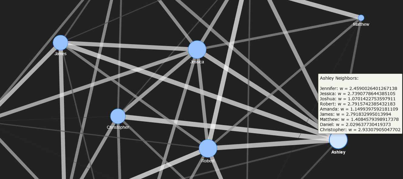
To enhance the readability and interactivity of the network graph, hover text is added to indicate the social connections (edges) for each individual (node) in the graph. To do this, an adjacency list, or map of all neighbours for each node, is determined from a PyVis function invoked on the PyVis network object.
## Get the adjacency list (map of neighbours) from the network.
neighbour_map = social_net.get_adj_list()
As the final step, after the adjacency list has been obtained, each node in the network is examined through iteration, updating the text that is displayed on hover.
#####################################################################
##
## Iterate through each node in the network, updating the text
## that is displayed on hover.
## 'title': The hover text title, which is 'Neighbours:'
## in this example.
## Text denoting each node's (individual's) social
## connections (names of individuals in a social
## relationship with the individual denoted by the node),
## and the strength of the relationship (weight) is
## added to the title for subsequent display on hover.
## 'value': The number of neighbours (the length of the
## neighbour map for a specific node.
##
#####################################################################
for node in social_net.nodes:
## Title of the hover text.
node['title'] += ' Neighbours:<br>'
## Get the adjacency list for the node being examined.
nbr_map = neighbour_map[node['id']]
## Convert the map into a list.
nbr_map = [x for x in nbr_map]
## Get the length of the list.
nnbr = len(nbr_map)
## For each neighbour, get the location in the data frame
## of the neighbour.
for i in range(0, nnbr):
## Find the data whose source is the node being examined
## and whose destination is the i-th neigbhour in
## the neighbour map.
v0 = social_data.loc[(social_data['SOURCE'] == node['id'])
& (social_data['DESTINATION'] == nbr_map[i])]
## If the neighbour has data, extract its value....
if (len(v0) > 0):
## Obtain the weight.
w = v0['WEIGHT'].values[0]
## If the weight in greater than zero (i.e. a social
## connection exists, add the weight information to the
## text.
if (w > 0):
node['title'] += '<br>' + nbr_map[i] + ': w = ' + str(w)
## Add the total number of connections for a node to that node.
node['value'] = len(neighbour_map[node['id']])
Finally, the plot can be displayed by invoking the PyVis show() function on the network graph object. An HTML file must be specified so that it can be shown in the user’s browser. The HTML file runs a script that displays the network graph object with a Javascript function in the browser. The name of the HTML file is selected by the user, and the HTML code can be examined or displayed. The HTML contains an external reference to a CSS style sheet and the Javascript function, but the browser normally caches these files so that PyVis can be run off-line. An example of this code follows. It is assumed that ‘path’ is set to the directory specified by the user.
## File name....
fn0 = 'pyvisExample_0.html'
fn_HTML = path + fn0
social_net.show(fn_HTML)
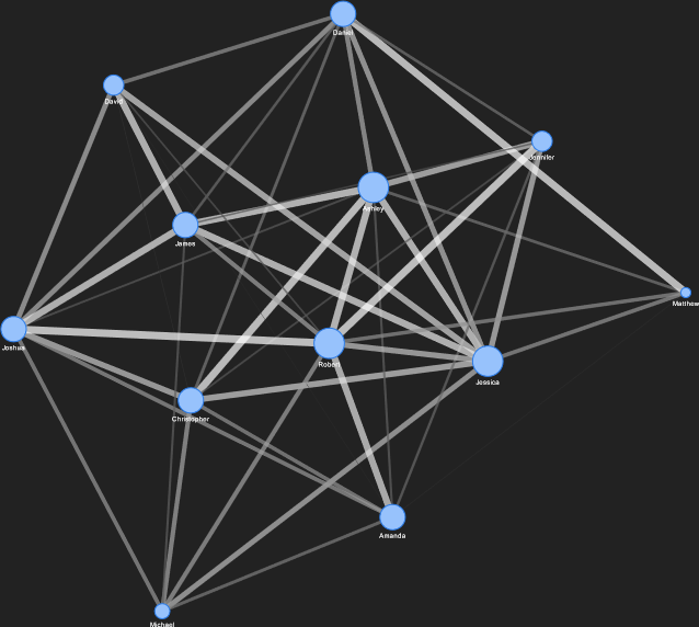
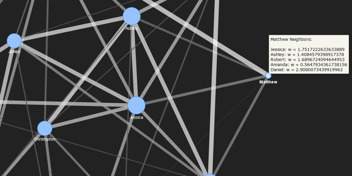
The corresponding network, generated and displayed with PyVis, is shown below.
The full network visualization showing all 12 nodes.
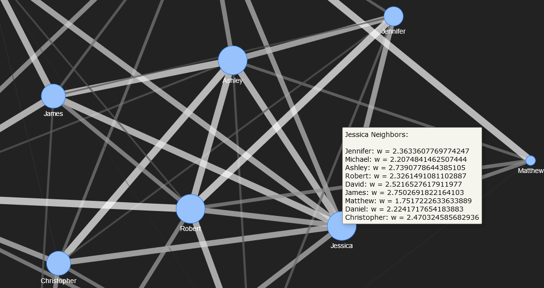
The neighbours for Jessica and Matthew are shown below. Their nodes are zoomed.
Nodes in the interior of the network can be moved to a side to facilitate interpreting the connections. For instance, the node for Ashley is pulled to the right side in the figure below.