Introduction to Principal Component Analysis
INTRODUCTION
In previous sections, k-means clustering was presented as a way to categorize numerical data, and text and documents from the statistics and metrics calculated from this text. An example of clustering ancient Greco-Roman authors based on characteristics of their literary output, such as known works, commentaries, modern editions, and number of manuscripts was presented. Clustering results were analyzed through silhouette scores and silhouette plots. These statistical methods provide metrics to assess clustering performance and are usually sufficient for determining whether a different number of clusters (k) or a different set of features should be applied. In addition, it is often beneficial to explore the clusters produced by k-means visually. As demonstrated in the previous section, for clustering on two features (i.e., 2D data), a scatterplot can be generated wherein the 2D data are directly plotted on the 2D axes (x-axis and y-axis) and coloured according to the clusters to which each data sample belongs. For clustering on three features (i.e., 3D data), a 3D scatter plot (sometimes called a bubble plot) can be used to directly plot the 3D data on the three coordinate axes (x-axis, y-axis, and z-axis) and colour-coded according to their respective clusters. However, as seen in the previous section, interpreting the clusters becomes more difficult in 3D, even with the interactive plot generated in Plotly that allows users to rotate, zoom, and interact with the plot. On a 2D computer monitor, screen, or other output device, it is beneficial to have the capability to “map”, or “transform” data in higher dimensions (3D or higher) to a 2D plot so that the data can be intuitively analyzed. In other words, it would be beneficial to visualize high dimensional clusters in the two dimensions corresponding to computer screens. For instance, the data on Greco-Roman authors in the last section was clustered on both three dimensions (the feature set of known works, commentaries, and modern editions), and four dimensions (the feature set of known works, commentaries, modern editions, and number of manuscripts). Although the 3D clustering could be represented in an interactive 3D scatter plot, interpretation could possibly be facilitated through a 2D representation. The 4D clustering results cannot be directly visualized, although in some visualizations for scientific data, time is sometimes utilized as the fourth dimension. However, for larger corpora with more metadata, the data have higher dimensions, such as 5D, 10D, etc., and even 3D scatter plot representations are inadequate in those cases. Therefore, the most straightforward approach to resolving this problem is to somehow “map” or “transform” the data so that it can be visualized in 2D, as indicated above.
Visualizing high dimensional data is an active research area in scientific visualization, where data acquired from experiments, sensors, or as the result of computational simulations must be analyzed. High dimensional data visualization is also an essential tool in machine learning. Machine learning algorithms frequently use high dimensional data as input and produced high dimensional results as output. Consequently, many high dimensional visualization techniques were developed within this context. One possible approach is to reduce the number of dimensions in high dimensional data so that the transformed results can be visualized in 2D, or perhaps in 3D. Dimensionality reduction, or simply dimension reduction, facilitates analysis of and gaining insights into voluminous data sets containing high dimensional and heterogenous data. These complex data are transformed into a simpler, lower dimensional form so that the main distinguishing features in the original, complex data are preserved. Calculating this simpler form of the data is often a pre-processing step so that other machine learning or statistical methods can be applied, whereas using the original data may result in models that are too complex or not sufficiently accurate or robust. Therefore, to visualize high dimensional data in 2D, one approach is to simply reduce the number of dimensions to 2, or to 3 if a 3D visualization is needed.
PRINCIPAL COMPONENT ANALYSIS
Dimensionality reduction is usually performed with a technique known as principal component analysis, or PCA. PCA is an unsupervised machine learning technique that is used extensively in exploratory data analysis and prediction. The data are transformed into lower dimensions based on characteristics of the data themselves. It is technically not a clustering or visualization technique. Specifically, PCA is used to project high dimensional data onto a lower dimensional subspace. A photograph provides a simple example of projection. A picture is taken of some three-dimensional object in the real word, which is subsequently viewed as a 2D photograph or on a 2D computer screen. The dimension has been reduced from three to two. The main characteristics of the original 3D object are retained in the photograph, and the viewer can determine those characteristics from the photograph.
When PCA is applied to high dimensional numerical data, the main characteristics of the data, known as components, are computed in an unsupervised manner. The user need not specify those characteristics. The algorithm allows any number of components (e.g., 2, 3, 4, 10, etc.) to be specified, as long as that number is lower than the dimensionality of the original sample data. For instance, it does not make sense to obtain 7 components from 3D data. The main components of the original data derived from PCA, that is, the principal components, can then be subjected to further analysis, or visualized if there are two or three principal components. This dimensionality reduction therefore simplifies the original high dimensional samples, facilitating analysis and visualization.
PCA therefore projects each data sample onto only the first few principal components, resulting in lower dimensional representation, while simultaneously preserving most of the variation in the original data, or as much of this variation as possible. The resulting components are orthogonal unit vectors or vectors of length one that are at 90-degree angles from each other. An example of orthogonal vectors is the set of 3D coordinate axes, the x-axis, y-axis, and z-axis in 3D space. PCA computes these orthogonal vectors so that the transformed data generally lie along them. The PCA algorithm is mathematically complex and relies on concepts from linear algebra. Specifically, the principal components are the eigenvectors of the co-variance matrix of the data. A full mathematical treatment is beyond the scope of the current discussion. In terms of clustering and visualization, it suffices to note that PCA transforms high dimensional data (such as the numbers of known works, commentaries, modern editions, and manuscripts described above) into a lower dimensional 2D (or 3D) representation that can be visualized with scatter plots and coloured, or otherwise distinguished, according to the cluster to which each of the points belongs, as determined through k-means clustering.
Like k-means clustering, PCA is an unsupervised approach within the domain of machine learning. Both techniques produce abstract results that may or may not be indicative of the actual characteristics of the data. For example, the clusters produced by the feature set consisting of known works, commentaries, modern editions, and manuscripts may not represent distinguishing features in which the user is interested, such as, for instance, the spatial variation or influences of the authors. Similarly, PCA produces abstract results in that the principal components may not directly correspond to a specific feature. For instance, the first principal component may not directly indicate that, say, the number of known works is the most important “principal” feature, or that a combination of the number modern editions and manuscripts is the second most important feature. The transformed points only allow the analyst to assess the clustering results. However, a scholar with knowledge of PCA and statistics can combine domain knowledge with the PCA results to gain insight into the clusters, and, furthermore, to indicate directions that should be explored with other statistical and computational tools. In this sense, PCA facilitates exploratory data analysis. The main utility of PCA in the present context is to reduce the high dimensional data to lower dimensions so that the resulting transformed points can be plotted and coloured (or otherwise distinguished) by cluster label.
The PCA algorithm has been widely used since its introduction in the early years of the twentieth century. It has been implemented in many software libraries in all the major programming languages. In Python, an implementation is available in the Scikit Learn package.
AN EXAMPLE OF VISUALIZING CLUSTERS OF GRECO-ROMAN AUTHORS
To illustrate the use of this function, examples will be demonstrated on 3D and 4D data from the ancient authors data frame that was used in the previous section. Assume that the data have been read in and the z-scores have been computed for the features, as described in the previous section. Clustering was performed with the k-means algorithm, with k = 5 clusters. The appropriate library functions must first be imported.
# Dimensionality reduction with PCA....
from sklearn.decomposition import PCA
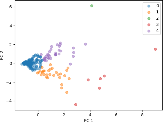
The first feature set has three characteristics: number of known works, number of commentaries, and number of modern editions. Recall that these values are in fact the z-scores for the features, and not the values read into the data frame. The resulting data frame containing the z-score for the three features is named AUTHORS1.
## Make a list of the three relevant features, and extract them from Zscore.
featureList1 = ['known_works', 'commentaries', 'modern_editions']
AUTHORS1 = Zscore[featureList1]
PCA must now be initialized. Standard parameters are used. In this example, two principal components (n_components) are needed, as the results will be displayed on a 2D scatterplot. Whitening is a process used in signal processing and data analysis to ensure that the outputs of a process are uncorrelated. Whitening will not be used in the current example.
## Use PCA to reduce the dimensionality.
## Intialize the PCA algorithm.
pca = PCA(n_components = 2, whiten = False, random_state = 1)
>>> type(pca)
<class 'sklearn.decomposition._pca.PCA'>
The pca variable is a Sklearn object containing methods (functions) for PCA. The fit_transform() method is invoked on (run from) this object. The transformed points are stored in the Numpy array variable authorsPCA1.
## Transform the data points.
authorsPCA1 = pca.fit_transform(AUTHORS1[featureList1])
The authorsPCA1 Numpy array consists of 238 rows representing the number of authors, and 2 columns for the two principal components, as can be verified with the shape attribute of the Numpy array.
>>> authorsPCA1.shape
(238, 2)
The transformed data can then be displayed. The first column contains the value of the first principal component for each author, and the second value contains the value of the second principal component. In this example, standard Matplotlib functions will be used to generate the scatter plot. Ensure that the Matplotlib plotting function has been included.
## For plotting....
import matplotlib.pyplot as plt
## Set up the scatter plot.
figPCA1, axPCA1 = plt.subplots()
## Iterate through the K clusters, colouring the points in that cluster
## with default colours - a different colour for every cluster.
for i in range(0, K):
indx = np.where(label1 == i)
axPCA1.scatter(authorsPCA1[indx, 0], authorsPCA1[indx, 1], label = i, alpha = 0.5)
## Label the x-axis and y-axis.
plt.xlabel('PC 1')
plt.ylabel('PC 2')
## Display the legend.
plt.legend()
## Display the plot.
plt.show(block = False)
The resulting figure is shown below.
For the second experiment, the feature set has four characteristics: number of known works, number of commentaries, number of modern editions, and number of manuscripts. The resulting data frame containing the z-score for the three features is named AUTHORS2.
## Add number of manuscripts to the feature list.
featureList2 = ['known_works', 'commentaries', 'modern_editions', 'manuscripts']
## Create a data frame from the feature list.
AUTHORS2 = Zscore[featureList2]
After k-means clustering on AUTHORS2 with k = 5 clusters, PCA is performed as it was for the first feature set.
## Use PCA to reduce the dimensionality.
## Intialize the PCA algorithm.
pca = PCA(n_components = 2, whiten = False, random_state = 1)
## Transform the data points.
authorsPCA2 = pca.fit_transform(AUTHORS2[featureList2])
The scatter plot is then displayed in the same manner as it was for authorsPCA1 (which used three features in the feature set). The resulting figure is shown below.
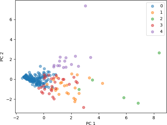
From these plots of the 3D and 4D points that were transformed into 2D points by PCA, it seen that the clusters represent distinct points in 2D space. Some clusters are very concentrated in a small part of the 2D space, while others are more spread out. Both feature sets produced clusters that are separated, with a higher degree of separation seen with the feature set with three characteristics. From this analysis, it can be concluded that the number of known works, commentaries, and modern editions characterize different clusters, and are useful in categorizing these Greco-Roman authors. The addition of the fourth characteristic, number of manuscripts, also resulted in clusters that are distinguishable, but less so than with the three features.
CONCLUSION
Principal component analysis is a widely used dimension reduction technique for data exploration that simplifies the analysis of high dimensional data by transforming the data into a lower dimensional representation. It can also be used to visualize clustering results of high dimensional data points. PCA functions are implemented in all major programming languages and are available in Python through the Scikit Learn library. Although the algorithm is complex and relies on advanced concepts from linear algebra, this functionality is implemented in functions called by the user. The user simply needs to know the procedure and arguments for calling this function. PCA is one technique to visualize high dimensional data. Another popular method used in machine learning, t-SNE, or t-distributed stochastic neighbour embedding, is discussed in the next section.
