Advanced Text Analysis In R
INTRODUCTION
Lexical dispersion quantifies how frequently a word appears across the parts of a corpus. It is a unitless statistic used in corpus linguistics that quantifies how “evenly” or “uniformly” a word or term occurs throughout the texts of a corpus. Dispersion values are usually normalized to be in the interval 0 to 1. For a specific word w, the minimum dispersion value of zero occurs if and only if w occurs in exactly one text in the corpus; that is, the word or term does not occur uniformly throughout the corpus, and is concentrated in only one text or document of the corpus. The maximum dispersion value of one occurs if and only if w occurs with the same frequency in all texts of the corpus; that is, w is spread uniformly throughout all texts of the corpus (Burch & Egbert, 2019). Several different dispersion measures can be used. The choice of which one to use is dependent on the analysis being performed, or the research question under investigation. In the following discussion, the following nomenclature is used (Gries, 2019):
w The word being analyzed, for which dispersion is computed
l The number of words or terms in the entire corpus (the length of the corpus)
n The number of parts or sub-corpora in the corpus
s A vector (list, array) of n percentages of the sized of the n corpus parts (1, 2, ..., n)
f The overall frequency of w in the entire corpus
v A vector (list, array) of n frequencies of w in each part of the corpus (1, 2, ..., n)
p A vector (list, array) of n percentages that w comprises of each corpus part (1, 2, ..., n)
In the following discussion, let mp denote the mean of the n p values. Following the development in(Gries, 2019), the biased standard deviation estimator is used (the R function sd calculates the unbiased estimate) (Gries, 2019):
[latex]sd_{\textrm{p}} = \sqrt{\frac{\sum\limits_{i = 1}^{n}(p_i-\mu_{\textbf{p}})^2}{n}}[/latex]
where
[latex]\mu_{\textbf{p}} = \frac{\sum\limits_{i = 1}^{n}p_i}{n} \label{mu_p}[/latex]
Several dispersion measures exist, and some of them are presented below (Gries, 2019). A widely used measure is Juilland’s D (D denotes dispersion), denoted simply as D. It is calculated with the standard deviation and mean of the p percentages (Gries, 2019).
[latex]D = 1 - \frac{sd_{\textbf{p}}}{\mu_{\textbf{p}}\sqrt{n-1}} \label{D}[/latex]
Carroll’s D2 measure, simply denoted as D2, is based on entropy, a concept from information theory (Gries, 2019)
[latex]D_2 = \frac{- \sum\limits_{i = 1}^{n}\left(\frac{p_i}{ \sum\limits_{i = 1}^{n}p_i } \times \lg \left( \frac{p_i}{\sum\limits_{i = 1}^{n}p_i} \right)\right)}{\lg{n}} \label{D_2}[/latex]
where lg(x) denotes the base-2 logarithm of x (e.g. lg(8) = 3, lg(1024) = 10). Note that if pi = 0, then lg(pi) is represented in R as -Inf. Then 0 x -Inf results in NaN (not a number). Therefore, using this term when computing entropy, 0 x lg(pi) is defined as zero for the case of pi = 0.
This situation can be seen in R code as follows. (Note: The full R source code for this example is provided in the distribution for this course.)
> log2(0)
[1] -Inf
> 0 * log2(0)
[1] NaN
A version Rosengren’s S metric that is robust with respect to varying sizes of corpus parts is defined as (Gries, 2019) (its minimum value is 1/n):
[latex]S_{adj} = \frac{\left(\sum\limits_{i = 1}^{n}\sqrt{s_i v_i}\right)^2}{f} \label{S_adj}[/latex]
Another measure, know as deviation of proportions, or DP, assumes values between 1 – min(s), indicating a very uniform, evenly-spread distribution, and 1 for a maximally non-uniform, “clumpy” distribution. It is defined as:
[latex]DP = 0.5 \sum\limits_{i = 1}^{n}\left| \frac{v_i}{f} - s_i \right| \label{DP}[/latex]
An example of computing these metrics, given in (Gries, 2019), is demonstrated with R code as follows. First, the required values, as defined above, are initialized.
## Length (in words) of the corpus
l <- 50
## Number of parts of the corpus
n <- 5
## Percentages of the n corpus part sizes
s <- c(0.18, 0.2, 0.2, 0.2, 0.22)
## Overall frequency of the word a in the corpus
f <- 15
## Frequency of w in each part of the corpus (1, 2, ..., n)
v <- c(1, 2, 3, 4, 5)
## Percentages a comprises of each corpus part (1, 2, ..., n)
p <- c(1/9, 2/10, 3/10, 4/10, 5/11)
Next, the dispersion metrics are computed.
sd_p <- sqrt(sum((p - mean(p))^2) / n)
## Juilland D metric....
D <- 1 - (sd_p/mean(p) * 1.0/sqrt(n - 1))
## The Carroll D2 metric uses an entropy calculation.
## This is a straightforward implementation, but would result in NaN
## values when pi values are zero, and 0 * log2(0) (-Inf) results in NaN.
## 0 * log2(0) (-Inf) results in NaN terms that are replaced with zeros.
term0 <- (p/sum(p) * log2(p/sum(p)))
## Obtain the indices at which NaN values occur.
nanIndx <- which(is.nan(term0))
## Replace those values with zeros.
term0[nanIndx] <- 0
## Continue the computation.
term1 <- -sum(term0)
D2 <- term1 / log2(n)
## Rosengren's S metric (adjusted)
Sadj <- sum(sqrt(s * v))^2 / f
## Deviation of proportions
DP <- 0.5 * sum(abs(v/f - s))
Using the example values in (Gries, 2019), the following results are obtained:
> D
[1] 0.7851505
> D2
[1] 0.9379213
> Sadj
[1] 0.9498163
> DP
[1] 0.18
A more complex example will now be presented using the mini-corpus of digital humanities and analysis topics presented in the previous section. In this example, the dispersion metric for the word “data” will be computed using the dispersion measures discussed above.
## Word to analyze
w <- 'data'
## For standardization, all words will be lower case.
word <- tolower(word)
## Assess the word on the basis of the first document in the corpus.
## Obtain the tokens from this document.
toks <- tokens(fulltext[1])
Here, toks is a list.
> toks <- tokens(fulltext[1])
> typeof(toks)
[1] "list"
To facilitate accessing the individual tokens for comparing with the target word (the word “data”), the character strings comprising the list are extracted. These strings are located in the first element of the list.
## 'toks' is a list, which must be made accessible as characters for analysis.
toks <- toks[[1]]
This operation results in character strings that can be more easily analyzed.
> typeof(toks)
[1] "character"
The process continues by determining the number of tokens in the document and comparing each of the N tokens in the document to the target word.
## Number of tokens.
N = length(toks)
## Overall frequency of the word a in the corpus
f = 0
## Examine each of the N tokens.
for (i in 1:N) {
## Get the i-th token.
tok <- toks[i]
## Convert the token to lower case.
tok <- tolower(tok)
## Compare the token to the word.
## NOTE: In a real text analysis application, lemmatization and
## stemming would be performed. The following simplified
## procedure is for demonstration purposes.
if (tok == w) {
## Increment the frequency.
f <- f + 1
} ## if
} ## for i
The frequency of the target word (w in the R code) was calculated as 6 in this example. This is the f variable defined above that is subsequently used in the computation of the dispersion metrics.
> f
[1] 6
The R code to calculate the values necessary to compute the dispersion metrics across all documents in the corpus is executed in a nested loop. The outer loop, indexed with idoc, is performed for each document. The inner loop (indexed with i) calculates the frequency of the target word in each document by comparing each token in the document to the target word.
## Put everything into a big loop.
w <- 'data'
w <- tolower(word)
l <- 0 ## Length of corpus, in words/tokens.
Ndocs <- length(fulltext) ## Number of documents in the corpus
s <- c() ## Percentages of the n corpus part sizes
f <- 0 ## Overall frequency of the word in the corpus
v <- c() ## Frequency of a in each part of the corpus (1, 2, ..., n)
p <- c() ## Percentages a comprises of each corpus part (1, 2, ..., n)
## Main loop....
for (idoc in 1:Ndocs) {
a <- fulltext[idoc]
## Obtain the tokens.
a <- tokens(a)
a <- a[[1]]
## Number of tokens....
N = length(a)
## Update the list of the number of tokens. Part size percentage will be computed later.
s[idoc] = N
f0 = 0 ## Frequency....
for (i in 1:N) {
tok <- a[i]
tok <- tolower(tok)
if (tok == word) {
f0 <- f0 + 1
} ## if
} ## for i
## Update the number of times the token occurs in the document.
v[idoc] <- f0
## Update the number of times the token occurs in the corpus.
f <- f + f0
}
## Calculate the values needed to compute the dispersion metrics.
l <- sum(s) ## Length of corpus, in words/tokens.
s <- s /l ## Percentages of the n corpus part sizes
p <- v / (s * l) ## Percentages a comprises of each corpus part (1, 2, ..., n)
## Compute the dispersion metrics.
## Biased standard deviation estimate, following Gries (2020).
sd_p <- sqrt(sum((p - mean(p))^2) / Ndocs)
## Juilland D metric....
D <- 1 - (sd_p/mean(p) * 1.0/sqrt(Ndocs - 1))
## The Carroll D2 metric uses an entropy calculation.
## This is a straightforward implementation, but would result in NaN
## values when pi values are zero, and 0 * log2(0) (-Inf) results in NaN.
## 0 * log2(0) (-Inf) results in NaN terms that are replaced with zeros.
term0 <- (p/sum(p) * log2(p/sum(p)))
## Obtain the indices at which NaN values occur.
nanIndx <- which(is.nan(term0))
## Replace those values with zeros.
term0[nanIndx] <- 0
## Continue the computation.
term1 <- -sum(term0)
D2 <- term1 / log2(Ndocs)
## Rosengren's S metric (adjusted)
Sadj <- sum(sqrt(s * v))^2 / f
## Deviation of proportions
DP <- 0.5 * sum(abs(v/f - s))
The dispersion metrics are as follows:
> w
[1] "data"
> l
[1] 6518
> Ndocs
[1] 12
> s
[1] 0.13301626 0.06873274 0.06627800 0.09343357 0.09481436 0.07011353
[7] 0.07318196 0.08269408 0.05968088 0.08422829 0.07348880 0.10033753
> f
[1] 119
> v
[1] 6 2 7 3 8 8 15 8 22 7 0 33
> p
[1] 0.006920415 0.004464286 0.016203704 0.004926108 0.012944984 0.017505470
[7] 0.031446541 0.014842301 0.056555270 0.012750455 0.000000000 0.050458716
> D
[1] 0.7273443
> D2
[1] 0.8454375
> Sadj
[1] 0.788881
> DP
[1] 0.3550349
Grouping and Summarizing Data in Data Frames
In the next section a large corpus of news texts will be analyzed through aggregation and visualization. Aggregation and summarization are important concepts in working with data frames in R. To illustrate these concepts, suppose that a data frame is to be constructed with 100 normally-distributed random numbers, labeled with integers ranging from 1 to 10. The labels will be stored in the variable x_test, and the random numbers in y_test. (Note: The full R source code for this example is provided in the distribution for this course.)
## Generate 100 random integers in the range [1, 10] as labels.
x_test <- sample(1:10, 100, replace = T)
## Generate 100 random numbers from a normal (Gaussian) distribution with
## zero mean and standard deviation of 10.0.
y_test <- rnorm(100, 0.0, 10.0)
The two variables x_test and y_test will now be put into a data frame.
## Create a data frame.
df_test <- data.frame(x_test, y_test)
The result is a data frame with two columns, whose names can be observed.
## Verify the column names.
colnames(df_test)
> colnames(df_test)
[1] "x_test" "y_test"
With this data frame, various aggregation functions can now be performed. In this example, these functions will be executed on each of the ten groups designated by the ten labels, or integers from 1 to 10. To do this, the group_by() function is utilized. The grouping variable is the argument to the function. For example, to obtain the count of the number of items in each label, the following operation is performed:
## Test the grouping operation.
> df_test %>% group_by(x_test) %>% count()
# A tibble: 10 x 2
# Groups: x_test [10]
x_test n
<int> <int>
1 1 7
2 2 12
3 3 6
4 4 12
5 5 12
6 6 8
7 7 12
8 8 16
9 9 6
10 10 9
The function returns a “tibble”, which is an encapsulation of a data frame having beneficial characteristics for specific applications. Note that with tibbles, the data type for each frame is displayed. More details can be found Here. In this example, it is seen that 7 of the 100 items have label 1, 12 have label 2, etc. The default column name is n. Summing all the values in the n column yields 100, as expected. The default behaviour is to display the values by ascending values of the grouping variable (x_test in this case), but descending order can also be used, as shown below.
The groupings can be stored in another data frame.
## Store the groupings by the discrete variable x_test into a new data frame.
## Group in descending order, for demonstration purposes.
df_count <- df_test %>% group_by(x_test) %>% count() %>%
arrange(desc(x_test))
> df_count
# A tibble: 10 x 2
# Groups: x_test [10]
x_test n
<int> <int>
1 10 9
2 9 6
3 8 16
4 7 12
5 6 8
6 5 12
7 4 12
8 3 6
9 2 12
10 1 7
For the present discussion, however, ascending order is sufficient.
## The default is to group on the grouping variable in ascending order.
df_count <- df_test %>% group_by(x_test) %>% count()
> df_count
# A tibble: 10 x 2
# Groups: x_test [10]
x_test n
<int> <int>
1 1 7
2 2 12
3 3 6
4 4 12
5 5 12
6 6 8
7 7 12
8 8 16
9 9 6
10 10 9
Various aggregation functions can be performed based on these groups. To group by the label, x_test, and to display the mean of the y_test values in each of the groups, the summarize()(or summarise()) function is used. The output column will be named Mean, and the aggregation function is the mean on the y_test values in each group.
df_test %>% group_by(x_test) %>% summarize(Mean = mean(y_test))
# A tibble: 10 x 2
x_test Mean
<int> <dbl>
1 1 3.30
2 2 -0.00644
3 3 -7.23
4 4 2.13
5 5 0.727
6 6 -3.72
7 7 -4.70
8 8 -3.66
9 9 -0.121
10 10 2.24
Values in the groups can be summed as follows:
df_test %>% group_by(x_test) %>% summarize(Sum = sum(y_test))
# A tibble: 10 x 2
x_test Sum
<int> <dbl>
1 1 23.1
2 2 -0.0773
3 3 -43.4
4 4 25.5
5 5 8.72
6 6 -29.8
7 7 -56.3
8 8 -58.6
9 9 -0.725
10 10 20.1
Another useful statistic is the standard deviation, which is calculated for each group.
df_test %>% group_by(x_test) %>% summarize(Standard_Deviation = sd(y_test))
# A tibble: 10 x 2
x_test Standard_Deviation
<int> <dbl>
1 1 8.33
2 2 12.6
3 3 15.4
4 4 11.3
5 5 7.99
6 6 12.9
7 7 9.23
8 8 10.7
9 9 14.2
10 10 6.85
The user can also define summarization functions. For instance, suppose that, for each group, the following sum is required:
[latex]f(\textbf{x}) = \sum\limits_{i = 1}^{n}\left( \frac{1}{2} (x_i + 1)^2 + 2x_i -4.4 \right) \label{f(x)}[/latex]
This function can be implemented by defining an aggregation function, say, aggFunc(), as follows:
aggFunc <- function(x) {
return(sum(0.5 * (x + 1)^2 + 2*x - 4.4))
}
The aggregation can then be performed as follows:
df_test %>% group_by(x_test) %>% summarize(Func = aggFunc(y_test))
# A tibble: 10 x 2
x_test Func
<int> <dbl>
1 1 288.
2 2 833.
3 3 598.
4 4 757.
5 5 333.
6 6 519.
7 7 385.
8 8 720.
9 9 476.
10 10 235.
There are different ways to express the Func column with more decimal places. A simple, interactive approach is to cast the tibble as a data frame, utilizing one of the powerful benefits of R for easily converting and transforming data structures.
data.frame(df_test %>% group_by(x_test) %>% summarize(Func = aggFunc(y_test)))
x_test Func
1 1 288.0182
2 2 832.8727
3 3 597.7268
4 4 757.0733
5 5 333.3635
6 6 518.6994
7 7 384.5854
8 8 720.3047
9 9 475.7950
10 10 235.4535
TEXT ANALYSIS IN R USING AGGREGATION AND UDPIPE
The R package UDPipe contains important functionality for several text processing operations. In this example, based on, text from the ABC (Australian Broadcasting Corporation) News website is analyzed.
The UDPipe package provides functionality for tokenization, parts of speech (POS) tagging, lemmatization, and other natural language processing (NLP) functions. The package must be installed and loaded. In addition, dplyr for data manipulation is needed.
## If necessary, use install.packages(“udpipe”) to obtain and install the package.
library(udpipe)
library(dplyr)
Functions for tokenization, tagging, lemmatization and dependency parsing can be accessed by setting a UDPipe model. In this example, the corpus is in English.
##english-ewt-ud-2.5-191206.udpipe
udmodel_english <- udpipe_load_model(file = 'english-ewt-ud-2.5-191206.udpipe')
The argument to the udmodel_english() function is the file required by UDPipe for tokenization, lemmatization, and other functionality.
The data are available as a CSV file, and is read as follows:
## Use the file path on your system where the CSV file resides.
inputPath <- 'Your File Path'
inputFileName <- 'abcnews-date-text.csv'
inputFile <- paste(inputPath, inputFileName, sep = '')
newsText <- read.csv(inputFile, header = T, stringsAsFactors = F)
The number of rows and columns in the data frame can be determined as follows:
> nrow(newsText)
[1] 1082168
> ncol(newsText)
[1] 2
As can be seen, there are over a million news texts. This data frame consists of two columns, whose names can be seen as follows:
> colnames(newsText)
[1] "publish_date" "headline_text"
One of the useful features of manipulating data in data frames is that basic query and aggregation operations can be performed on them. In this case, the texts are to be aggregated by year, with the dates delineated in descending order. The group_by() operation groups the data. The count() function returns the number of items (articles) in each group. The arrange() function returns the result in descending order.
newsText %>% group_by(publish_date) %>% count() %>% arrange(desc(n))
# A tibble: 5,238 x 2
# Groups: publish_date [5,238]
publish_date n
<int> <int>
1 20120824 384
2 20130412 384
3 20110222 380
4 20130514 380
5 20120814 379
6 20121017 379
7 20130416 379
8 20120801 377
9 20121023 377
10 20130328 377
# ... with 5,228 more rows
To enable a detailed analysis of the data, the dates, which are represented in yyyymmdd format (e.g. 20121023 is October 23, 2012), the year, month, and date of each entry are separated with the mutate() function.
newsTextDates <- newsText %>% mutate(year = str_sub(publish_date,1,4),
month = str_sub(publish_date,5,6),
date = str_sub(publish_date,7,8))
The text can now be grouped by year with the group_by() function, and the number of articles published in each year can be obtained with the count() function.
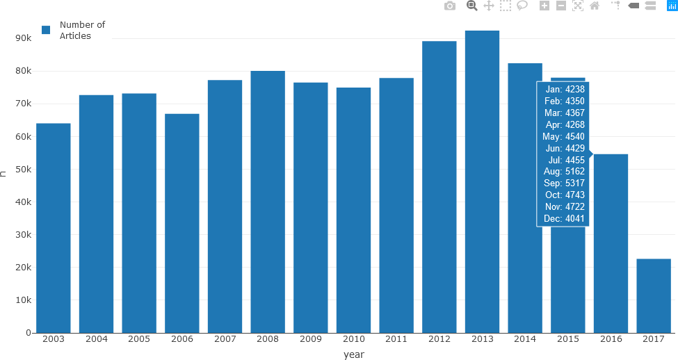
newsTextDates %>% group_by(year) %>% count()
# A tibble: 15 x 2
# Groups: year [15]
year n
<chr> <int>
1 2003 64003
2 2004 72674
3 2005 73125
4 2006 66915
5 2007 77201
6 2008 80014
7 2009 76456
8 2010 74948
9 2011 77833
10 2012 89114
11 2013 92363
12 2014 82341
13 2015 77956
14 2016 54632
15 2017 22593
Although these results are understood in tabular format, for a large number of years or for more complex data, visualizations are useful. For this purpose, the Plotly graphing library will be used.
## Plot the bar chart in Plotly.
library(plotly)
A straightforward and intuitive way to visualize this data is with a bar chart. To make the bar chart more informative, the number of articles in each month and in each year could be displayed as hover text, that when a user hovers over a year, the individual counts for each month are displayed as hover text. Generating this text requires some processing. First, an intermediate variable, say a, is initialized to the news text grouped by year, and by month within each year.
a <- newsTextDates %>% group_by(year, month) %>% count()
The first few rows of the data frame are as follows.
a
# A tibble: 173 x 3
# Groups: year, month [173]
year month n
<chr> <chr> <int>
1 2003 02 2181
2 2003 03 6412
3 2003 04 6101
4 2003 05 6400
5 2003 06 6346
6 2003 07 6506
7 2003 08 6128
8 2003 09 5840
9 2003 10 6599
10 2003 11 5711
# ... with 163 more rows
This step is followed by obtaining the unique years in the resulting data frame.
yrs <- unique(newsTextDates[['year']])
> yrs
[1] "2003" "2004" "2005" "2006" "2007" "2008" "2009" "2010" "2011" "2012" "2013" "2014" "2015" "2016" "2017"
Now, an intermediate data frame, named df, is generated from the intermediate a data frame. It is initialized to the number of unique years as the number of rows, and 13 columns (1 column for the year, 12 columns for the months).
df <- data.frame(matrix(ncol = 13, nrow = length(yrs)))
Next, the months (more precisely, the short form name of the months) are placed into a list named months. The columns of the data frame that was just constructed are renamed with the colnames() function.
months <- c('Jan', 'Feb', 'Mar', 'Apr', 'May', 'Jun', 'Jul', 'Aug', 'Sep', 'Oct', 'Nov', 'Dec')
colnames(df) <- c('year', 'Jan', 'Feb', 'Mar', 'Apr', 'May', 'Jun', 'Jul', 'Aug', 'Sep', 'Oct', 'Nov', 'Dec')
Several approaches, varying in both complexity and elegance, can be employed for this task. For the purposes of this demonstration, a straightforward approach using a loop is used. The reader should follow the loop to understand how the intermediate data frame is populated. To ensure that months for which there are no articles would have a value of zero, an inner loop is used to initialize each row (year) to zeros before the row is populated with the month counts.
## Populate the data frame with the counts for each month within each year.
for (iyear in 1:length(yrs)) {
aa <- subset(a, (year == yrs[iyear]))
## Update the year.
df[iyear, 1] <- yrs[iyear]
## Initialize to zeros.
for (imonth in 1:12) {
indx <- imonth + 1
df[iyear, indx] <- 0
} ## imonth
## Update the counts for each month.
for (imonth in 1:nrow(aa)) {
indx <- as.integer(aa[imonth, 2]) + 1
df[iyear, indx] <- aa[imonth, 3]
} ## i (each month)
} ## iyear (each year)
To ensure that the intermediate data frame can be utilized as hover text, the split() function is used to generate the resultList variable, which will be used in the subsequently Plotly function.
resultList <- split(df, seq_len(nrow(df)))
The bar chart with the hover text can now be displayed. The <extra></extra> tag in the hover template is used to suppress displaying the name of the trace (e.g. Trace 0).
## Generate the bar chart, adding hover text from resultList.
fig <- plot_ly(newsTextYears, x = ~year, y = ~n, type = 'bar', name = 'Number of\nArticles',
customdata = resultList,
hovertemplate = paste('Jan: %{customdata.Jan}',
'<br>Feb: %{customdata.Feb}',
'<br>Mar: %{customdata.Mar}',
'<br>Apr: %{customdata.Apr}',
'<br>May: %{customdata.May}',
'<br>Jun: %{customdata.Jun}',
'<br>Jul: %{customdata.Jul}',
'<br>Aug: %{customdata.Aug}',
'<br>Sep: %{customdata.Sep}',
'<br>Oct: %{customdata.Oct}',
'<br>Nov: %{customdata.Nov}',
'<br>Dec: %{customdata.Dec}',
'<extra></extra>')
)
## Update the placement of the legend, and specify that it be displayed.
fig <- fig %>% layout(legend = list(x = 0.0, y = 1.0), showlegend = T)
## Display the figure.
fig
The resulting bar chart is displayed along with the number of articles for each month displayed as hover text.
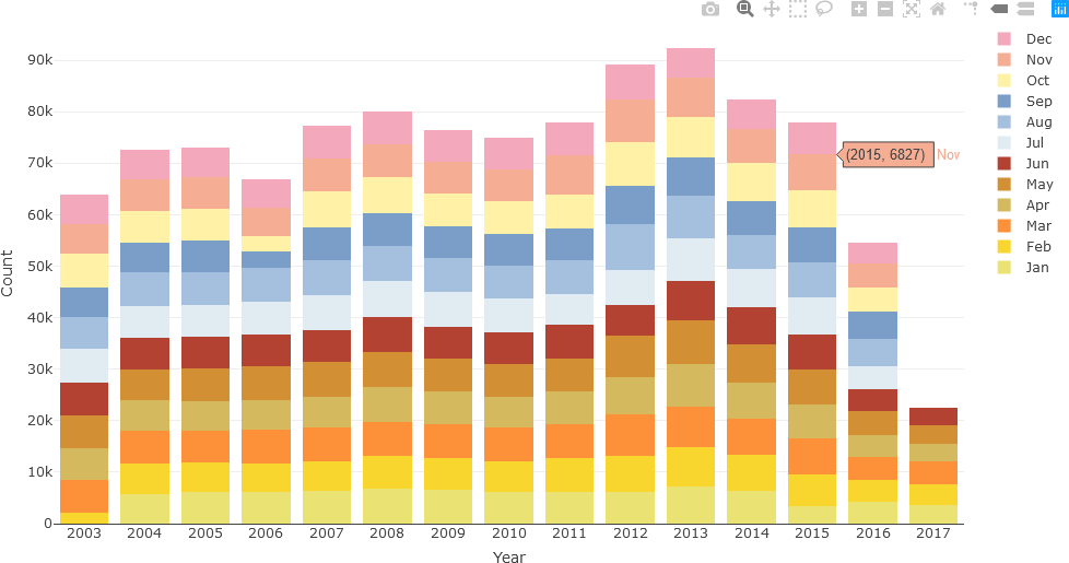
Although the hover text is informative and may be preferred by some users to assess the exact article count for each month, the same data can be displayed as a stacked bar chart. When colour-coded, this representation can potentially reveal monthly or seasonal patterns that may not be evident with hover text. In the following example, seasonal colour palettes (summer, autumn, winter, and spring months in Australia) are used. The user can use any colour palette, as appropriate for the specific question being investigated.
## Sources:
## https://www.color-hex.com/color-palette/493
## https://www.codeofcolors.com/spring-colors.html
## https://www.schemecolor.com/cool-autumn-color-palette.php
## https://www.codeofcolors.com/spring-colors.html
clrs <- c(
+ ## Summer (Australia)
+ 'rgba(234, 227, 116, 1)', 'rgba(249, 214, 46, 1)', 'rgba(252, 145, 58, 1)',
+ ## Autumn
+ 'rgba(212, 185, 94, 1)', 'rgba(210, 143, 51, 1)', 'rgba(179, 66, 51, 1)',
+ ## Winter
+ 'rgba(224, 236, 242, 1)', 'rgba(165, 192, 223, 1)', 'rgba(122, 158, 199, 1)',
+ ## Spring
+ 'rgba(255, 241, 166, 1)', 'rgba(245, 173, 148, 1)', 'rgba(243, 168, 188, 1)'
+ )
clrs
[1] "rgba(234, 227, 116, 1)" "rgba(249, 214, 46, 1)" "rgba(252, 145, 58, 1)" "rgba(212, 185, 94, 1)" "rgba(210, 143, 51, 1)"
[6] "rgba(179, 66, 51, 1)" "rgba(224, 236, 242, 1)" "rgba(165, 192, 223, 1)" "rgba(122, 158, 199, 1)" "rgba(255, 241, 166, 1)"
[11] "rgba(245, 173, 148, 1)" "rgba(243, 168, 188, 1)"
Initialize the first trace of the stacked bar chart with the data for January, and add the data for the other eleven months in a loop. After updating the axis titles, the figure is displayed.
## Initialize the plot at January.
fig <- plot_ly(x = df[[1]], y = df[[2]], type = 'bar', name = months[1],
marker = list(color = c(clrs[1]))
)
## Add traces for the other 11 months.
for (imonth in 2:length(months)) {
fig <- fig %>% add_trace(x = df[[1]], y = df[[imonth+1]], type = 'bar', name = months[imonth],
marker = list(color = c(clrs[imonth]))
)
}
## Update the x-axis and y-axis titles, and specify the graph will be a stacked bar chart.
fig <- fig %>% layout(yaxis = list(title = 'Count'), xaxis = list(title = 'Year'), barmode = 'stack')
## Display the figure.
fig
The stacked bar chart is then displayed.
Now, additional text analysis will be performed. In the following example, only text from December 2010 will be considered. The relevant data is first extracted with the filter() function into newsTextFiltered. A new data frame, df_Filtered, is then generated by using the annotation function of UDPipe, which annotates the headline text form the English model read earlier.
newsTextFiltered <- newsTextDates %>% filter(year == 2010 & month == 12)
df_Filtered <- data.frame(udpipe_annotate(udmodel_english, newsTextFiltered$headline_text))
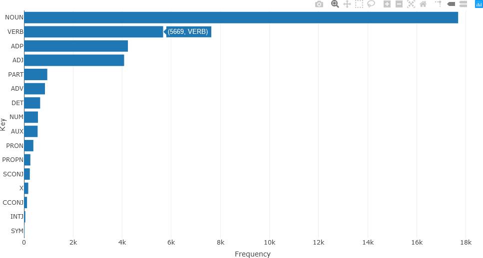
Universal Parts of Speech (UPOS) tagging is subsequently employed to generate statistics for the text (see Here for more information about UPOS tags). The df_Filtered data frame contains a UPOS column, indicating the part of speech for each annotation. The first ten annotations are shown below.
df_Filtered$upos[1:10]
[1] "NUM" "NUM" "ADJ" "NOUN" "PART" "VERB" "ADJ" "NOUN" "ADJ" "NOUN"
“NUM” denotes a numerical annotation, “ADJ” denotes an adjective, “NOUN”, “PART”, and “VERB” denote nouns, particle words (e.g. adpositions, coordinating conjunctions), and verbs, respectively. Text frequency statistics are then calculated from these UPOS tags.
stats <- txt_freq(df_Filtered$upos)
A bar chart of the parts of speech can then be generated and displayed in a straightforward manner.
fig <- plot_ly(stats, x = ~freq, y = ~key, type = 'bar', orientation = 'h', name = 'UPOS')
fig <- fig %>% layout(yaxis = list(title = 'Key'),
xaxis = list(title = 'Frequency'))
fig
The resulting bar chart is shown below.
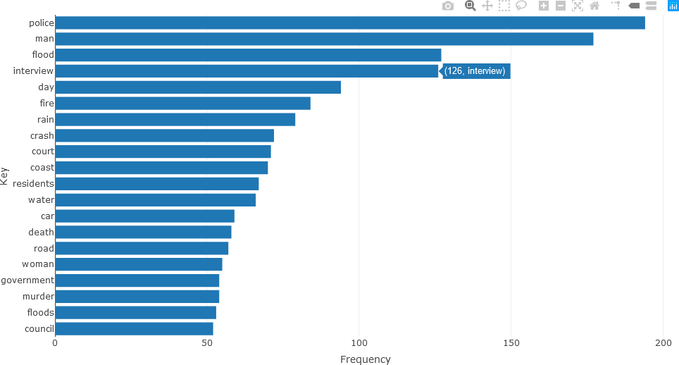
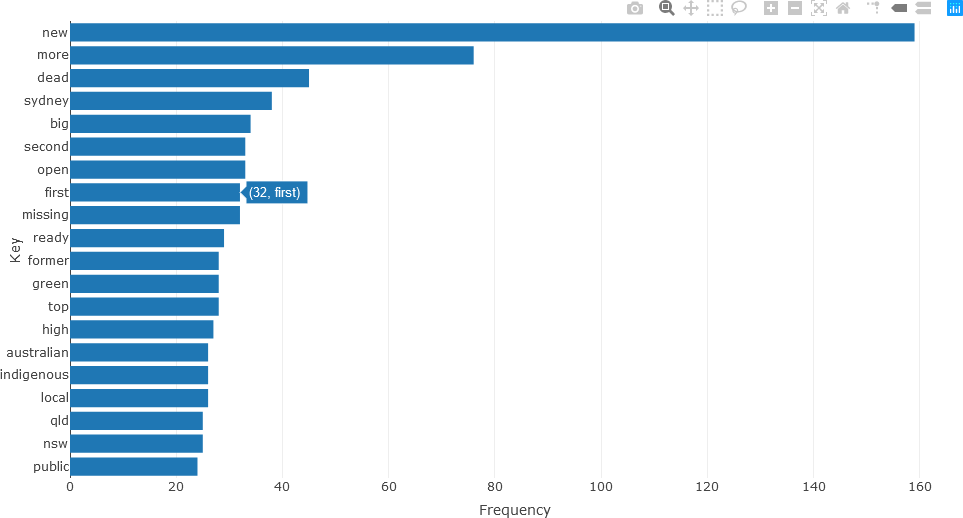
Detailed analysis of the different parts of speech can subsequently be obtained. For instance, the twenty most frequently occurring nouns in the text of the articles for December 2010 (using the head() function) can be visualized with a bar chart as follows.
## NOUNS
stats <- subset(df_Filtered, upos %in% c("NOUN"))
stats <- txt_freq(stats$token)
stats$key <- factor(stats$key, levels = rev(stats$key))
fig <- plot_ly(head(stats, 20), x = ~freq, y = ~key, type = 'bar', orientation = 'h', name = 'UPOS')
fig <- fig %>% layout(yaxis = list(title = 'Key'),
xaxis = list(title = 'Frequency'))
fig
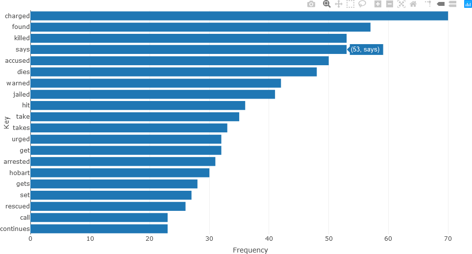
Frequently occurring adjectives and verbs can be analyzed in the same manner. The statistics for adjectives are shown below.
## ADJECTIVES
stats <- subset(df_Filtered, upos %in% c("ADJ"))
stats <- txt_freq(stats$token)
stats$key <- factor(stats$key, levels = rev(stats$key))
fig <- plot_ly(head(stats, 20), x = ~freq, y = ~key, type = 'bar', orientation = 'h', name = 'UPOS')
fig <- fig %>% layout(yaxis = list(title = 'Key'),
xaxis = list(title = 'Frequency'))
fig
The bar chart for verbs is constructed in a similar manner.
## VERBS
stats <- subset(df_Filtered, upos %in% c("VERB"))
stats <- txt_freq(stats$token)
stats$key <- factor(stats$key, levels = rev(stats$key))
fig <- plot_ly(head(stats, 20), x = ~freq, y = ~key, type = 'bar', orientation = 'h', name = 'UPOS')
fig <- fig %>% layout(yaxis = list(title = 'Key'),
xaxis = list(title = 'Frequency'))
fig
KEYWORD EXTRACTION AND THE RAKE ALGORITHM
Keywords are typically defined as words and/or sequences of words that are discriminating for a text or corpus of texts. That is, keywords provide a compact representation of the document’s (or documents’) essential content (Rose et al., 2010). It is often necessary to extract keywords from a single document, in contrast to a corpus of documents. One reason for this is that key words may not be used consistently, or in the same context, throughout the corpus documents. Another factor is that words or phrases that occur frequently in a document are not likely to be discriminating or essential to the content of the document. Furthermore, corpora are often dynamic, wherein new documents are added or existing documents are modified. Keyword assignment was generally performed by professional curators who use a standardized taxonomy, or categorization/classification scheme. However, as a manual task requiring human judgement, a degree of subjectivity is naturally introduced into the process. Consequently, more objective, automated methods are desirable.
The Rapid Automatic Keyword Extraction (RAKE) algorithm is a popular unsupervised, domain-independent, and language-independent machine learning machine learning approach that was developed for keyword extraction in individual documents (Rose et al., 2010). It extracts keywords based on statistical measures, specifically, word occurrence frequency and its co-occurrence with other words, and does not directly rely on natural language processing (NLP).
The main benefit of RAKE is that it handles a wide range of different documents and collections, as well as large volumes of text. This adaptivity is important, given the increasingly fast rate at which texts are generated, collected, and modified. RAKE is also an efficient method, extracting keywords in one pass through the algorithm, thereby freeing computational resources for other analytical tasks. In comparative tests, RAKE had higher precision than other existing techniques, and compared well with those techniques in other performance measures. Therefore, it can be used in applications using keywords, such as defining queries in information retrieval systems and to improve the functionality of these systems (Rose et al., 2010).
Part of the method’s simplicity vis-a-vis NLP is a relatively small number of input parameters. RAKE requires a list of stop words (stoplist), a set of phrase delimiters, and a set of word delimiters. The stop words and phrase delimiters are needed to partition the document text into sequences of words occurring in the text, known as candidate keywords.
First, text is parsed into a set of candidate keywords not containing irrelevant words from a text array that was split with specific word delimiters. The positions of these words are recorded. Sequences of contiguous words are then formed using phrase delimiters and the positions of stop words, and are designated as candidate keywords. All the words in a specific sequence are assigned the same position within the text; that is, they are treated as single keywords.
After candidate keyword identification, a co-occurrence matrix is produced for the individual words within the candidate keywords. A co-occurrence matrix consists of words represented by rows and columns. The matrix value for a particular element (row, column) indicates the number of times the word in a row occurs in the same context as the word in the corresponding column. Here, the context may refer to the same sentence (whether the words occur in the same sentence) or within a specified distance of each other, known as a window. Windows, which “slide” across the text, can have various lengths, depending on parameters specified by the user. For instance, a window size of 3 will first examine words at positions 1, 2, 3 in a single window, followed by 2, 3, 4, followed by 3, 4, 5, etc., until the end of the text is reached. The co-occurrence matrix is a symmetric matrix. That is, the number in (rowi, columnj) is the same value in (rowj, columni) of the matrix.
As co-occurrences of words within candidate keywords are used, sliding windows, whose length must be determined, are not required. Consequently, the algorithm adapts to the style and content of the text, and enables the algorithm to be adaptive and flexible in measuring word co-occurrences, which are important for scoring, as described below (Rose et al., 2010).
From the co-occurrence matrix, various statistics, or scores can be computed for each word. The degree of a word w, denoted as deg(w) is the sum of the values in the row of w. Because of the symmetry of the co-occurrence matrix, the same deg(w) can be obtained as the sum of the values in the column of w. The frequency of w, freq(w), is the value on the diagonal for w. For instance, if word w occurs in row 7, then freq(w) is the matrix value at row 7, column 7. The ratio of degree to frequency, deg(w)/freq(w) is also used. These metrics are used for different purposes. Words that frequently occur and that are part of longer candidate keywords are favoured by deg(w). The freq(w) metric favours frequently occurring words, regardless of the number of co-occurring words. The deg(w)/freq(w) metric favours words that are predominantly found in longer candidate keywords (Rose et al., 2010). From these values, and for a specific metric, word scores for candidate keywords are computed as the sum of the metrics for each of the individual words in the keyword.
For example, consider a co-occurrence matrix with five words.
| digital | humanities | computer | algorithm | programming | |
| digital | 8 | 4 | 2 | ||
| humanities | 4 | 7 | |||
| computer | 2 | 4 | 1 | 3 | |
| algorithm | 1 | 2 | |||
| programming | 3 | 5 |
For each w, the deg(w), freq(w), and deg(w)/freq(w) (rounded to two decimal places) metrics are calculated.
| deg(w) | freq(w) | deg(w)/freq(w) | |
| digital | 14 | 8 | 1.75 |
| humanities | 11 | 7 | 1.57 |
| computer | 10 | 4 | 2.5 |
| algorithm | 3 | 2 | 1.5 |
| programming | 8 | 5 | 1.6 |
Word scores are computed for the keyword sequences as follows from these metrics.
| deg(w) | freq(w) | deg(w)/freq(w) | |
| digital humanities | 25 | 15 | 3.32 |
| digital computer | 24 | 12 | 4.25 |
| computer algorithm | 13 | 6 | 4.00 |
| computer programming | 18 | 7 | 4.10 |
After candidate keywords are scored, the top T scoring candidates are selected as keywords for the document, where T is selected by the user. In (Rose et al., 2010), T is calculated as 1/3 of the number of words in the co-occurrence matrix.
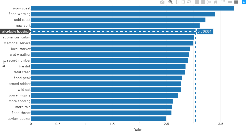
The following example returns to the ABC News headline text. The UDPipe keywords_rake() function is described on rdrr.io. In this example, RAKE is used to extract important noun-adjective keyword sequences. Only the 20 most pertinent keywords that occur more than three times are considered, and represented in the stats variable, as shown below. To facilitate processing, these statistics are stored in the data frame df_temp.
## Use RAKE to find keywords occurring in NOUN-ADJECTIVE sequences.
stats <- keywords_rake(x = df_Filtered, term = "lemma", group = "doc_id",
relevant = df_Filtered$upos %in% c("NOUN", "ADJ"))
stats$key <- factor(stats$keyword, levels = rev(stats$keyword))
df_temp <- data.frame(head(subset(stats, freq > 3), 20))
The data frame can then by analyzed.
> colnames(df_temp)
[1] "keyword" "ngram" "freq" "rake" "key"
> nrow(df_temp)
[1] 20
> df_temp
keyword ngram freq rake key
7 ivory coast 2 8 3.750000 ivory coast
20 flood warning 2 4 3.395207 flood warning
33 gold coast 2 6 3.217368 gold coast
44 new york 2 4 3.111814 new york
55 affordable housing 2 4 3.036364 affordable housing
58 national curriculum 2 4 3.011429 national curriculum
63 memorial service 2 4 2.994774 memorial service
75 local market 2 8 2.936655 local market
80 wet weather 2 5 2.911111 wet weather
82 record number 2 4 2.898785 record number
91 fire drill 2 4 2.850962 fire drill
93 fatal crash 2 6 2.845192 fatal crash
99 flood peak 2 5 2.787780 flood peak
106 armed robber 2 4 2.766667 armed robber
107 wild oat 2 7 2.763636 wild oat
119 power inquiry 2 5 2.711779 power inquiry
136 more flooding 2 4 2.616606 more flooding
139 more rain 2 7 2.601765 more rain
144 flood threat 2 4 2.590947 flood threat
156 asylum seeker 2 8 2.489510 asylum seeker
In the UDPipe implementation of RAKE, each word w is scored according to the ratio measure deg(w)/freq(w), and the RAKE score for the candidate keyword is the sum of the scores for the individual words comprising the keyword. From examining the data frame, it is observed that n-grams are also calculated. The data frame facilitates generating the horizontal bar chart, which is generated with Plotly.
fig <- plot_ly(x = df_temp$rake, y = df_temp$keyword, type = 'bar', orientation = 'h')
fig <- fig %>% layout(yaxis = list(title = 'Keyword',
ticktext = df_temp$keyword, showticks = T,
autorange = 'reversed'),
xaxis = list(title = 'Rake Value'))
fig
When the plot is generated the “Toggle Spike Lines” and the “Compare data on hover” plot options were activated by clicking their respective icons in the upper right corner.
UDPipe provides many other advanced functions for text analysis. For instance, phrases having specified structures can be analyzed using regular expressions (see the last example Here). As another example, the correlation matrix of frequently occurring words can be calculated and displayed from the document-term matrix (DTM). To generate the DTM with the frequencies of the tokenized words in a document or corpus, the UDPipe document_term_frequencies() function is used, as shown below.
dtm <- document_term_frequencies(x = df_Filtered, document = "doc_id", term = "token")
The resulting matrix is a list data structure.
typeof(dtm)
[1] "list"
Examining the DTM yields the following:
nrow(dtm)
[1] 36393
head(dtm, 10)
doc_id term freq
1: doc1 130 1
2: doc1 m 1
3: doc1 annual 1
4: doc1 cost 1
5: doc1 to 1
6: doc1 run 1
7: doc1 desal 1
8: doc1 plant 1
9: doc2 4wd 1
10: doc2 occupants 1
The list can be converted to an S4 object as follows:
dtm <- document_term_matrix(dtm)
typeof(dtm)
[1] "S4"
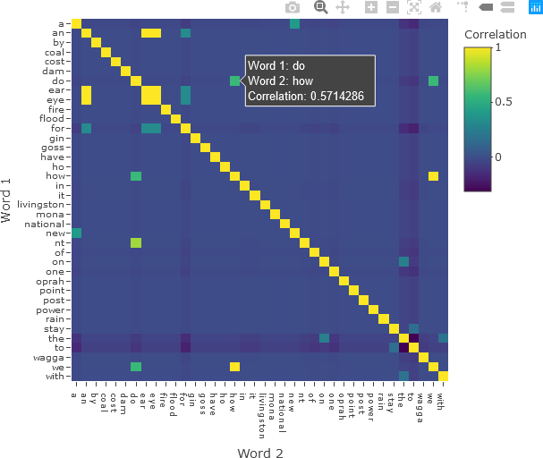
The correlation matrix of the words can be calculated with the UDPipe dtm_cor() function.
correlation <- dtm_cor(dtm)
The resulting correlation matrix is a symmetric square matrix.
nrow(correlation)
[1] 8126
ncol(correlation)
[1] 8126
The matrix can be converted to a co-occurrence data structure with the as_cooccurrence() function.
cooc <- as_cooccurrence(correlation)
nrow(cooc)
[1] 66031876
ncol(cooc)
[1] 3
head(cooc)
term1 term2 cooc
1 0 0 1.0000000000
2 000 0 -0.0002323143
3 1 0 -0.0005196414
4 10 0 -0.0008384480
5 100 0 -0.0006974014
6 107 0 -0.0002323143
The correlation matrix has 8126 rows and columns, and therefore displaying the entire matrix would be very difficult to interpret and computationally expensive and memory intensive. Therefore, the example is re-run with using only those words that have a frequency of 2 or more.
dtm <- document_term_frequencies(x = df_Filtered, document = "doc_id", term = "token")
dtm <- dtm[dtm$freq >= 2,]
head(dtm)
doc_id term freq
1: doc11 by 2
2: doc42 to 2
3: doc69 for 2
4: doc79 the 2
5: doc182 it 2
6: doc433 to 2
dtm <- document_term_matrix(dtm)
correlation <- dtm_cor(dtm)
nrow(correlation)
[1] 38
ncol(correlation)
[1] 38
The matrix can then be displayed with Plotly, applying options to display all the words on the axes and formatting the plot for intuitive display. Hover text with the word in each row and column, along with the correlation value, is added. The colour bar is also given a title.
fig <- plot_ly(x = colnames(correlation), y = colnames(correlation), z = correlation,
type = 'heatmap',
colorbar = list(title = 'Correlation'),
hovertemplate = paste('Word 1: %{y}',
'<br>Word 2: %{x}',
'<br>Correlation: %{z}',
'<extra></extra>')
)
fig <- fig %>% layout(xaxis = list(title = 'Word 2', tickfont = list(size = 10),
tickvals = seq(0, ncol(correlation))),
yaxis = list(title = 'Word 1', tickfont = list(size = 10),
tickvals = seq(0, nrow(correlation)),
autorange = 'reversed')
)
fig
The resulting correlation matrix is shown below.
The reader is encouraged to explore the other text analysis functions in UDPipe, and to experiment with the data sets available in this distribution, or with the reader’s own text.
