Analysis of Artificial Neural Networks
INTRODUCTION
The previous section introduced the success rate as a very basic measure of ANN performance. In this section, more detailed analyses will be introduced. ANN analysis is a large, complex field. Depending on the specific application, different analysis techniques can be employed. In this section, some additional basic methods are introduced, including confusion matrix analysis and visualizing network outputs. This section continues the ANN example of classifying MNIST images of handwritten digits presented in the previous section. Recall that a multilayer perceptron (MLP) ANN was constructed with 1116 neurons in the input layer (one for each of the (31(36) = 1116 pixel values), 256 hidden neurons in a single hidden layer, and a single neuron for the label classification in the output layer. A data set of 4000 images were used and split into 3000 training images and 1000 testing images. The network was trained on the 3000 image samples for 1000 iterations. An “acceptable” success rate of 0.864 was achieved after training. Recall, however, that what qualifies as an “acceptable” success rate is highly dependent on the application and other factors that must be considered by the user.
THE CONFUSION MATRIX
A confusion matrix is a matrix containing the frequency of each possible pair of labels. The true values of the label are represented as rows, and the predicted values of the label from the ANN output are represented as columns. For example, if the trained network is tested with a handwritten digit “3” but the network output was “8”, i.e., the predicted value was “8”, then this mislabeling would be represented in the row corresponding to “3” and the column corresponding to “8”. Specifically, in this example, the number of times “3” was incorrectly labeled as “8” is recorded in the row corresponding to “8” on the x-axis and “3” on the y-axis. The same procedure is performed for all pairs of true values (in rows) and predicted values (in columns). These frequencies (counts) are then normalized down each column, so that the sum of the elements of the confusion matrix in each column is 1. In the present example, there are ten digits, and therefore there are ten rows and ten columns, resulting in a matrix with 100 elements. Confusion matrices are generally square matrices having the same number of rows and columns. If the network had perfect testing performance, then all true values would be correctly labeled as the same predicted values. In general, confusion matrices contain high values on the diagonal, indicating that true label x was correctly labeled as predicted value x. Confusion matrices with many elements are often visualized as a heat map. The confusion matrix for the ANN classification demonstrated in the last section is shown below.
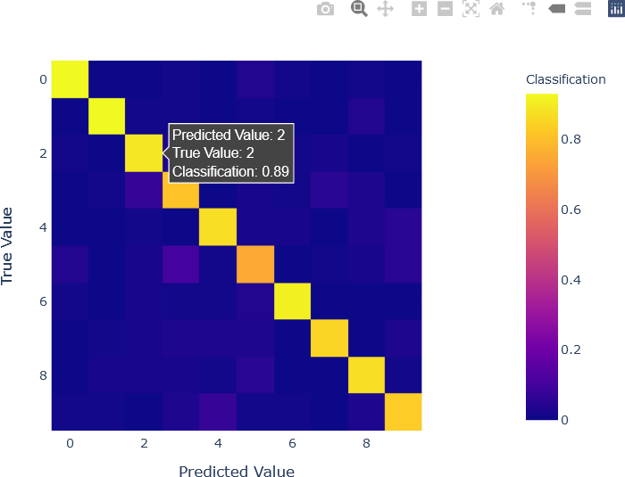
The visualization of the confusion matrix provides important information about network performance. As is to be expected, the highest values are in the diagonal, indicating correct classification. However, some of the other, lower values are also interesting. For instance, “5” is relatively frequently mislabeled as “3”, with a value of 0.1, and as “9”, with a value of 0.05. In fact, “5” was the most frequently mislabeled digit, as it was correctly labeled with a relatively low classification value of 0.75. The digit “4” was also (relatively) frequently mislabeled as “9”, with a classification value of 0.05. This can be explained by the similarity in the shapes of “4” and “9”. Digits with the highest classification values (0.93), as observed by the diagonal of the heat map, were “0” and “1”, both easily distinguishable digits. The interactivity supplied by the Plotly library and the code used to generate the plot enable the user to hover over individual cells and obtain important information, such as the classification value.
To create the confusion matrix in Python, it must first be initialized with Ndigits rows and Ndigits columns.
## Initialize the square confusion matrix.
confusion = np.zeros((Ndigits, Ndigits))
Each element in the matrix is computed with vector operations. The y_test and y_test_predict variables contain labels that, in this example, can be used as the indices of the matrix, as digit “0” corresponds to row 0 (for y_test) or column 0 (for y_test_predict) of the matrix, allowing this shortcut to be used. Alternately, a some less efficient way of calculating the confusion matrix is to loop through each element of y_test and y_test_predict in a nested loop with 10 iterations in the outer loop (for each row indicated by the values in y_test) and 10 iterations in the inner loop for each column indicated by the values in y_test_predict, resulting in (10)(10) = 100 iterations. Recall that y_test and y_test_predict are lists of length Ntest.
## Compute each element in the matrix.
## Recall that y_test and y_test_predict are lists of length Ntest.
for i in range(0, Ntest):
confusion[y_test[i]][y_test_predict[i]] = confusion[y_test[i]][y_test_predict[i]] + 1
The values in the confusion matrix now contain the counts (frequencies) of the true label in a row being labeled as the predicted label in a column. As stated above, the values in the columns of a confusion matrix are normalized so that the sum of the values in each column is 1. This operation is shown below.
## Normalize across rows.
for i in range(0, Ndigits):
confusion[i] = confusion[i] / np.sum(confusion[i])
The heat map of the confusion matrix shown above was visualized with the Plotly Express plotting library in Python. The code to generate the heat map is shown below. Note that the display labels were modified for added clarity.
## Display the confusion matrix with Plotly.
## Plotly express is used.
import plotly.express as px
fig = px.imshow(confusion
x = np.arange(0, Ndigits),
y = np.arange(0, Ndigits),
labels = dict(x = 'Predicted Value',
y = 'True Value',
color = 'Classification')
)
fig.show()
VISUALIZATION OF ANN WEIGHTS
Visualizing the weights that the ANN learned during training can potentially reveal important information about the learning that the network achieved. Recall that weights are the parameters that the network has learned, and consequently, visually analyzing them can lead to new insights that can potentially be used to improve performance. Weights that appear unstructured when visualized, that contains very high weights, or that have very few or no values may suggest that hyperparameters require adjustment. For instance, the problems just mentioned may indicate that the learning rate is too high. Visualization is particularly important in complex deep ANNs, and ANN architectures with multiple components, such as the recent architecture known as convolutional neural networks (CNNs) that have demonstrated a high degree of success in image classification and image analysis. Although the network presented is relatively simple, visualizing the weights can still be instructive for investigating what the network “learned”.
Once the network has been trained, the connection weights into each hidden neuron can be visualized as an image. Each hidden neuron receives 1116 input, because each 31 row by 36 column image contains (31)(36) = 1116 pixel values. Because the ANN has 256 hidden neurons, there are 256 such images. Because 256 is a perfect square (162 = 256), the images can be arranged in a grid of 16 rows and 16 columns. This layout is not required, however. For instance, for a network with 40 hidden neurons, the images can be arranged with 8 rows and 5 columns, 4 rows and 10 columns, etc. The layout itself is not crucially important.
For this visualization, Matplotlib will be used. The weights, also known as coefficients, can be obtained directly from the ANN class through the coefs_ attribute. The reader should refer Here and Here for additional details. Weights (coefficients) are available for each set of connections. The clf.coefs_[0] variable contains the connection weights from the input layer into the hidden layer. The clf.coefs_[1] variable contains the connection weights from the hidden layer into the output layer. In ANNs with more hidden layers, clf.coefs_ has more elements. In the current example, however, the connection weights into the single hidden are of interest. The weights (coefficients) are therefore obtained as clf.coefs_[0]. The sizes and shapes of the weights can be determined through command line operations.
>>> len(clf.coefs_)
2
>>> clf.coefs_[0].shape
(1116, 256)
>>> clf.coefs_[1].shape
(256, 10)
These operations confirm that there are two layers of coefficients. The first set of weights, clf.coefs_[0], has 1116 rows and 256 columns, indicating 1116 pixel values from each image, and 256 hidden neurons. The second set of weights, clf.coefs_[1], has 256 rows and 10 columns, indicating the 10 outputs (an output for each possible digit) from which the output label is decided.
The code to visualize the weights, the following code can be used. However, the reader is encouraged to experiment with this code to obtain visualizations that are conducive to the reader’s own investigations.
## In this example, assume that the number of hidden units
## is a perfect square, which is the case for the current
## example, as 256 == 16**2.
## Therefore, the weights visualization can have a square
## layout with 16 rows and 16 columns.
plotRows = int(np.sqrt(nHiddenNeurons))
plotCols = int(np.sqrt(nHiddenNeurons))
## Initialize the plot with the number of rows and columns
## in a grid.
fig, axes = plt.subplots(plotRows, plotCols)
vmin, vmax = clf.coefs_[0].min(), clf.coefs_[0].max()
## Obtain the connection weights (coefficients) for each
## hidden neuron iteratively, and display it as a grey-level
## image on the image grid.
for coef, ax in zip(clf.coefs_[0].T, axes.ravel()):
## Scale to the image, not image set.
## Obtain the minimum and maximum coefficient value.
umin, umax = coef.min(), coef.max()
ax.matshow(coef.reshape(nrows, ncols),
cmap = plt.cm.gray,
vmin = 1 * umin, vmax = 1 * umax)
ax.set_xticks(())
ax.set_yticks(())
## Display the grid of images.
plt.show(block = False)
The 16 row by 16 column grid of weights is shown below.
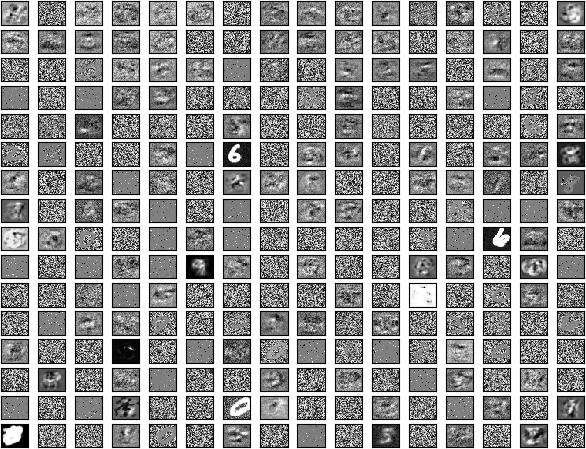
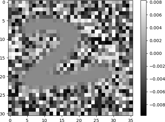
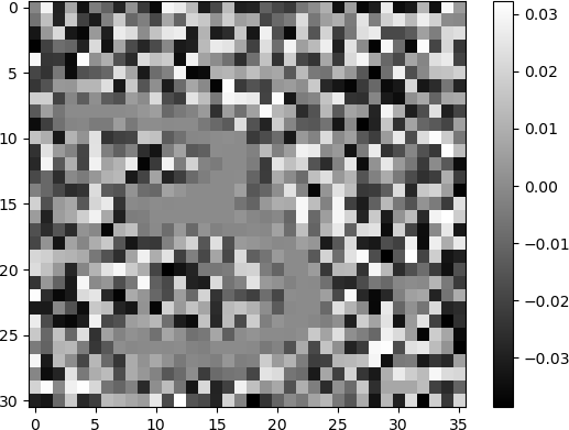
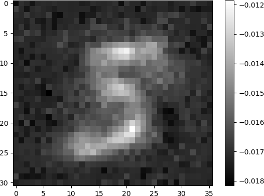
The grid is a display of 256 grey-scale images corresponding to the 256 hidden neurons in the single hidden layer, arranged in 16 rows and 16 columns. The 1116 weights that are input to each hidden neuron are re-shaped and displayed as images with 31 rows and 36 columns, the same dimensionality as the images of handwritten digits. Each image indicates the weights that the ANN has learned during training. Many of the images appear to be random, with unorganized pixels of shades of white, grey, and black. Some images have some degree of structure, and appear as diffuse patterns of “blobs”, but do not resemble digits. A few images clearly denote digits. Clearly discernible images of the digit “6” in white shades against a dark background are observed. The digit “0” is discernible in some images. Other digits are less clear but are still discernible. For example, the digits “5” and “9” are observed in some images. In another example, the digit “2” is somewhat discernible in the image in row 5, column 0.
The digit “8” can be observed, along with some other structures, in the image in row 6, column 15.
The digit “3” can be observed against a noisy background in the image in row 1, column 12.
The digit “5” can be observed as a blurred, diffuse character in the image in row 15, column 10.
Other digits, displayed with varying degrees of discernibility, can be seen throughout the grid. However, many other images are either “blob” structures, or simply noise.
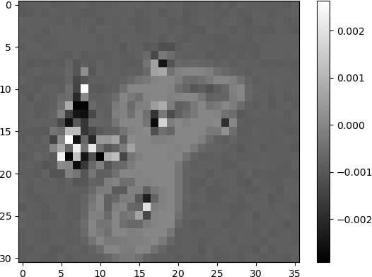
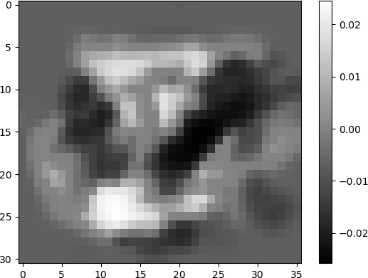
The connection weights into the neurons in the hidden layer displayed as images provide an indication of neurons that “learned” various features of the input. The images shown above indicate hidden neurons that are highly activated by specific digits (e.g., “2”, “8”, “3”, and “5”). Other neurons such as the one shown below, consists of a “blob” pattern (row 15, column 14), but still exhibits some structure. The white area in the middle of the image indicates activation by a number of possible digits, such as “2” or “8”.
Other images appear to only contain noise, and therefore do not likely contribute substantially to the ANN output. Experienced ANN users and machine learning practitioners may use visualizations such as this to determine neurons that may impede network performance. Further statistical analyses performed on the weight parameters can also potentially suggest fruitful directions for hyperparameter tuning. Many of these technical issues are complex, and are beyond the scope of the current discussion.
CONCLUSION
Analysis of artificial neural networks is an active research area in machine learning, especially in view of recent successful applications of deep learning. In this section, a simple analysis technique, confusion matrix analysis, was introduced. Visualization of network weights is common for complex ANN architectures but can also provides insights into the learning process and suggest ways to improve performance, for example, through tuning hyperparameters. There are a variety of other basic analysis methods that were not covered, such as analyzing true positives, true negatives, false positives, and false negatives for classification. Receiver operating characteristic curves (ROC curves) are very useful for this type of analysis. The reader is encouraged to explore these methods, as well as more advanced ones, that may be encountered in digital humanities scholarship.
EXERCISE
Visualize the weights that were learned by the improved ANN that you constructed in the exercise in the last section. Use the Python code presented in this example to generate your own visualization. Compare the results with those shown here. From your visualization, discuss how your visualization may suggest directions to pursue in hyperparameter tuning or in other ways of improving network performance.
