Introduction to T-Sne for High Dimensional Visualization
INTRODUCTION
In the previous section, principal component analysis (PCA) was introduced as a method to reduce the complexity of high dimensional data. Specifically, PCA is used to reduce the dimension of the original data, while retaining most of the pertinent information in that data, and preserving as much of the variation in the original data as possible. PCA transforms this high dimensional data into a form that can be represented graphically with scatter plots in two or three dimensions. Both PCA and k-means clustering are unsupervised machine learning techniques. They both produce abstract results that may or may not be indicative of the actual characteristics of the data. However, both are extremely useful for analyzing and exploring large, complex data sets. K-means clustering can be used to determine the features that are most characteristic of the data set, and PCA is used to represent these complex data in a simpler form, and, for the purposes of the present discussion, facilitates visualization.
Another technique to visualize high dimensional data is t-SNE, or t-distributed stochastic neighbour embedding, a technique widely applied in machine learning applications. Like PCA, t-SNE is an unsupervised method for dimensionality reduction – or, more formally, “embedding” high dimensional data into a low dimensional space – so that this lower dimensional data can be visualized. High dimensional data samples that have similar characteristics are modeled by 2D or 3D points that are close to each other. Those data samples whose characteristics are dissimilar are modeled, with a high probability, by 2D or 3D points that are distant to each other. Although both PCA and t-SNE are unsupervised dimensionality reduction techniques, there are some key differences. PCA is a linear technique wherein large pair-wise distances between data samples are preserved to maximize the variance between the transformed points. Data points that are dissimilar – i.e., they are distant in high dimensional space – are correspondingly distant in the transformed points that PCA returns. In contrast, t-SNE is a nonlinear technique wherein only small pairwise distances between similar points are preserved. T-SNE is widely employed in a variety of machine learning applications. For instance, it is used to visualize neural networks, and especially high dimensional convolutional neural network (CNN) feature maps, which, for the purpose of the current discussion, represent the output of the multiple layers of this network.
T-SNE AND ITS PYTHON (SCIKIT LEARN) IMPLEMENTATION
The results produced by t-SNE depend on the tuning (adjustment) of hyperparameters. For the current discussion, the most important of these is perplexity. Perplexity has a complex mathematical definition, but it generally can be considered as a variance metric. It is a measure of the number of nearest neighbours a sample has within a region defined by Gaussian (bell-shaped) functions. In general, high values of perplexity result in more distinguishable “shapes” that can be observed when visualizing points transformed by t-SNE. Larger data sets usually require higher perplexity values (see Here for further examples of the effect of perplexity).
It is important to remember that PCA and t-SNE were developed for different purposes. The purpose of PCA is dimension reduction of high dimensional data, and was introduced in the 1930s in the context of statistical analysis. The much newer t-SNE algorithm, introduced in 2008, also performs dimension reduction, but in the context of visualization and machine learning algorithms. Some of the main differences (see Here for a head-to-head comparison) are:
- while both methods are unsupervised learning techniques, PCA is linear, whereas t-SNE is nonlinear;
- PCA is global, and was designed to preserve the global structure of complex data (focusing on points distance to each other), whereas t-SNE generates “clusters” due to its preservation of local structure (focusing on points close to each other);
- PCA is very sensitive to outliers in the data (an important consideration in the digital humanities, where outliers are considered valuable because they convey insightful information), whereas, in comparison, t-SNE is less sensitive to outliers;
- PCA is (for the most part) deterministic (not random), whereas t-SNE is stochastic (it employs randomness); and
- PCA does not generally require careful tuning of hyperparameters, whereas the data transformation effected by t-SNE is highly dependent on hyperparameters, especially perplexity. Typical values of perplexity range from 5 to 50.
Like the k-means clustering algorithm and PCA, t-SNE is implemented in Python through the Scikit Learn package. Scikit Learn, and specifically sklearn.manifold, is used to access this functionality. The t-SNE algorithms in Scikit Learn also have default settings for the hyperparameters. For example, the default for perplexity is 30.
## t-SNE functions....
from sklearn.manifold import TSNE
The TSNE object contains the methods (functions) for generating transformed points.
>>> TSNE
<class 'sklearn.manifold._t_sne.TSNE'>
Specifically, the fit_transform() method, parameterized by the original high dimensional data, is invoked.
The concepts of t-SNE as they pertain to visualizing high dimensional data can be illustrated by comparing PCA and t-SNE data transformations. The following example uses the 3D “Swiss Roll” data set, commonly used to assess t-SNE. Scikit Learn provides functionality to generate this data set.
In the example that follows, 500 points are generated. First, however, the required libraries must be imported.
import numpy as np
from sklearn import datasets
import matplotlib.pyplot as plt
from mpl_toolkits.mplot3d import Axes3D
## Dimensionality reduction with PCA....
from sklearn.decomposition import PCA
## t-SNE functions....
from sklearn.manifold import TSNE
With these libraries imported, the samples of the Swiss Roll data can be generated.
## Specify the number of samples.
n_samples = 500
swiss_roll = datasets.make_swiss_roll(n_samples = 500)
The variable swiss_roll consists of two objects. The first object, the one that contains the 3D points is a Numpy array with 500 rows and 3 columns (as the number of samples was set to 500). The 3D points can be stored in another variable, X, for later use.
################################################
##
## Extract the 3D points.
##
## x == X[:, 0] (all values in column 0)
## y == X[:, 1] (all values in column 1)
## z == X[:, 2] (all values in column 2)
##
################################################
X = swiss_roll[0]
>>> type(X)
<class 'numpy.ndarray'>
>>> X.shape
(500, 3)
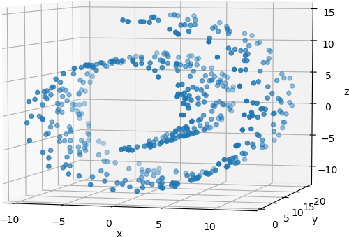
The 3D points can be directly visualized with a 3D scatter plot in Matplotlib, as shown below.
## Prepare the 3D scatter plot.
fig = plt.figure(0)
ax = Axes3D(fig)
## Generate the 3D scatter plot.
ax.scatter(X[:, 0], X[:, 1], X[:, 2])
ax.set_xlabel('x')
ax.set_ylabel('y')
ax.set_zlabel('z')
## Display the plot.
plt.show(block = False)
The resulting plot can be rotated to view the 3D data from different orientations. One such orientation is shown below.
Principal component analysis is applied to these 500 points to reduce their dimensionality to 2.
## Use PCA to reduce the dimensionality.
## Intialize the PCA algorithm.
pca = PCA(n_components = 2, whiten = False, random_state = 1)
## Transform the 3D Swiss Roll data points.
X_PCA = pca.fit_transform(X)
The result, X_PCA, is a Numpy array with 500 rows (the number of samples) and 2 columns (the 3D data are reduced to 2D).
>>> type(X_PCA)
<class 'numpy.ndarray'>
>>> X_PCA.shape
(500, 2)
These 2D points can be visualized in a scatter plot in a straightforward manner.
#############################################
## Display the 2D points computed by PCA.
#############################################
plt.figure(1)
plt.scatter(X_PCA[:, 0], X_PCA[:, 1], label = 'PCA')
## Format the plot.
plt.xlabel('x')
plt.ylabel('y')
plt.legend()
## Display the plot.
plt.show(block = False)
The resulting scatter plot is shown below.
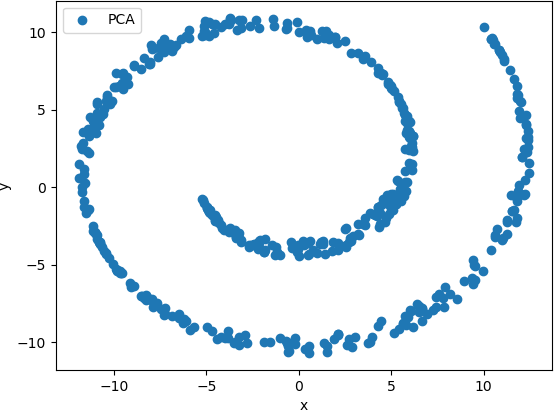
This plot shows that the basic shape of the Swiss Roll was preserved as a spiral. However, no clusters of points are observed, and therefore analysis of the relationships between the points is difficult.
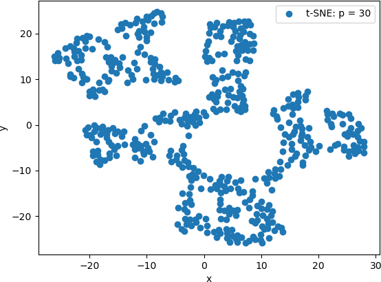
As an alternative approach, t-SNE is applied to the original data, and the transformed points are plotted on a scatter plot. The default perplexity value of 30.0 is used.
## Use t-SNE to embed the 3D points into 2D space.
X_tSNE = TSNE(n_components = 2, init = 'random').fit_transform(X)
As with PCA, the resulting variable is a Numpy array with 500 rows and 2 columns.
>>> type(X_tSNE)
<class 'numpy.ndarray'>
>>> X_tSNE.shape
(500, 2)
The scatter plot can be generated and displayed as follows.
##################################################
## Display the 2D points computed by t-SNE.
##################################################
plt.figure(2)
plt.scatter(X_tSNE[:, 0], X_tSNE[:, 1], label = 't-SNE: p = 30')
## Format the plot.
plt.xlabel('x')
plt.ylabel('y')
plt.legend()
## Display the plot.
plt.show(block = False)
The resulting scatter plot is shown below.
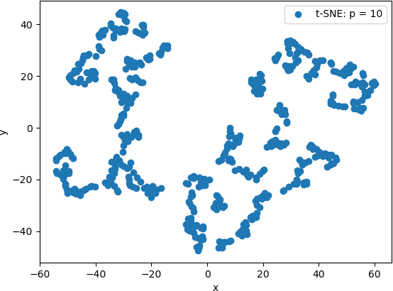
T-SNE is then applied to original data with a perplexity value of 10.
## Use t-SNE to embed the 3D points into 2D space.
p = 10
X_tSNE = TSNE(n_components = 2, perplexity = p, init = 'random').fit_transform(X)
The resulting 2D points are displayed in the same way as above. The 2D scatter plot is shown below.
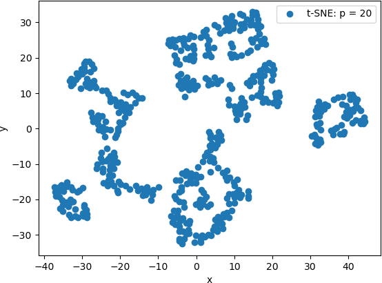
The 2D scatter plot of the 2D points generated by t-SNE with a perplexity value of 20 is shown below.
Finally, t-SNE was used with a perplexity value of 100. The 2D scatter plot is shown below.
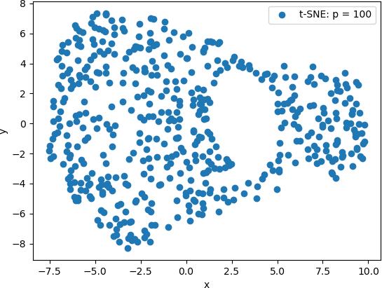
From these scatter plots, it can be observed that while PCA projected the “spiral” shape of the original Swiss Roll data onto 2D, t-SNE calculated clusters of similar data points, revealing an underlying structure to the points that is not evident from the original 3D data. Lower perplexity values, such as 10 and 20, produced tightly packed points that tended to form “strings” of 2D points. A perplexity of 30 (the default value in Scikit Learn) produced five clearly distinguishable clusters in which the 2D points were generally evenly distributed throughout the clusters. The high perplexity value, 100 in this example, resulted in two sparse clusters that were connected by two thin “strings” of points. These plots are consistent with lower perplexity values corresponding to each point having fewer neighbours is its general area, which in turn makes the 2D points appear together in “strings”.
This example illustrates the difference in the visualizations of PCA-transformed points and the 3D transformed by t-SNE. It also illustrates the effect of the perplexity hyperparameter on the resulting t-SNE visualizations. However, the latter more clearly suggest that the original 3D data set has an underlying structure. T-SNE provides a technique to explore this structure.
VISUALIZING HIGH DIMENSIONAL CLUSTERS
NOTE: The code for this example is available in the Python script K-Means_tSNE_Example.py.
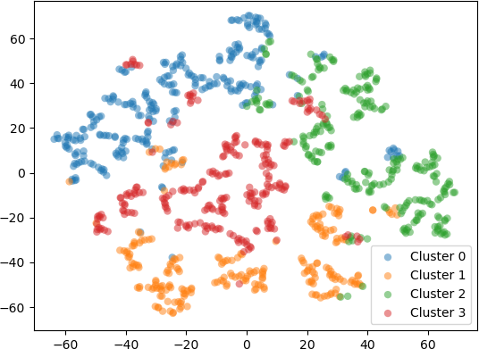
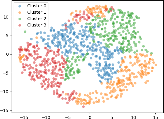
In a second example, 1000 five-dimensional (5D) data were clustered into k = 4 clusters with the k-means algorithm. To visualize the resulting clusters, the 5D data points were embedded into 2D space with t-SNE using different perplexity values. The transformed 2D points were displayed in a scatter plot and coloured according to the cluster label. Setting the perplexity hyperparameter to 10 resulted in points shown in the scatter plot below.
Setting scatter plot of the 2D points produced by t-SNE with the perplexity hyperparameter set to 30 is shown below.
Setting scatter plot of the 2D points produced by t-SNE with the perplexity hyperparameter set to 50 is shown below.
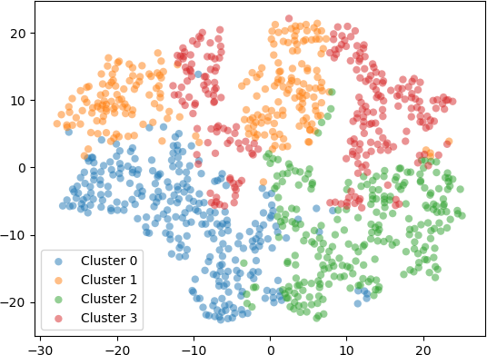
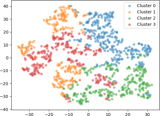
Finally, setting the perplexity hyperparameter to 100 resulted in the 2D embedding shown in the scatter plot below.
EXAMPLE: AN ALTERNATIVE DATA-DRIVEN COUNTRY MAP
The t-SNE algorithm is utilized in a web-based interactive visualization of a country map based on social and political statistical measures. The distances between the countries in the visualization, as well as the clusters that are generate, indicate the similarities and differences between countries. The map is generated from t-SNE computations performed “on-the-fly”. Countries are grouped together – or separated – based on various statistics for each country, including population, gross domestic product, the GINI index indicating the degree of inequality in the distribution of wealth and income for a particular country, and the Happy Planet Index indicating human well-being and environmental factors. Each country is represented by a dot with various characteristics and labeled with the name of the country. The clusters of dots generated by running the t-SNE algorithm represent country groupings, and the distances between the dots represent the distances in the statistical measures between the countries. The user interface for this web-based visualization provides many features for data exploration and for the visualization layout, including different criteria for assigning colours (e.g., by region, GDP, employment, government spending, etc.) and for the size of each dot (e.g., population, surface area, GINI index, health expenditures, etc.), as well as other interactive features. A useful feature of the visualization is the information presented to the user. The web site also displays “Understanding the Data” information, and states that “t-SNE clusters similar countries together, but it doesn’t tell you what makes them similar. That’s what you have to figure out by yourself, which can uncover unexpected connections.” This statement underscores one of the main benefits of t-SNE: it is a powerful data exploration tool that not only facilitates the discovery of hidden connections and relationships, but also points beyond itself to areas that require further exploration and investigation with other statistical, computational, or visualization tools.
CONCLUSION
From this example and the preceding one, it can be seen that t-SNE is a useful technique to visualize high dimensional data. In the first example, PCA and t-SNE with different perplexity values were applied to 3D points from a test data set, and the resulting transform 2D points were visualized. The results showed that PCA projected the 3D points onto 2D, preserving the overall shape of the data set. However, t-SNE revealed an underlying structure in the data, indicated by separate “clusters” of 2D points. These clusters were most evident when the perplexity value was set to 30. In the second example, 5D points were clustered with k-means. The 5D data points were embedded into 2D with t-SNE and displayed on a scatter plot, with each 2D point coloured according to the cluster to which it belongs. The results generally indicate that t-SNE provides a good indication of the clusters, especially for perplexity values of 30, 50, and 100. However, with increasing perplexity, the points tended to group together more, as expected, due to increased number of neighbours for each point (corresponding to the higher perplexity values).
In digital humanities research, it is important to utilize a variety of tools to explore complex, high dimensional data. T-SNE is useful for digital humanists in developing an intuition into their own complex data (Wattenberg et al., 2016). Both PCA and t-SNE are useful tools for visualizing these data, and for assessing clustering.
EXERCISE
The code for the second example described above is available in the Python script kMeans_tSNE_Example.py. Study this code and experiment with it. Change the number of dimensions and the number of clusters, as well as the perplexity values for t-SNE. Use the PCA code in Example 1 to compare the t-SNE results with those obtained with PCA. Explain whether the results are the same or different and offer some explanations for this similarity or dissimilarity.
