Text Analysis with K-Means Clustering
INTRODUCTION
In this section, an implementation of text analysis with the k-means clustering algorithm in Python is illustrated with a small corpus of works of Greco-Roman authors. The implementation is based on the example Clustering with Scikit-Learn in Python by Thomas Jurczyk on the Programming Historian website. Visualizations of this algorithm in Matplotlib and the Plotly plotting library in Python will also be discussed.
Recall that k-means clustering is an unsupervised machine learning algorithm that assigns multi-dimensional data to one of k different clusters (labeling each sample, or data point) by minimizing the distances between data within the same cluster, known as intra-cluster distance. Although the algorithm is unsupervised, the user selects k, the number of clusters.
A brief synopsis of the algorithm follows. Suppose that n D-dimensional samples are to be clustered into k clusters. The algorithm begins by randomly assigning each sample to one of the k clusters. This step is usually performed so that the number of points assigned to each cluster is as uniform as possible, although some advanced approaches may employ alternative methods to initially assign cluster labels. Based on this initial assignment, the k centroids are computed, usually as the mean of each individual dimensions (i.e., a cluster of 4-D data will have a 4-D centroid consisting of 4 scalar values) of the points assigned to each cluster. For example, assume that n = 12, D = 2, and k = 3 clusters are required. The following Python code illustrates these steps.
>>> ## Demonstration of initial assignment to clusters and computing centroids.
>>> n = 12
>>> D = 2
>>> k = 3
## Generate n normally-distributed D-D data points with zero mean and unit standard deviation. >>> X = np.random.normal(loc = 0, scale = 1.0, size = (n, D))
>>> X = np.random.normal(loc = 0, scale = 1.0, size = (n, D))
>>> X
array([[-0.71112356, -1.87523809],
[ 0.50418298, 0.0806559 ],
[ 0.24195205, -0.2529071 ],
[ 0.38992053, 0.99104302],
[-1.23610191, -0.84809575],
[ 1.3736631 , -0.63269857],
[-0.2932828 , 0.90753583],
[-0.25139405, 0.18523016],
[ 0.62077347, 0.93040127],
[ 0.78964679, 0.45251141],
[ 0.3839797 , 1.37691636],
[ 0.41352913, 2.22360301]])
>>> ## Randomly assign each of the n D-D points to a cluster label 1, 2, ..., k.
>>> label = np.random.randint(low = 0, high = k, size = n)
>>> label
array([0, 0, 1, 1, 2, 1, 1, 2, 1, 0, 1, 0])
>>> ## Initialize k centroids.
>>> Xcentroid = np.zeros((k, D))
>>> ## For clarity, compute the k centroids of each cluster in a loop.
>>> for ik in range(0, k):
indx = np.argwhere(label == ik)
Xk = X[indx]
Xcentroid[ik] = np.mean(Xk, axis = 0)
>>> Xcentroid
array([[ 0.24905883, 0.22038306],
[ 0.45283434, 0.5533818 ],
[-0.74374798, -0.3314328 ]])
The next step is computing the distance from each of the n samples to the k centroids, usually using a standard metric, such as the Euclidean distance, or 2-norm (although other distance metrics can be alternatively used). Each of the n samples are reassigned to (relabeled with) the cluster to whose centroid the point is closest. It is possible that not every point will require a reassignment.
>>> ## Initialize distances between each of the n data points and each of the k clusters.
>>> Xdist = np.zeros((n, k))
>>> ## Calculate the Euclidean distances.
>>> for ik in range(0, k):
Xdist[:, ik] = np.linalg.norm(X - Xcentroid[ik], axis = 1)
>>> Xdist
array([[2.30512 , 2.69313806, 1.54414998],
[0.29088143, 0.47550653, 1.31421032],
[0.47334351, 0.83341054, 0.98882295],
[0.7834276 , 0.44216003, 1.74188018],
[1.82957629, 2.19468562, 0.71368971],
[1.41155341, 1.50156993, 2.13873578],
[0.87539327, 0.82590306, 1.31831792],
[0.50168597, 0.79465292, 0.71368971],
[0.80143474, 0.41273143, 1.85853276],
[0.58831871, 0.35159274, 1.72216957],
[1.16437662, 0.82640797, 2.04700429],
[2.00996036, 1.67068363, 2.80490611]])
>>> ## Reassign labels based on the minimum distance.
>>> label = np.argmin(Xdist, axis = 1)
>>> label
array([2, 0, 0, 1, 2, 0, 1, 0, 1, 1, 1, 1], dtype=int32)
From this example, it seen that the cluster labels for the n samples were updated from the initial cluster labels [0, 0, 1, 1, 2, 1, 1, 2, 1, 0, 1, 0] to [2, 0, 0, 1, 2, 0, 1, 0, 1, 1, 1, 1]. Seven samples, points 0, 2, 5, 6, 7, 9, and 11, were reassigned.
After the reassignment step is complete, the centroids are re-calculated. The distances from each of the n points (whose coordinates do not change) to the cluster centroids (that are updated in each iteration of the algorithm) are subsequently recomputed.
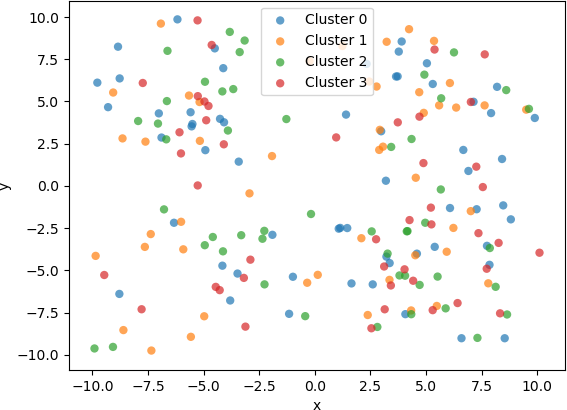
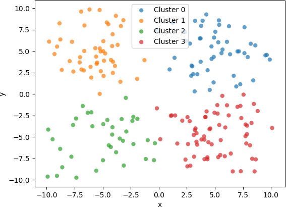
The entire process for is demonstrated and illustrated for clustering 200 2D samples into 3 clusters. That is, n = 200, D = 2, and k = 3. The final clustering results will be displayed with Matplotlib. Assume that these points are already available.
## Seed the random number generator for reproducibility.
np.random.seed(20)
## Number of D-D data points....
n = 200
## Number of dimensions....
D = 2
## Number of clusters....
k = 4
The next section of code sets the parameters needed for the algorithm, and randomly assigns cluster labels to samples.
#####################################################
##
## Set the parameters and initialize.
##
######################################################
## Randomly assign each of the n D-D points to a cluster label 1, 2, ..., k.
label = np.random.randint(low = 0, high = k, size = n)
## Make a copy for later comparisons.
label_init = np.copy(label)
## Maximum budget of iterations.
MAX_ITERS = 1000
## Convergence is declared if there are no changes in the labels for a specified number of iterations.
N_itersNoChange = 8
## Counter.
itersNoChange = 0
## 'iter' is a reserved word in Python.
iters = 0
## Initialize k centroids.
Xcentroid = np.zeros((k, D))
The k-means algorithm is now run iteratively until convergence criteria have been reached. In this implementation, convergence is declared if the cluster labels have not changed for a user-specified number of iterations, or if the maximum budget of iterations has been expended.
########################################################################
##
## Main k-means algorithm loop.
## Convergence is declared if the cluster labels have not changed
## for 'itersNoChange' iterations, or if the maximum budget of
## iterations has been expended.
##
########################################################################
while ((itersNoChange < N_itersNoChange) and (iters < MAX_ITERS)):
## For clarity, compute the k centroids of each cluster in a loop.
for ik in range(0, k):
indx = np.argwhere(label == ik)
Xk = X[indx]
Xcentroid[ik] = np.mean(Xk, axis = 0)
## The next step is computing the distance from each of the n data points
## to the k centroids, usually using a standard metric, such as the
## Euclidean distance, or 2-norm (although other distance metrics can be
## alternatively used). Each of the n data points are reassigned to (relabeled
## with) the cluster to whose centroid the point is closest. It is possible
## that not every point will require a reassignment.
## Initialize distances between each of the n data points and each of
## the k clusters.
Xdist = np.zeros((n, k))
## Calculate the Euclidean distances.
for ik in range(0, k):
Xdist[:, ik] = np.linalg.norm(X - Xcentroid[ik], axis = 1)
## Reassign labels based on the minimum distance.
label_new = np.argmin(Xdist, axis = 1)
## Check whether any of the labels changed. If non changed, update 'itersNoChange'.
## Otherwise, reset it.
if (all(label == label_new)):
itersNoChange += 1
else:
itersNoChange = 0
## The new labels are stored.
label = np.copy(label_new)
## Next iteration....
iters += 1
To improve the readability of the plot, a legend is added. Each sample will be coloured according to its final assigned cluster.
## Initialize a list of cluster labels for displaying the plots.
cluster_label = []
for ik in range(0, k):
cluster_label.append('Cluster ' + str(ik))
For comparison purposes, a plot of the 2D samples coloured with the initial, randomly assigned clusters and a plot of the same samples coloured with the final assigned clusters are displayed below.
Although the implementation of the k-means algorithm shown above works well for clustering low-dimensional (e.g. 2D or 3D) data , there are more advanced implementations that include advanced features that improve performance and accuracy. For instance, the implementation in the Scikit Learn library for Python contains advanced features, including a “smart” initialization technique to hasten convergence and k-means algorithmic variations. For instance, an efficient variation can be used if the data are known to be in well-defined clusters. This implementation also contains methods for setting parameters and for predicting the cluster to which new data belong. Some of its computations are implemented in highly optimized, compiled code, in contrast to interpreted line of code in a Python script. Error conditions and numerical instabilities are also handled. Because of its robustness, efficiency, and encapsulation as a library function, the Scikit Learn k-means implementation will be used in the subsequent example.
CLUSTERING THE WORKS OF ANCIENT AUTHORS
In this example, ancient Greco-Roman authors will be grouped into clusters based on features of their literary output. The data that will be used are in the publicly available CSV file DNP_ancient_authors.csv, hosted in GitHub. The file contains information for 238 authors. The columns consist of an integer index starting at 0, author name, and eight features (attributes or fields): word count, and numbers of modern translations, known works, manuscripts, early editions, early translations, modern editions, and commentaries. The data are easily handled with in a data frame. As usual, the Numpy library (for numerical functions) and Pandas (for data frame handling) are imported.
import numpy as np
import pandas as pd
The data are read from the CSV file into a data frame, with the “authors” column used as an index.
filePath = 'File Path. . . '
fileName = 'DNP_ancient_authors.csv'
fnameIn = filePath + fileName
## Read the CSV file into a data frame, using the first column ('authors')
## as the index.
df_authors = pd.read_csv(fnameIn, index_col = 'authors').drop(columns=['Unnamed: 0'])
The means and standard deviations of the data in each column can be calculated.
## Obtain the means (mu) and standard deviations (sigma) of all the data columns.
MU = np.mean(df_authors, axis = 0)
SIGMA = np.std(df_authors, axis = 0)
## Results:
##>>> MU
##word_count 904.441176
##modern_translations 12.970588
##known_works 4.735294
##manuscripts 4.512605
##early_editions 5.823529
##early_translations 4.794118
##modern_editions 10.399160
##commentaries 3.815126
##dtype: float64
##>>> SIGMA
##word_count 802.696995
##modern_translations 16.518235
##known_works 6.770029
##manuscripts 4.627949
##early_editions 4.241942
##early_translations 6.667654
##modern_editions 11.627821
##commentaries 6.998759
##dtype: float64
For subsequent statistical processing, the data are normalized to zero mean and unit standard deviation by calculating the z-scores for each feature. Library functions are supplied for this normalization (e.g. the standard scaler in sklearn.preprocessing). However, z-scores can be calculated in a straightforward manner, and the results are stored in the same format as the original data as shown below. Note that the resulting Zscore is a data frame with the same columns as the original data, df_authors.
## The data stored as a dataframe facilitates calculating the z-score.
Zscore = (df_authors - MU) / SIGMA
The clustering can now proceed with these normalized values. However, an important question is what features to use of the eight that are available. In his lesson from The Programming Historian referenced above, T. Juraczyk used a sophisticated procedure to explore the features, determining that three features are particularly relevant: known works, commentaries, and modern editions. Consequently, a feature list is constructed from these three features from the standardized z-scores in the new data frame.
#########################################################################
##
## After some exploration of the features, it is determined that three
## features are particularly relevant (see T. Juraczyk for a full
## explanation of how these features were determined):
##
## known_works
## commentaries
## modern_editions
##
#########################################################################
## Make a list of the three relevant features, and extract them from Zscore.
featureList1 = ['known_works', 'commentaries', 'modern_editions']
AUTHORS1 = Zscore[featureList1]
In the following example, the data will be grouped into five (5) clusters; i.e., k = 5. The k-means algorithm implemented in Scikit Learn is applied to the data frame containing the z-score values for the three features. First, the required libraries are imported.
from sklearn.cluster import KMeans # K-means clustering....
from sklearn.decomposition import PCA # Dimensionality reduction with PCA....
## For generating silouhette plots....
from sklearn.metrics import silhouette_samples, silhouette_score
## For plotting....
import matplotlib.pyplot as plt
import plotly.express as px
## For colourmaps....
from matplotlib import cm
The number of clusters is set to 5, and the k-means algorithm is run. After the cluster labels have been calculated, they are added to the data frame to as strings facilitate visualization of the discrete valued labels. In the next line, the authors’ names are added to the data frame as indices.
## Select the number of clusters.
K = 5
## Run the k-means algorithm to generate the cluster labels.
kmeans = KMeans(n_clusters = K, random_state = 0).fit(AUTHORS1)
label1 = kmeans.predict(AUTHORS1)
## Add the labels to the data frame.
AUTHORS1 = AUTHORS1.assign(label = label1.astype(str))
## Add the authors from the index to the data frame so that it appears as data.
AUTHORS1['author'] = pd.Series(AUTHORS1.index, index = AUTHORS1.index)
As there are three features, their z-scores can be displayed with a 3D plot. In this case, a 3D scatter plot in Plotly is used. To make the plot more informative, the word count is added to the data frame to enhance the 3D scatter plot visualization. The word count is indicated by the size of the individual markers, enabling the user to intuitively assess the word count for each individual author, even though the word count was not used as a clustering feature. In addition, the authors’ names are displayed as hover text when the user interacts with the plot.
## Add the word count as an indicator.
AUTHORS1 = AUTHORS1.assign(word_count = df_authors['word_count'])
The Plotly 3D scatter plot is then generated, modified, and displayed.
## Generate an interactive plot with Plotly.
fig = px.scatter_3d(AUTHORS1,
x = featureList1[0],
y = featureList1[1],
z = featureList1[2],
color = 'label',
opacity = 0.5,
size = 'word_count',
hover_data = ['author'],
)
## Modify the layout.
## Replace underscores ("_") in the labels with spaces
## (e.g. 'known_works' becomes 'known works'), and reduce the font size.
fig.update_layout(scene = dict(xaxis_title = featureList1[0].replace('_', ' '),
yaxis_title = featureList1[1].replace('_', ' '),
zaxis_title = featureList1[2].replace('_', ' '),
),
font = dict(family = 'Arial', size = 8),
)
## Display the figure.
fig.show()
The resulting 3D scatter plot is shown below, after minor panning and rotation to make all the components of the figure visible. Note that in this example, the cluster labels are simply the cluster numbers, and therefore are not inherently ordered. Alternative label names can be assigned, if needed.
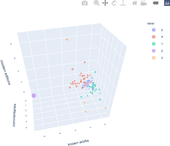
This interactive plot can be zoomed, and additional information about a specific sample is displayed as hover text when the user hovers over that point.
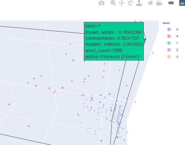
This interactive plot can be zoomed, and additional information about a specific sample is displayed as hover text when the user hovers over that point.
Using the framework presented in this example, users may explore different combinations of features by extracting them from the original data frame and re-running the analysis. For instance, the use may want to investigate whether adding ‘manuscripts’ as a feature results in different clusters.
## Add number of manuscripts to the feature list.
featureList2 = ['known_works', 'commentaries', 'modern_editions', 'manuscripts']
## Create a data frame from the feature list.
AUTHORS2 = Zscore[featureList2]
## Perform k-means clustering and obtain the cluster labels.
kmeans = KMeans(n_clusters = K, random_state = 0).fit(AUTHORS2)
label2 = kmeans.predict(AUTHORS2)
## Add the labels to the data frame.
AUTHORS2 = AUTHORS2.assign(label = label2.astype(str))
## Add the authors from the index to the dataframe so that it appears as data.
AUTHORS2['author'] = pd.Series(AUTHORS2.index, index = AUTHORS2.index)
Different values of k may also be used. The interpretation of these plots is dependent on the researcher’s specific questions, such as the features that best separate groups of authors or whether the clusters calculated by the algorithm relate to other historical, geographical, or literary factors extrinsic to the features studied here. In other words, computational tools provide the means of analyzing and visualizing data, but the most important part of the research consists of using these computational results and integrating them into human domain knowledge to gain new insights and to make new discoveries.
CLUSTERING ANALYSIS WITH SILHOUETTE PLOTS
Cluster analysis can also be assessed statistically, and is not limited to simply visualizing the points, or transformations of the points, on scatter plots. Recall that the goal of clustering is to minimize the intra-cluster distance (all samples in the cluster are tightly “packed” into a cluster, measured by a distance metric, such as Euclidean distance) and to maximize inter-cluster distance (distinct clusters are separated by a high value of the distance metric). During the clustering process, samples are assigned to the closest cluster. However, it is also beneficial to assess the distance of that point from other cluster centres to investigate intra-cluster distance. To perform this assessment, metrics, known as silhouette coefficients (or silhouette values), are calculated from these distances, and the subsequent analysis is facilitated by visualizing the coefficients in silhouette plots. Silhouette coefficients assume values from -1 to 1, where a value of 1 for a particular sample in a particular cluster indicates that the sample is far from the other clusters, which is the optimal situation. For a particular sample a silhouette coefficient of zero indicates that the sample is on the boundary of neighbouring clusters, and negative values indicate that the cluster assignment for that sample may be incorrect. The Scikit Learn library contains functions to compute silhouette coefficients.
The function silhouette_samples() from sklearn.metrics is parameterized by the original data and the cluster labels, and returns the silhouette coefficient for each sample, ranging from -1 to 1. The overall silhouette score, which is the mean of all silhouette coefficients returned by silhouette_samples(), is obtained with silhouette_score(), and is also parameterized by the original data and cluster labels. Alternately, the mean of the coefficient values returned from silhouette_samples()can be calculated.
The silhouette coefficients are normally displayed with special visualizations known as silhouette plots, which have some similarities to horizontal bar charts. All samples are grouped according to their cluster and sorted. The sorted silhouette values for each cluster, 0, 1, …, k – 1, are then displayed on the vertical axis. Usually the silhouette score (mean of all silhouette coefficients) is also indicated. Silhouette plots convey useful information about the clustering. The density (size) of the clusters is indicated by their span (thickness) on the vertical axis. In this way, the researcher can assess how uniform the sizes are, or, alternately, whether most of the data was assigned to a small number of clusters. It can also be determined whether any clusters have no data, possibly indicating that k was chosen to be too high. It may also indicate that the selected feature set on which to cluster does not result in separation of the data into clusters. A large number of negative values may indicate that an alternative clustering approach should be used, that the set of features should be adjusted, or that the data are not conducive to clustering. A large number of silhouette coefficients below the silhouette score also may be indicative of an incorrect number of clusters, a sub-optimal feature set selected by the user or a sub-optimal choice of clustering algorithm and/or parameters. It may also suggest that the data per se do not exist in definable clusters.
Silhouette analysis is illustrated with the data for Greco-Roman authors used in the example above. Silhouette coefficients for the feature set consisting of known works, commentaries, and modern editions are calculated with the silhouette_samples() function in the Scikit Learn library.
sample_silhouette_values1 = silhouette_samples(AUTHORS1[featureList1], label1)
The function returns a set of n silhouette coefficients, where n indicates the number of samples. Some basic statistics are also calculated. In this example, k = 5, as was the case in the example above.
>>> type(sample_silhouette_values1)
<class 'numpy.ndarray'>
>>> len(sample_silhouette_values1)
238
>>> max(sample_silhouette_values1)
0.7955939411329257
>>> min(sample_silhouette_values1)
-0.15434785729045564
>>> np.mean(sample_silhouette_values1)
0.548239495330005
>>> np.std(sample_silhouette_values1)
0.25930208374480884
As can be seen, the minimum silhouette coefficient has a negative value. The mean value is slightly above 0.5. Recall that values close to 1 are considered favourable. The fraction of negative values and fraction of values greater than 0.5 are also calculated in a straightforward manner.
>>> sum(sample_silhouette_values1 < 0) / len(sample_silhouette_values1)
0.05042016806722689
>>> sum(sample_silhouette_values1 > 0.5) / len(sample_silhouette_values1)
0.6134453781512605
The silhouette score can also be obtained.
>>> silhouette_score(AUTHORS1[featureList1], label1)
0.548239495330005
As expected, the silhouette score is the mean of the n silhouette coefficients (n = 238 in this example). Clusters are grouped on the vertical axis, and the silhouette score for each sample in each cluster is indicated as a length along the horizontal axis.
The silhouette plot is generated from the silhouette coefficients. For each cluster 0, 1, …, k – 1, the samples assigned to that cluster are found, and subsequently sorted. For a specific cluster, the sorted silhouette values for the samples belonging to that cluster are displayed with the Matplotlib fill_between() function, which fills an area between two horizontal curves (see Here). The filled area is placed on the part of the plot allocated to that particular cluster. As stated earlier, the “thickness” of the filled area indicates the density of that cluster, or the number of points that belong to it. To facilitate assessing the clusters with respect to the overall silhouette score, a dashed black vertical line positioned at the value of the silhouette score is displayed. Additionally, each cluster is distinctly coloured. The function to generate the silhouette plot is shown below, and is adapted from the code presented in Selecting the number of clusters with silhouette analysis on KMeans clustering.
Recall that the colour maps are enabled from Matplotlib with the following code:
## For colourmaps....
from matplotlib import cm
The function to create the silhouette plots, silhouettePlot(), is shown below, based on this code. The function is parameterized by the number of clusters k, the original data samples, and the cluster labels assigned by the k-means algorithm.
##################################################
##
## SILHOUETTE PLOT....
##
## Reference:
## https://scikit-learn.org/stable/auto_examples/cluster/plot_kmeans_silhouette_analysis.html#sphx-glr-download-auto-examples-cluster-plot-kmeans-silhouette-analysis-py
##
##################################################
def silhouettePlot(K, X, cluster_labels):
# Create a subplot with 1 row and 2 columns
fig, ax1 = plt.subplots()
ax1.set_xlim([-0.1, 1])
# The (K + 1) * 10 is for inserting blank space between silhouette
# plots of individual clusters to demarcate them clearly.
ax1.set_ylim([0, len(X) + (K + 1) * 10])
# Compute the silhouette scores.
sample_silhouette_values = silhouette_samples(X, cluster_labels)
# The silhouette_score calcuates the mean silhouette value for all samples,
# providing a perspective into the density and separation of the resulting
# clusters.
silhouette_avg = silhouette_score(X, cluster_labels)
y_lower = 10
for i in range(K):
# Aggregate the silhouette scores for samples belonging to
# cluster i, and sort them.
ith_cluster_silhouette_values = sample_silhouette_values[cluster_labels == i]
ith_cluster_silhouette_values.sort()
size_cluster_i = ith_cluster_silhouette_values.shape[0]
y_upper = y_lower + size_cluster_i
## Define the colour based on the spectral colormap.
colour = cm.nipy_spectral(float(i) / K)
ax1.fill_betweenx(
np.arange(y_lower, y_upper),
0,
ith_cluster_silhouette_values,
facecolor = colour,
edgecolor = colour,
alpha = 0.7,
)
# Label the silhouette plots with their cluster numbers at the middle.
ax1.text(-0.05, y_lower + 0.5 * size_cluster_i, str(i))
# Compute the new y_lower for next plot.
y_lower = y_upper + 10 # 10 for the 0 samples
## Format the silhouette plot.
ax1.set_xlabel('Silhouette Coefficient Values')
ax1.set_ylabel('Cluster Label')
## Vertical line for average silhouette score of all the values
ax1.axvline(x = silhouette_avg, color= 'black', linestyle = '--')
ax1.set_yticks([]) # Clear the yaxis labels / ticks
ax1.set_xticks([-0.1, 0, 0.2, 0.4, 0.6, 0.8, 1])
## Display the plot.
plt.show(block = False)
The silhouette plots for the two feature lists (known works, commentaries, modern editions) and (known works, commentaries, modern editions, manuscripts) for k = 2, 3, 4, 5, 6 can be generated in a loop. The display of the plots is handled by the silhouettePlot() function. The example below calculates the silhouette coefficients and silhouette plots for the feature set (known works, commentaries, modern editions), with the code for setting the larger feature set (known works, commentaries, modern editions, manuscripts) commented. For simplicity, the data frames are assigned to the variable X so that the same loop can be run for any number of feature sets.
# Reset AUTHORS for silhouette analysis.
## First set of features (featureList1).
AUTHORS1 = Zscore[featureList1]
X = AUTHORS1
## Second set of features (featureList2).
## AUTHORS2 = Zscore[featureList2]
## X = AUTHORS2
Krange = [2, 3, 4, 5, 6]
for K in Krange:
## Perform k-means on the author features.
kmeans = KMeans(n_clusters = K, random_state = 0).fit(X)
label = kmeans.predict(X)
## Generate the silhouette plot.
silhouettePlot(K, X, label)
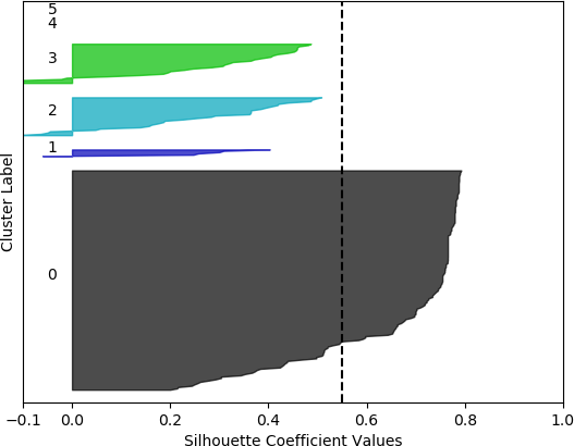
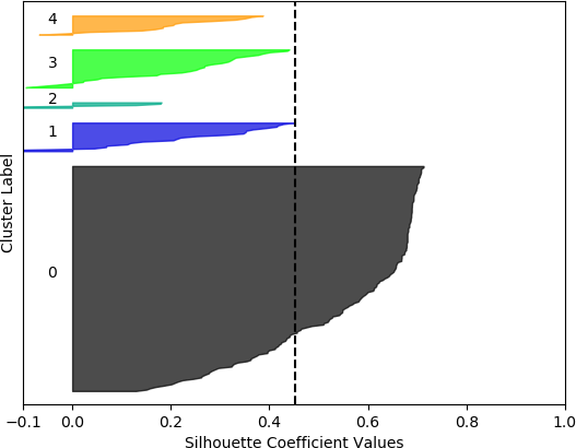
The resulting plots are shown below for the first feature set (known works, commentaries, modern editions).
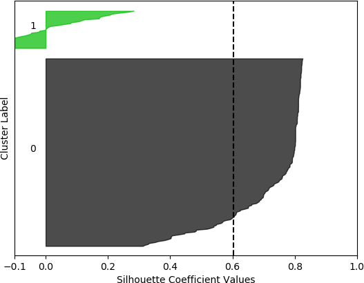
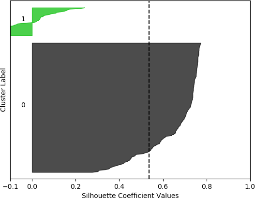
k = 2, silhouette score = 0.602940232120834
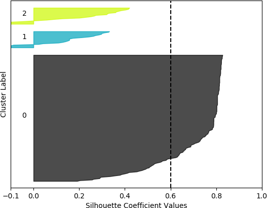
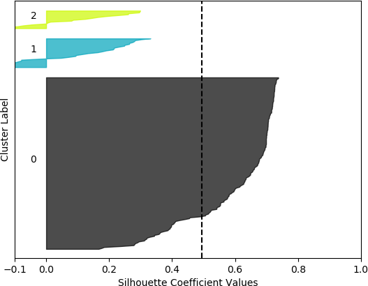
k = 3, silhouette score = 0.6013875131605194
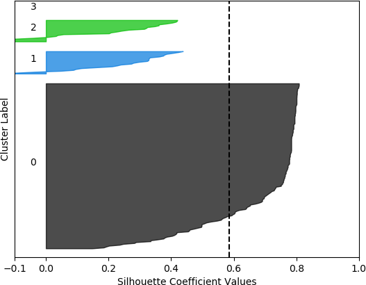
k = 4, silhouette score = 0.5863398368271572
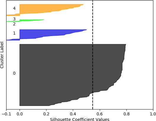
k = 5, silhouette score = 0.548239495330005
k = 6, silhouette score = 0.5495611146851107
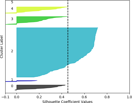
The plots for the second feature set (known works, commentaries, modern editions, manuscripts) are shown below.
k = 2, silhouette score = 0.5354387533555555
k = 3, silhouette score = 0.4939714304247195
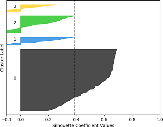
k = 4, silhouette score = 0.39006806025967555
k = 5, silhouette score = 0.4532517658822373
k = 6, silhouette score = 0.45381720358334243
Cluster 0 ranges from slightly less than 0 to slightly over 0.4.
Cluster 1 ranges from less than -0.1 to slightly less than 0.2.
Clusters 3 and 4 range from less than -0.1 to about 0.45.
Cluster 5 contain no data points. The vertical dashed line denotes the silhouette score of approximately 0.45.
From these plots, it can be seen that the best cluster results were obtained with the larger feature set (known works, commentaries, modern editions, manuscripts) with k = 5 clusters. For both feature sets, using k = 6 clusters did not improve performance, as only 5 clusters were identified. That is, no samples were in the sixth cluster. Although none of the samples in four out of the five clusters for k = 5 and the larger feature set had silhouette coefficient values greater than 0.5, the values for this configuration were generally higher than for the other configurations.
However, when the silhouette scores are examined, it is seen that these scores are generally higher for the first, smaller set of features. In fact, the highest score was obtained for k = 2 clusters. In this, case, it could not be assumed that this is the best configuration, as one cluster is much denser than the other cluster, which contains very few samples. The other silhouette plots for the smaller feature set also indicate that one cluster is generally overrepresented. In this sense, the analysis becomes more difficult, and more advanced statistical methods are needed to assess which feature set and number of clusters is preferable for this data set. This analysis, however, is beyond the scope of the current discussion. For the present purposes, and assessing all the plots, it may be surmised that, in general, k = 5 clusters with the larger feature set results in all five clusters having at least some samples, and the distribution of the samples into clusters is somewhat more uniform than in the other cases, although one cluster is still much denser than the others. The silhouette score is also slightly below 0.5. Two of the clusters (clusters 2 and 3 in the plot) have relatively high values (although lower than 0.5), and each cluster (with the exception of cluster 2) has a very small ratio of negative values.
For this example, the analysis is difficult because the silhouette plots do not indicate an obvious choice of feature set or number of clusters. However, as in the case of most humanities research, and, in fact, analysis of real-world data in general, the data are not conducive to facile, obvious, and straightforward conclusions. In a real situation such as this one, the researcher would conduct further statistical analyses and apply alternative visualizations, as suggested earlier. Even in these cases, however, the insights, knowledge, and domain knowledge of the scholar are of paramount importance, as evidenced by this example.
In subsequent sections, one such further analysis will be described. The example in this section will be revisited in the context of visualizing the clustering results of 3D and 4D samples (the two feature sets in this case) with 2D plots. For this task, the fundamental concepts of principal component analysis (PCA) will be introduced.
