Information Visualization in the Humanities
INFORMATION VISUALIZATION AND REDUCTION
Visualization is a mapping between discrete data and a visual representation of that discrete data (Manovich, 2011). Since the latter part of the 1700s, visualization has been formulated as representing data with abstract graphics primitives, known as vector graphics. It was in the 19th century that most of the standard visualization and plotting techniques that are still widely used today were developed. Line graphs, bar charts, pie charts, etc., all employ geometric primitives such as lines (line graphs), rectangles and boxes (bar charts), sectors of circles (pie charts and the more recent sunburst plots), points (scatter plots), glyphs (small pictorial symbols) and combinations of these primitives.
Heat maps are simply visualizations of 2D matrices or arrays, consisting of a square or rectangular grid of rows and columns, where the value of each element at the intersection of a row and column is represented in some way, usually by a colour on a colour scale corresponding to the possible values in the matrix. Consequently, information visualization can be defined as a mapping from abstract, mathematical modalities to a visual, or image modality (Manovich, 2011). Information visualizations currently in use generally continue to employ these mappings of data to geometric primitives, but with use of advanced algorithms and their implementation in software, larger data sets can be visualized, animation can be introduced to show how data changes over time, and interactive features enable users to manipulate visualizations. In all these cases, however, information visualization is inherently reductive. Graphical primitives represent complex objects and relationships. This reduction is necessary for visualizations to reveal structures, trends, patterns, and anomalies in data through these primitives. However, in any reductive process, much information is lost. Most of what is in the data is discarded for the sake of discovering patterns in the small amount that is not discarded.
Information visualizations also privilege spatial relationships. Line graphs, for instance, are interpreted by variations in the lines connecting data points. Scatter plots are interpreted through the spatial relationships between the “dot” graphical primitive. Bar charts are interpreted by a geometric measure of the size of the bars. Pie charts display different-sized sectors to represent proportions. Even more recent network visualizations are essentially graphs, which are essentially spatial. Heat maps are not obviously spatial, as patterns are discerned in the colouring of the elements. However, interpreting these colours requires locating elements spatially by their row(s) and column(s). Patterns of colour and the various contours and shapes on the heatmap reveal patterns and anomalies, and in that sense, heatmaps can also be considered to have a strong spatial component. In all these cases, space and spatial relationships and arrangements, or the spatial layout, comprise the mode in which viewers understand these visualizations. One reason for this privileging of space is that those who create visualisations are influenced by human visual perception, which also privileges spatial arrangements in a scene over other visual features, such as colour, texture, etc. Therefore, it is thought that the dominance of space is simply a reflection of humans’ cognitive processes. As spatial arrangements are used to represent the most important dimensions of the data, other visual features can be used for secondary, less important dimensions. In a scatter plot, for instance, the dots can be coloured or sized according to some dimension. In line graphs, different variables may be displayed on the same plot and coloured differently, or have different markers, line widths, or line styles, to represent less important dimensions. Examples of using non-spatial features of geometric primitives were illustrated in previous sections using Matplotlib and Plotly. However, in these examples, both 2D and 3D, spatial relationships were reserved for the most important dimension of the data being visualized.
In many software-enabled visualizations, and in those demonstrated in previous sections, colour played an important, yet secondary role. However, taking a larger view of information visualization, colour did not play a prominent role. In fact, in most visualizations, colour was not considered to be vitally important. Technological limitations were part of the reason for the relative unimportance of colour. This was the case even in the visual arts. Chinese “ink and wash painting” did not use colour. Black ink was used to represent contrasts between contours in an object, along with their spatial arrangements and brushstroke styles. In the few instances where colour was employed in visualizations in the 1800s and up until and including the 20th century, it was mainly reserved for discrete dimensions, or for categorical variables or dimensions. Colour only became a prominent visualization characteristic in the 1990s, when computer technology and display monitors facilitated its use, as well as the employment of texture, tone, opacity (translucency, or transparency), and other non-spatial visual features.
Consequently, the use of spatial arrangements and graphical primitives to represent data is generally a reductive process. Such reduction poses challenges especially for humanities scholars, whose data is generally non-numeric, qualitative, and textual. Standard information visualization techniques are widely understood in all scholarly communities and are and will continue to be the predominant tool for analyzing statistical data and any object that can be represented quantitatively. However, new research into information visualization is focusing on new ways to visualize data – particularly in the humanities – that are less reductive, and therefore go beyond the standard use of spatially arranged graphical primitives. Some of these innovations are enabled by advances in computational technology. The computational capabilities and vector graphics provided by the Web, animations, streaming video, advances in graphics technology (graphics cards, programmable graphics processing units, etc.), as well as improvements in algorithms and software, have increased the options for representing data. Virtual reality systems offer ultra-high-resolution graphics and enable real-time user interaction with complex visualizations. Data can now be assigned a large range of continuous values in terms of colour, transparency, texture, and other visual parameters. These non-spatial parameters are now used to represent important data dimensions.
CRITICISM OF INFORMATION VISUALIZATION IN THE HUMANITIES
Although interactive data visualization has been a mainstay tool in the social, biological, physical, and biomedical sciences for decades (an in fact originated in the empirical sciences), it has been unevenly extended to and adopted in the digital humanities. Distant reading and cultural analytics, for instance, emerged because of digital tools. Literary studies, conversely, has not yet been widely influenced by computational methods. Moreover, there has been an uneasiness among humanities scholars concerning the appropriateness of common visualization approaches for their scholarly work (Kleymann & Stange, 2021). The reductive nature of information visualizations – mapping complex data objects onto geometric primitives – has been noted by humanities scholars. Such visualizations are widely used to represent, view, and analyze data in the digital humanities. Standard line graphs, pie charts, bar graphs, and heatmaps for 2D matrix data, all of which are based on graphical primitives, as discussed above, are among the well-known visualization techniques for representing numerical data. However, newer, innovative information visualization approaches are needed to visualize the non-numeric, qualitative data common in the digital humanities. Some humanities scholars consider the widespread adoption of these methods in some areas, most of which have been developed outside the humanities, to contain problematic elements. In a 2011 article, Johanna Drucker, Professor in the Department of Information Studies at the University of California, Los Angeles, criticizes the increased adoption of computational methods by humanities scholars, particularly visualization approaches, that have been developed in other disciplines primarily for scientific applications. She notes that maps generated by geographic information systems (GIS), and types of graphs intended for statistical display “conceals their epistemological biases under a guise of familiarity” (Drucker, 2011). She even refers to information visualization tools as a type of “intellectual Trojan horse” (Drucker, 2011). The main problem, as Drucker sees it, is that what is presented on these plots are thought to self-evidently constitute “unquestioned representations of ‘what is’” (Drucker, 2011). She draws a sharp distinction between observer-independent “data”, which is “given” – that is, observable and recordable, and represented as (sometimes misleading) graphical primitives on graphs, plots, pie charts, etc., and capta, which is actively “taken”, or constructed, and not simply a natural expression of some fact that exists independently of the observer.
In other words, Drucker questions the “mapping” between real world objects, statistics, and concepts and their visual representation as graphical primitives. The observer-independence that characterizes data is not generally (or in a wholesale manner) consonant with observer-codependence of the phenomenon being investigated. The latter denotes investigation and activity that privileges the subjective and partial character of knowledge production, which is fundamental in humanities scholarship. Drucker warns that observer-independent visualizations, tools, and techniques developed by and for those in other disciplines – comprising most of the standard visualization and plotting methods currently in use – conflict with the humanistic method, as the disciplines in which they were developed do not share the same “fundamental epistemological assumptions” (Drucker, 2011). She also states that when “the methods grounded in empirical sciences are put at the service of the social sciences or humanities in a crudely reductive manner, basic principles of critical thought are violated, or at the very least, put too far to the side” (Drucker, 2011). Drucker explains that an observation of a phenomena – in which empirical “data” are created for statistical representation and analysis – is not identical to the phenomena which is observed. In the case of common information visualization approaches, the critical distance is removed between phenomena and their interpretation, and thereby undermining the interpretative stance which underlies the production of humanistic knowledge. These observations correspond to the concerns voiced by Manovich about the reductive nature of most common information visualization approaches (Drucker, 2011).
Drucker offers suggestions on integrating humanistic values with information visualization. She proposes a subjective model, applicable for humanities scholarship, in which treats data as capta. Her proposed model addresses four levels of interpretation or knowledge production:
(1) experience: modelling phenomenological experience;
(2) relationships: modelling and representing the relationships between documents and fields of discourse (for example, dates on diplomatic documents during World War II need to be understood differently than documents from later years that refer to those dates);
(3) spatio-temporality: notions of space and time need to be modelled in documents used in the humanities, such as narratives; and
(4) performative quality: the interpretation of any or all the preceding characteristics also needs to be modelled.
To illustrate her points, Drucker refers to the well-known visualization of Dr. John Snow, who created a chart that led to the discovery of the Broad Street Pump as the source of a cholera outbreak in 1854. She proposes enhancing the original dot symbols (standard graphical primitives) used on the original with additional layers that express the individuality and lives of the persons affected, such as “profile, age, size, health, economic potential, family and social roles”, because an indication these features, representing an individual life, are not identical to or reductive to each other (Drucker, 2011). She concludes with the observation: “We have a very long way to go in creating graphical expressions that serve humanistic interpretation” (Drucker, 2011).
In a response to Drucker’s proposals, Denison University humanities analytics scholar Matthew Lavin argued against replacing “data” with “capta”, at least in terminology. Instead, he proposes a revised and expanded etymology for “data” and suggests concepts of situated data as alternatives to capta (Lavin, 2021). In situated data analysis, scholars analyze not only data, but the processes by which the data were generated (or constructed), framed, processed, and presented for different audiences and for different purposes. Situated data analysis is based on the idea that data are always partial and situated, and tools need to be provided to allow scholars to analyze how these data are situated, and the effects of being situated. Situated data analysis focuses on information visualizations, which are representations of data for human consumption, and algorithmic operations on data that are performed computationally (Rettberg, 2020). Situated data models are particularly useful in studying social phenomena, such as relationships in social media applications. It can also be used to address some of the concerns of humanists regarding the reductive nature of information visualizations. Lavin urges humanities scholars to openly and critically discuss crucial concepts related to the paradigms of data-driven inquiry, which are becoming increasingly predominant in humanities research. This critical discussion includes practices that contextualize and situate data. Lavin strongly agrees with Drucker that data should not be thought of as self-evident or straightforwardly objective. Instead, it needs to be recognized that social constructions are always in the foreground, thereby inflecting and pervading metrics and measures used in information visualization that are normally considered to be neutral. With this new sense of situated data, Lavin proposes that students study the etymology of the word “data” to better understand the nuances of what data actually entail. He concludes that the term “data” is still meaningful for humanists, and that concepts of situated data should be emphasized over capta.
DIRECT VISUALIZATION
As suggested above, intuitive and comprehensible textual information, visual representations of non-spatial variables, and additional layers to personalize data and to impart further information are proposed to enhance the humanistic value of information visualizations. Complementary to these improvements, representations of the actual objects themselves that are being analyzed can also be part of the visualization, in a paradigm known as direct visualization (Manovich, 2011). In direct visualization, objects that are normally “reduced” to graphical primitives are used “directly”, in their original (or somewhat modified or transformed) form. This type of visualization does not generally employ vector graphics – graphical primitives such as lines, circles, etc. – that form the basis of almost all the graphing techniques since many of them were first developed in the 1800s. In many cases, the data themselves are already visual. In cultural and new media studies, objects as diverse as texts, film frames, imagery, and magazine covers can be reformulated into innovative visual representations without the reduction inherent in representing data with graphical primitives. In this way, direct visualizations do not use the standard principal of information visualization wherein the most important dimensions in the data are mapped to spatial variables. Direct visualization can therefore be considered as “visualisation without reduction” (Manovich, 2011).
Incorporating the actual visual media itself into a visualization instead of representing them by graphical primitives facilitates and enhances knowledge discovery. In addition to patterns, anomalies, and trends being revealed (as is the case with information visualization based on vector graphics), scholars are assisted in discovering the meaning or causes of these patterns, and in discovering further patterns and gaining additional insights. Direct visualizations are not intended to fully replace standard visualizations, but provide an alternative enabled by new media capacities, computational and visualization technology, and algorithmic advances.
Direct visualization is particularly relevant for the humanities. In media studies, museum studies, GLAM (Galleries, Libraries, Archives, and Museums), and cultural institutions, the potential of visualization is being realized. For instance, the exhibition of cultural artefacts is enhanced by visualization capabilities. Interactive and immersive augmented reality and virtual reality displays and exhibits are increasingly being adopted as research and pedagogical tools (Szabo, 2018). Furthermore, the focus of most humanities scholarship is on cultural texts in a variety of forms, such as literature, poems, works of art, musical compositions and scores, and architecture. As artifacts of the “computer revolution” and widespread permeation of the Internet and Web into people’s consciousness, computer games, procedurally generated art (art created in part through computational methods and algorithms) and interactive environments are also new forms of media of interest to humanities scholars, underscoring one of the most important differences between humanities data and more traditional, scientific data. In the humanities, artifacts are used to investigate trends and patterns, whereas in scientific settings, data are used to formulate laws and models (Manovich, 2011).
EXAMPLES OF DIRECT VISUALIZATION
A project named “TimeLine” [http://manovich.net/index.php/exhibitions/timeline] illustrates the concept of direct visualization. TimeLine is a high-resolution visualization of all 4535 covers of Time magazine published from 1923 to 2009. The project was created by Lev Manovich and Jeremy Douglass, and employed specially developed custom software. The project has been exhibited at the Graphic Design Museum in Breda, the Netherlands in 2010 as part of the “Shaping Time” exhibit, and (with William Huber) at Gallery Calit2 in La Jolla, California as the “Mapping Time: Visualization of Temporal Patterns in Media and Art” exhibit in 2010. This visualization can be studied to identify interesting patterns and trends in the magazine covers.
“Anna Karenina”, another visualization project led by Lev Manovich, leverages computational advances to open new possibilities for visualizing patterns in cultural artifacts, specifically in the print media that predates computers. A book index can also be considered as a visualization technique. The number of lines for concepts or names in a book in an index is indicative of the importance of that entry in the book, and therefore enables the reader to quickly identify these important entries. In an example of a direct visualization of textual content, a visualization of the complete text of Tolstoy’s novel Anna Karenina was created. Its motivation was the common reading practice of underlining or otherwise highlighting important lines and passages in a text. The visualization was created with a custom program that read the text from a file and re-arranges it into a visual series of columns from top to bottom, left to right. The columns are rendered as a single image, where specific words in the text are highlighted. For instance, the text is searched for occurrences of the word “Anna”, and the matches are highlighted. The purpose is to allow researchers to quickly identify patterns and trends, possibly followed by closer analysis.
HERMENEUTIC VISUALIZATION
A large component of humanities scholarship, and one that is crucially important in interpretive processes in literary studies (hermeneutics), consists of annotation, comparison and representation. Although tools are available for these three activities, they do not directly enable or assist hermeneutic investigations. Because interactive data visualizations convey information in an easily accessible form and assist users in making sense out of data, they can potentially be employed to complement human cognitive abilities to facilitate hermeneutic processes, especially if the data can be presented in multiple ways. For instance, annotations combined with visualizations convey qualitative information for hermeneutic investigations.
Some digital humanists argue that visualization can support interpretative activities and allows new perspectives that move beyond strictly text based hermeneutic practices to emerge.
The need for hermeneutic visualization is underscored by the deficiencies perceived by some humanities scholars in which processing, transformations, and manipulation of data is emphasized to the detriment of human agency and interpretation. Specifically, many standard visualizations are open to misinterpretation, and, in the worst case, are treated as real objects, instead of simply as faithful representations of those real objects.
Efforts have been undertaken to address this need. For instance, a web-based prototype was proposed for visualizing hermeneutic exploration of textual meaning and for assisting in the construction of arguments about texts (two essential activities in literary studies). The system, named “Stereoscope”, enables scholars to represent digital annotations with a variety of interactive visualizations to assist them in qualitative thinking about the texts. The ability to generate multiple visualizations and perspectives is key. The visualizations, used in conjunction tags and other annotations, provides scholars with insights needed to formulate scholarly arguments about literary works, and to covey these arguments to the wider scholarly community (Kleymann & Stange, 2021). Stereoscope is part of “The Three-Dimensional Dynamic Data Visualisation and Exploration for Digital Humanities Research” project, or 3DH. 3DH is a large, international research project funded by the Ministry for Science and Research in Hamburg, Germany. Johanna Drucker is an associate member of this work.
The interface for the Stereoscope system was designed to facilitate hermeneutic practices. The annotated text that is being analyzed is shown in the left column. The different visualizations and layouts that represent the annotated text are shown in the centre canvas. Annotations are represented as circles and are coupled with the text shown on the right. The graphical primitives in the centre and text in the left panel change in appearance whenever either is modified by the user. In addition, the qualitative attributes of annotations can be changed and recorded by interacting with and manipulating the visualizations. The right column is the control panel for creating and managing the different visualizations and the interaction with the annotations. Constructing and conveying argumentation is facilitated through assigning comments and tags to visualizations (Kleymann & Stange, 2021).
The web-based system has experimental features in development that allows users to supply their won annotations, or to annotate texts with a freely available textual analysis tool that exports the annotations as a JSON (JavaScript Object Notation) file for subsequent import into Stereoscope.
As part of the 3DH research project, Stereoscope aims to investigate visualizations that respect hermeneutic premises of interpretative activity and that support this activity. The work focuses on guidelines for designing hermeneutic visualizations based on the premises of hermeneutic theory (Kleymann & Stange, 2021) (also see Stereoscope and ThreeDH.net).
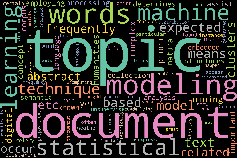
IMPLEMENTING A DIRECT VISUALIZATION – WORD CLOUDS
Word clouds, or tag clouds are a well-known example of direct visualization. Flickr started using these visualizations in 2005, which are now displayed on a large number of web sites. Word clouds are visualization of the most common words in a text, displayed in a font size corresponding to their occurrence frequency in the text. Word clouds are direct visualizations, as the words themselves are part of the visualization in a way that indicates their frequency. They can also be considered as media visualisations, in which actual media objects – in this case, words from text – or components of them are used to generate the visualization.
These frequencies are not mapped on to graphics primitives, as would be the case with using bar charts labeled with the word.
Although word clouds have become very popular as direct visualizations, and convey important information quickly and intuitively to the analyst, they do not replace standard visualizations, such as the aforementioned bar charts, but rather should be used in a complementary manner with other analysis and visualization techniques. For instance, if frequencies of important words are all in the same narrow range, bar charts may be easier to interpret than word clouds.
The Python code to generate this word cloud visualization is described below. This example is based on the web article “Simple Word Cloud in Python”.
## Import packages....
## For plotting....
import matplotlib.pyplot as plt
## For calculating the word cloud....
from wordcloud import WordCloud, STOPWORDS
Next, the text is defined. This text can either be read from a file, placed inline (in the Python program or script itself), or it can be obtained from web scraping. In this example, the following text is placed inline in the Python script. The text is an excerpt from the section on topic modeling. For simplicity, the double quotes have been removed manually so that the text can be assigned to a string variable in a straightforward manner.
Topic modeling is an important, yet complex concept in text mining in the digital humanities, employing techniques from machine learning and natural language processing. A topic model is a statistical model that determines topics in a corpus or other document collection. The topics are not known a priori. These topics assist in the analysis of semantic structures that embedded in text. Topic modeling, like k-means clustering, is an unsupervised machine learning technique based on the premise that certain words or terms are expected to frequently appear in documents about a particular topic. For instance, rain, snow, and wind would be expected to occur frequently in documents related to weather, whereas onion, kale, and celery would often be found in documents about vegetables. Common words, such as conjunctions, prepositions, etc., and words not directly related to the topic (e.g. happen, great, thought, etc.) may occur with equal frequency in both sets of documents. This underlying idea of topic modeling is expressed mathematically by computing statistical measures on the words in the documents, which ultimately enables topics to be discovered, and the distribution of the topics throughout the documents analyzed. Technically, as a statistical modeling technique based on machine learning, topic modeling generates clusters of similar words, and therefore the topics are abstract. In this sense, the topics are analogous to the abstract clusters produced by the k-means algorithm.
If the text were obtained from web scraping function, such as those provided in the Wikipedia Python library, additional cleaning of the text may be necessary. For example, if text surrounded with “==” (e.g. “== Biography ==”) indicates header information, then that set of symbols can be removed through regular expressions. First, the re library for regular expressions is imported, followed by removing all occurrences of “==”. Specifically, they are replaced with the empty string.
## For regular expressions used for parsing the input text....
import re
text = re.sub(r'==.*?==+', '', text)
Next, new line characters are replaced with the empty string.
text = text.replace('\n', '')
The word cloud is then generated with various parameters that can be modified by the user. The size of the word cloud is defined. A randomization state is set for reproducibility. The background colour and colour map are set. Note that because qualitative, non-continuous information is displayed, a qualitative colour map – Set2 in this example – is appropriate (see Colormaps). Stop words that are not to be included in the word cloud are also specified. The word cloud is generated by invoking (running) the generate() function on the WordCloud class imported above. The generate() function is parameterized by the text. Invoking this function performs all the necessary computations, and generates the word cloud image.
# Generate the word cloud.
wordcloud = WordCloud(width = 3000, height = 2000,
random_state = 1,
background_color = 'black',
colormap = 'Set2',
collocations = False,
stopwords = STOPWORDS).generate(text)
The final step consists of displaying the word cloud. The Matplotlib plotting library is used for this purpose.
## Display the word cloud image.
plt.imshow(wordcloud)
# No axis details are needed.
plt.axis('off')
## Display the plot....
plt.show(block = False)
EXERCISE
Generate and display a word cloud using text of your choosing. The text should be of sufficient length so that the text can be analyzed with the resulting word cloud. The exact size or size range depends on the text, but one heuristic that can be used is that the text should contain at least 200 words. To determine the number of words properly, tokenization should be performed. However, for a quick indication, the split() function can be used on the text, which returns a list of the words that are separated by a delimiter specified by the user. The default (using the function with no parameters) uses any white space character as a delimiter. The length of the list provides an indication of the number of words in the text. For example, the number of words can be determined for the text above by combining the length function with the split function.
>>> len(text.split())
227
From your word cloud, perform a basic visual text analysis to determine the most “important” words. Do these words correspond with your intuition regarding the text that you chose? Why or why not?
