3.1 Working With Graphics
An Overview of Graphics
Before getting into details on creating, formatting, and incorporating graphics, consider the types and their functions.
Graphics should never be for decoration. Instead, they should have a clear purpose and help the reader to understand something in the document that would be difficult to show with text alone. For that reason, you should take some extra steps to help your audience use the graphic effectively.
You can use graphics to represent the following elements in your writing:
- Objects — If you are describing a fuel-injection system, you will probably need a drawing or diagram of it. If you are explaining how to graft a fruit tree, you’ll need some illustrations of how that is done. Photographs, drawings, diagrams, maps, and schematics are the types of graphics that show objects.
- Numbers — If you are discussing the rising cost of housing in Vancouver, you could use a table with the columns being for five-year periods since 1970; the rows could be for different types of housing. You could show the same data in the form of bar charts, pie charts, or line graphs. Tables, bar charts, pie charts, and line graphs are some of the principal ways to show numerical data.
- Concepts — If you want to show how your company is organized, such as the relationships of the different departments and officials, you could set up an organization chart (boxes and circles connected with lines showing how everything is hierarchically arranged and related). This would be an example of a graphic for a concept; this type depicts nonphysical, conceptual things and their relationships.
- Words — Graphics can be used to depict words. You’ve probably noticed how some textbooks may put key definitions in a box, maybe with different colour in the background. The same can be done with key points or extended examples.
Pick The Right Graphic For Your Purpose
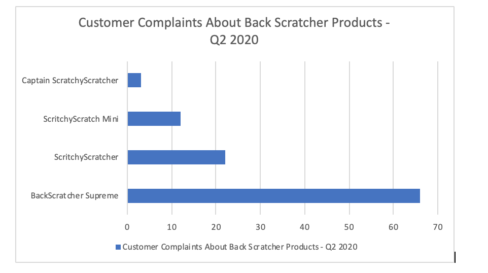
Different graphics have different functions, so you should choose one that meets your needs. For example, let’s say you have been asked to write a report recommending whether your company should voluntarily recall a product. You might insert a photo of the damaged product so that your readers can see proof that the damage is extensive. You might also include a diagram of the product to help the reader understand why the malfunction occurs. If you want your reader to understand that the product has been receiving a lot of customer complaints, you might create a bar chart that compares the number of complaints received by your product to those of similar products you sell.
When selecting a chart, graph or table, pick the one that fits the relationship you are trying to show. For example, if you wanted to show how something changed over time, you’d use a line graph. If you wanted to compare different numbers, you’d use a bar graph. If you wanted to show the percentages of a whole, you’d use a pie chart.
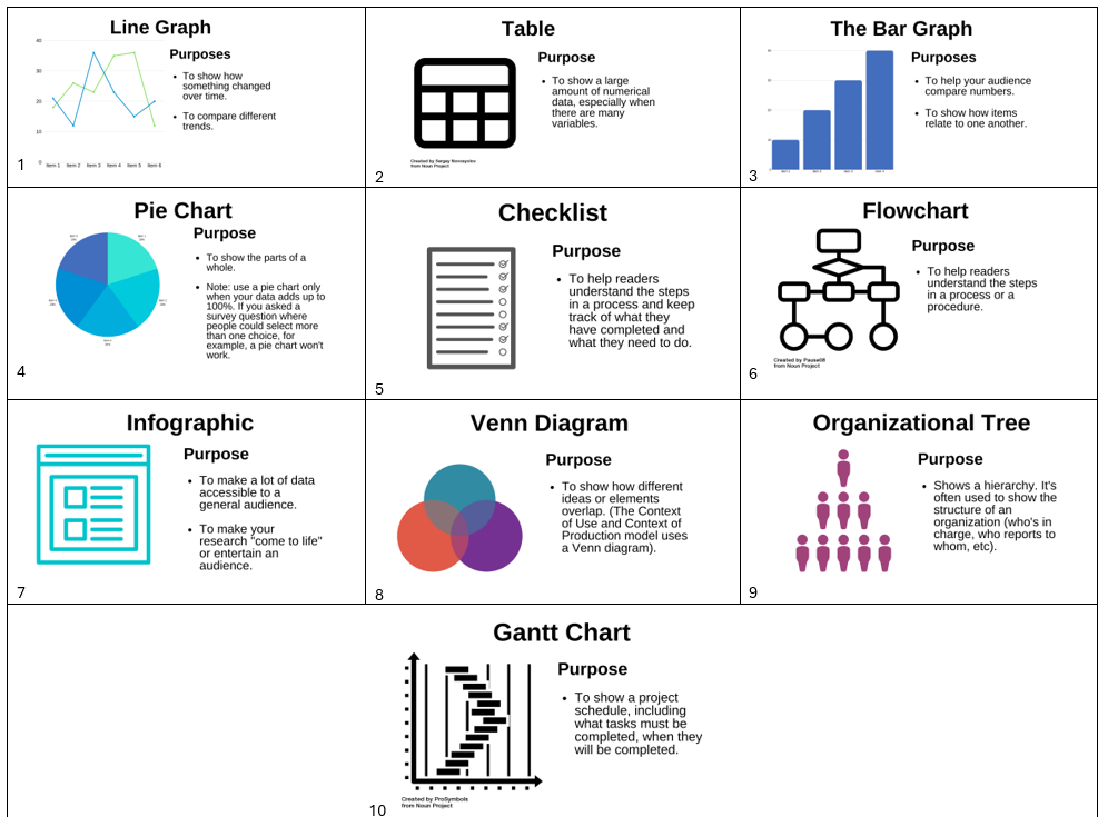
This collection of images will help you to see some popular types of charts and graphs.
Consider: Types of Charts and Graphs
Types of charts and graphs – Text version

- Line Graph: The line graph shows how something has changed over time and shows trends. You can also use it to compare different trends.
- Table: Use tables to show a large amount of numerical data, especially if there are many variables.
- Bar Graph: Use a bar graph to help your audience compare numbers and to show how several items relate to one another.
- Pie chart: Use a pie chart to show parts of a whole. Make sure that when you use a pie chart, your data adds up to 100%. If you allowed people to select multiple survey options, for example, a pie chart won’t be effective.
- Checklist: Use a checklist to help readers understand the steps in a procedure and keep track of their progress.
- Flowchart: Use a flow chart to help readers understand the steps in a process or procedure.
- Infographic: Use an infographic to make a lot of data accessible to a general audience.
- Venn Diagram: Use a Venn Diagram to show how different ideas or elements overlap. Note: The Context of Use/ Context of Production model uses a Venn diagram.
- Organizational tree: The Organizational Tree shows a hierarchy. It’s often used to show the structure of an organization.
- Gantt Chart:The Gantt chart is used to show a project schedule, including what tasks need to be completed and when they should be completed by.
Activity source: Adapted from 14.4: Working With Graphics In Advanced Professional Communication , CC BY-NC-SA 4.0. / Extracted from H5P to improve user experience/print/PDF
Make Your Graphic
Once you understand your audience and the purpose of your graphic, it’s time to create it. Many people create charts in Excel, Word, Google Docs, or a free chart generator. Make sure that you label your chart clearly.
Integrate Your Graphic
You chose your graphic because it shows a relationship, but without additional help your readers might not see the same connections you see. Insert your graphic close to the text that discusses it, though you should make sure that your graphic fits on one page. For example, if you have written a paragraph explaining that the defective product has three times more customer complaints than similar products, you would put the bar graph that shows this data directly below.
The first mention of a graphic is called a lead-in statement. It’s also recommended to use a lead-out statement after the graphic. This is a statement that connects the figure to the material that follows.
Example
Our research shows that the BackScratcher Supreme received three times more complaints than our other backscratchers. This bar graph shows the number of customer complaints we received last quarter for each product.

As you can see, no other back scratcher comes close for the number of complaints. This suggests that the matter is systemic and that there haven’t been just a few isolated incidents.
Label The Graphic
Add Alt Text for the Graphic
Cite the Graphic
Just as you would cite and reference a paraphrase or a direct quote, you must also cite and reference any graphics that you use that were created by someone else or that were based on someone else’s data. Indicate the source of any graphic or data you have borrowed. Whenever you borrow a graphic or data from some other source, document that fact in the figure title using an in-text citation. You should also include the reference information in the reference list.
This reference guide from SFU tells you how to cite graphs, charts, photos and other images in a variety of settings.
Creating Accessible Graphics
Graphics are a key way to persuade and inform your audience, so you’ll want to make sure that everyone can benefit from them. If you haven’t written accessible text for your photos, for example, someone using a screen reader couldn’t understand them. Choosing the wrong colour palette would make it hard for someone who is colourblind (or who is viewing the material in black and white) to understand your graphics. Choosing a colour that has a negative association in another culture might also give readers a negative impression of your graphics.
Karwai Pun, who works for the U.K. Home Office, has created a series of posters to show how to design accessible graphics. You’ll notice that a lot of the advice works for all users. Take a moment to scroll through these graphics and see how you can apply what you’ve learned when creating charts and graphs in the rest of the chapter.
Consider: Designing Accessible Graphics
Designing Accessible Graphics – Text version
Designing for Users With Dyslexia
Do
- use images and diagrams to support text
- align text to the left and keep a consistent layout
- consider producing materials in other formats (for example, audio and video)
- keep content short, clear and simple
- let users change the contrast between background and text.
Don’t
- use blocks of heavy text
- underline words
- use italics or write in capitals
- force users to remember things from previous pages – give reminders and prompts
- rely on accurate spelling, use autocorrect or provide suggestions
- put too much information on page.
Designing For Deaf and Hard of Hearing Users
Do
- write in plain English
- use subtitles or provide transcripts for video
- use a linear, logical layout
- break up content with sub-headings, images and videos
- let users ask for their preferred communication support when booking appointments
Don’t
- use complicated words or figures of speech
- put content in audio or video only
- make complex layouts and menus
- make users read long blocks of content
- make the telephone the only means of contact for users.
Designing For Users With Mobility Issues
Do
- make large clickable actions
- give form fields space
- design for keyboard or speech only
- use design with mobile and touch screen in mind
- provide shortcuts
Don’t
- demand precision
- bunch interactions together
- make dynamic content that requires a lot of mouse movement
- have short time out windows
- tire users with lots of typing and scrolling.
Designing For Users With Low Vision
Do
- use good contrasts and a readable font size
- publish all information on web pages (HTML)
- use a combination of colour, shapes and text
- follow a linear, logical layout -and ensure text flows and is visible when text is magnified to 200%
- put buttons and notifications in context
Don’t
- use low colour contrasts and small font size
- bury information in downloads
- only use colour to convey meaning
- spread content all over a page
- separate actions from their context
Designing For Users Who Use Screen Readers
Do
- describe images and provide transcripts for video
- follow a linear, logical layout structure content using HTML5
- build for keyboard use only
- write descriptive links and heading – for example, Contact us
Don’t
- only show information in an image or video
- spread content all over a page
- rely on text size and placement for structure (use headers)
- force mouse or screen use
- write uninformative links and headings like “click here”
Designing For Users on the Autistic Spectrum
Do
- use simple colours
- write in plain English
- use simple sentences and bullets
- make buttons descriptive – for example, “Attach file”
- build simple and consistent layouts
Don’t
- use bright contrasting colours
- use figures of speech and idioms
- create a wall of text
- make buttons vague and unpredictable (click here)
- build complex and cluttered layouts.
This Dos And Don’ts Of Designing Accessible Services page also contains plain text versions of the posters.
Attribution & References
Except where otherwise noted, this page has been adapted from 14.2: Types of Graphics and 14.4: Working With Graphics In Advanced Professional Communication by Melissa Ashman; Arley Cruthers; eCampusOntario; Ontario Business Faculty; and University of Minnesota, CC BY-NC-SA 4.0

