11.3 Creating and Organizing Web Content
Options for making websites
Websites are everywhere! In fact, you’re on a website right now. The world wide web opened up the internet and for a long time it has been a space where people can create their own content. But how do you go about making a website?
There are many ways in which you can create a website, from learning how to code it from scratch and then getting a domain and hosting, to using a service that allows you to create a website using a simple editor and customisable sections.
 Tip
Tip
If you want to learn how to code websites, then starting with HTML and CSS to understand the structure and style of the web is very useful. If you’re looking for other options where you don’t need to write any code, then Google Sites is good, and there are many other website services like WordPress and Squarespace. Coding Practical Guide: HTML and CSS is another great resource for learning about these building blocks.
What makes a good website?
Consider different websites that you’ve visited recently. Can you think of a good example of a site and outline why you think it’s effective?

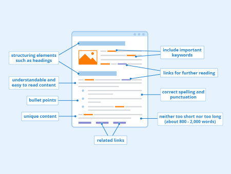
Features of good websites
Structure
Websites are made up of pages that link to other pages.Think about the “journey” users will take through the site. This may include tables of contents or “back to homepage” buttons.
Navigation
Navigation bars are crucial for allowing people to get around your site.
Icons
Icons communicate things to the user. Use them as short hands for buttons or diagrams.
Branding
Might sound like a horrible term, but it just means what kind of “vibe” you want to have. Think colours, fonts, styles, images…
Fonts
The font you choose can indicate the style of your website. Choose wisely! Some fonts are more readable than others, especially on screens. Font size and spacing are also important to consider the readability of your website.
Text and hyperlinks
It is very useful and helpful to write your written information(text) as clearly and concisely (and with not too many words)as possible as doing this kind of thing may make it easier or less annoying to read your website and help people to actually understand what on earth you might be saying to them.
Designing for users – Universal design
Whether you’re writing code or creating other digital content and applications, you need to think about the users of your program. More importantly, you need to be aware that “users” are not all the same, and design with different needs in mind.
Universal design focuses on designing with everyone in mind from the start, trying to give as many people as possible a good experience with whatever you are creating. It is about using universal design principles to embed flexibility, usability, and reliability into anything digital you create, rather than seeing digital accessibiltiy as an ‘extra’ or something that must be done separately.
From the very start of your design process, you need to be thinking about what the goal of your project is, who it is aimed at, and how they will be using it. You need to get feedback from other people and make sure you take into account other people’s experiences.
You can read more about Designing for Users on the University of York website.
Web code
HTML, or HyperText Markup Language, is the coding language by which the web is structured. These days it is used alongside CSS (Cascading Style Sheets), which controls the appearance of the page content.
You will often find guides and tutorials to HTML and CSS together as they work together to display web pages in your web browser.
There’s a third part of a web coding trinity in the form of JavaScript, which is a scripting language that makes the web interactive. JavaScript interacts with the HTML and CSS on the pages to make websites do things. It is best to know some HTML and CSS before starting with JavaScript.
w3schools is a good place for learning HTML, CSS, and JavaScript, along with other tools for further web development.
Consider: Accessibility and Usability
- Have you ever tried to use a website that didn’t work for you?
- What prevented you from accessing the content on that page?
- What did you in this scenario?
Page organization and Accessibility Features
What good is having a Site if not everyone can access it?
Accessibility on your website is crucial for ensuring a smooth experience for all of your audience. Embracing universal design principles means creating content accessible to everyone, regardless of abilities or disabilities. By incorporating accessibility, you not only adhere to ethical design practices but also broaden the reach and impact of your content.

Heading styles
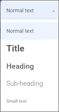
Using heading styles is a fundamental step in enhancing the accessibility of your webpages and website. These styles help organise and structure your content, making it easier for all users to navigate, including those who rely on screen readers. You can change your heading styles when editing text in many HTML editors and Google sites by clicking on the drop down box on the formatting toolbar.
Your web document should start with Heading 1 for the title or page name, and then use Heading 2, Heading 3, and so on for subheadings to create a clear hierarchy of information.
Alt text & captions
Adding alt text to your images is a critical accessibility feature. Alt text provides a brief, descriptive text that conveys the content and purpose of an image. This text is read aloud by screen readers, making visual content accessible to users who cannot see it. Provide a meaningful but concise description for your image. This practice ensures that everyone can understand and appreciate the visual elements on your site. Captions can be added in the same way, but are different to alt text. Instead of being hidden away in the background within the code of your Site, Captions are displayed to everyone. This is important if you need to reference images or data, or if you need to provide further context to an image beyond its visuals. You can find more guidance from us on how to add alt text and good practice when doing so in this Alt Text Guide.
Colour contrast
Maintaining proper colour contrast is essential to ensure that your site is accessible to individuals with visual impairments. Inadequate contrast levels between your text and background colours can pose significant challenges to many. You can use tools like WhoCanUse to check your site’s colours for accessibility. This tool helps you identify colour combinations that might be difficult for some users to distinguish by assigning scores to different font & background colour combinations.
Captions on embedded videos
Including captions on embedded videos is another crucial step for accessibility. Captions provide a textual representation of the audio content in videos, allowing individuals with hearing impairments to access the information. Most video hosting platforms, including YouTube, offer tools for adding captions.
Accessible hyperlinks
Creating accessible hyperlinks is about providing clear and informative link text. Rather than using generic phrases like “click here” or “read more”, use descriptive link text that conveys the purpose or destination of the link. This approach benefits users who rely on screen readers, as they can understand the link’s context without having to read surrounding text or a gigantic URL! For instance, instead of “Click here for more information”, you could use “Learn more about our research.” This makes it much clearer what the link leads to rather than a vague promise of “information.”
Website Creation Tools: HTML vs. Editors
Websites are written in code, usually a combination of coding languages. HTML and CSS often form the structure and styling of webpages.You can write websites from scratch using code, or use friendly editing tools that allow you to add and edit elements without any coding.
Some common website creation & hosting tools include:
- Google Sites (free with Gmail/Google account) – see the textbook section on Google sites for a tutorial on how to create a site using this user friendly system, with drag and drop elements
- WordPress (has a free plan but to have a custom domain or better design tools you have to pay)
Your college/university or employer may have specific spaces and tools available for website creation and hosting. In order to ensure you can access your website after leaving your college or university, make sure you sign up for your space (such as Google Sites) using a free personal Google account – you may not have access to your college email address indefinitely.
Attribution & References
Except where otherwise noted, this content is adapted from “Websites: Skills Guide“, “Google Workspace: a Practical Guide“, and “Designing for Users” by University of York, CC BY-NC-SA 4.0

