11.2 Content Strategy & Website Design Interface
Content Strategy
When creating a website, content strategy is a necessary first step. What will the website say? All websites have a specific audience so finding out about what your audience needs, wants and expects from the business is the key to its success. This means web content, as well as design, must be human-centered.
When we build content with a specific strategy for success it also meets search intent, a key component of search engine optimization. Writing effective content focuses on the readability or usability so that the target audience is more likely to get the message you want them to receive, and your website is more likely to achieve its intended purpose.
Donal Miller and Dr. J.J. Peterson (2020) identify some key things to avoid in their book “Marketing Made Simple”:
- “You are using too much insider language
- You are using too many words in the heading
- The call to action buttons use passive language
- The call to action buttons are not repeated down the page
- The images do not relate to the product or back up the words you’re using on the page
- The language is cute or clever but not clear
- The site does not promote a lead generator
- You’re using a slideshow so the text changes too fast a frustrates potential customers
- The site tells your story rather than inviting customers into a story.”
A website should clearly indicate the “problem” the business is trying to solve. This includes what happens when the problem is solved, by using or purchasing the service/product and most importantly how to go about purchasing it.
Designing a website is like designing anything: it requires a clear purpose. Understanding your target audience, writing content and choosing design features that will best achieve your purpose. In essence, you must understand the flow of content and how you can most effectively convey the desired message to that audience.
Search Intent
Interviewing existing customers helps copywriters and business owners better understand what content is expected on the site. Without a direct link to the company’s main stakeholders, the customer, and copy editors may miss the purpose as seen by the audience. If the business is new and there are no “users” to interview, then considerable market research should be completed. What are businesses in the same field doing well, where is their space for excelling and differentiating?
While there will probably be many different types of customers, the main target audience is what the content should be directed towards. Finding this data and separating it into themes is often cost prohibitive, both in-terms of time and money. There is an alternative though, and that is through the use of search intent analysis through search data. Google is the king of search engines with more than 90% of the market share worldwide.
Watch What is Search Intent? Keyword Search Intent Explained For Beginners (7 mins) on YouTube for a concise outline of search intent and keywords.
Video source: Surfside PPC. (2023, March 11). What is search intent? Keyword search intent explained for beginners [Video]. YouTube. https://www.youtube.com/watch?v=83aDlCwmlns
Google’s 4 Types of Search Intent
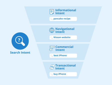
Google uses search intent categories to design its Search Engine Results Pages (SERPs). When researching which terms and categories you should emphasize on a business website, make sure to note that some searches may fall under multiple categories.
This taxonomy was developed by Andrei Broader, back in 2002 when they were the vice president of research at AltaVista. [1].
The categories are summarized below by Rebekah Baggs & Chris Corak, from the book: SEO for Everyone
“Informational. The user wants to learn about a topic. Informational searches might look like:
- “is life insurance tax deductable”
- “how long do running shoes last”
- “income tax brackets”
- “fender jaguar vs jazzmaster”
Transactional. The user wants to take action – to make a purchase, say, or download a product manual. Transactional search intent is not always tied to buying something. Transactional searches might look like:
- “life insurance quotes”
- “fugazi in on the kill taker on vinyl”
- “RACI chart template”
Navigational. With this kind of search, someone wants to go to a specific website or find a specific page (perhaps one they’ve visited before). There’s typically only one destination the searcher is trying to get to. Navigational searches look like:
- “amazon.com”
- “powell books”
- “healthline keo diet”
Google has more recently added:
“Visit-in-person. These searches have local, real-world intent; someone is seeking an in-person experience or a brick-and-motar interaction. Visit-in-person searches look like:
- “Thai restaurants open now”
- “movie times”
- “barber shops”
- “discount tires near me””
Using a search engine can provide you with lots of great content ideas. Break the results into content topics; and don’t forget to go back to the initial search result in Google to see related search queries.
Website Header Space
When someone lands on your website for the first time they first need to determine if they have found the site they were expecting. Having your business name and logo front and centre on your website is a must. Below that the next item of content should be a very short description of what the business does; what services or products they offer, ideally in 5-words or less. This is the main sub-heading.
The main sub-heading is undoubtedly the most important content piece on your website. It ensures users that they are on the right site and that you have the solution for a deep-seeded problem of not enough money, time, status, etc. Do not be overly specific with the main sub-heading: Ensure the broad scope of services and products are included while also indicating how it will solve a real problem in the customers life.
Call to Action
Many business websites fail to clearly define how you can purchase their product or service. The solution: have multiple “call-to-action” buttons throughout the site, specifically on the top-right menu or under the main sub-heading. For example: “Book a free consultation” is a great way to funnel leads to your inbox.
Make your target audience part of your story
When writing content for a website it is important to bring the customer into the story. For example, at SupaDesign we know you are the type of customer who wants to be seen and heard. Your voice matters and will be emphasized throughout the design process. When you position your customers at the heart of the business and show them that you truly understand the problem you are solving for them, you will get much better conversions on your content.
Use Testimonials & Stats to Build Authority
Using testimonials on your site helps builds reputation and authority. Interview your customers, or draft a testimonial of a conversation or sentiment they have expressed from you for their approval. Having at least 3 testimonials on your website helps build authority but also shows the humanistic-side of the business.
Statistics have the effect of giving fast authority. For example, 100+ satisfied customers, $100,000s of dollars saved. Even adding the number of years you have been in business will add authority to the content.
Smart Interface Design
Websites should be unique, content-driven and show a clear business purpose. Coming up with a new solution for design issues can be very time consuming. Smart design patterns allow us to ask the right questions of our website layout to ensure maximum cross-cultural usability.
The guidelines below have been curated through usability sessions, design iterations and A/B testing. Before we dive into patterns, we want our website to be usable by all and that starts with adhering to website accessibility standards.
Website Accessibility Standards
An Introduction to Web Accessibility outlines patterns you must implement when designing a website to make sure the site works for everyone.
Review the Tips for Getting Started and pay close attention to the requirement for alternative text on media, as it is a requirement for all images that are non-decorative. A decorative image does not add value to the content and is seen more as a placeholder on the site to ensure consistent flow of the page layout.
Layout patterns
Navigation
Besides being consistently stylized across all pages on your website, your navigation should also have the following features:
- Customizing the style of your navigation can dramatically make your website more user-friendly. Add a “home” button/link and set the logo as a link which returns home. On the left-most side of your menu, people will usually look for a way to get back to your homepage. This link is often called “home”, is the businesses logo or the name of the business.
- Navigation items look like a button/link. All links in your navigation should look like a link rather than plain text. WordPress.com will stylize your navigation to stand-out, however, using a specific colour pallet will ensure that your navigation links/buttons have sufficient contrast and “pop” when compared to the content on the rest of the page, is a must.
- Add a hover effect. People often read the web by moving their cursor over the content. When they go to click on a navigation link with their cursor, as opposed to tapping with a finger/thumb, the link is expected to change to indicate that you will be taken to another page.
Active White Space
Are there any glaringly large empty spaces on your pages? Are any of the images touching directly next to text? If so you need to think about “white” space on your page. For example, images should usually have some margin around them to prevent text from touching the side.
Active white space is used to create eye-catching space between components on your web page to make them easy to read and aesthetically appealing.
Too much white space leaves the layout looking plain and empty. Placing a decorative image in that space may enhance the layout and a non-decorative image may add value to the content.
Form layout
Every business website should have a contact form to make it easy for individuals to contact the business.
Forms are tricky but there are a few key patterns to follow:
- For complex forms, not typically of contact forms, break down the form into tasks (i.e. name and personal details, then order of relevant information)
- Put the tasks in a sensible order and use verbs to describe them (i.e. Shipping information)
- Tell users what they need before they start (i.e. documents, time)
- Make the submit button large enough and close enough to the form that it is easy to find.
Strategy, Usability and Style
In the article How To Evaluate A Websites Design?, Hardingham (2020) pays particular attention to the Strategy, Usability and Style, which are relevant to knowing if your website is effective, or not.
Attribution & References
Except where otherwise noted, this page is adapted from 3.1 KEY CONCEPT: Content Strategy and 3.3 Website Design Interface and Patterns In Maintaining an Online Presence by Julia Grav, Camosun College, CC BY 4.0
References
Baggs, R. & Corak, C. (2021). SEO for Everyone. A Book Apart.
Hardingham, A. (2020 August 31). How to evaluate a websites design?. https://www.rivmedia.co.uk/how-to-evaluate-a-websites-design/8486
Miller, D. & Peterson, J. (2020) Marketing Made Simple. HarperCollins Leadership.
W3C. (n.d.). Introduction to Web Accessibility. https://www.w3.org/WAI/fundamentals/accessibility-intro
W3C. (n.d.). Designing for Web Accessibility. https://www.w3.org/WAI/tips/designing/
- https://www.cis.upenn.edu/~nenkova/Courses/cis430/p3-broder.pdf ↵
