3.4 Colour Theory
Colour Theory in Context
Colour is used in so many aspects of our lives – in the objects and environments that we see all around us every day, our clothes, homes, art and design creations, and digital media like photography, videos, games and websites.
This chapter explains the colour systems used in mixing and creating colour in both digital media, such as images, videos, websites, and physical materials, such as printing, paint pigments, and dyes.
Consider
- What colours do you find calming?
- Are there colours that you find energizing?
- How could you use such preferences to enhance your designs?
Additive and Subtractive Colour
Additive colour works by mixing colours of light. The more colours of light you add together, the closer you get to white light. It is the opposite of the colour spectrum, where white light is refracted (broken up) into a rainbow of colours.
Subtractive colour involves mixing physical materials like paint pigments, printing inks, and dyes. The more colour materials you mix, the darker the colour gets. It’s called ‘subtractive’ because of the absorption or subtraction of certain wavelengths from white light. This absorption is based on how different atoms behave when light hits them.
Understanding the difference between additive and subtractive colour can help you when working with different kinds of materials and digital media. Learn more about each of the following topics in the OER Colour Theory: Understanding and Working with Colour:
- Additive and subtractive colour
- Additive and subtractive colours on the colour wheel
- How additive and subtractive colour works when printing a digital image
Colour systems: digital
Digital colour systems are used by visual creation tools, such as apps for image editing and illustration, digital photography and video, interactive objects like games and websites, online media, 3D, and extended reality environments (XR) (including Augmented Reality and Virtual Reality).
These colour systems and their terminology have become industry standards and part of the knowledge base required for any digital media creator. This section explains some of the technical terms commonly used and how these systems work.
Learn more about each of the following topics in the OER Colour Theory: Understanding and Working with Colour:
- Colour spaces or gamuts
- How digital screens display colour
- What is Hexadecimal colour?
- Other RGB colour models
- How do digital images and videos display colour?
Colour systems: printing
Colour printing requires a range of different methods for printing all kinds of imagery onto different kinds of materials. This includes photographic imagery, artwork, publications, and graphic, industrial, fashion, and textile design products.
Understanding how subtractive colour systems work, how inks, pigments and materials behave in printing processes, and how to achieve effects like metallic and fluorescent colours or gloss and embossed finishes requires special skill and expertise.
Learn more about how different colours are produced for the printing process including Process (CMYK+) and Spot (Pantone) colour in the OER Colour Theory: Understanding and Working with Colour:
- Do I need to convert an RGB image to CMYK to print it?
- Process (CMYK+) and Spot (Pantone) colour printing
- Colour management – what can go wrong?
Colour systems: pigments and dyes
The development, mixing and use of pigments and dyes throughout history, across all cultures, is an important part of understanding colour theory. From early human use of natural pigments made from ochres in the earth to synthetic colours developed in science labs, there are many interesting stories behind the colours we know and use today.
Learn more about the history and development of colour materials and how they are used in creative practice in the following sections from the OER Colour Theory: Understanding and Working with Colour:
- Colour pigments: history and usage
- Mixing paint pigments
- Colour dyes: a (very) short history of dyes from around the world
- Colour dyes: methods and processes
- Colour dyes: synthetic colours and sustainability
- Special colours, controversial colours and interesting facts
- Problematic colours
Colour wheels and relationships
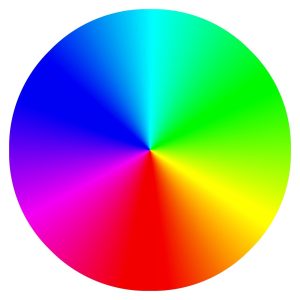
Colour wheels have been used for hundreds of years as a method of working with colour – to understand mixing colour, creating colour palettes and relationships, and selecting colour in software applications.
Many early colour wheels used the RYB (Red, Yellow, Blue) primaries alongside secondary and tertiary colours in a wheel, but today, with digital technologies influencing how we create works that use colour, it is accepted that the additive colour primaries (RGB) (or CMY for subtractive colour) are the standard used in software applications as screen-based media work with additive colour (pixels are made of light).
Learn more about an interactive colour wheel and information about colour relationships, schemes, properties and colour systems used in creative industries in the following sections from the OER Colour Theory: Understanding and Working with Colour:
The visible spectrum
Sir Isaac Newton was the first to classify the visible spectrum as we know it today.
Visible Light Spectrum and other non-visible electromagnetic radiation
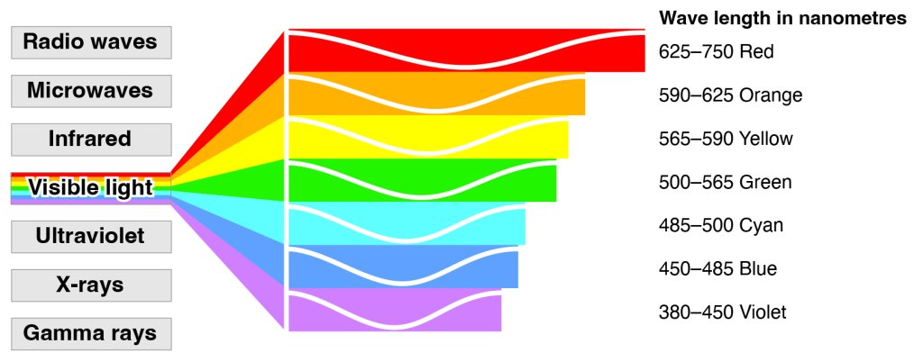
This diagram shows the visible light spectrum and other types of non-visible electromagnetic radiation measured in nanometres (nm).

The colours we see are based on wavelengths, and as Figure 3.4a shows, there are wavelengths that the human eye cannot see, like radio waves, X-rays, and microwaves. In the visible spectrum, violet rays, which are the shortest wavelengths are also the highest in energy. Red light wavelengths are the longest and the lowest in energy.
The physics of light and colour
Physics is the science that deals with energy and matter. To understand what colour is and how we see it, we need to explore the physical properties of light as a form of energy and how it interacts with matter – the objects we see.
Learn more about physics-related topics in an introductory way with videos, links, and learning activities to help you to extend your knowledge of the physics of light and colour:
- Light: electromagnetic radiation
- Optics 1: lenses and ocular devices
- Optics 2: electronic technologies and spectral analysis
- Why are things different colours?
The eye – how we see colour
Understanding how we see colour is fundamental to understanding colour theory. The human eye has evolved to detect lightwaves from a limited bandwidth, as previously discussed in this resource – this is the visible spectrum. But how exactly do our eyes detect light and distinguish between different light wavelengths?
Learn more about how we see and how our brains interpret visual information:
Trends and Palettes
A trend is a direction that is developing or changing – as with fashion, which is constantly evolving. Colour trends are how we describe certain colours or colour palettes (selected groups of colours that are used together) that become popular at different times. Knowing about colour trends is useful in design fields like fashion and textile design, interior design, product and packaging design and web design, where new products are continuously emerging.
Commercial colour charts are easy to find for paints and textiles. In design, the href=”https://www.pantone.com/color-tools/physical-color-tools/graphics”>Pantone Matching System (PMS) for graphics and print and the Pantone Fashion, Home and Interiors System (FHI) for textiles and pigments have become industry standards for colour selection for a wide range of design and commercial production solutions.
The Pantone Colour Institute has also become known for its colour trend influencing. They select a “colour of the year” each year.
Here are some past Pantone colours of the year (Table 3.4a):
| Year | Code | Name | Swatch | Colour Description |
|---|---|---|---|---|
| 2023 | PANTONE 18-1750 |
Viva Magenta | Magenta, red | |
| 2022 | PANTONE 17-3938 | Very Peri | Blue-purple colour, periwinkle | |
| 2021 | PANTONE 17-5104 |
Ultimate Gray | Medium gray | |
| PANTONE 13-0647 |
Illuminating | Bright yellow | ||
| 2020 | PANTONE 19-4052 |
Classic Blue | Dark blue | |
| 2019 | PANTONE 16-1546 |
Living Coral | Salmon | |
| 2018 |
PANTONE 18-3838 |
Ultra Violet | Purple | |
| 2017 | PANTONE 15-0343 |
Greenery | Green | |
| 2016 | PANTONE 13-1520 |
Rose Quartz | Light Pink | |
| 2016 | PANTONE 15-3919 |
Serenity | Light blue, periwinkle | |
| 2015 | PANTONE 18-1438 |
Marsala | Rust/brown | |
| 2014 | PANTONE 18-3224 |
Radiant Orchid | Pink/purple | |
| 2013 | PANTONE 17-5641 |
Emerald | Green | |
| 2012 | PANTONE 17-1463 |
Tangerine Tango | Dark orange | |
| 2011 | PANTONE 18-2120 |
Honeysuckle | Dark pink |
Source: Pantone past colours of the year.

Aesthetics of colour palettes
A colour palette is a set of colours that a designer or artist chooses to work with on a project like an image, website, fashion range, product packaging etc.
Choosing the right set of colours can play an important role in how successful your design, artwork or product is and how users respond to it.
As previously discussed in this chapter, colour perception and aesthetic taste are subjective things, but colours do have common links to our emotions and moods. Any artist or designer will have their preferred palettes for working with specific projects. However, if you have a design brief from a client, you may need to create a unique colour palette for your client’s website or product. It can be difficult to know which colours work best together, and if those colours successfully symbolise or represent your client’s business.
Many online tools can recommend currently trending and aesthetically pleasing colour palettes or can help you create your own palettes by using keyword searches. Other online tools allow you to upload images to create a colour palette from the colours used in the image, or use AI to create colour palettes based on machine learning.
Attribution & References
Except where otherwise noted, this page is adapted from “Colour theory: the visible spectrum“, “Colour trends and palettes” and “Working with colour” In Colour Theory: Understanding and Working with Colour by Lisa Cianci, CC BY-NC 4.0 . / Combined 3 pages from the same source, created table of contents links back to original text.
References
Pantone. (n.d.). Color of the year. https://www.pantone.com/articles/color-of-the-year

