Accessibility
WCAG Standards
The WCAG standards are divided into four main principles: Perceivable, Operable, Understandable and Robust – or POUR.
Perceivable, Operable, Understandable, and Robust (POUR)
- Perceivable: All users must be able to perceive the content being presented. Examples of this are including transcripts for audio files for users who are Deaf or Hard of Hearing, and including alternative text for images so Blind and Low Vision users can understand the image’s meaning.
- Operable: There cannot be any interaction or navigation that excludes users. Making the web content accessible by keyboard commands is an example of this.
- Understandable: Both the content and the operation of the interface must be easy to use and understand.
- Robust: Means that there must be multiple ways to access the content, like ensuring user interfaces are compatible with assistive technologies.

WCAG standards also include three different levels of compliance: A, AA and AAA. Level A indicates a minimum level of compliance, while level AAA indicates the highest possible level. The AODA requires all organizations to comply with the WCAG guidelines at level AA.
Core Principles of Digital Accessibility in OER
The following section provides an overview of explanations of some of the WCAG standard requirements for elements commonly used in digital OER content.
Structure
What: Content must be clear and organized using a hierarchical structure of style Headings, Styles, and Lists.
Why: Adding semantic structure to your documents is useful for everyone, including people with learning disabilities or visual impairments. By doing so, sighted users can efficiently navigate through documents and assistive technologies, such as screen readers, will be able identify list contents and efficiently navigate through long documents.
How: Use style headers in sequential order (H1 for main headings, then H2 for subheadings, H3 and so on for headings nested beyond this) to structure web pages. Heading styles can be created and modified in most web authoring platforms (such as Pressbooks and WordPress) as well as most word-processing programs. Similarly, use ‘strong’ style rather than the ‘bold’ function. Create bullets and numbered lists rather than dashes or asterisks.
Font Styles
What: Use san serif fonts of a legible size.
Why: Fancy fonts with embellishments (serifs), or fonts that are too small, can be difficult to read for some users.
How: Always use sans serif style fonts (e.g., Calibri, Arial, Open Sans) and 12pnt or larger size. The WCAG standard recommendation is using 12 point font size or larger (9 points or more for footnotes), and clear fonts that can scale 200% size.
Hyperlinks
What: All links (to other web pages or to non-web content) must be embedded and include a contextual description of the linked source.
Why: Accessible hyperlinks are helpful to understand what you will find when clicking on a link, and can be helpful even out of context when screen readers list all links on a page.
How: Instead of hyperlinking to the words “click here,” you might hyperlink the text, “information on open education is available at the University of Ottawa is available online.“ Always set your links so they open in a new tab. If the link you are navigating to is not another web page, describe the source type (e.g. [PDF]).
Tables
What: Use simple tables to present information and data that can be easily navigated.
Why: Tables can be helpful to present and categorize information but can be confusing or difficult for screen readers to navigate. See this example from WebAIM which demonstrates why presenting information in a table can be confusing.
How: Use tables for organizing data and not for laying out pages. Do not use merged or split cells. Use header rows and break large, complex tables into smaller ones. More comprehensive guidance can be found in the Creating Accessible Tables resource from WebAIM.
Alternative Text
What: Providing embedded textual information on images can help users understand their nature and purpose.
Why: Providing multiple formats of any information makes it accessible to more users. Any purposeful (non-decorative) images should include textual information for Blind and Low-Vision users.
How: If an image is not decorative (conveys contextual content), provide a brief description of only the intended contextual information. This description can include any text in the image or be longer if necessary (but only for infographics or similar images when an accompanying image description isn’t present). Make sure that your alternative text conveys context and functionality and not a categorical description of every aspect of the image. A decorative image does not require alt text, mark it decorative and screen readers will ignore it.
Here is an example on how to write poor, good and better alt-text:

Attribution: Arctic Beach Life by Vidar Nordli-Mathisen on Unsplash, Unsplash License.
Poor: People swimming at the beach
Good: People running into the water at the beach
Better: A group of adults in swimsuits at the beach, running into the water, on a sunny day with cliffs and mountains in the background.
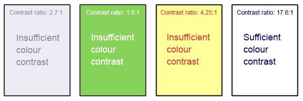
Colour Contrast
What: Colour contrast refers to the contrast between two adjacent colours.
Why: There must be sufficient contrast two adjacent colours or else those with low vision, colour blindness, or use monochromatic devices cannot differentiate between them.
How: Ensure that colour is not the only means of conveying important information (such as essential information in images or links in text). WCAG 2.2 level AA requires that the visual presentation of text and text images have a contrast ratio of at least 4.5:1 while to meet level AAA, the contrast ratio should be at least 7:1[1]. Many free programs exist which you can download and perform your own contrast checks.
Attribution: A. Coolidge, S. Donner, T. Robertson & J. Gray (2018), Accessibility Toolkit – 2nd Edition, BCcampus, CC BY 4.0.
Captions and Transcripts
What: Captions and transcripts are text versions of the spoken content in audio, video, and multimedia presentations.
Why: Providing video captions and audio transcriptions allows deaf and hard of hearing users to understand what is being said. This is also helpful for non-English speaking, or second language speaking users, or for users who learn more efficiently by reading.
How: Most video hosting platforms (e.g., YouTube, Kaltura, Vimeo, Yuja, Microsoft, etc.) offer machine-generated captions which need to be edited for accuracy. Transcripts may be added as a document under videos or embedded in a website. Transcripts can also be easily added to most video platforms.
 Activity: Core Principles of Digital Accessibility
Assess your understanding of the core principles of digital accessibility by completing this H5P activity.
- W3C, Web Content Accessibility Guidelines (WCAG) 2.2, 1.4.3 Contrast (Minimum) and 1.4.6 Contrast (Enhanced), https://www.w3.org/WAI/WCAG22/Understanding/contrast-minimum.html ↵
