8.2 Linear Regression
Learning Objectives
- Calculate a line of best fit for correlated variables using linear regression.
- Calculate the Coefficient of determination
Formula & Symbol Hub
Symbols Used
- [latex]\bar{x}[/latex] = mean of set x
- [latex]S_x[/latex] = standard deviation of set x
- [latex]b_0[/latex] = the y intercept of a line
- [latex]b_1[/latex] = the slope of a line
- [latex]x[/latex] = the predictor variable in linear regression
- [latex]\hat{y}[/latex] = the estimate of the mean in linear regression
Formulas Used
-
Formula 8.2 - Simple Linear Regression
[latex]\hat{y}=b_0+b_1x[/latex]
Simple Linear Regression
Once we have identified two variables that are correlated, we would like to model this relationship. We want to use one variable as a predictor or explanatory variable to explain the other variable, the response or dependent variable. In order to do this, we need a good relationship between our two variables. The model can then be used to predict changes in our response variable. A strong relationship between the predictor variable and the response variable leads to a good model.

Image Description
The image is a scatter plot with red dots representing data points. The x-axis ranges from [latex]2[/latex] to [latex]8[/latex], and the y-axis ranges from [latex]7[/latex] to [latex]17[/latex]. A blue line representing a trend line is drawn diagonally from the bottom-left to the top-right, indicating a positive linear relationship between the variables on the x-axis and y-axis. The data points are scattered around the trend line, showing some variance but generally following the upward trend.
A simple linear regression model is a mathematical equation that allows us to predict a response for a given predictor value.
Our model will take the form of
[latex]\boxed{8.2}[/latex] Simple Linear Regression
[latex]{\color{red}{\hat{y}}}={\color{blue}{b_0}}+{\color{green}{b_1}}{\color{purple}{x}}[/latex]
[latex]{\color{blue}{b_0}}\text{ is the y-intercept.}[/latex]
[latex]{\color{green}{b_1}}\text{ is the slope.}[/latex]
[latex]{\color{purple}{x}}\text{ is the predictor variable.}[/latex]
[latex]{\color{red}{\hat{y}}}\text{ is the estimate of the mean value of the response variable for any value of the predictor variable.}[/latex]
The y-intercept is the predicted value for the response ([latex]y[/latex]) when [latex]x=0[/latex]. The slope describes the change in [latex]y[/latex] for each one unit change in [latex]x[/latex]. Let’s look at this example to clarify the interpretation of the slope and intercept.
Video: "BAII Plus - Correlation and regression coefficients" by Joshua Emmanuel [4:53] is licensed under the Standard YouTube License.Transcript and closed captions available on YouTube.
Example 8.2.1
A hydrologist creates a model to predict the volume flow for a stream at a bridge crossing with a predictor variable of daily rainfall in inches.
[latex]\hat{y}=1.6+29x[/latex]. The y-intercept of [latex]1.6[/latex] can be interpreted this way: On a day with no rainfall, there will be [latex]1.6[/latex] gal. of water/min. flowing in the stream at that bridge crossing. The slope tells us that if it rained one inch that day the flow in the stream would increase by an additional [latex]29[/latex] gal./min. If it rained [latex]2[/latex] inches that day, the flow would increase by an additional [latex]58[/latex] gal./min.
Try It
What would be the average stream flow if it rained [latex]0.45[/latex] inches that day?
Solution
[latex]\hat{y}= 1.6 + 29x = 1.6 + 29(0.45) = 14.65 \text{gal./min.}[/latex]
 Paths to Success
The Least-Squares Regression Line (shortcut equations)
The equation is given by [latex]\hat{y}=b_0+b_1x[/latex]
where [latex]\begin{align*}b_1=r\left(\frac{S_y}{S_x}\right)\end{align*}[/latex] is the slope and [latex]b_0=\hat{y}-b_1[/latex] [latex]\hat{x}[/latex] is the [latex]y[/latex]-intercept of the regression line.
An alternate computational equation for slope is:
[latex]\begin{align*}b_1=\frac{\sum xy-\frac{\left(\sum x\right)\left(\sum y\right)}{n}}{\sum x^2-\frac{\left(\sum x\right)^2}{n}}=\frac{S_{xy}}{S_{xx}}\end{align*}[/latex]
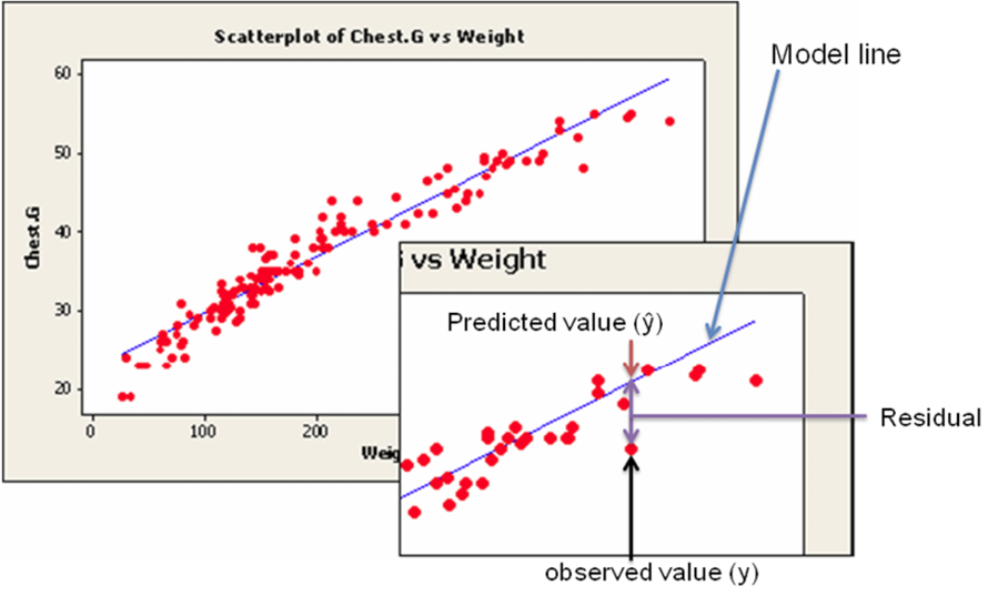
This simple model is the line of best fit for our sample data. The regression line does not go through every point; instead it balances the difference between all data points and the straight-line model. The difference between the observed data value and the predicted value (the value on the straight line) is the error or residual. The criterion to determine the line that best describes the relation between two variables is based on the residuals.
[latex]\text{Residual}=\text{Observed}–\text{Predicted}[/latex]
For example, if you wanted to predict the chest girth of a black bear given its weight, you could use the following model.
[latex]\text{Chest girth}=13.2+0.43[/latex] weight
The predicted chest girth of a bear that weighed [latex]120[/latex] lb. is [latex]64.8[/latex] in.
[latex]\text{Chest girth}=13.2+0.43(120)=64.8[/latex] in.
But a measured bear chest girth (observed value) for a bear that weighed [latex]120[/latex] lb. was actually [latex]62.1[/latex] in.
The residual would be [latex]62.1–64.8=-2.7[/latex] in.
A negative residual indicates that the model is over-predicting. A positive residual indicates that the model is under-predicting. In this instance, the model over-predicted the chest girth of a bear that actually weighed [latex]120[/latex] lb.

Image Description
The image features two main graphs depicting a scatter plot of chest circumference (Chest.G) versus weight. Data points are illustrated with red dots.
In the larger main graph, titled "Scatterplot of Chest.G vs Weight," a blue model line plots a trend through the data points, showing a positive linear relationship.
The inset graph focuses on a specific data point. The graph shows two primary values for the highlighted data point: the observed value ([latex]y[/latex]) marked with a black arrow from the x-axis to the red dot and the predicted value ([latex]\hat{y}[/latex]) represented by where the blue model line intersects the same x-coordinate. The vertical distance between the red dot (observed value) and the blue line (predicted value) is labeled as "Residual."
The labels indicate the slope of the blue line as "Model line" and the vertical line between observed and predicted values is noted as "Residual."
This random error (residual) takes into account all unpredictable and unknown factors that are not included in the model. An ordinary least squares regression line minimizes the sum of the squared errors between the observed and predicted values to create a best fitting line. The differences between the observed and predicted values are squared to deal with the positive and negative differences.
Coefficient of Determination
After we fit our regression line (compute [latex]b_0[/latex] and [latex]b_1[/latex]), we usually wish to know how well the model fits our data. To determine this, we need to think back to the idea of analysis of variance. In ANOVA, we partitioned the variation using sums of squares so we could identify a treatment effect opposed to random variation that occurred in our data. The idea is the same for regression. We want to partition the total variability into two parts: the variation due to the regression and the variation due to random error. And we are again going to compute sums of squares to help us do this.
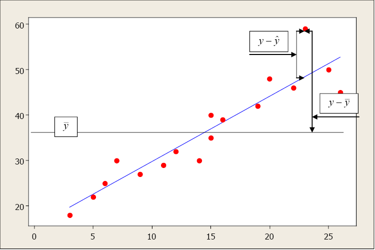
Suppose the total variability in the sample measurements about the sample mean is denoted by [latex]\sum{(y_i-\hat{y})^2}[/latex], called the sums of squares of total variability about the mean (SST). The squared difference between the predicted value [latex]\hat{y}[/latex] and the sample mean is denoted by [latex]\sum{(\hat{y}_i-\bar{y})^2}[/latex], called the sums of squares due to regression (SSR). The SSR represents the variability explained by the regression line. Finally, the variability which cannot be explained by the regression line is called the sums of squares due to error (SSE) and is denoted by [latex]\sum{(y_i-\bar{y})^2}[/latex]. SSE is actually the squared residual.
| SST | =SSR | +SSE |
| [latex]\sum{(y_i-\hat{y})^2}[/latex] | [latex]_=\sum{(\hat{y}_i-\bar{y})^2}[/latex] | [latex]_+\sum{(y_i-\bar{y})^2}[/latex] |

Image Description
This image is a scatter plot with red data points displaying a positive correlation. It includes a blue line representing the line of best fit. The x-axis ranges from [latex]0[/latex] to [latex]25[/latex], while the y-axis ranges from [latex]0[/latex] to [latex]60[/latex]. There are two horizontal gray lines: one at approximately [latex]y=20[/latex], representing the mean of [latex]y[/latex] ([latex]\bar{y}[/latex]), and another at approximately [latex]y=37[/latex], marking a specific value on the line of best fit and near the data points.
Annotations in the plot explain statistical concepts:
- One labeled box near the left points to the mean of [latex]y[/latex] ([latex]\bar{y}[/latex]).
- A box at the upper end near the right side indicates the residual ([latex]y-\hat{y}[/latex]) with an arrow pointing downward.
- Another labeled box below that shows the difference between actual value and mean ([latex]y-\bar{y}[/latex]), also with an arrow pointing downward.
Arrows and labels help visually explain the relationships between actual data points, the mean, and the line of best fit.
The sums of squares and mean sums of squares (just like ANOVA) are typically presented in the regression analysis of variance table. The ratio of the mean sums of squares for the regression (MSR) and mean sums of squares for error (MSE) form an f-test statistic used to test the regression model.
The relationship between these sums of square is defined as
[latex]\text{Total Variation}=\text{Explained Variation}+\text{Unexplained Variation}[/latex]
The larger the explained variation, the better the model is at prediction. The larger the unexplained variation, the worse the model is at prediction. A quantitative measure of the explanatory power of a model is [latex]R^2[/latex], the Coefficient of Determination:
[latex]R^2= \frac{\text{Explained Variation}}{\text{Total Variation}}[/latex]
The Coefficient of Determination measures the percent variation in the response variable ([latex]y[/latex]) that is explained by the model.
- Values range from [latex]0[/latex] to [latex]1[/latex].
- An [latex]R^2[/latex] close to zero indicates a model with very little explanatory power.
- An [latex]R^2[/latex] close to one indicates a model with more explanatory power.
The Coefficient of Determination and the linear correlation coefficient are related mathematically.
[latex]R^2 = r^2[/latex]
However, they have two very different meanings: [latex]r[/latex] is a measure of the strength and direction of a linear relationship between two variables; [latex]R^2[/latex] describes the percent variation in [latex]y[/latex] that is explained by the model.
Attribution
"Chapter 7: Correlation and Simple Linear Regression" from Natural Resources Biometrics by Diane Kiernan is licensed under a Creative Commons Attribution-NonCommercial 4.0 International License, except where otherwise noted.

