8.1 Linear Correlation
Learning Objectives
- Calculate the linear correlation coefficient for any given sets and use it to determine stong/weak positive/negative or no correlation between the sets
Formula & Symbol Hub
Symbols Used
- [latex]\bar{x}[/latex] = mean of set x
- [latex]S_x[/latex] = standard deviation of set x
- [latex]r[/latex] = linear correlation coefficient
Formulas Used
-
Formula 8.1 - Linear Correlation Coefficient
[latex]\begin{align*}r=\frac{\sum\frac{\left(x_i-\bar{x}\right)}{S_x}\frac{\left(y_i-\bar{y}\right)}{S_y}}{n-1}\end{align*}[/latex]
Linear Correlation Coefficient
Because visual examinations are largely subjective, we need a more precise and objective measure to define the correlation between the two variables. To quantify the strength and direction of the relationship between two variables, we use the linear correlation coefficient:
[latex]\boxed{8.1}[/latex] Linear Correlation Coefficient
[latex]\begin{align*}{\color{red}{r}}=\frac{\sum\frac{\left({\color{blue}{x_i}}-{\color{green}{\bar{x}}}\right)}{{\color{purple}{S_x}}}\frac{\left({\color{blue}{y_i}}-{\color{green}{\bar{y}}}\right)}{{\color{purple}{S_y}}}}{{\color{brown}{n}}-1}\end{align*}[/latex]
[latex]{\color{red}{r}}\text{ is the Linear Correlation Coefficient.}[/latex]
[latex]{\color{blue}{x_i}}\text{ and }{\color{blue}{y_i}}\text{ are values from data sets x and y.}[/latex]
[latex]{\color{green}{\bar{x}}}\text{ and }{\color{green}{\bar{y}}}\text{ are the sample means of data sets x and y.}[/latex]
[latex]{\color{purple}{S_x}}\text{ and }{\color{purple}{S_y}}\text{ are the sample standard deviations of data sets x and y.}[/latex]
[latex]{\color{brown}{n}}\text{ is the sample size of sets x and y.}[/latex]
An alternate computation of the correlation coefficient is:
[latex]\begin{align*}r=\frac{S_{xy}}{\sqrt{S_{xx}S_{yy}}}\end{align*}[/latex]
where [latex]\begin{align*}S_{xx}=\sum x^2-\frac{\left(\sum x\right)^2}{n}\end{align*}[/latex]
[latex]\begin{align*}S_{xy}&=\sum xy-\frac{\left(\sum x\right)\left(\sum y\right)}{n}\\[1.5ex]S_{yy}&=\sum y^2-\frac{\left(\sum y\right)^2}{n}\end{align*}[/latex]
The linear correlation coefficient is also referred to as Pearson’s product moment correlation coefficient in honor of Karl Pearson, who originally developed it. This statistic numerically describes how strong the straight-line or linear relationship is between the two variables and the direction, positive or negative.
The properties of [latex]r[/latex]:
- It is always between [latex]-1[/latex] and [latex]+1[/latex].
- It is a unitless measure so [latex]r[/latex] would be the same value whether you measures the two variables in pounds and inches or in grams and centimeters.
- Positive values of [latex]r[/latex] are associated with positive relationships.
- Negative values of [latex]r[/latex] are associated with negative relationships.
Examples of Positive Correlation
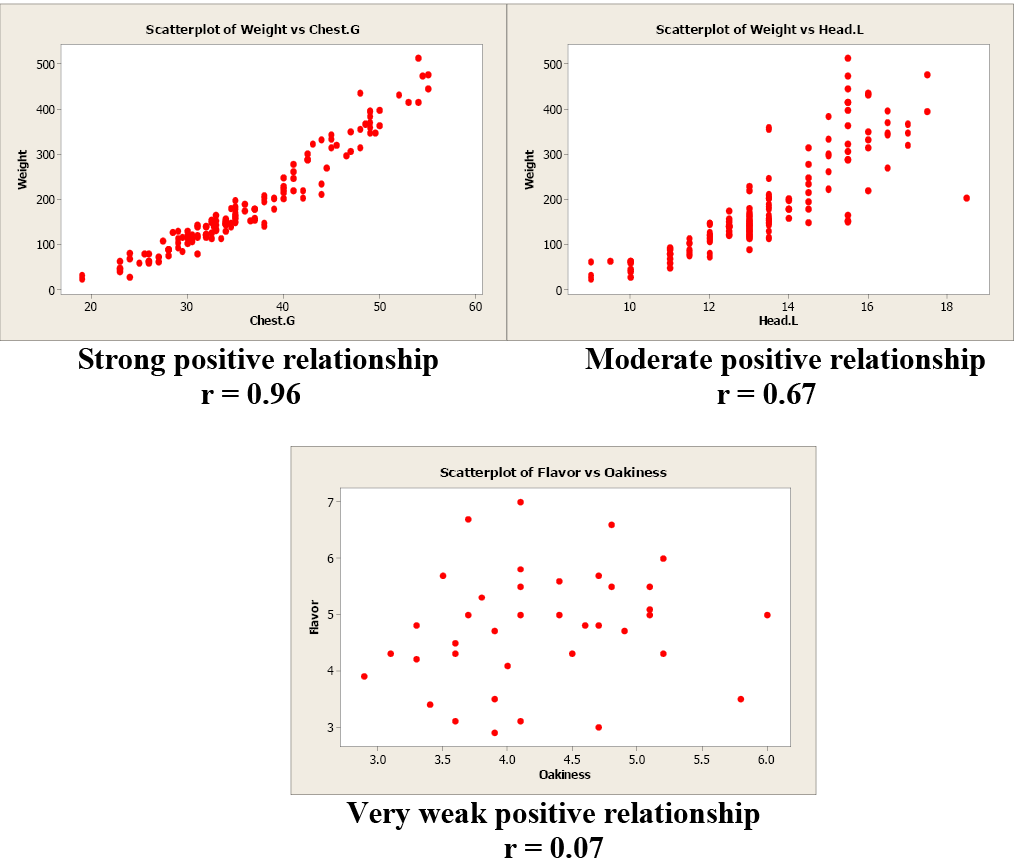
Image Description
The image contains three scatterplots that depict relationships between different variables, each with associated correlation coefficient values ([latex]r[/latex]) displayed below the scatterplots.
Top-left scatterplot: Title “Scatterplot of Weight vs Chest.G”. The x-axis is labeled “Chest.G” and ranges from [latex]20[/latex] to [latex]60[/latex]. The y-axis is labeled “Weight” and ranges from [latex]0[/latex] to [latex]500[/latex]. There are red dots forming a clear upward linear pattern, indicating a strong positive relationship. Below the scatterplot, the text reads: “Strong positive relationship [latex]r=0.96[/latex]”.
Top-right scatterplot: Title “Scatterplot of Weight vs Head.L”. The x-axis is labeled “Head.L” and ranges from [latex]10[/latex] to [latex]18[/latex]. The y-axis is labeled “Weight” and ranges from [latex]0[/latex] to [latex]500[/latex]. There are red dots forming a moderately upward pattern, indicating a moderate positive relationship. Below the scatterplot, the text reads: “Moderate positive relationship [latex]r=0.67[/latex]”.
Bottom scatterplot: Title “Scatterplot of Flavor vs Oakiness”. The x-axis is labeled “Oakiness” and ranges from [latex]3.0[/latex] to [latex]6.0[/latex]. The y-axis is labeled “Flavor” and ranges from [latex]3[/latex] to [latex]7[/latex]. There are red dots scattered without any distinct pattern, indicating a very weak positive relationship. Below the scatterplot, the text reads: “Very weak positive relationship [latex]r=0.07[/latex]”.
Examples of Negative Correlation
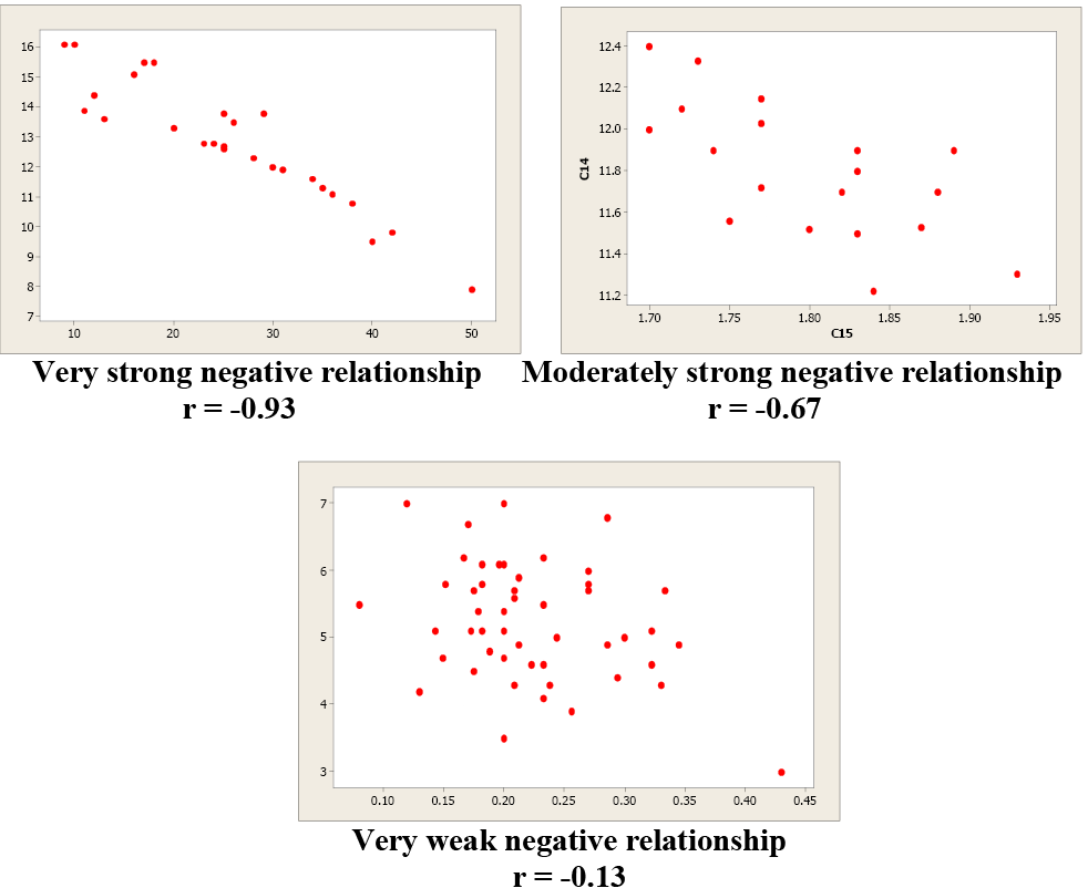
Image Description
This image contains three scatterplots demonstrating relationships between paired data points, each featuring red dots representing individual data points.
The top left scatterplot titled "Very strong negative relationship, [latex]r=-0.93[/latex]" shows a clear downward trend, indicating a very strong negative correlation. Data points are tightly clustered along a descending line.
The top right scatterplot titled "Moderately strong negative relationship, [latex]r=-0.67[/latex]" shows a moderate downward trend with a moderate amount of dispersion around the trend line, indicating a moderately strong negative correlation.
The bottom center scatterplot titled "Very weak negative relationship, [latex]r=-0.13[/latex]" shows a very weak downward trend with considerable scatter around the trend line, indicating a very weak negative correlation.
Correlation is not causation!!! Just because two variables are correlated does not mean that one variable causes another variable to change.
Examine these next two scatterplots. Both of these data sets have an [latex]r=0.01[/latex], but they are very different. Plot 1 shows little linear relationship between x and y variables. Plot 2 shows a strong non-linear relationship. Pearson’s linear correlation coefficient only measures the strength and direction of a linear relationship. Ignoring the scatterplot could result in a serious mistake when describing the relationship between two variables.
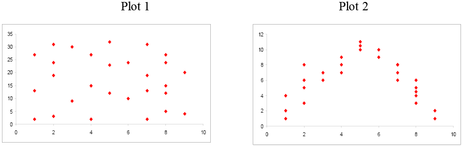
Image Description
This image contains two scatter plots side by side.
Plot [latex]1[/latex]: This scatter plot features red diamond-shaped markers, dispersed randomly across the plot area. The X-axis ranges from [latex]0[/latex] to [latex]10[/latex], and the Y-axis ranges from [latex]0[/latex] to [latex]35[/latex].
Plot [latex]2[/latex]: This scatter plot also features red diamond-shaped markers, but they are arranged in a parabolic shape. The X-axis ranges from [latex]0[/latex] to [latex]10[/latex], and the Y-axis ranges from [latex]0[/latex] to [latex]12[/latex].
When you investigate the relationship between two variables, always begin with a scatterplot. This graph allows you to look for patterns (both linear and non-linear). The next step is to quantitatively describe the strength and direction of the linear relationship using [latex]r[/latex]. Once you have established that a linear relationship exists, you can take the next step in model building.
Attribution
"Chapter 7: Correlation and Simple Linear Regression" from Natural Resources Biometrics by Diane Kiernan is licensed under a Creative Commons Attribution-NonCommercial 4.0 International License, except where otherwise noted.
