6.6 Graphical Representation
Learning Objectives
- Contrast how you can represent data. Know what data sets and purposes would incline you to use one over another.
Data organization and summarization can be done graphically as well as numerically. Tables and graphs allow for a quick overview of the information collected and support the presentation of the data used in the project. While there are a multitude of available graphics, this chapter will focus on a specific few commonly used tools.
Pie Charts
Pie charts are an excellent visual tool, allowing the reader to quickly see the relationship between categories. It is important to label each category clearly, and adding the frequency or relative frequency is often helpful. However, too many categories can be confusing. Be careful of putting too much information in a pie chart. The first pie chart gives a clear idea of the representation of fish types relative to the whole sample. The second pie chart is more difficult to interpret, with too many categories. It is important to select the best graphic when presenting the information to the reader.
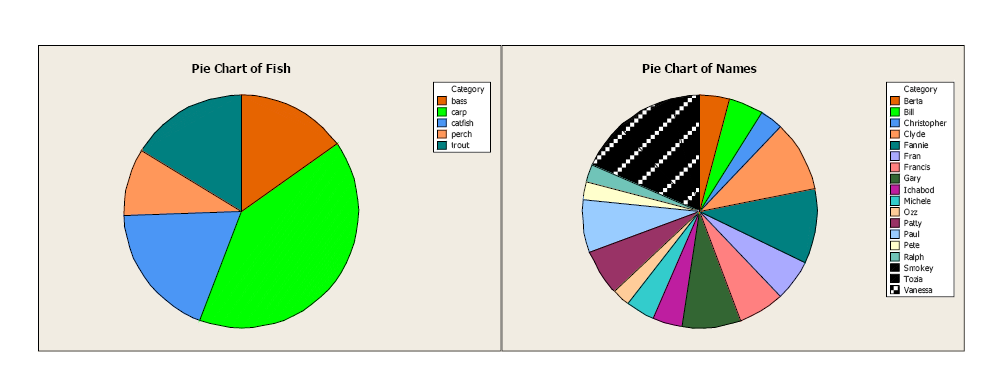
Image Description
There are two adjacent pie charts in this image:
- The pie chart on the left is titled "Pie Chart of Fish" and contains segments of different colours representing categories such as bass, carp, catfish, perch, and trout. The colours for each category are depicted in a legend situated to the right of the pie chart.
- The pie chart on the right is titled "Pie Chart of Names" and contains a larger variety of segments, each representing names like Barta, Bill, Christopher, Clyde, and others. Each segment is coloured differently, with the corresponding colours listed in a legend to the right of the chart.
Both charts are set against a light-coloured background with clear labels and legends for reference.
Bar Charts and Histograms
Bar charts graphically describe the distribution of a qualitative variable (fish type), while histograms describe the distribution of a quantitative variable discrete or continuous variables (bear weight).
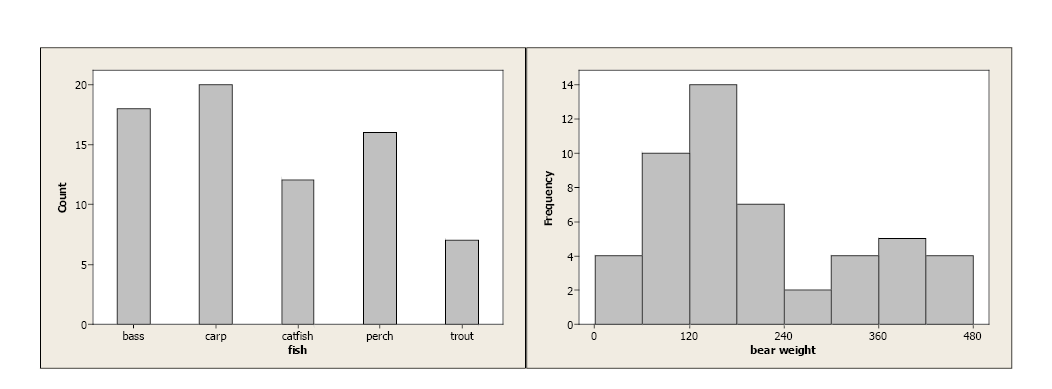
Image Description
There are two bar charts side by side, each within its own beige background area.
The left chart depicts the count of different types of fish. The x-axis is labelled "fish," and the y-axis is labelled "Count."
- Bass: approximately [latex]18[/latex]
- Carp: [latex]20[/latex]
- Catfish: approximately [latex]11[/latex]
- Perch: approximately [latex]15[/latex]
- Trout: approximately [latex]8[/latex]
The right chart shows the frequency distribution of bear weights. The x-axis is labelled "bear weight," with increments from [latex]0[/latex] to [latex]480[/latex], and the y-axis is labelled "Frequency."
- [latex]0[/latex]: approximately [latex]4[/latex]
- [latex]120[/latex]: approximately [latex]11[/latex]
- [latex]240[/latex]: [latex]15[/latex]
- [latex]360[/latex]: approximately [latex]5[/latex]
- [latex]480[/latex]: approximately [latex]4[/latex]
In both cases, the bars’ equal width and the y-axis are clearly defined. With qualitative data, each category is represented by a specific bar. With continuous data, lower and upper-class limits must be defined with equal class widths. There should be no gaps between classes, and each observation should fall into one class.
Boxplots
Boxplots use the 5-number summary (minimum and maximum values with the three quartiles) to illustrate the center, spread, and distribution of your data. When paired with histograms, they give an excellent description, both numerically and graphically, of the data.
With symmetric data, the distribution is bell-shaped and somewhat symmetric. In the boxplot, we see that [latex]Q1[/latex] and [latex]Q3[/latex] are approximately equidistant from the median, as are the minimum and maximum values. Also, both whiskers (lines extending from the boxes) are approximately equal in length.

Image Description
The image is a box plot labelled "Symmetric" displayed on a two-dimensional grid.
The x-axis is labelled "Values" and ranges from [latex]0[/latex] to [latex]40[/latex] in increments of [latex]10[/latex]. The y-axis does not have specific labels or notches but provides the vertical alignment.
In the middle of the plot, there is a rectangular box that extends from a value slightly above [latex]10[/latex] to a value slightly below [latex]30[/latex] on the x-axis. The median is represented by a vertical line inside the box at around [latex]20[/latex].
On either side of the box, horizontal lines (whiskers) extend outward. The left whisker runs from the start of the box to a value slightly above [latex]0[/latex] on the x-axis, and the right whisker runs from the end of the box to a value slightly below [latex]40[/latex] on the x-axis.
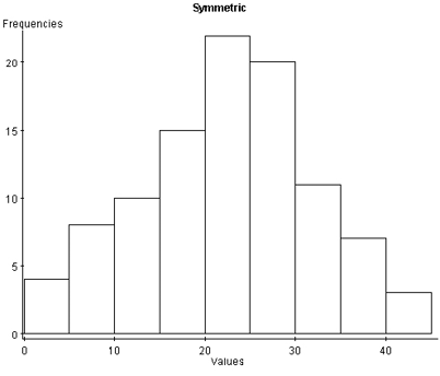
Image Description
The image depicts a histogram labelled "Symmetric." The x-axis is labelled "Values" and ranges from [latex]0[/latex] to [latex]40[/latex] in increments of [latex]10[/latex]. The y-axis is labeled "Frequencies" and ranges from [latex]0[/latex] to [latex]25[/latex] in increments of [latex]5[/latex].
- The bar representing the range [latex]0-5[/latex] has a frequency of about [latex]5[/latex].
- The bar representing the range [latex]5-10[/latex] has a frequency about [latex]10[/latex].
- The bar representing the range [latex]10-15[/latex] has a frequency slightly above [latex]10[/latex].
- The bar representing the range [latex]15-20[/latex] has a frequency between [latex]15[/latex] and [latex]20[/latex].
- The bar representing the range [latex]20-25[/latex] has the highest frequency, slightly above [latex]20[/latex].
- The bar representing the range [latex]25-30[/latex] has a frequency about [latex]18[/latex].
- The bar representing the range [latex]30-35[/latex] has a frequency slightly above [latex]10[/latex].
- The bar representing the range [latex]35-40[/latex] has a frequency of about [latex]10[/latex].
- The bar representing the range [latex]40-45[/latex] has a frequency of about [latex]5[/latex].
With skewed left distributions, we see that the histogram looks “pulled” to the left. In the boxplot, [latex]Q1[/latex] is farther away from the median as are the minimum values, and the left whisker is longer than the right whisker.
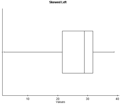
Image Description
The image is a box plot labeled "Skewed Left." It consists of a rectangular box with horizontal lines extending from either side. The main elements are:
- A horizontal axis labeled "Values" with tick marks and numbers ranging from [latex]10[/latex] to [latex]40[/latex], in increments of [latex]10[/latex].
- The box spans from approximately [latex]20[/latex] to [latex]32[/latex] on the horizontal axis.
- A vertical line inside the box indicating the median, positioned closer to the right edge of the box around [latex]30[/latex].
- The left whisker extends from the left side of the box at approximately [latex]20[/latex], to just before the [latex]10[/latex] mark on the horizontal axis.
- The right whisker extends from the right side of the box at approximately [latex]32[/latex], ending roughly around [latex]36[/latex] on the horizontal axis.
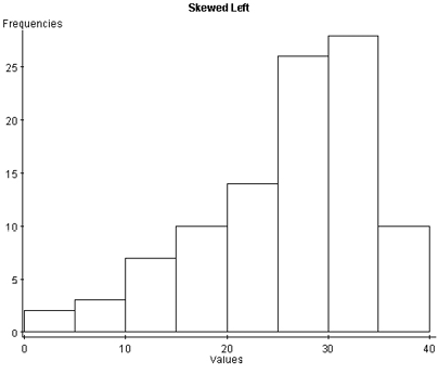
Image Description
The image is a histogram titled "Skewed Left". The horizontal axis is labeled "Values" and the vertical axis is labeled "Frequencies". The vertical axis ranges from [latex]0[/latex] to [latex]30[/latex] in increments of [latex]5[/latex], while the horizontal axis ranges from [latex]0[/latex] to [latex]40[/latex] in increments of [latex]10[/latex].
The histogram consists of several bars indicating the frequency of different ranges of values:
- The first bar ([latex]0-5[/latex]) has a frequency of about [latex]2[/latex].
- The second bar ([latex]5-10[/latex]) has a frequency of about [latex]4[/latex].
- The third bar ([latex]10-15[/latex]) has a frequency of about [latex]7[/latex].
- The fourth bar ([latex]15-20[/latex]) has a frequency of about [latex]10[/latex].
- The fifth bar ([latex]20-25[/latex]) has a frequency of about [latex]15[/latex].
- The sixth bar ([latex]25-30[/latex]) has a frequency of about [latex]20[/latex].
- The seventh bar ([latex]30-35[/latex]) has the highest frequency, about [latex]27[/latex].
- The eighth bar ([latex]35-40[/latex]) has a frequency of about [latex]12[/latex].
With skewed right distributions, we see that the histogram looks “pulled” to the right. In the boxplot, [latex]Q3[/latex] is farther away from the median, as is the maximum value, and the right whisker is longer than the left whisker.
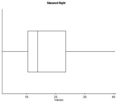
Image Description
This image depicts a box plot labeled "Skewed Right." The horizontal axis is labeled "Values" and ranges from [latex]0[/latex] to [latex]40[/latex]. The box plot includes a rectangular box with its left edge around [latex]10[/latex] and its right edge around [latex]23[/latex]. A vertical line inside the box, representing the median, is closer to the left edge of the box. The whiskers extend from the edges of the box to approximately [latex]5[/latex] on the left side and [latex]37[/latex] on the right side, indicating a right-skewed distribution.
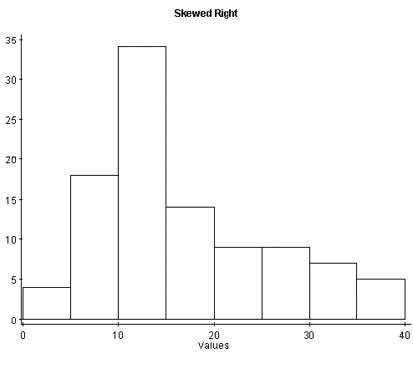
Image Description
This image is a histogram titled "Skewed Right." The horizontal axis is labeled "Values" and ranges from [latex]0[/latex] to [latex]40[/latex]. The vertical axis is unlabeled but ranges from [latex]0[/latex] to [latex]35[/latex], with tick marks in intervals of [latex]5[/latex].
The bars represent the frequency of different ranges of values:
- The first bar, ranging from [latex]0[/latex] to approximately [latex]5[/latex], has a height of about [latex]5[/latex].
- The second bar, ranging from approximately [latex]5[/latex] to [latex]10[/latex], has a height of about [latex]20[/latex].
- The third bar, ranging from approximately [latex]10[/latex] to [latex]15[/latex], has the highest height of about [latex]35[/latex].
- The fourth bar, ranging from approximately [latex]15[/latex] to [latex]20[/latex], has a height of about [latex]15[/latex].
- The fifth bar, ranging from approximately [latex]20[/latex] to [latex]25[/latex], has a height of about [latex]10[/latex].
- The sixth bar, ranging from approximately [latex]25[/latex] to [latex]30[/latex], has a height of about [latex]10[/latex].
- The seventh bar, ranging from approximately [latex]30[/latex] to [latex]35[/latex], has a height of about [latex]7[/latex].
- The eighth bar, ranging from approximately [latex]35[/latex] to [latex]40[/latex], has a height of about [latex]5[/latex].
The distribution of the data is skewed to the right, with a higher concentration of values on the lower end and a tail extending towards higher values.
Attribution
"Chapter 1: Descriptive Statistics and the Normal Distribution" from Natural Resources Biometrics by Diane Kiernan is licensed under a Creative Commons Attribution-NonCommercial 4.0 International License, except where otherwise noted.
