14.1 Time Series Patterns
LEARNING OBJECTIVES
- Identify and describe the components of a time series data.
- Construct a time series graph.
- Analyze and interpret time series data presented in a time series graph.
Suppose that we want to study the temperature range of a region for an entire month. Every day at noon we note the temperature and write this down in a log. A variety of statistical studies could be done with this data. We could find the mean or the median temperature for the month. We could construct a histogram displaying the number of days that temperatures reach a certain range of values. However, all of these methods ignore a portion of the data that we have collected—time. Because each date is paired with the temperature reading for that day, we do not have to think of the data as being random. Instead, we can use the times given to impose a chronological order on the data.
A time series is a set of observations for a particular variable taken at regular intervals of time or over successive periods of time. The interval in a time series may be taken every second, every minute, every hour, every day, every week, every month, every year, or at any other regular time interval. The data in a time series must be indexed in chronological order in order to spot patterns or trends that occur in the data over time. If these trends or patterns continue into the future, we can use the past pattern to create a model and make predictions about what will happen in the future.
EXAMPLE
The data below records the daily high temperature, in Celsius, every day over a two-week period.
| Day | Temperature (Celsius) |
|---|---|
| 1 | 6 |
| 2 | 5 |
| 3 | 3 |
| 4 | 5 |
| 5 | 2 |
| 6 | 6 |
| 7 | 9 |
| 8 | 10 |
| 9 | 4 |
| 10 | 5 |
| 11 | 10 |
| 12 | 3 |
| 13 | 4 |
| 14 | 8 |
This is a time series where the data points (temperature) are measured daily over a period of time. The interval of time for the time series is daily.
Time Series Graphs
A time series graph, also called a time series plot, is a useful tool to help us identify any underlying patterns in the time series data. A time series graph is a graphical presentation of the relationship between time (in chronological order) and the time series variable. The horizontal axis is used to plot the date or time increments, and the vertical axis is used to plot the values of the variable that we are measuring. By doing this, we make each point on the graph correspond to a date and a measured quantity. The points on the graph are typically connected by straight lines in the order in which they occur.
CONSTRUCTING A TIME SERIES GRAPH IN EXCEL
To create a time series graph in Excel:
- Time is the horizontal axis, and the quantity being measured is the vertical axis.
- If necessary, rearrange the columns so that the column containing time is on the left and the measured variable is on the right. (Excel always places the variable on the left on the horizontal axis.)
- Go to the Insert tab. In the Charts group, click on Scatter. Select the scatter diagram with the markers (points) connected by straight lines.
- Using the chart tools, add axis titles, including both the variable names and units on the axes.
- Using the chart tools, add a chart title.
Visit the Microsoft page for more information about creating a time series graph in Excel.
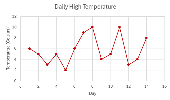
EXAMPLE
The time series below records the daily high temperature, in Celsius, every day over a two-week period. Construct a time series graph for this data.
| Day | Temperature (Celsius) |
|---|---|
| 1 | 6 |
| 2 | 5 |
| 3 | 3 |
| 4 | 5 |
| 5 | 2 |
| 6 | 6 |
| 7 | 9 |
| 8 | 10 |
| 9 | 4 |
| 10 | 5 |
| 11 | 10 |
| 12 | 3 |
| 13 | 4 |
| 14 | 8 |
Solution
EXAMPLE
The following data shows the Annual Consumer Price Index each year for ten years. Construct a time series graph for this data.
| Year | Annual Consumer Price Index |
|---|---|
| 1 | 184.0 |
| 2 | 188.9 |
| 3 | 195.3 |
| 4 | 201.6 |
| 5 | 207.342 |
| 6 | 215.303 |
| 7 | 214.537 |
| 8 | 218.056 |
| 9 | 224.939 |
| 10 | 229.594 |
Solution
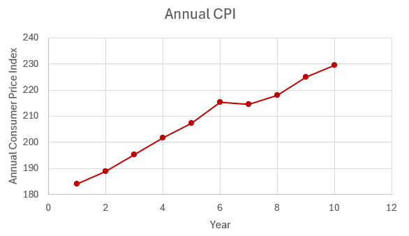
Time series graphs are important tools in various applications of statistics. When recording values of the same variable over an extended period of time, sometimes it is difficult to discern any trend or pattern. However, once the same data points are displayed graphically, some features jump out. Time series graphs make trends easy to spot.
Components of a Time Series
Time series forecasting models use historical time series data to develop a forecast of the future. Although most models can be applied to any time series data, the choice of model for a particular time series depends on the patterns or components present in the time series. Some models are better at capturing certain components than other models. To get the most accurate predictions, we want to select a model that is good at modelling the components present in the given time series. By analyzing the graph of a time series, we can often identify the components present in the time series, allowing us to break down a complex time series into more manageable parts in order to build better models and forecasts. Time series data typically exhibits one or more of four possible components that help us understand the underlying patterns present in a time series.
Trend Pattern
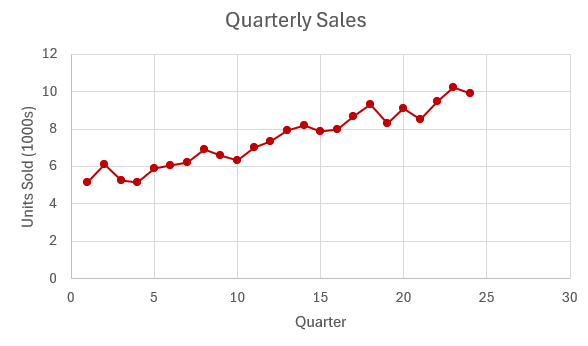
A trend pattern is the long-term movement or general direction of the data over a period of time. A trend could be upward, downward, or a flat trend and is generally the result of long-term factors or influences on the data. For example, in a time series for the price of a stock the overall increase or decrease in value of the stock over several years is considered a trend. Often, we look for linear trends in the data, and when a linear trend is present, we can use a trendline or simple linear regression model to model the data. But trends do not have to follow a linear model. Other examples of trends in a time series include quadratic trends or exponential trends.
EXAMPLE
The following time series graph shows the Annual Consumer Price Index each year for ten years. The trendline, found through simple linear regression, is included on the graph.
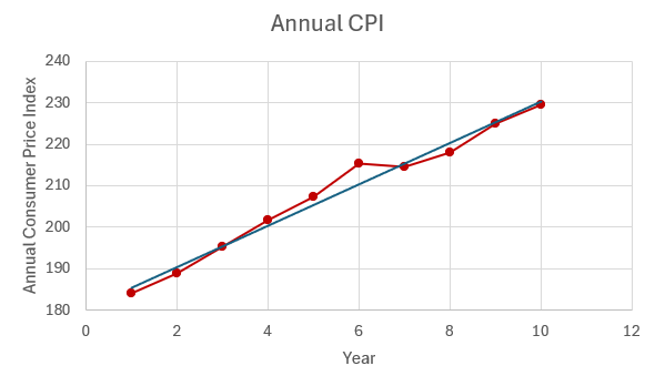
From the time series graph we can see the overall trend of the annual consumer price index is an increase over time. In this instance, the trend appears to be linear, which we can see by how closely the data follows the trendline.
Seasonality or Seasonal Patterns
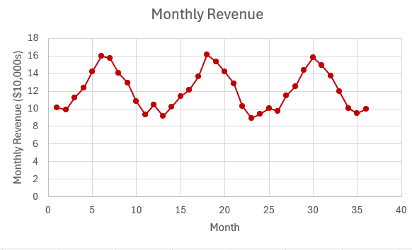
Seasonal patterns are repeated patterns that occur over a one-year period due to seasonal influences. Repeated and predictable highs and lows in the time series data that occur at the same time each year indicate seasonality in the data. For example, retail sales experience predictable highs during the holiday season every year, which creates a seasonal pattern.
EXAMPLE
The following time series graph shows a business's sales each quarter for four years.
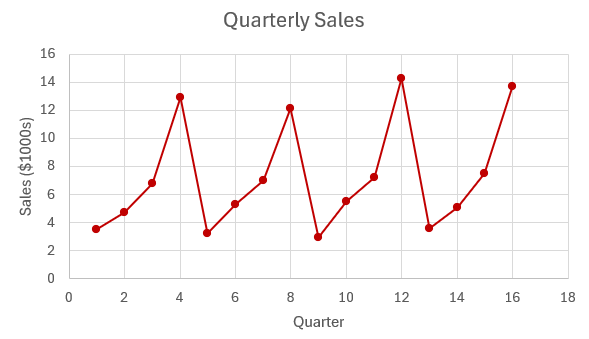
From the time series, we see seasonal patterns in the quarterly sales. We can see regular and predictable highs in every fourth quarter (quarters 4, 8, 12, and 16), which correspond to the increased sales the business sees during the holiday season in the last quarter of each year. We can also see regular and predictable lows in every first quarter (quarters 1, 5, 9, and 13), which correspond to the decrease in sales the business sees after the holiday season in the first quarter of the year.
Cycles or Cyclic Patterns
Unlike seasonality, which occurs at regular intervals, cyclic patterns occur at irregular intervals and are often influenced by multi-year economic or business cycles. These fluctuations are much longer in duration, typically spanning multiple years. Because of the extended time frame required for cycles, identifying a cyclic pattern in a time series is challenging.
Irregular Variation or Random Fluctuations
Random variation or irregular components in a time series are unpredictable or unforeseen changes in the data that cannot be attributed to any of the other components. Random fluctuations are often unexplained, reflecting the inherent randomness and unpredictability in the system.
EXAMPLE
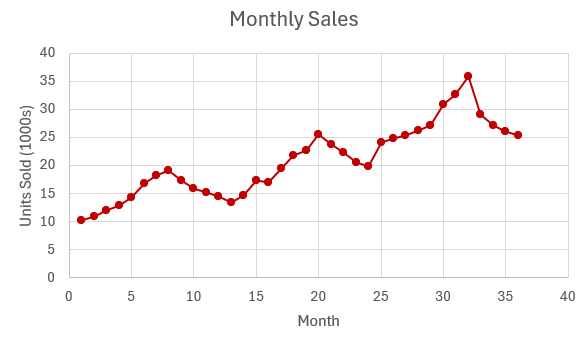
The following time series graph shows the number of units sold for a particular product each month for one year.
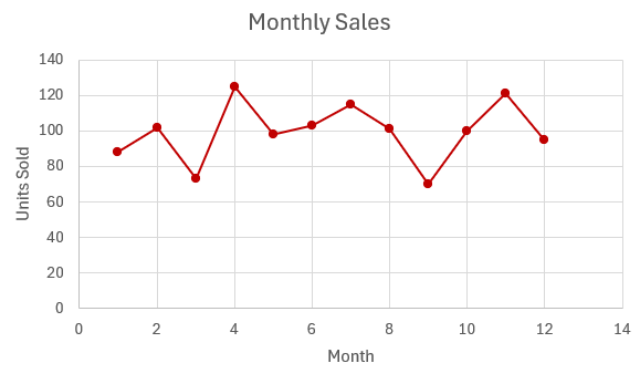 There is no general trend or pattern to the data from left to right across the graph, so the time series does not appear to have a trend component. With only one year of data, it is not possible to spot any seasonal effects or cyclical patterns. The time series graph does exhibit random variations.
Exercises
- For each of the following time series, identify the components of the time series present in the data.
Click to see Answer
- seasonal effects, random variation
- trend, random variation
- seasonal effects, trend, random variation
- The number of pizzas sold each week at a local pizza restaurant is given in the table below.
Week Number of Pizzas Sold 1 120 2 135 3 140 4 115 5 130 6 145 7 160 8 170 9 125 10 130 11 150 12 140 13 155 14 180 15 165 16 170 17 190 - Create a time series graph for this data.
- What components of a time series are present in the time series?
Click to see Answer
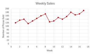
- trend, random variation
- The number of coffees sold each day at a local coffee shop is given in the table below.
Day Number of Coffees Sold 1 120 2 100 3 115 4 130 5 110 6 150 7 165 8 110 9 120 10 125 11 135 12 130 13 152 14 160 15 110 16 120 17 125 18 127 19 130 20 155 21 162 22 120 23 125 24 130 25 135 26 137 27 160 28 155 29 130 30 140 31 145 32 139 33 142 34 165 35 163 36 130 37 120 38 125 39 135 40 145 41 160 42 170 43 130 44 137 45 130 46 135 47 132 48 163 49 168 50 125 51 130 52 120 53 115 54 125 55 156 56 161 - Create a time series graph for this data.
- What components of a time series are present in the time series?
Click to see Answer
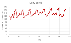
- seasonal effects, random variation
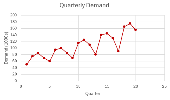
- The quarterly demand, in [latex]1000[/latex]s, for a particular product is recorded in the table below.
Quarter Demand (in [latex]1000[/latex]s) 1 50 2 75 3 85 4 70 5 60 6 95 7 100 8 85 9 70 10 115 11 125 12 110 13 80 14 140 15 145 16 130 17 90 18 165 19 175 20 155 - Create a time series graph for this data.
- What components of a time series are present in the time series?
Click to see Answer
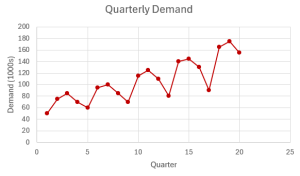
- trend, seasonal effects, random variation


Attribution
"2.2 Histograms, Frequency Polygons, and Time Series Graphs" in Introductory Statistics by OpenStax is licensed under a Creative Commons Attribution 4.0 International License.
