15.1 Control Charts
LEARNING OBJECTIVES
- Construct a control chart to monitor the quality of a process.
- Analyze a control chart to determine if a process is in or out of control.
The quality of a product or service is the degree to which the product or service meets specifications. Although quality control applies to both products and services, for simplicity, this chapter focuses on products and the manufacturing process used to produce those products. Through a regular process of sampling and inspections of the production process, a decision is made to either continue production or adjust the production process to bring the product up to acceptable quality standards.
Even though a manufacturing process employs the highest quality standards, there are always factors that disrupt the production process and cause a poor quality output. Factors that might result in poor quality include machines or tools breaking down or wearing out, defective or poor quality raw or purchased materials, vibrations altering a machine's settings, or mistakes made by human operators. By monitoring the process and production output, poor quality can be detected early, and corrective action taken to adjust the production process.
All processes contain some degree of variability, but the goal is to keep those variations under control and within acceptable limits. Variations fall into one of two categories—assignable or natural.
- Assignable variations are variations in the production process that are not random and controllable. For example, worn-out tools or machines, defects in raw materials, improperly adjusted equipment, and human error are assignable variations. These types of variations can be controlled and corrected. When quality is affected by assignable variations, the process is considered out-of-control and should be adjusted as soon as possible.
- Natural or common variations are variations in the production process that are random and uncontrollable. For example, random variations caused by temperature or humidity are natural variations. These types of variations occur in almost every production process and cannot be controlled by the manufacturer. When quality is affected by natural variations, the process is considered in-control and does not require adjustment.
Statistical process control is a process that sets standards for the product, monitors that the product meets those standards, takes measurements, and corrects quality problems as the product is produced. Of course, it is not possible to assess every single product that is produced. Instead, random samples of the product are taken and examined. If the samples fall within acceptable limits, the process is in-control and is allowed to continue. If the samples fall outside the acceptable limits, the production process is out-of-control, the process is stopped, any assignable variations are identified, and corrective action is taken to resolve those assignable variations.
NOTE
Statistical process control procedures are similar to hypothesis testing. The null hypothesis is that the process is in-control and the alternative hypothesis is that the process is out-of-control. Samples of the process are taken as evidence to either support the claim that the process is in-control (the null hypothesis) or to support the claim that the process is out-of-control (the alternative hypothesis). However, like any hypothesis test, the test may not identify the correct decision. For example, the statistical process control procedures may indicate that the process is out-of-control (the null hypothesis is false) when, in fact, the process is in-control, which is a Type I error in hypothesis testing. Similarly, the statistical process control procedures may indicate that the process is in-control (the null hypothesis is true) when, in fact, the process is out-of-control, which is a Type II error in hypothesis testing.
Control Charts
A control chart is a statistical tool used to monitor the quality or consistency of a process over time. A control chart is a graphical presentation of data over time. A control chart helps determine whether a process is in a state of statistical control or if there are any (assignable) variations that need corrective actions. For example, suppose the process is monitoring the mean of the samples. A series of samples are taken at different times, and the mean of each sample is calculated and plotted against time or order of production on the control chart. Typically, small samples are used to monitor the process on a control chart instead of individual items. Generally, individual items contain too much variability, which makes it difficult to identify trends in the process.
A control chart plots data points against time or order of production, similar to a time-series plot. Along with the data points, control charts include three lines—the centerline, the upper control limit, and the lower control limit—that help assess the stability and variability of a process over time.
- Centerline. The centerline represents the target or average value of the process being monitored on the control chart. The centerline is a reference point, which allows us to see how the data behaves relative to the expected or desired outcome. For example, suppose a company produces [latex]300[/latex] gram bags of ground coffee. As part of the quality control process, the company monitors the average weight of coffee in a sample of bags The centerline of the control chart is [latex]300[/latex] grams, the target weight of each bag of coffee.
- Upper Control Limit (UCL). The upper control limit is the highest value allowed for a data point to be considered in-control. The value of the upper control limit is based on a statistical formula that accounts for the variation in the process. Typically, the value of the upper control limit is two or three standard deviations above the centerline in a normally distributed process. The upper control limit helps detect when a process may be out-of-control due to significant variation in the process. Generally, a data point above the upper control limit indicates that the process may be experiencing abnormal variability that requires further investigation. For example, suppose a company produces [latex]300[/latex] gram bags of ground coffee. If the upper control limit is set at [latex]305[/latex] grams, any sample with a mean weight greater than [latex]305[/latex] grams may suggest a problem with the production process.
- Lower Control Limit (LCL). The lower control limit is the lowest value allowed for a data point to be considered in-control. The value of the lower control limit is based on a statistical formula that accounts for the variation in the process. Typically, the value of the lower control limit is two or three standard deviations below the centerline in a normally distributed process. The lower control limit helps detect when a process may be out-of-control due to significant variation in the process. Generally, a data point below the lower control limit indicates that the process may be experiencing abnormal variability that requires further investigation. For example, suppose a company produces [latex]300[/latex] gram bags of ground coffee. If the lower control limit is set at [latex]295[/latex] grams, any sample with a mean weight less than [latex]295[/latex] grams may suggest a problem with the production process.
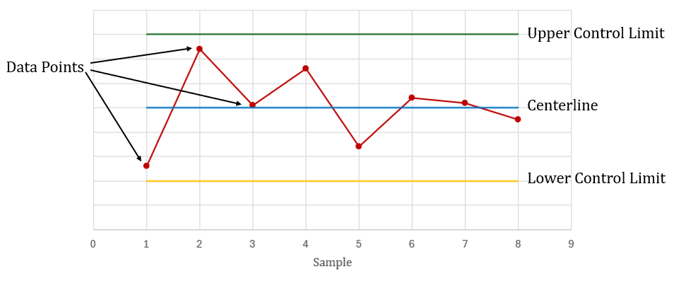 The upper control limit and lower control limit are calculated so that there is a high probability that data points fall in between the two limits when the process is in-control. Together, the centerline, upper control limit, and lower control limit help to determine if the process is in-control or out-of-control where corrective action is required. Data points falling outside the control limits typically signal that the process is out-of-control and that the process needs to be investigated for potential causes.
Interpreting a Control Chart
Interpreting a control chart involves analyzing the data points in relation to the centerline, upper control limit, and lower control limit, as well as recognizing patterns or trends that may indicate a need for corrective action. When a process is in-control, a control chart shows random fluctuations above and below the centerline within the upper and lower control limits. Abnormal or non-random appearing patterns on a control chart may indicate that a process is out-of-control, requiring corrective action.
Below is a list of abnormal or unusual control chart patterns that may indicate an out-of-control process.
- Data points above the upper control limit or below the lower control limit. When any data points fall outside the control limits, the process is considered out-of-control. In such cases, some unexpected or abnormal variation may be influencing the process, requiring corrective action.
When all of the data points are inside the control limits, the process is typically considered in-control. However, even when all the points are inside the control limits, certain patterns in the data may indicate an out-of-control process.
- Trends of six or more consecutive increasing or decreasing data points. Even if the data points are within the control limits, a consistent upward or downward movement of data points over time may indicate that something is changing in the process. In such cases, the process is considered out-of-control, requiring corrective action.
- Eight or more consecutive data points are all above or all below the centerline. A run of a certain number of consecutive data points all on one side of the centerline (either above or below it) may indicate something is changing in the process. In addition to eight or more consecutive data points all above or below the centerline, other patterns that may indicate a run include ten out of eleven data points all above or all below the centerline or twelve out of fourteen data points all above or all below the centerline. In such cases, the process is considered out-of-control, requiring corrective action.
- Fourteen or more consecutive points that alternate in direction (increasing then decreasing). Data points that follow a repeating, alternating pattern of high and low values may indicate something is changing the process. In such cases, the process is considered out-of-control, requiring corrective action.
- Two out of three consecutive data points are in the outer one-third of the control chart. When two out of three consecutive data points are more than two standard deviations from the centerline, it signals a potential issue in the process that may need investigation.
- Four out of five consecutive data points are in the outer two-thirds of the control chart. When four out of five consecutive data points are more than one standard deviation from the centerline, it signals a potential issue in the process that may need investigation.
- Eight consecutive data points with none within one standard deviation of the centerline. When eight consecutive data points are all more than one standard deviation from the centerline and the points are in both directions, it signals a potential issue in the process.
- Fifteen consecutive data points are all within one standard deviation of the centerline on either side of the centerline. When fifteen consecutive data points are all within one standard deviation of the centerline, on either side of the centerline, it signals a potential issue in the process.
Exercises
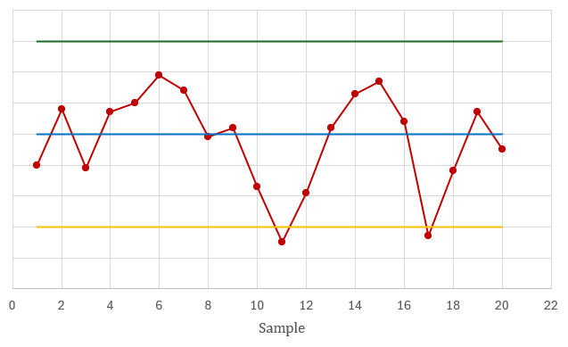
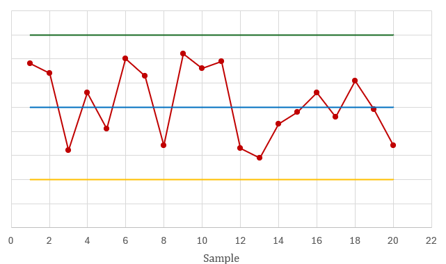
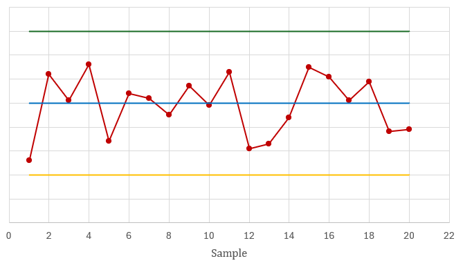
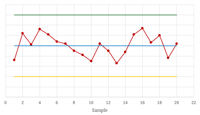
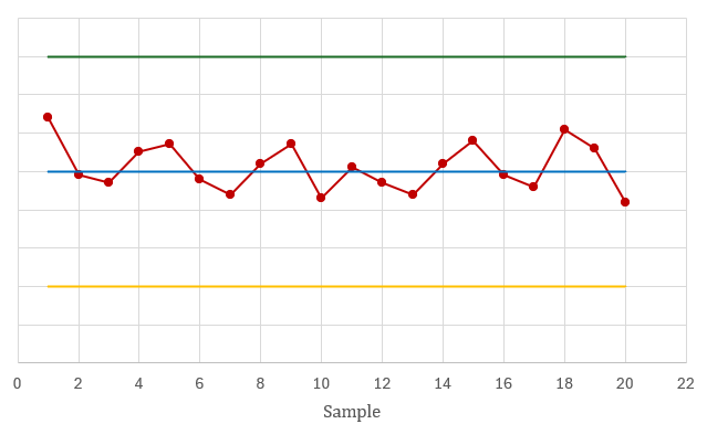
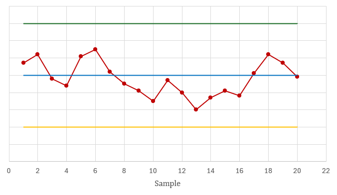
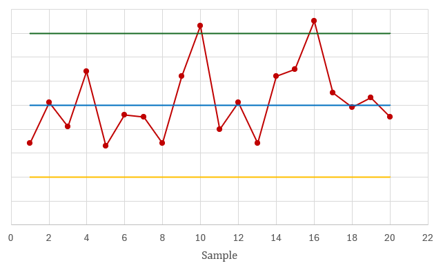
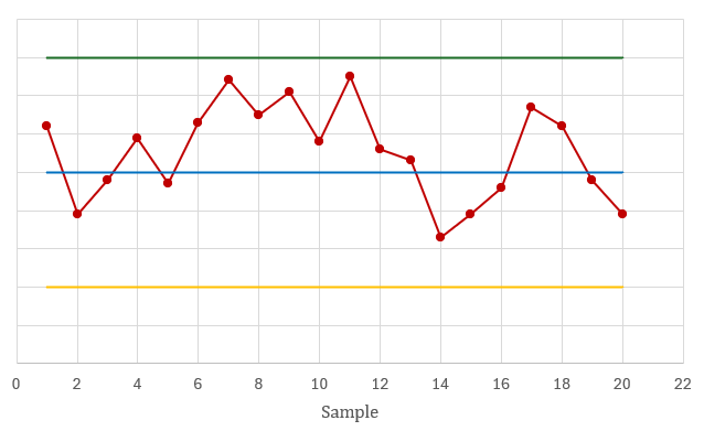
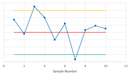
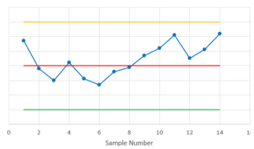
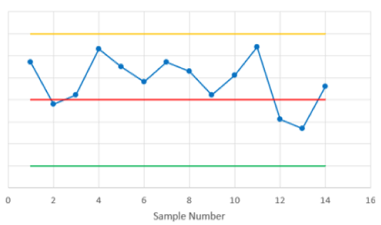
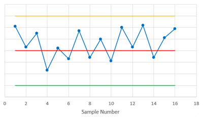
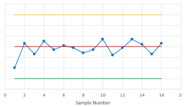
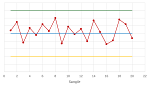
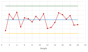
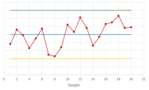
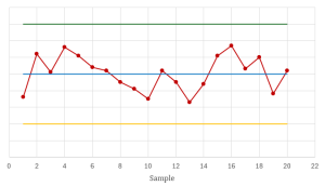
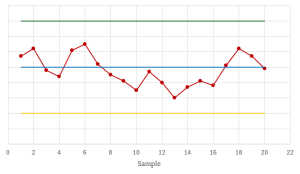
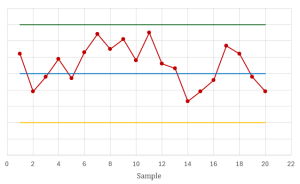
- For each of the following control charts, determine if the process is in-control or out-of-control. If the process is out-of-control, identify the pattern in the data that indicates an out-of-control process.

Click to see Answer
Out-of-control because there are points below the lower control limit.
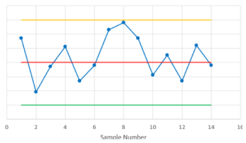
Click to see Answer
Out-of-control because there are [latex]15[/latex] consecutive points that alternate in direction.

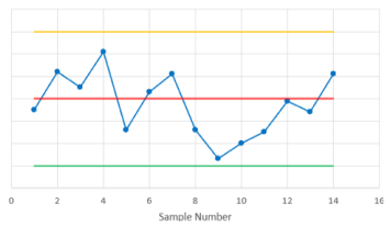
Click to see Answer
Out-of-control because there are [latex]8[/latex] consecutive points, none within one standard deviation of the centerline.
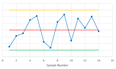
Click to see Answer
In-control.
Click to see Answer
Out-of-control because there are two of three consecutive points more than two standard deviations from the centerline.
Click to see Answer
Out-of-control because there are [latex]6[/latex] consecutive decreasing points.

Click to see Answer
Out-of-control because there are [latex]15[/latex] consecutive points, all within one standard deviation of the centerline.
Click to see Answer
Out-of-control because there are [latex]8[/latex] consecutive points all below the centerline.

Click to see Answer
Out-of-control because there are points above the upper control limit.
Click to see Answer
Out-of-control because there are four of five consecutive points more than one standard deviation from the centerline.