Chapter 2: Comparative Advantage and the Standard Trade Model
2.3 Benefits from Trade: Production Possibilities Frontier Under Constant and Increasing Costs
We can demonstrate the benefits of international trade using the production possibilities frontier (PPF). The PPF shows all combinations of quantities of two products that an economy can produce, assuming all of its resources are fully utilized and that the highest level of productivity is attained. Formally, the PPF assumes that the economy produces only two goods with a fixed quantity of resources and a given technology. We will show the benefits from international trade based on the theory of comparative advantage, first assuming constant costs and then subsequently assuming increasing costs. The following three videos provide some basic information on the development and meaning of the PPF.
Review: The Production Possibilities Frontier
Review or refresh your understanding of the production possibilities frontier by watching these videos.
Part 1 [5:13]
Source: Federal Reserve Bank of St. Louis. (2016, December 1). (1/3) The production possibilities frontier – Economic lowdown [Video]. YouTube. https://www.youtube.com/watch?v=nsQi2ipSP2c
Part 2 [5:24]
Source: Federal Reserve Bank of St. Louis. (2016, December 1). (2/3) The production possibilities frontier – Economic lowdown [Video]. YouTube. https://www.youtube.com/watch?v=8C9y_5-rshE
Part 3 [5:10]
Source: Federal Reserve Bank of St. Louis. (2016, December 1). (3/3) The production possibilities frontier – Economic lowdown [Video]. YouTube. https://www.youtube.com/watch?v=Nw0ugthoc8o
The Production Possibilities Frontier with Constant Costs
We can illustrate Ricardo’s theory of trade using a linear or straight-line PPF. Ricardo assumed that labour was the only factor and that labour productivity was constant across industries within each country. Given a fixed quantity of labour and the state of technology, the PPF represents production efficiency. To increase the production of one good, society must reduce the production of the other — there is a trade-off. With labour productivity constant, opportunity costs are constant, and the PPF is a straight line. Any combination of the two goods inside the PPF represents inefficient production, while any combination beyond the PPF is unattainable without trade.
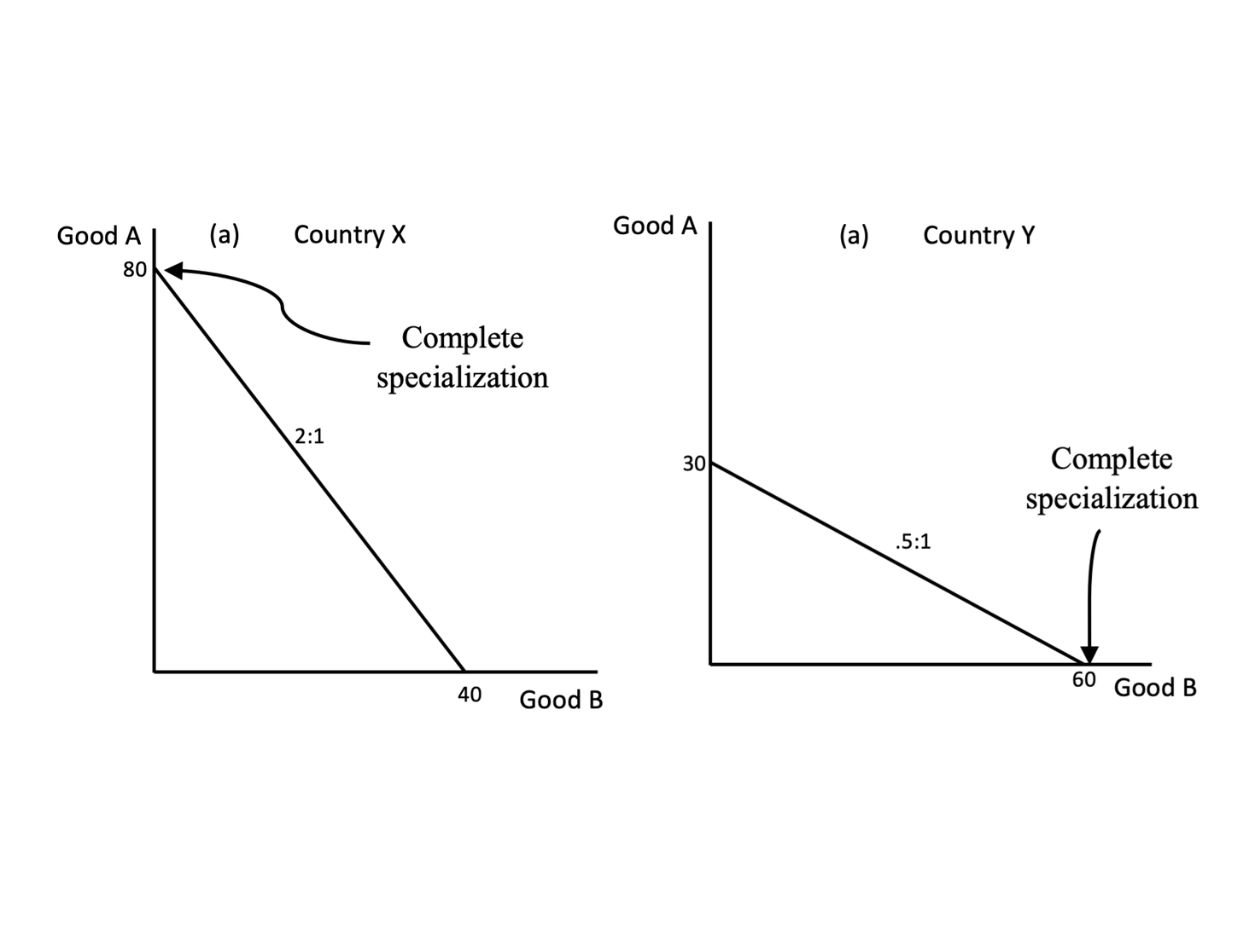
Given the straight-line or linear PPF, each country produces only the good in which it has a comparative advantage and imports the good in which it has a comparative disadvantage. This situation is illustrated in Figure 2.3.
Credit: © by Kenrick H. Jordan and Conestoga College, CC BY-NC-SA 4.0.
Based on Figure 2.3, Country X has a comparative advantage in the production of Good A and will, therefore, specialize completely in producing and exporting this good. Meanwhile, Country Y has a comparative advantage in producing and exporting Good B. Given a fixed quantity of labour and the state of technology, we see from the graph above that Country Y is able to produce more of Good B than Country X. Good B has a low price in Country Y and a high price in Country X. The converse is true for Good A. Since Country X can produce more of Good A than Good B, Good A will have a low price in Country X and a high price in Country Y.
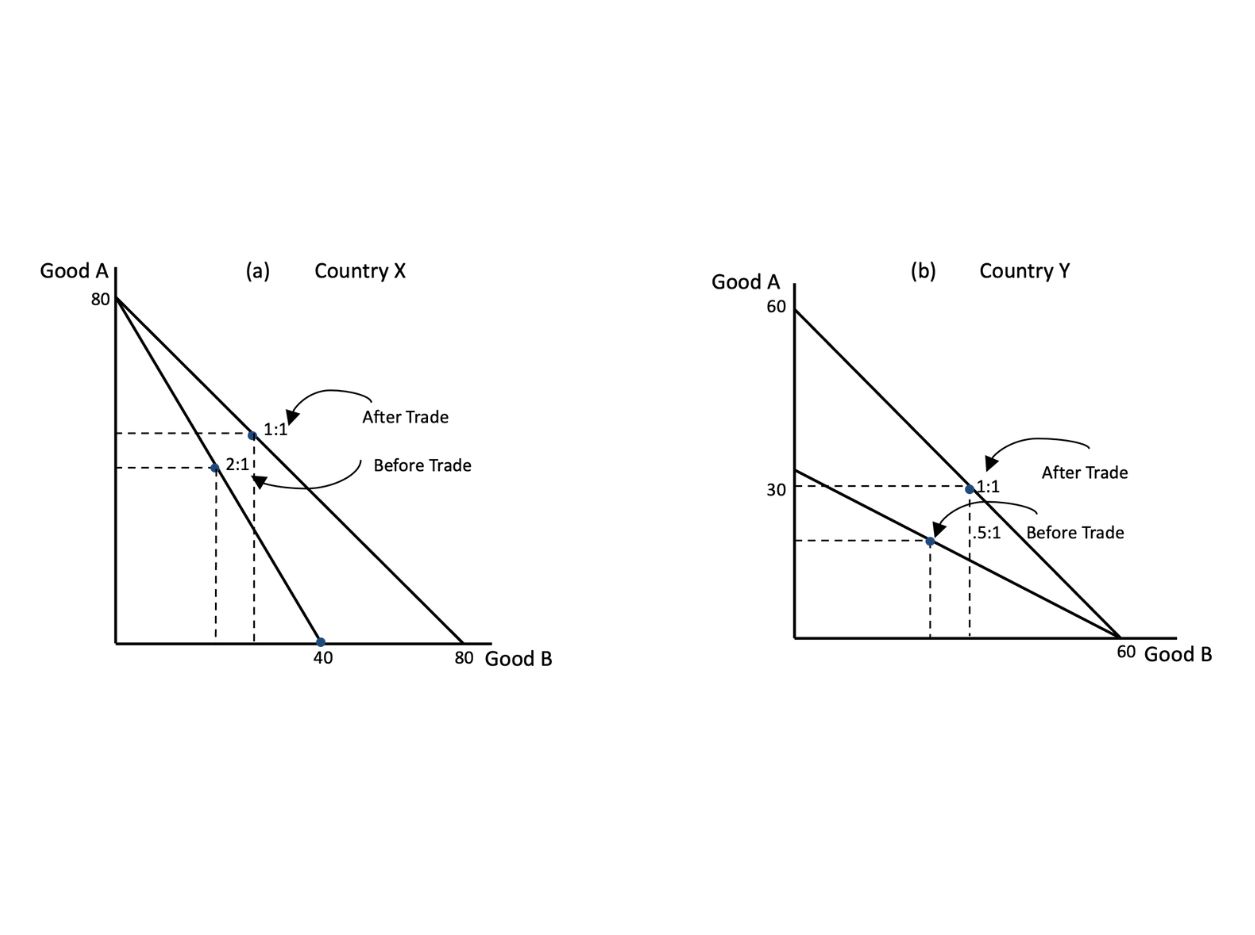
With international trade, the product whose price was initially low rises due to the additional source of demand from abroad. Meanwhile, the product whose price was initially high falls because of the additional source of supply that comes into the domestic market. Thus, there will be a tendency for the price of each traded product to be the same in both domestic markets as well as in the international market. As the relative price of the export products rises, each country can now buy more of the import product. With international trade, therefore, each country can now consume a combined quantity of both products that is beyond its production possibilities frontier. Therefore, each country benefits from trade.
In Figure 2.4, on the presumption that the international price ratio settles at 1:1 (i.e., one unit of Good A exchanges for 1 unit of Good B), we can compare the situation before trade with the situation after trade for each country. That is, we can compare a point on the domestic terms of trade line (i.e., the same as the PPF) with a point on the international terms of trade line. Since the international terms of the trade line lie beyond the domestic terms of the trade line, a point on the former represents an improvement compared with the situation before the trade. Thus, the economic well-being of both countries improves with trade. Each country is now more productive because it directs all its resources into the industry in which input cost (i.e., labour use) is lower. With both countries now able to produce more output at lower cost, product prices fall as real income rises, facilitating higher consumption.
Credit: © by Kenrick H. Jordan and Conestoga College, CC BY-NC-SA 4.0.
The Production Possibilities Frontier with Increasing Costs
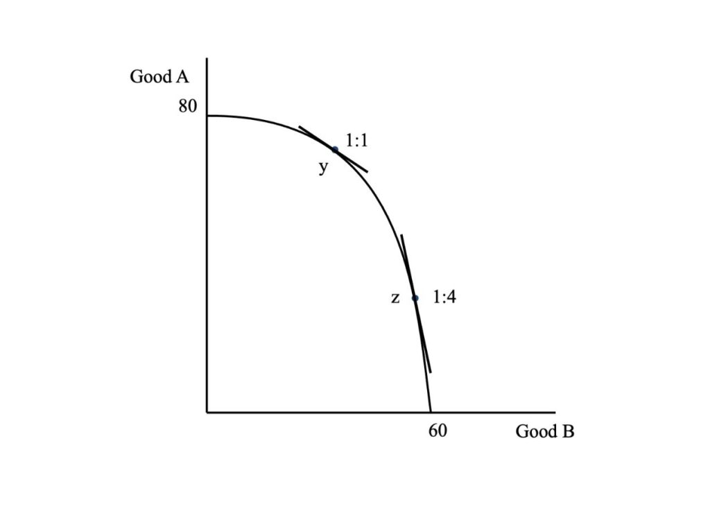
While this explanation of international trade is a meaningful one, the idea of complete specialization in production is a limitation. In reality, complete specialization is unlikely because many industries face increasing costs of production. Usually, to produce more of one good, increasingly more resources must be bid away from production of the other good, which raises the cost of production. Also, most firms experience diminishing returns to the factors of production, which, given constant factor prices, causes marginal costs to rise. When the PPF reflects increasing opportunity cost, it becomes concave, compared with the linear PPF that results from the assumption of constant opportunity cost. Figure 2.5 shows the production possibilities frontier of a country with increasing costs.
Credit: © by Kenrick H. Jordan and Conestoga College, CC BY-NC-SA 4.0.
Since the PPF indicates the production possibilities facing the economy (i.e., the various output combinations that the economy can produce), how does the society choose the combination of the two goods that produces the highest economic benefit at the lowest cost? In other words, how does the society allocate its resources to get the maximum benefit in terms of well-being? Since the PPF represents only the supply side of the economy, we must consider the preferences and income of the society. We introduce society’s preferences through the use of community indifference curves.
An indifference curve shows the various combinations of consumption quantities of two goods that lead to the same level of satisfaction or economic well-being. The assumptions behind indifference curves are:
- Completeness — consumers can compare and rank all possible consumption bundles;
- Transitivity — if consumption bundle B is preferred to bundle A and bundle C is preferred to bundle B, then bundle C is preferred to bundle A;
- More consumption is always better.
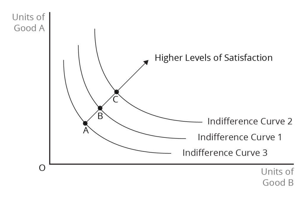
We can think about a map of indifference curves — an infinite number of indifference curves radiating outward from the origin. Consumption bundles on an indifference curve further away from the origin are preferred to bundles on lower indifference curves. Along any indifference curve, the consumer faces a trade-off between quantities of the two products if he or she wants to maintain the same level of satisfaction. Figure 2.6 shows a map of indifference curves.
Credit: © by Kenrick H. Jordan and Conestoga College, CC BY-NC-SA 4.0.
The Best Choice for an Individual Consumer
While indifference curves reflect the preferences of the consumer, by themselves, they do not tell us what combination of the quantities of the two products the consumer will buy. The consumption bundle that the consumer actually buys depends on his or her available income and product prices. Formally, the consumer has a budget constraint, which shows the combinations of quantities of the two products that the consumer can buy, assuming that the income is completely spent.
For any given income, the consumer faces a trade-off in consumption that is reflected in the ratio of the prices of the two products. That is, if the consumer buys more of one product, he must buy less of the other product. This price ratio, or the relative price, is equal to the slope of the budget constraint. As a result, the budget constraint is often called the price line. Given the budget constraint, the consumer will choose a consumption bundle that provides the highest level of satisfaction. This quantity combination of the two products is given by the point of tangency between the price line and the highest attainable indifference curve. Figure 2.7 shows the best choice between two goods for the consumer.
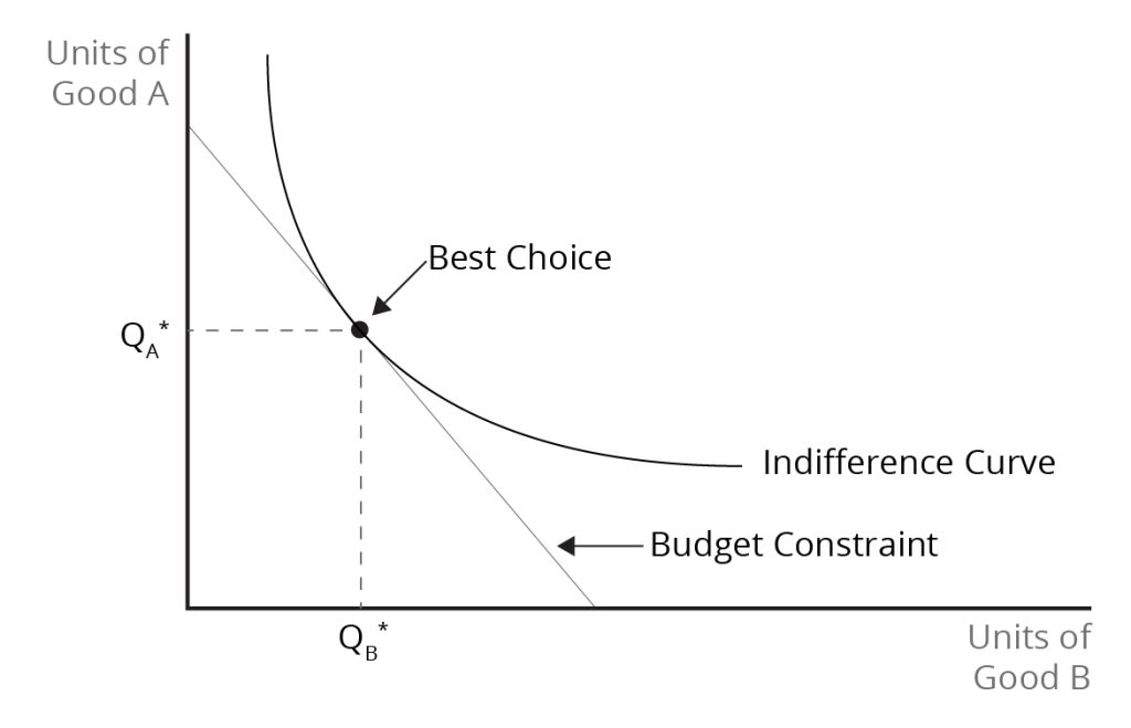
Credit: © by Kenrick H. Jordan and Conestoga College, CC BY-NC-SA 4.0.
The Best Choice for the Nation
To analyze international trade, we use community indifference curves to reflect the preferences of a nation. Community indifference curves show how the economic well-being of the nation (or, more generally, a group of people) depends on the bundle of products consumed by the nation. The nation’s choice of consumption bundle is determined in a manner similar to that for the individual. We use community indifference curves together with a price line, representing the national budget constraint, as the basis for determining the combination of the quantities of the two products that the nation consumes.
We must note that economic theory raises questions about the application of community indifference curves. Because the preferences of individuals differ, the shapes of indifference curves for different individuals will vary. Therefore, aggregating individual indifference curves into community indifference curves to represent national preferences is problematic. Also, for related reasons, the concept of national well-being is not well defined – higher national well-being does not mean that everyone is better off since what constitutes a benefit from consumption will vary among individuals.
Image Descriptions
Figure 2.3 International Trade Under Constant Costs
The image consists of two graphs labelled (a) Country X and (a) Country Y, representing Production Possibilities Curves (PPC) under constant costs before trade. Both graphs display two axes representing quantities of two different goods, Good A on the y-axis and Good B on the x-axis.
The line on the Country X graph originates at 80 units of Good A on the vertical axis and ends at 40 units of Good B on the horizontal axis. The curve has a labelled point of “Complete specialization” at the beginning of the and is labelled “2:1,” indicating a relationship between the production of Good A and Good B.
The line on the Country Y graph for Country X originates 30 units of Good A on the vertical axis and ends at 60 units of Good B on the horizontal axis. The curve has a labelled point of “Complete specialization” at the end of the and is labelled “0.5:1,” indicating a relationship between the production of Good A and Good B.
[back]
Figure 2.4: International Trade Under Constant Costs, Before and After Trade
The image consists of two graphs labelled (a) Country X and (b) Country Y. Both graphs are labelled ‘Good A’ on the vertical axis and ‘Good B’ on the horizontal axis. The scales on the axes differ between the two graphs.
For graph (a) Country X, the Good A axis and Good B axis extend to 80 units. A line extends from Good A 80 downward to Good B 40. Dotted lines intersect the line at the label 2:1, which is further labelled “Before Trade.” A line extends from Good A 80 downward to Good B 80, further to the right of the first line. Dotted lines intersect the line at a slightly higher point, at the label 1:1, which is further labelled “After Trade”.
For graph (b) Country Y, the Good A axis and Good B axis extend to 60 units. A line extends from Good A 30 downward to Good B 60. Dotted lines intersect the line at the label 5:1, which is further labelled “Before Trade”. A line extends from Good A 60, higher than the first line, downward to Good B 60. Dotted lines intersect the line at a slightly higher point, at the label 1:1, which is further labelled “After Trade.”
[back]
Figure 2.5: The Production Possibilities Frontier with Increasing Costs
The image displays a graph with two axes: the vertical axis (y-axis) is labelled “Good A” and is marked with the number 80 at the end; the horizontal axis (x-axis) is labelled “Good B” with a marked just past center at 60. Two points with line tangents are marked on the curve: the higher point “y” with a ratio of 1:1 above it and a lower point “z” with a ratio of 1:4 below it.
[back]
Figure 2.6: An Indifference Curve Map
The image presents a graph with a vertical axis labelled “Units of Good A,” and a horizontal axis labelled “Units of Good B,” with the letter “O” at the origin where the axes meet. Three smooth, convex curves extend from the upper left to the lower right, labelled as “Indifference Curve 3,” “Indifference Curve 1,” and “Indifference Curve 2,” from left to right. A diagonal line intersects all three curves, beginning on Curve 3 and moving up to the right ending beyond Curve 2 with an arrowhead and labelled “Higher Levels of Satisfaction” The three points of intersection on the line are labelled “A,” on Curve 3, “B” on Curve 1, and “C” on Curve 2.
[back]
Figure 2.7: The Consumer’s Best Choice Using Indifference Curves and the Budget Constraint
The image shows a graph with a vertical axis labelled “Units of Good A” and a horizontal axis labelled “Units of Good B.” There is a convex curve labelled “Indifference Curve.” A straight, downward-sloping line labelled “Budget Constraint” is to the left of the curve. The point where the Budget Constraint is tangent to the Indifference Curve is marked as the “Best Choice” and labelled with a bold dot. From the dot, dashed lines lead horizontally and vertically to the respective axes, and at the intersections, they indicate the number of goods A and B at the optimal choice, marked as “QA*” and “QB*,” respectively.
[back]
a diagram that shows the productively efficient combinations of two products that an economy can produce given the resources it has available
a graph that shows combinations of different goods among which a consumer is indifferent, i.e., that gives the same level of satisfaction to a consumer

