Chapter 1: Introduction to Economics of International Trade
1.4 Demand, Supply, Markets, and the Basic Theory of Trade
In this section, we review the fundamental concepts of demand, supply, and markets and use them to show that exchange is beneficial for both buyers and sellers under perfect competition. Consumer surplus and producer surplus are the basis for measuring the benefits to producers and consumers from any market transaction. Recognizing that foreign transactions widen the scope of the market, we apply demand and supply analysis to develop the basic theory of international trade.
The main conclusions that we derive include the following:
- Initial price differences between countries are the immediate reason for trade.
- Trade changes the domestic price in participating countries and leads to a single price in all markets.
- Countries participating in trade gain economic well-being.
- The gains from trade for participating countries are importantly influenced by the relative changes in domestic prices.
- Trade alters domestic production and consumption.
- Trade affects the economic well-being of different groups in society differently.
First, let’s consider demand, supply, and market equilibrium, along with consumer surplus and producer surplus. Then, we will develop the basic model of international trade and draw the main conclusions stemming from the model.
Demand
The key factors influencing demand are consumer preferences, the product’s price, the prices of related products, and income. Given these factors, individual consumers attempt to obtain the highest level of satisfaction.
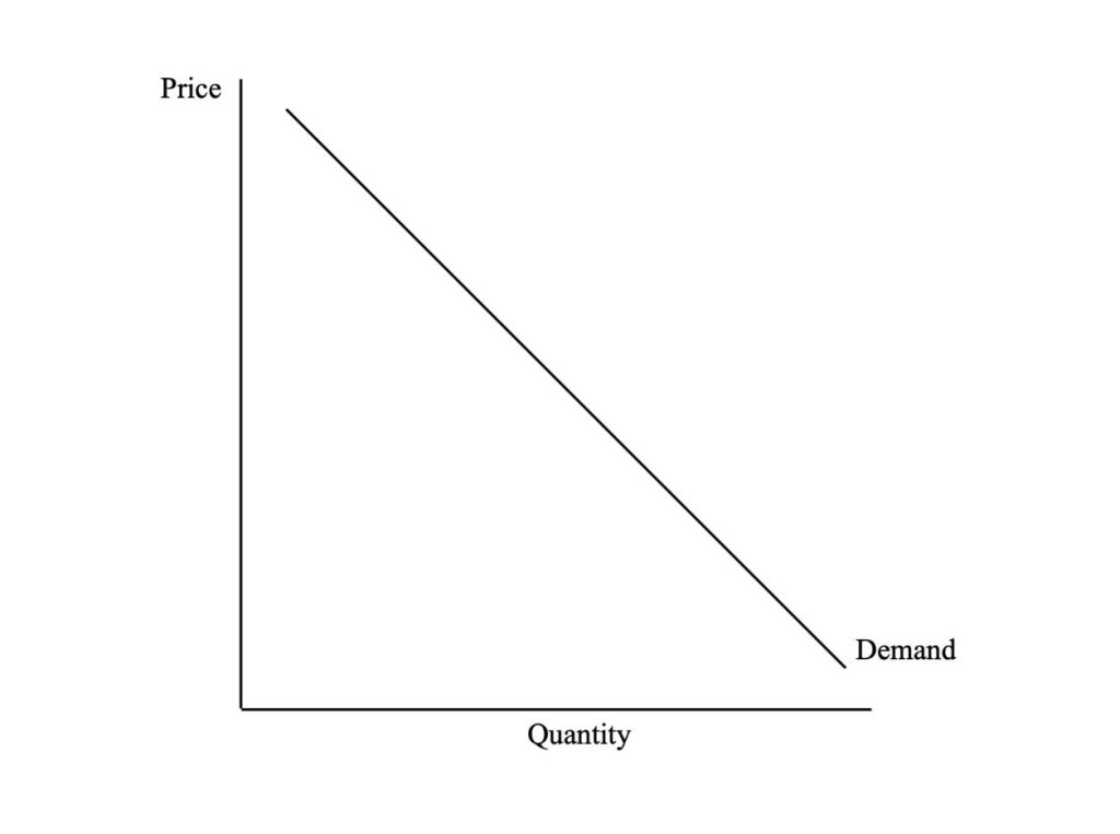
The law of demand isolates the relationship between the quantity demanded and the product’s price, assuming all other influences remain unchanged. We can view this relationship in the form of a demand curve, as shown in Figure 1.3, which plots the respective quantities that the consumers are willing to purchase at different prices. In effect, the demand curve tells us how much of the product the consumer would buy if faced with particular prices.
Review: Demand
Review or refresh your understanding of the concept of demand in economics by reading “3.1 Demand” in Principles of Economics (published by Saylor Academy).
The law of demand indicates an inverse relationship between the product’s price and the quantity demanded. This negative relationship is influenced by substitution and income effects. The substitution effect arises from the fact that changes in relative prices usually cause consumers to switch purchases away from the more expensive product toward the cheaper one. The income effect reflects the potential for consumers to buy a larger quantity of one or more products as real income increases due to a fall in one product’s price. If the quantity purchased increases as real income rises, the product in question is a normal good; if the quantity purchased falls in response to an increase in real income, the product is an inferior good. Most goods are presumed to be normal.
Credit: © by Kenrick H. Jordan and Conestoga College, CC BY-NC-SA 4.0.
Price Elasticity of Demand
While we recognize that the quantity bought will usually fall in response to a price increase, we are often interested in how much — quantity demanded changes in response to the price change. We measure this quantity response by the price elasticity of demand. The price elasticity of demand is the percentage change in quantity demanded divided by the percentage change in the product’s price:
[latex]\%\Delta\text{Q}_{d} \div \%\Delta\text{P}[/latex]
where [latex]\Delta[/latex] is the change, [latex]\text{Q}_{d}[/latex] is quantity, and [latex]\text{P}[/latex] is price.
The interpretation of the price elasticity of demand is shown in Table 1.2.
Interpretation
| Price Elasticity of Demand | Interpretation |
|---|---|
| [latex]\varepsilon_{d}>{1}[/latex] | Demand is price elastic |
| [latex]\varepsilon_{d}<{1}[/latex] | Demand is price inelastic |
| [latex]\varepsilon_{d}={1}[/latex] | Demand is unitary elastic |
- The calculated value for the elasticity is negative, reflecting the inverse relationship between price and quantity demanded. However, its sign is usually ignored.
- If the calculated value of the price elasticity of demand is greater than 1 in absolute terms, demand is elastic, meaning that a 1% fall in price leads to a greater than 1% increase in quantity demanded.
- If price elasticity is less than 1, demand is inelastic, meaning that a 1% fall in price leads to a less than 1% increase in quantity demanded.
- If price elasticity is equal to 1, demand is unit elastic, meaning that a 1% fall in price leads to a 1% increase in quantity demanded.
Change in Quantity Demanded Versus Change in Demand
A change in the price of the product will lead to a change in the quantity demanded and a movement along the demand curve in keeping with the law of demand. In this case, all the other influences on demand (e.g., income, prices of related products) remain unchanged in the background. If, however, any one of the influences on demand other than the product’s price were to change, there would be a change in demand, and the demand curve would shift, as indicated in Figure 1.4. For instance, an increase in income raises demand and shifts the demand curve to the right, whereas a decrease in income lowers demand and shifts the demand curve to the left.

Credit: Figure 1 in “Changes in Supply and Demand” © Lumen Learning, CC BY 4.0
Consumer Surplus
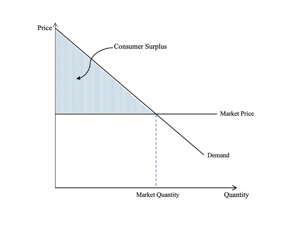
The demand curve reflects the value of the product to the consumer. For a specific quantity of the product, the demand curve represents the highest price the consumer is willing to pay, consistent with the expected benefit. However, in a competitive market, the consumer pays the prevailing price, which may be different from the value he or she puts on the product. To the extent that the value the consumer places on the product is higher than the market price, there is a net gain for the consumer. If the net gains to all consumers buying the product at the market price are added together, this represents the net benefit to all consumers or consumer surplus. Graphically, consumer surplus is represented by the area below the demand curve for the product and above the market price line, as shown in Figure 1.5.
Credit: © by Kenrick H. Jordan and Conestoga College, CC BY-NC-SA 4.0.
A major application of consumer surplus is to measure the impact on the economic well-being of consumers of a change in the market price. A reduction in price increases the well-being of consumers as they can buy more of the product at a lower price, whereas a higher price causes their well-being to fall.
Supply
A firm supplies a product to make a profit. Profit, on a unit basis, is the difference between price and the average total cost of production and sales. Therefore, supply depends on the price of the product, the price of other related products, the prices of resource inputs, and the technology used in production. The latter two factors influence the cost of production and sales.
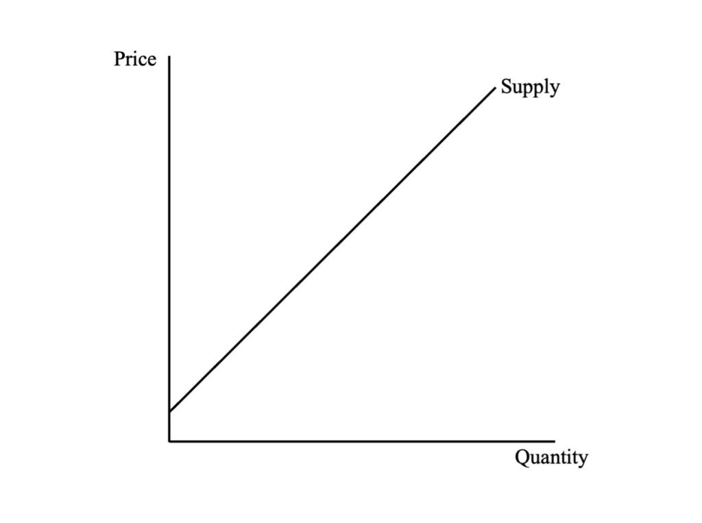
The law of supply isolates the relationship between the quantity of the product supplied and its price, while the other factors influencing supply remain unchanged. We can represent this relationship using a supply curve which plots the respective quantities that the producers will offer for sale at particular prices.
Review: Supply
Review or refresh your understanding of the concept of supply in economics by reading “3.2 Supply” in Principles of Economics (published by Saylor Academy).
The law of supply indicates a positive relationship between the product’s price and the quantity supplied. Since costs typically increase as the production of a good or service expands, producers require successively higher prices to compensate them for rising costs. The supply curve, shown in Figure 1.6, therefore, reflects the increasing marginal cost of production. This means that the supply curve is also a marginal cost curve.
Credit: © by Kenrick H. Jordan and Conestoga College, CC BY-NC-SA 4.0.
Price Elasticity of Supply
We have established that the quantity of a good that is produced and sold will usually rise in response to an increase in its price. However, we are likely to be interested in how much the quantity supplied changes because of changes in price. This quantity response is measured by the price elasticity of supply, which is the percentage change in quantity supplied divided by the percentage change in the product price:
[latex]\%\Delta\text{Q}_{s} \div \%\Delta\text{P}[/latex]
where [latex]\Delta[/latex] is the change, [latex]\text{Q}_{s}[/latex] is quantity, and [latex]\text{P}[/latex] is price.
The interpretation of the price elasticity of supply is shown in Table 1.3.
Interpretation
| Price Elasticity of Supply | Interpretation |
|---|---|
| [latex]\varepsilon_{s}>{1}[/latex] | Supply is price elastic |
| [latex]\varepsilon_{s}<{1}[/latex] | Supply is price inelastic |
| [latex]\varepsilon_{s}={1}[/latex] | Supply is unitary elastic |
- The calculated value for the elasticity is positive, reflecting the positive relationship between price and quantity supplied.
- If the price elasticity of supply is greater than 1, supply is elastic, meaning that an increase in price will lead to a more than proportional increase in quantity supplied.
- If the price elasticity of supply is less than 1, supply is inelastic in that an increase in price will lead to a less-than-proportional increase in quantity supplied.
- If the elasticity is equal to 1, supply is unit-elastic, and the positive quantity response will be proportional to the increase in price.
A Change in Quantity Supplied versus a Change in Supply
A change in the product’s price will cause a change in the quantity supplied and a movement along a given supply curve, in line with the law of supply. In this case, all the other influences on supply remain unchanged. If, however, there were to be a change in any of the other factors affecting supply, there would be a change in supply, and the supply curve would shift, as indicated in Figure 1.7. For instance, reducing resource prices or improving technology would increase supply, and the supply curve would shift to the right. Changes in these same factors in the opposite direction would reduce supply and cause the supply curve to shift inward.

Credit: Figure 3 in “Changes in Supply and Demand” © Lumen Learning, CC BY 4.0.
Producer Surplus
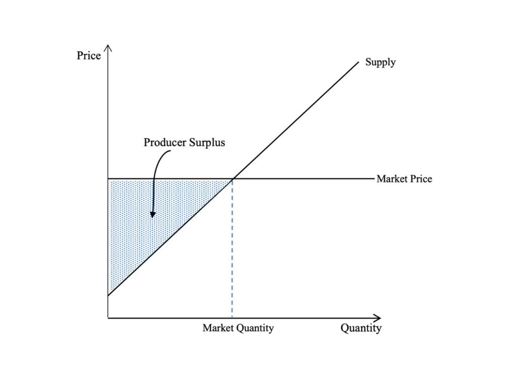
The supply curve reflects the lowest cost associated with supplying specific quantities of the product. However, in a competitive market, the producer receives the prevailing market price, which may be different from the minimum price he or she is willing to accept. To the extent that the minimum acceptable price to the producer is less than the market price, there is a net gain. If the net gains to all producers were combined, this would represent their total net benefit or producer surplus. Graphically, producer surplus is represented by the area above the supply curve for the product and below the price line, as shown in Figure 1.8.
Credit: © by Kenrick H. Jordan and Conestoga College, CC BY-NC-SA 4.0.
We use producer surplus to measure the impact on producers of a change in the market price. An increase in price raises the economic well-being of producers as they produce more, whereas a lower price causes producers’ net benefits to fall.
Market Equilibrium: Bringing Supply and Demand Together
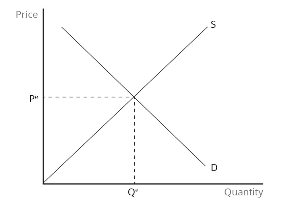
Market equilibrium is determined by the interaction of demand and supply conditions and occurs when the quantity demanded is equal to the quantity supplied. The equilibrium price is determined simultaneously with the equilibrium quantity, as shown in Figure 1.9. At the point of intersection of the supply and demand curves, the equilibrium quantity of the product delivers the highest possible benefit to society at minimum cost in terms of resource use. Therefore, in equilibrium, production is socially efficient.
Any deviation of the market price from its equilibrium value would lead to either a surplus or shortage, which would set in motion forces that eventually return the market to equilibrium. In equilibrium, both sides of the market benefit from the exchange – i.e., there are net benefits for both consumers and producers. Moreover, the sum of consumer surplus and producer surplus is at a maximum. The distribution of the gains from market exchange between consumers and producers depends on the market price and the elasticities of supply and demand.
Credit: © by Kenrick H. Jordan and Conestoga College, CC BY-NC-SA 4.0.
Review: Market Equilibrium
Review or refresh your understanding of the concept of equilibrium in economics by reading “3.3 Demand, Supply, and Equilibrium” in Principles of Economics (published by Saylor Academy).
International Trade Between Two National Markets
Initial differences in the price of a product in their domestic markets is the reason that two countries engage in international trade. Let us assume that two countries producing and consuming a particular product are not engaging in international trade. The price of the product is high in one country and low in the other, with the difference in price caused by differences in resource availability or in technology. Once people become aware of the price difference, they would recognize the opportunity for arbitrage. Arbitrage involves buying the product in the market where it has a low value and selling it in the market where its value is high to make a profit.
International trade will now emerge because of this difference in prices. This situation is depicted in Figure 1.10. For any price above the equilibrium in the low-price national market, excess supply and, therefore, exports will arise. Also, for any price below the equilibrium in the high-price national market, there will be excess demand and, therefore, imports will emerge. Therefore, an international market for the product will come into being.
In the low-price market, the additional source of demand from foreign buyers raises the product’s price, while in the high-price market, the increase in available supplies due to imports reduces it. Assuming that there are no transportation costs between the two countries and no other barriers to trade, free trade will eventually lead to a single price in both national markets. At that price – the world price – the international market will be in equilibrium, with export supply being equal to import demand. In equilibrium, world supply is also equal to world demand. As in any market, any imbalance between export supply and import demand will set off an adjustment process that pushes the international price back to its equilibrium value.

Credit: © by Kenrick H. Jordan and Conestoga College, CC BY-NC-SA 4.0.
The Effects on Economic Well-Being in the Importing Country
In the importing country – where the product price was initially high – the shift from self-sufficiency to free trade causes the price on the domestic market to fall. On the one hand, this provides a benefit to consumers in this country as they pay a lower price and can now purchase a larger quantity of the product. Consumer surplus, therefore, increases. On the other hand, producers in the importing country are worse off because of international trade because the domestic price falls, and they supply a smaller quantity of the product due to import competition. Producer surplus, therefore, declines. However, with consumers gaining more than domestic producers lose, the economic well-being of the importing country increases if gains or losses are valued equally for consumers and producers.
The Effects on Economic Well-Being in the Exporting Country
In the exporting country, where the product price was initially low, the shift from self-sufficiency to free trade raises the price on the domestic market. This provides a benefit to producers in this country as they receive a higher price and sell a larger quantity of the product. Producer surplus, therefore, increases. On the other hand, consumers in the exporting country are worse off due to trade because of the increase in the domestic price and the smaller quantity of the product that they can now buy. Consumer surplus, therefore, shrinks. With producers gaining more than domestic consumers lose, the economic well-being of the exporting country rises if gains or losses are valued the same for consumers and producers.
The Distribution of the Gains Between Importing and Exporting Countries
This analysis shows that both importing and exporting countries gain from free trade and, therefore, the world also benefits. However, we must also consider whether one country gains more economic well-being than the other. In the international market, we can compare the relative sizes of the surpluses accruing to the importing and exporting countries. Since exports and imports must be equal, the relative gains depend on the size of the price change in both countries. The country that experiences the larger price change will have greater net benefits from trade. The net benefits are divided in proportion to the changes in price that international trade brings to both the importing and exporting countries. The elasticities of import demand and export supply are also important, with the country having the more inelastic trade curve – export supply curve or import demand curve – gaining more.
Attributions
Figure 1.4 A Change in Demand reuses Figure 1 in “Changes in Supply and Demand” of Microeconomics by Lumen Learning and available under a CC BY 4.0 Deed | Attribution 4.0 International | Creative Commons license.
Figure 1.7 A Change in Supply reuses Figure 3 in “Changes in Supply and Demand” of Microeconomics by Lumen Learning and available under a CC BY 4.0 Deed | Attribution 4.0 International | Creative Commons license.
Image Descriptions
Figure 1.3: Demand Curve
The image is a graph with a vertical axis labelled “Price” and a horizontal axis labelled “Quantity.” A single downward-sloping line extends from a high point on the vertical axis to the far-right point on the horizontal axis. The line is labelled “Demand” near its intersection with the horizontal axis. The graph has no numerical scale, grid lines, or other annotations.
[back]
Figure 1.4: Change in Demand
The image is a graph representing a change in market demand. The graph has two axes: the vertical axis is labelled “Price,” and the horizontal axis is labelled “Quantity.” There are three downward-sloping lines, equidistant and parallel to one another. The leftmost demand curve is labelled “D1“, the middle demand curve is labelled “D0“, and the rightmost demand curve is labelled “D2“. The lines are equally angled, parallel to one another, and uniformly spaced apart. Two sets of stacked arrows between the lines indicate movement from one demand curve to another. One set of stacked arrow points from D0 to D1 indicates a shift to the left, and the other points from D0 to D2 indicate a shift to the right. These arrows symbolize a decrease and an increase in demand, respectively.
[back]
Figure 1.5: Consumer Surplus
The image shows a simple graph with two axes: the vertical axis represents “Price,” and the horizontal axis represents “Quantity.” A downward-sloping line labelled “Demand” intersects the vertical axis at a high price point and the horizontal axis at a point further to the right, indicating that as price decreases, quantity demanded increases. There is a horizontal line labelled “Market Price,” intersecting the demand curve, indicating the market equilibrium price. The area between the demand curve, the market price, and the vertical axis is shaded, indicating the consumer surplus area. There is a vertical dashed line from the intersection point of the demand curve and the market price extending down to meet the horizontal axis, labeled “Market Quantity.” No other textual information is present.
[back]
Figure 1.6: Supply Curve
The image displays a simple graph with a vertical axis on the left, labelled “Price,” and a horizontal axis at the bottom, labelled “Quantity.” A single straight line originates from the y-axis, just above where the axes intersect, and rises diagonally to the upper right side of the graph, indicating a direct relationship between price and quantity. The slope of the line is positive, suggesting that as the price increases, the quantity of goods supplied also increases. The diagonal line is labelled “Supply.”
[back]
Figure 1.7: A Change in Supply
The image shows a simple line graph with two axes: the vertical axis is labelled “Price,” and the horizontal axis is labelled “Quantity.” There are three upward-sloping lines from left to right, labelled “S2“, “S0“, and “S1” respectively, indicating different supply curves. Each line represents a different state of supply. The lines are equally angled, parallel to one another, and uniformly spaced apart. Two sets of stacked arrows between the lines indicate movement from one supply curve to another. One set of stacked arrow points from “S0” to “S2” indicates a shift to the left, and the other points from “S0” to “S1” indicate a shift to the right.
[back]
Figure 1.8: Producer Surplus
The image is a graph with two axes: the vertical axis is labelled “Price,” and the horizontal axis is labelled “Quantity.” A supply curve is depicted by an upward-sloping line from the origin toward the right, labelled “Supply.” A horizontal line at the middle of the vertical axis is labelled “Market Price.” A vertical dotted line labelled “Market Quantity” intersects the horizontal market price line at the same point where it intersects the supply curve. Between the vertical axis, below the market price line, and above the Supply line, is a shaded triangle area labelled “Producer Surplus.”
[back]
Figure 1.9: Market Equilibrium
The image is a graph with two axes and two intersecting lines. The vertical axis represents “Price,” while the horizontal axis represents “Quantity.” There are two lines that intersect: the upward-sloping line is labelled “S,” and the downward-sloping line is labelled “D.” They intersect at a point that establishes the market equilibrium. At this intersection, the price level is indicated by a dashed horizontal line extending left from the intersection and is labelled “Pe,” and the quantity is indicated by a dashed vertical line extending downward and labelled “Qe.”
[back]
Figure 1.10: Three Markets: The Effects of International Trade
The image displays three separate supply and demand graphs, representing different market types and the effects of international trade. Each graph consists of two axes: Price on the vertical axis and Quantity on the horizontal axis, with Supply (S) and Demand (D) curves intersecting at the equilibrium point.
In the “High-Priced Market” graph on the left, the supply curve slopes upwards to the right, and the Demand curve slopes downwards to the right, intersecting to indicate the market equilibrium. A horizontal line labelled PW is drawn below the equilibrium point, indicating the world price. Vertical dotted lines go from where the world price line intersects the supply and demand curves and down to the x-axis, labelled Qs and Qd. The section of the world price line between the supply and demand intercepts is labelled “Imports.”
The central graph, titled “International Market,” has an upward-sloping supply curve labelled SX and a downward-sloping demand curve labelled Dm. The horizontal line indicating the world price, PW, intersects where supply and demand intersect.
On the right is the “Low-Priced Market” graph. Similar to the first graph, the supply and demand curves intersect, but here, the horizontal world price line, Pw, is drawn above the equilibrium point. Vertical dotted lines go from where the world price line intersects the supply and demand curves and down to the x-axis, labelled Qs and Qd. The section of the world price line between the supply and demand intercepts is labelled “Exports.”
A horizontal dotted line goes from the beginning of the supply line on the center graph y-axis across to the intersection of supply and demand on the right graph.
[back]
the relationship between price and the quantity demanded of a certain good or service, assuming other influences on demand remain constant
the relationship between price and the quantity supplied of a certain good or service
interaction between potential buyers and sellers; a combination of demand and supply
a market in which there are many buyers and sellers; firms sell identical products; information is readily available; and there are no barriers to the entry or exit of firms
the extra benefit consumers receive from buying a good or service, measured by what the individuals are willing to pay minus the amount that they actually pay
the extra benefit producers receive from selling a good or service, measured by the difference between the price they actually receive and the lowest price they are willing to accept
when changes in relative prices lead consumers to substitute a cheaper product for a more expensive one
when the demand for a good changes with an increase or decrease in consumers' income
measures responsiveness of one economic variable to changes in another economic variable
the increase in the total cost that results from a unit increase in production
the process of buying a good in one market and selling it in another market (e.g, across borders) to take advantage of price differences

