Chapter 10. Internal Audit Reporting, Communication, and Follow-up
10.04. Visualizing Data in Audit Reports

Key Questions
![]() Briefly reflect on the following before we begin:
Briefly reflect on the following before we begin:
- What are the benefits of using data visualization in audit reporting?
- How can auditors select the most appropriate charts and graphs to represent audit data clearly and effectively?
- What tools and software are available for creating impactful visualizations in audit reports?
- How can auditors ensure that visualizations help rather than complicate understanding of audit findings?
Effective communication of audit findings is paramount for internal auditors in our data-driven world. Data visualization techniques are an increasingly popular method for enhancing the comprehension of audit data. This section explores the benefits, challenges, and best practices of visualizing audit report data.
Data visualization offers numerous benefits in audit reporting, including conveying complex information clearly and concisely. Visual representations of data can enhance understanding and facilitate decision-making by providing stakeholders with easily digestible insights. By using charts, graphs, and other visual elements, auditors can present trends, patterns, and outliers more effectively, enabling stakeholders to identify areas of concern or opportunity more readily. Different data types require different visual representations, and auditors must carefully choose the most suitable formats to present their findings accurately. Additionally, utilizing tools and software specifically designed for creating visualizations can streamline the process and enhance the quality of visual outputs. These tools often offer features such as customizable templates, interactive elements, and data analysis capabilities, empowering auditors to create compelling visualizations that resonate with stakeholders.
 Internal Audit in Action
Background
FinSons Inc., a financial services company, conducted an internal audit to analyze its economic performance over the past five years. The audit aimed to identify trends, opportunities, and areas of concern in revenue, expenses, and profitability.
Challenge
The challenge was presenting the complex financial data in a manner that was easily understandable to stakeholders, including executives and department heads, who may not necessarily have a background in finance or data analysis.
Action Taken
- Benefits of Data Visualization: Recognizing the power of visual aids, the audit team decided to use data visualization to summarize and highlight key financial trends and anomalies discovered during the audit.
- Selecting Appropriate Charts and Graphs: For revenue and expense trends, line graphs were chosen to depict changes over time, providing a clear visual representation of growth patterns and seasonal fluctuations. Bar charts were used to compare profitability across different business units, highlighting areas of strength and concern.
- Tools and Software for Creating Visualizations: The team used advanced data visualization software to create interactive dashboards that allowed users to explore the data in more detail, such as drilling down into specific periods or business units.
- Ensuring Clarity and Interpretability: Care was taken to ensure that all visualizations were transparent and understandable, with descriptive titles, labelled axes, and a legend explaining any colours or symbols used.
- Integrating Visuals into the Report: The visualizations were seamlessly integrated into the audit report, accompanied by concise narratives that explained the significance of the findings depicted in the visuals.
Outcome
Data visualization in FinSons Inc.’s audit report transformed the presentation of financial performance data, making it far more accessible and engaging for stakeholders. The visual representations helped stakeholders quickly grasp vital trends and areas needing attention, leading to more informed discussions about strategic financial planning and decision-making.
Reflection
This scenario highlights the effectiveness of using data visualization in audit reports to convey complex information succinctly and engagingly. By carefully selecting suitable types of visuals and integrating them thoughtfully into the report, auditors can significantly enhance stakeholders’ understanding and utilization of audit findings.
Benefits of Using Data Visualization in Audit Reporting
Data visualization has become an essential tool in internal audit reporting, offering numerous benefits that enhance the effectiveness and clarity of audit communications.
Data visualization in audit reporting aligns with modern technological trends and stakeholder expectations. In an increasingly digital world, stakeholders expect to receive information in innovative and interactive formats. By incorporating data visualization into audit reports, internal auditors demonstrate their commitment to leveraging technology and meeting these evolving expectations. This modern approach can enhance the perceived value and relevance of the internal audit function within the organization.
Data Visualization as a Tool in Internal Audit Reporting
Simplification of Complex Information
One of the primary advantages of using data visualization is its ability to simplify complex information. Auditors often deal with vast amounts of data, which can be overwhelming and challenging to interpret in a raw form. Visual representations, such as charts, graphs, and dashboards, can distill this information into more digestible formats, making it easier for stakeholders to understand critical findings and review trends at a glance.
Improved Decision-making
Visual tools help to quickly highlight critical issues and areas of concern, enabling management to make informed decisions based on clear, concise insights. For instance, a well-designed heat map can show areas of high risk or frequent non-compliance, prompting immediate attention and action. By presenting data visually, auditors can convey the urgency and importance of their findings more effectively than with text alone.
Reader Engagement and Retention
Stakeholders, including board members and senior management, are likelier to engage with and remember visual information than lengthy narrative reports. Visuals can capture attention and convey messages more powerfully, ensuring that critical points are not overlooked. This is particularly important in audit reports, which aim to drive improvements and corrective actions. Engaging visual reports are more likely to prompt the necessary follow-up actions from stakeholders.
Transparency and Accountability
Visual tools can clearly show audit processes, findings, and recommendations, providing a transparent view of the audit’s scope and results. This clarity helps build trust with stakeholders, who can easily see the basis for the auditors’ conclusions and recommendations. Transparent reporting is crucial in maintaining the credibility and integrity of the internal audit function.
Trend Analysis and Benchmarking
Data visualization also supports trend analysis and benchmarking. Auditors can use visual tools to compare data across different periods or against industry standards, identifying patterns and deviations that may indicate underlying issues. For example, a line graph that shows a trend of control deficiencies over several years can reveal whether the organization is improving its internal controls or if new problems are emerging. This analysis is vital for continuous improvement and strategic planning.
Inclusive Approach
Auditors often present their findings to diverse audiences, including those who do not have a deep understanding of the audit processes or do not have a technical grasp of the audited topic. Visual aids can bridge this gap, making it easier to explain complex concepts and findings in a way that is accessible to all stakeholders. This inclusive approach ensures everyone involved can participate in discussions and decision-making.
Highlighting Relationships and Correlations
Another advantage of data visualization is its role in highlighting relationships and correlations. Visual tools can uncover connections between data points that might not be apparent in a written report. For instance, a scatter plot can illustrate the correlation between two variables, such as the frequency of control reviews and the incidence of fraud. Identifying these relationships can provide deeper insights into the causes of issues and help develop more effective mitigation strategies.
Efficient Reporting
Creating visual reports can save time compared to writing detailed narrative reports. Automated tools and software can quickly generate visualizations from raw data, allowing auditors to focus more on analysis and interpretation than data compilation. This efficiency is especially valuable in dynamic environments where timely reporting is critical.
Improved Accuracy and Precision
Visual tools can help identify anomalies and outliers that might be missed in text-based reports. For example, a box plot can show the data distribution and highlight any outliers, indicating potential errors or areas that require further investigation. This precision ensures that audit reports are thorough and accurate, supporting more effective risk management and control processes.
Selecting Appropriate Charts and Graphs for Audit Data
Selecting the right charts and graphs is crucial for effectively conveying audit data. Different visualizations can highlight various aspects of the data, making it easier for stakeholders to understand and interpret the findings.
Selecting the appropriate chart or graph also involves considering the audience’s familiarity with the data and various data visualization techniques. It is essential to choose straightforward and easy-to-interpret visuals, avoiding overly complex or specialized charts that may need to be clarified for stakeholders. Providing clear labels, legends, and explanatory notes can enhance the clarity and effectiveness of the visualizations. Auditors can improve the impact of their reports and facilitate better decision-making among stakeholders by selecting the appropriate visualization and ensuring clarity and interpretability.
Commonly Used Charts and Graphs
Bar Chart
The bar chart is one of the most familiar charts used in audit reporting. Bar charts are excellent for comparing quantities across different categories. Vertical bar charts are typically used for time series data, while horizontal bar charts are better for comparing categories.
Line Graph
Another helpful chart is the line graph, which shows trends over time. Line graphs can illustrate changes in data points over a continuous period, such as monthly revenue figures or quarterly audit findings. This type of visualization is particularly effective in demonstrating trends, patterns, and fluctuations. For example, a line graph can help auditors show how the number of detected fraud cases has changed over the past year, making it easier for stakeholders to see whether the situation is improving or worsening.
Pie Chart
Audit reports commonly use pie charts to show proportions and percentages. They provide a clear visual representation of how different parts make up a whole. For example, an auditor might use a pie chart to illustrate the proportion of total audit findings that fall into different risk categories. However, it is essential to use pie charts sparingly and limit the number of slices to avoid clutter and confusion. Pie charts are most effective when highlighting significant differences between a few categories rather than many small, similar segments.
Treemap
Treemaps can be highly effective when dealing with hierarchical data. Treemaps display data as nested rectangles, with each rectangle representing a category and its size proportional to the value it represents. This type of visualization is beneficial for showing the relative size of different components within a larger dataset. For instance, auditors can use tree maps to display the distribution of audit hours across various projects or departments, providing a clear view of where resources are being allocated.
Scatter Plot
Scatter plots are invaluable for illustrating relationships between two variables. Scatter plots plot individual data points on a two-dimensional grid, making it easy to see correlations, clusters, and outliers. Auditors might use scatter plots to show the relationship between control effectiveness and incident frequency, helping to identify patterns that could indicate underlying issues. When dealing with more than two variables, a bubble chart—a variation of the scatter plot—can be used, where the size of the bubbles represents an additional variable.
Heat Map
Heat maps are another powerful tool for visualizing data in audit reports. Heat maps use colour gradients to represent data values, making it easy to identify areas of high and low concentration. For example, an auditor might use a heat map to display the frequency of control breaches across different regions or business units. The colour intensity helps stakeholders quickly grasp the areas of most profound concern, facilitating quicker decision-making.
Histogram
Histograms are useful for showing the distribution of data. They display the frequency of data points within specified ranges, clearly showing how data is spread out. Auditors might use histograms to illustrate the distribution of transaction amounts, highlighting any unusual patterns or anomalies that may warrant further investigation. This type of chart is particularly effective for identifying skewness, outliers, and the overall shape of the data distribution.
Dashboards
In addition to these traditional charts, dashboards have become increasingly popular in audit reporting. Dashboards combine multiple visualizations into a single interface, allowing users to interact with and drill down into the data. They provide a comprehensive view of key performance indicators (KPIs) and audit metrics, enabling stakeholders to monitor the audit’s progress and outcomes in real time. Tools like Tableau, Power BI, and QlikView offer robust functionalities for creating interactive dashboards that can be customized to meet specific reporting needs.
Ensuring Clarity and Interpretability of Visual Data
Transparent and easily interpretable visuals help stakeholders quickly grasp the audit data’s key findings, trends, and implications, facilitating informed decision-making and action. Achieving this requires a thoughtful approach to design, presentation, and context.
Strategies to Ensure Visualizations are Comprehensible
Here are several strategies for ensuring clarity and interpretability in audit data visualizations.
Simplicity
Overly complex visuals can confuse rather than clarify. Auditors should aim to present data in the simplest form that accurately conveys the message. This often means choosing the most straightforward chart type that suits the data. For example, bar charts and line graphs are typically easier to interpret than complex visualizations like Sankey diagrams or radar charts. Keeping the design simple, with minimal distractions, helps maintain focus on the critical data points and insights.
Consistent and Clear Labelling
Every element of a chart or graph should be clearly labelled, including axes, data points, and legend items. Labels should be concise yet descriptive enough to convey the necessary information. For example, axis labels should include units of measurement where applicable and data points should be annotated to avoid ambiguity. Consistency in the style of labelling used for different visuals within the same report also helps readers make connections and comparisons more easily.
Colour Usage
Colours should be used purposefully to enhance understanding, not to decorate. Using a consistent colour scheme throughout the report helps prevent confusion. For instance, using the same colour to represent a particular department or risk category across multiple charts reinforces the connection between those elements. Additionally, auditors should be mindful of colourblindness and ensure that colour choices are accessible to all viewers. Tools like colourblind-friendly palettes can assist in selecting appropriate colours.
Context
Providing context helps stakeholders understand the significance of the data presented. This can be achieved by including relevant background information, benchmarks, or historical data for comparison. For example, a line graph showing a sudden spike in compliance issues is more meaningful if it includes annotations explaining the cause or the context of the spike. Contextual information can be added through captions, footnotes, or supplementary text.
Data Accuracy and Integrity
Any data used in visualizations must be accurate, complete, and up to date. Misleading visuals can result from data manipulation, whether intentional or accidental. Auditors must ensure that the data is presented truthfully and that the visual representation accurately reflects the underlying data. This includes being transparent about any limitations or uncertainties in the data. Appropriate scaling of axes and data points is another critical factor. Improper scaling can distort the data’s message, exaggerating or downplaying key findings. For instance, using a non-zero baseline in bar charts can mislead viewers about the magnitude of differences between categories. Similarly, inconsistent scaling between charts can make it challenging to compare related data points. Auditors should use scales that accurately represent the data and maintain consistency across multiple visuals.
Interactive Elements
Interactive elements can enhance clarity and engagement but must be used judiciously. Interactive dashboards allow users to explore the data and drill down into specific details. However, these elements should be intuitive and straightforward to navigate. Overly complex interactions can overwhelm users and detract from the visualization’s clarity. Simple features like tooltips that pop up when the user hovers over a word or image, clickable legends, and drill-down options can provide additional insights without cluttering the primary visual.
Testing and Feedback
Before finalizing a report, auditors should test the visualizations with a sample group of stakeholders to identify areas of confusion or misinterpretation and ensure that their intended audience can easily understand the visualizations. Feedback from these users can help refine the visuals, making them more effective. Iterative testing and refinement can significantly enhance the overall quality of the report.
Visual Hierarchy
Utilizing visual hierarchy helps guide the viewer’s attention to the most critical parts of the data. This is achieved by strategically using size, colour, and placement. For example, key data points or trends can be highlighted using bolder colours or larger fonts, while less critical information can be subdued. Organizing visuals in a logical sequence that builds a coherent narrative also aids comprehension.
Annotations and Explanations
Annotating key points, trends, or outliers directly on the visual can help viewers quickly understand their significance and add an additional layer of clarity to data visualizations. Explanations can be included in text boxes or callouts, providing additional context without requiring viewers to refer to the main text.
Consistent Formatting
A consistent style and format across the report contributes to a professional appearance and ease of interpretation. Consistent use of fonts, colours, and design elements helps create a cohesive look, reducing the cognitive load on the viewer. This consistency also aids in maintaining the focus on the data rather than on the visual presentation.
Best Practices for Integrating Visuals into Reports
Visuals can transform complex data into understandable insights, making it easier for stakeholders to grasp key findings and take informed actions. To maximize the effectiveness of visuals in audit reports, auditors should follow best practices that ensure clarity, consistency, and relevance.
Aligning Visuals with the Report’s Objectives
Each visual should serve a specific purpose, whether it’s highlighting a trend, comparing data, or illustrating a relationship. Before creating a visual, auditors should ask themselves what message they want to convey and how the visual can best support that message. For example, a bar chart might be used to compare the number of compliance issues across departments, while a line graph could show trends in audit findings over time. Ensuring that each visual aligns with the report’s objectives helps maintain focus and clarity.
Using the Right Visual for the Right Purpose
Different charts and graphs lend themselves best to various types of data and insights. Bar charts are best at comparing categories; line graphs show trends over time, pie charts illustrate proportions, and scatter plots demonstrate relationships between variables. Auditors should be aware of the limitations of each visual, e.g., using a pie chart for data with too many categories can make the visual cluttered and hard to read.
Consistency in Design and Formatting
Consistent formatting in a report helps to maintain a professional and cohesive appearance. This includes using the same colour schemes, fonts, and styles for all charts and graphs. Consistency helps readers navigate the report more efficiently and reduces cognitive load, allowing them to focus on the data rather than adjust to different visual styles. For instance, if red indicates high risk in one chart, it should be used consistently across all visuals to denote the same level of risk.
Simplifying Visuals
Overloading a visual with too much information can obscure the primary message. Auditors should strive to include only the most relevant data points and use clear, straightforward designs. This might involve limiting the number of categories in a bar chart or focusing on key trends in a line graph. Simplified visuals help highlight the most important findings and make the data easier to understand.
Providing Clear Labels and Legends
Every visual element should be clearly labelled, including axes, data points, and additional annotations. Legends should be concise and descriptive, making it easy for readers to understand what each element represents. For example, a line graph should have clearly labelled x and y axes, with units of measurement indicated where necessary, and a legend explaining the different lines if multiple datasets are plotted.
Contextualizing Data Within Visuals
Providing context for the data helps stakeholders understand the significance of the information. This can be achieved by including benchmarks, historical data, or industry standards for comparison. Contextual data can provide a frame of reference that makes it easier to interpret the current data. For instance, showing current audit findings alongside results from previous years can highlight improvements or emerging issues. Contextualization ensures that the visuals are not simply presenting the data but also providing insights into what the data means.
Integrating Narrative and Visuals
Visuals should be accompanied by explanatory text that provides insights and interpretations of the data. This narrative can guide readers through the visual, highlighting key points and explaining their significance. For example, a narrative accompanying a heat map might explain why certain areas have higher concentrations of issues and what actions have been recommended. Combining narrative and visuals creates a more compelling and informative report.
Interactive Elements
Interactive dashboards and visuals allow users to explore the data more deeply, providing additional layers of information and insights. Tools like Tableau, Power BI, etc., offer functionalities to create interactive visuals that can be embedded in reports. Interactive elements enable stakeholders to customize their views, drill down into specific data points, and comprehensively understand the audit findings. However, it’s essential to ensure that interactive features are user-friendly and add value without overwhelming the user. Auditors should review each visual to ensure it accurately represents the data and effectively communicates the intended message.
Feedback and Testing
It can be helpful to get feedback from colleagues or stakeholders to identify any areas of confusion or misinterpretation. This iterative process of testing and refining visuals helps ensure the final report is clear, accurate, and impactful.
Provenance of the Data
Stakeholders should understand where the data came from and how it was processed. This documentation can be included in the report’s appendix or as footnotes within the visuals. Providing this information builds trust and allows stakeholders to verify the findings if needed.
Avoiding Common Pitfalls in Data Visualization
Data visualization is a powerful tool for auditors, but it must be used correctly to effectively communicate findings and support decision-making. Avoiding common pitfalls in data visualization ensures that visuals are accurate, clear, and impactful. Here are some key pitfalls to avoid.
Overcomplicated Visuals
Complex charts with too much information can overwhelm and confuse stakeholders. Instead of clarifying data, overly intricate visuals can obscure critical insights. To avoid this, auditors should focus on simplicity. Each visual should present only the most relevant data, making it easy to understand. For example, if a bar chart compares several categories, it should include only the most critical ones rather than every possible category. Simplified visuals help maintain the audience’s focus and enhance comprehension.
Choosing the Wrong Type of Visualization
Different charts serve different purposes, and selecting the appropriate type is crucial for clear communication. For instance, using a pie chart to show changes over time is ineffective since pie charts illustrate parts of a whole. A line graph or bar chart would be more suitable for time-based data. Auditors should carefully consider what they want to convey and choose the chart type that best fits the data and message.
Using Inconsistent and Inappropriate Scales
Inconsistent scales and axes can distort the data’s message and mislead stakeholders. For example, using different scales on a bar chart can make some bars appear disproportionately larger or smaller than they are. Similarly, starting a y-axis at a value other than zero can exaggerate differences between data points. Using consistent and appropriate scales that accurately represent the data ensures that the visual provides an accurate picture of the findings.
Overuse of Colours and Decorative Elements
While colours can help distinguish different data sets, too many colours or overly bright hues can distract the reader and make the visual difficult to understand. Auditors should use colours purposefully and sparingly. A consistent colour scheme helps maintain clarity. Additionally, decorative elements like 3D effects or patterns should be avoided, as they can add unnecessary complexity and hinder readability. The focus should always be on making the data as clear and accessible as possible.
Incorrect Labelling
Labels provide essential context that helps viewers understand what they are looking at. Every axis should be clearly labelled with units of measurement where applicable. Data points should be annotated to highlight key findings, and legends should be concise but descriptive. Labels are necessary for stakeholders to interpret the data; incorrect labels can lead readers to incorrect conclusions.
Lack of Context
Data presented without context can be misleading or confusing. Auditors should provide necessary background information, such as historical data, benchmarks, or comparisons, to help stakeholders understand the significance of the findings. For instance, a line graph showing increased compliance issues is more meaningful if it includes data from previous years for comparison. Contextual information ensures that the visual tells a complete and accurate story.
Being Oblivious to the Audience
Auditors must also consider who will view the report and tailor the visuals accordingly. For example, a detailed scatter plot with multiple variables may be appropriate for an audience with a solid analytical background but overwhelming for a general audience. Understanding the audience’s level of expertise and what they need to know helps in creating visuals that are informative and accessible.
Cluttered Dashboards
Overloading dashboards with too many visuals can be counterproductive. While dashboards are valuable for providing a comprehensive view of data, too many charts and graphs can clutter the interface and make it difficult for users to find the information they need. Auditors should prioritize the most critical visuals and organize the dashboard in a logical, user-friendly manner. Interactive elements allow users to explore additional details without overwhelming the primary view.
Misrepresentation of Data
Auditors have an ethical responsibility to present data truthfully and accurately. Misleading representation of data can undermine the credibility of the audit report. Examples of misrepresentation include manipulating scales, omitting relevant data, or using visuals that exaggerate or downplay findings. Ensuring visuals accurately reflect the data and not mislead stakeholders is crucial for maintaining trust and integrity.
Examples of Effective Data Visualizations in Audit Contexts
In audit reporting, compelling data visualizations can significantly enhance understanding and communication of audit findings. Here are select examples of data visualizations that are useful in audit contexts:
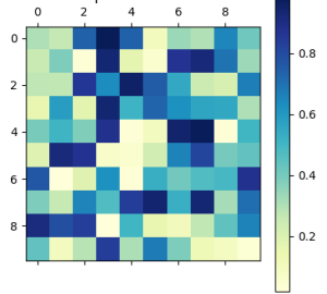
Heat Map for Risk Assessment
Description: A heat map is a graphical representation of data that depicts individual values as colours. In audit contexts, heat maps can be used to display the level of risk across different departments or processes within an organization.
Benefits: Benefits of heat maps include:
- Visual representation makes it easy to identify high-risk areas.
- Facilitates quick decision-making on where to allocate resources for risk mitigation.
Example: Exhibit 10.1 depicts a heat map showing the risk assessment results for various departments. Each cell represents a department and is colour-coded based on the level of risk (e.g., green for low risk, yellow for medium risk, and red for high risk). This allows stakeholders to quickly identify which areas require immediate attention.
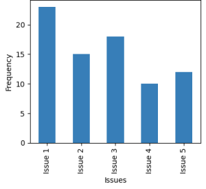
Bar Chart for Compliance Issues
Description: Bar charts are used to compare different categories or groups. They can illustrate compliance issues across various business units or periods in an audit context.
Benefits: Benefits of bar charts include:
- They are simple and easy to understand.
- Help in comparing compliance performance across departments.
- Identifies departments that need more focus on compliance.
Example: Exhibit 10.2 depicts a vertical bar chart showing the number of compliance issues identified in each department over the last quarter. Each bar represents a department, and the height of the bar corresponds to the number of problems.
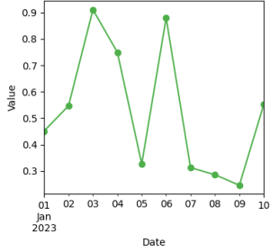
Line Graph for Trend Analysis
Description: Line graphs show trends over time. They are ideal for illustrating changes in key metrics, such as audit findings, over a specific period.
Benefits: Benefits of line graphs include:
- Clearly shows trends and patterns over time.
- Helps stakeholders understand whether the situation is improving or deteriorating.
- Identifies periods in audit findings that show significant changes.
Example: Exhibit 10.3 depicts a line graph that tracks changes in value of a commodity over time. Line graphs are often used to track the number of fraud incidents detected over time. In such line graphs the x-axis represents time (months or quarters), and the y-axis represents the number of incidents. Different lines can be used to describe various categories of fraud.
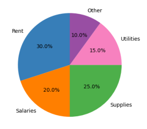
Pie Chart for Expense Distribution
Description: Pie charts represent data as pie slices, showing proportions within a whole. Pie charts can be used to display the distribution of expenses or resources.
Benefits: Benefits of pie charts include:
- Provides a clear visual of how resources are allocated.
- Helps in understanding the proportion of resources devoted to various areas.
- Useful for communicating resource allocation to stakeholders.
Example: Exhibit 10.4 shows a pie graph that illustrates how expenses are allocated across different categories. Pie charts are often used to depict audit resource distribution (e.g., time and budget) across different audit activities or departments. Each slice represents a different activity or department.
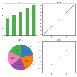
Dashboard for Key Performance Indicators (KPIs)
Description: Dashboards combine multiple visualizations to view key metrics and performance indicators comprehensively. They are interactive and allow users to drill down into specific data points. Exhibit 10.5 shows a dashboard for KPIs that combines different types of visualizations.
Benefits: Benefits of a dashboard include:
- Offers a real-time, comprehensive view of audit performance.
- Facilitates interactive exploration of data.
- Helps stakeholders monitor progress and make informed decisions.
Example: Exhibit 10.5 shows an interactive dashboard displaying key audit KPIs, such as the number of audits completed, issues identified, resolved, and time spent on each audit. The dashboard includes bar charts, line graphs, and heat maps, providing a holistic view of the audit function’s performance.
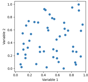
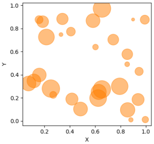
Scatter Plot for Correlation Analysis
Description: Scatter plots display the relationship between two variables. They help identify correlations and patterns within audit data.
Benefits: Benefits of a scatter plot include:
- Helps identify potential correlations between audit frequency and control effectiveness.
- Allows stakeholders to see patterns and outliers.
- Aids in making data-driven decisions about audit frequency.
Example: Exhibit 10.6 depicts a scatter plot that shows the relationship between two variables. Scatter plots are often used to illustrate the relationship between the frequency of internal audits and the number of detected control breaches. In such instances, the x-axis represents the number of audits conducted annually, and the y-axis represents the number of breaches detected. Each point represents a different business unit.
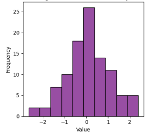
Histogram for Distribution Analysis
Description: Histograms show the distribution of a dataset. They help explain the frequency and spread of data points within a specific range.
Benefits: Benefits of a histogram include:
- Provides a clear view of how data is distributed.
- Helps identify any unusual patterns or anomalies.
- Useful for spotting trends such as skewness or the presence of outliers.
Example: Exhibit 10.7 shows a histogram displaying the distribution of transaction amounts in a financial audit. The x-axis represents transaction amounts in specified ranges, and the y-axis represents the frequency of transactions within each range.
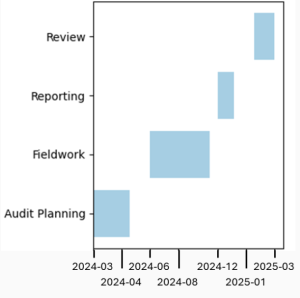
Gantt Chart for Audit Planning
Description: Gantt charts are used to visualize project schedules. They help plan and track the progress of audit activities.
Benefits: Benefits of a Gantt chart include:
- Clearly shows the timeline and dependencies of audit tasks.
- Helps track progress and identify any delays.
- Useful for communicating the audit schedule to stakeholders.
Example: Exhibit 10.8 depicts a Gantt chart showing the timeline for an internal audit project. The chart includes planning, fieldwork, reporting, and review, each represented by a horizontal bar spanning the planned duration.
Bubble Chart for Multi-Dimensional Data
Description: Bubble charts represent three dimensions of data. They help visualize complex data sets where two variables define a point’s position, and the bubble’s size represents a third variable.
Benefits: Benefits of a bubble chart include:
- Provides a multi-dimensional view of the data.
- Helps identify departments with high numbers of severe and costly issues.
- Useful for prioritizing audit responses based on multiple factors.
Example: Exhibit 10.9 depicts a bubble chart for multi-dimensional data. Bubble charts are often used to display audit findings across different departments. In such bubble charts, the x-axis represents the number of issues found, the y-axis represents the severity of the issue, and the size of each bubble represents the total cost of addressing the problems.
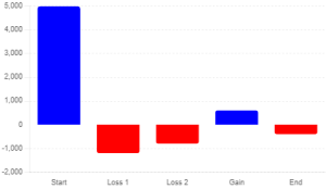
Waterfall Chart for Financial Analysis
Description: Waterfall charts show the cumulative effect of sequentially introduced positive or negative values. They are used in financial audits to illustrate how different factors contribute to a total.
Benefits: Benefits of a waterfall chart include:
- Clearly illustrates how individual components impact the overall financial result.
- Helps stakeholders understand the factors contributing to financial performance.
- Useful for detailed financial analysis and reporting.
Example: Exhibit 10.10 shows a waterfall chart for financial analysis. Waterfall charts are often used to show a company’s net income breakdown. Such waterfall charts, start with total revenue, and go on to display deductions for various items like costs of goods sold, operating expenses, and taxes to arrive at the final net income.
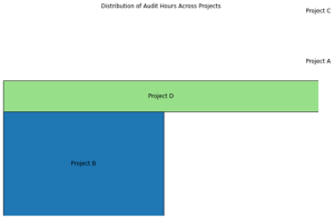
Treemap to Track Hours Across Projects
Description: Treemaps are good for depicting hierarchical data. A treemap shows the proportion of different components within a larger data set.
Benefits: Benefits of a treemap include:
- Useful for visually depicting areas of high risk.
- Useful for visually depicting resource allocation.
- Useful for tracking the status of audit findings.
Example: Exhibit 10.11 shows a simple treemap that depicts the allocation of hours over four different audit projects. A treemap is generally used to show how resources are distributed across different audit areas. It is a visual depiction that helps stakeholders ensure that resources are devoted to high-risk areas.
Internal Audit in Action
Background
Li Health, a healthcare provider, sought to improve operational efficiency across its network of clinics. An internal audit reviewed patient flow, staff productivity, and resource utilization.
Challenge
Communicating the findings from the operational efficiency audit in an actionable and understandable manner for both clinical and administrative staff posed a significant challenge, given the diversity of data and the varying levels of data literacy among stakeholders.
Action Taken
- Leveraging Data Visualization: To effectively communicate the audit’s findings, the team decided to leverage data visualization to make the data more digestible and actionable.
- Choosing Visualization Types: Patient flow data were visualized using Gantt charts to show the movement of patients through different stages of care, highlighting bottlenecks. Pie charts were utilized to depict the allocation of staff time across various tasks, identifying areas where productivity could be improved.
- Visualization Tools and Software: The team employed data visualization tools to create interactive charts and graphs, enabling stakeholders to interact with the data by filtering for specific time frames or departments.
- Clarity and Accessibility: Visualizations were designed with clarity and accessibility in mind, using straightforward labelling and uncomplicated representations. Each visualization was accompanied by a brief narrative explaining the key takeaways.
- Integrating Visuals into the Report: The visualizations were integrated into the operational efficiency audit report and positioned strategically next to relevant sections to reinforce the narrative and provide visual evidence of the audit’s findings.
Outcome
Integrating data visualization into the audit report on operational efficiency significantly enhanced stakeholder engagement and understanding. The visual representations allowed clinical and administrative staff to quickly grasp the efficiency issues and engage more constructively in discussions about potential improvements and solutions.
Reflection
Li Health’s experience demonstrates the transformative impact of data visualization on communicating audit findings, especially in operational contexts. By selecting appropriate visualization types and ensuring visuals are clear and accessible, auditors can facilitate a deeper understanding of complex data, driving more practical discussions and actions toward operational improvements.
 Key Takeaways
Let’s recap the concepts discussed in this section by reviewing these key takeaways:
- Data visualization simplifies complex information, improving clarity and aiding quick decision-making in audit reports for stakeholders.
- Selecting appropriate charts, like bar charts for comparisons and line graphs for trends, enhances data comprehension and communication.
- Tools like Excel, Tableau, and Power BI facilitate the efficient creation of compelling and interactive audit data visualizations.
- Clear labels, consistent design, and contextual information ensure visual data clarity and interpretability for better understanding.
- Avoid overcomplicated visuals, misleading scales, and excessive colours to maintain the integrity and readability of audit reports.
 Knowledge Check
 Review Questions
- How can data visualization in audit reporting improve decision-making?
- Why is it essential to ensure clarity and interpretability in data visualizations, and what strategies can auditors use to achieve this?
- Describe how data visualization supports transparency and accountability in audit reporting.
- How can visualizing data in audit reports contribute to more efficient reporting, and what role do automated tools play in this process?
Essay Questions
- Discuss the role of data visualization in enhancing transparency and accountability in internal audit reporting. How can auditors use visual tools to build trust with stakeholders and ensure that audit findings are clearly understood and acted upon?
- Explain the importance of selecting appropriate charts and graphs for audit data. How does the choice of visual tool impact the clarity and effectiveness of the audit report, and what factors should auditors consider when making these selections?
- Discuss the strategies auditors can use to ensure the clarity and interpretability of data visualizations in audit reports. How can these strategies improve stakeholder understanding and the overall impact of the audit findings?
Mini Case Study
Mehra Corporation, a mid-sized manufacturing firm, recently underwent an internal audit to assess its risk management, compliance, and operational efficiency. The audit team collected extensive data from various departments, including finance, operations, and human resources. The audit revealed several areas of concern, such as inconsistent compliance with company policies, inefficiencies in the supply chain, and potential financial discrepancies. The audit report is crucial for senior management to understand these issues and take corrective actions.
The audit team used data visualization to present their findings clearly and effectively. They created charts and graphs, including bar charts, pie charts, heat maps, and interactive dashboards. However, during the presentation to senior management, several challenges arose:
- Complexity of Visuals: Some visuals were very complex, making it difficult for the audience to understand the key messages.
- Misuse of Colour: The colour scheme used in the visuals was not accessible to all stakeholders, including those with colour blindness.
- Lack of Context: Certain charts needed more contextual information, making it hard to interpret the data accurately.
- Inconsistent Design: The visuals needed to be more consistent in design, which confused the audience and detracted from the report’s professionalism.
- Overloaded Dashboards: The interactive dashboards were overloaded with too many data points, leading to information overload and difficulty navigating the data.
Required: Address the following challenges:
- Identify and Suggest Simplification: Review a complex visual (bar chart comparing compliance issues across 15 departments) and suggest ways to simplify it for better understanding.
- Improve Colour Accessibility: Propose a revised colour scheme for a pie chart that uses red and green to indicate risk levels, ensuring it is accessible to colourblind viewers.
- Add Context to a Chart: Evaluate a line graph showing a rise in operational inefficiencies over the past year and suggest ways to add contextual information for better interpretation.
- Ensure Consistent Design: Analyze two visuals (a heat map and a scatter plot) using different fonts and colour schemes. Propose changes to ensure consistency.
- Streamline an Interactive Dashboard: Recommend strategies to streamline an overloaded interactive dashboard, focusing on enhancing user experience and data clarity.
