6.5 Tools for Quality Improvement
In any quality improvement initiative, data collection and evaluation play a critical role. Several basic, generic tools are commonly used to facilitate data analysis and drive continuous improvement efforts. These tools include check sheets, histograms, control charts, Pareto charts, scatter diagrams, and cause-and-effect diagrams.
Check Sheets
A check sheet is a custom-designed form used to record the frequency or number of occurrences of a particular event or outcome of interest. It can capture various types of information, such as the number of incidents, timing, or measurements that deviate from the desired specifications. Check sheets provide a structured way to collect and organize data, enabling further analysis and identification of patterns or trends.
Example
Motor Assembly Check Sheet
Name of Data Recorder: Lester B. Rapp
Location: Rochester, New York
Data Collection Dates: 1/17 – 1/23
| Defect Types/Event Occurrence | Sunday | Monday | Tuesday | Wednesday | Thursday | Friday | Saturday | Total |
|---|---|---|---|---|---|---|---|---|
| Supplied parts rusted | ||||||||| | ||||| | |||| | || | 20 | |||
| Misaligned weld | ||| | || | 5 | |||||
| Improper test procedure | 0 | |||||||
| Wrong part issued | | | || | 3 | |||||
| Film on parts | 0 | |||||||
| Voids in casting | |||| | || | 6 | |||||
| Incorrect dimensions | || | 2 | ||||||
| Adhesive failure | 0 | |||||||
| Masking insufficient | | | 1 | ||||||
| Spray failure | ||||| | 5 | ||||||
| TOTAL | 10 | 13 | 10 | 5 | 4 |
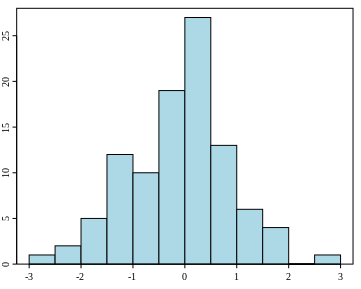
Histograms
A histogram is a graphical representation that displays the distribution of a dataset by grouping the data into bins or intervals along the horizontal axis and showing the frequency or count of observations in each bin on the vertical axis. Histograms are useful for visualizing a dataset’s shape, central tendency, and spread, which can help identify potential issues or areas for improvement.
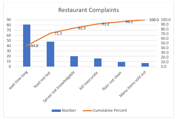
Pareto Charts
A Pareto chart is a specialized type of bar chart that displays the frequency of occurrences for various characteristics, arranged in descending order from highest to lowest. The X-axis represents each characteristic, while the Y-axis on the left side indicates the number of times each occurrence was recorded. Additionally, a cumulative percentage line is plotted to show the cumulative contribution of each category to the total. The Y-axis on the right side of the chart corresponds to the percentage values on this line.
In quality management, it is crucial for managers to allocate resources effectively to address the most frequently occurring problems. Pareto analysis helps focus attention on the most common defects, enabling managers to prioritize and allocate resources to rectify these issues efficiently. This approach is based on the Pareto principle, which suggests that a small number of causes often account for a large proportion of the effects.
Video: “How to Make a Pareto Chart in Excel” by David McLachlan [12:16] is licensed under the Standard YouTube License.Transcript and closed captions available on YouTube.
Steps in a Pareto Analysis
- Collect your raw data and put it into a simple table in descending order. Sum the total number of results at the bottom of the column.
| Complaints | Number |
|---|---|
| Long wait time | 81 |
| Food not hot | 48 |
| Server unknowledgeable | 20 |
| Bill inaccurate | 16 |
| Floor not clean | 9 |
| Menu items sold out | 7 |
- Include a cumulative column and calculate the cumulative percentage of each.
| Complaints | Number | Cumulative | Cumulative Percent |
|---|---|---|---|
| Long wait time | 81 | 81 | 44.8 |
| Food not hot | 48 | 129 | 71.3 |
| Server unknowledgeable | 20 | 149 | 82.3 |
| Bill inaccurate | 16 | 165 | 91.2 |
| Floor not clean | 9 | 174 | 96.1 |
| Menu items sold out | 7 | 181 | 100.0 |
- In EXCEL, your Pareto analysis will look like this.
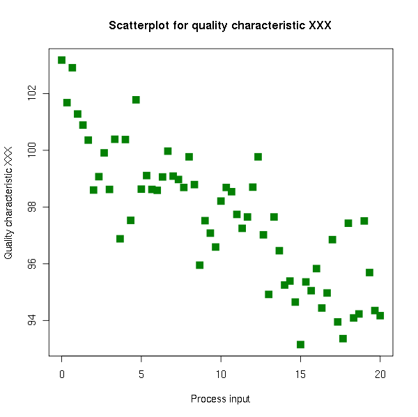
Scatter Diagrams
A scatter diagram is a graphical representation that displays the relationship between two variables by plotting their values as a series of points on a Cartesian coordinate system. Scatter diagrams can reveal patterns, trends, or correlations between the variables, which can aid in identifying potential causes or factors influencing a particular outcome.
Cause and Effect Diagrams
Also known as Fishbone diagrams, cause-and-effect diagrams were developed by Dr. Kaoru Ishikawa to help identify the root causes of a problem. The diagram’s overall shape resembles a fish’s, with the “head” pointing to the effect or problem being analyzed. Each “rib” of the fishbone represents a major cause or category that could potentially contribute to the problem.
Common categories used in Fishbone diagrams include:
- Man (People): Factors related to human resources, such as skills, training, and behaviour.
- Method: Factors related to processes, procedures, and techniques.
- Material: Factors related to raw materials, components, and supplies.
- Machine: Factors related to equipment, tools, and technology.
- Environment: Factors related to the physical and organizational environment.
Specific factors that fall under each category are written along the corresponding rib. This structured approach helps teams systematically explore and organize potential causes, facilitating a comprehensive analysis of the problem and aiding in the identification of root causes.

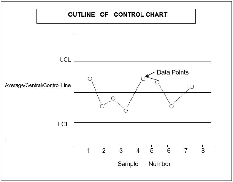
Control Charts
A control chart is a statistical tool used to monitor and control the quality of a product or process. It is a graphical representation that depicts whether sample quality falls within the normal range of variation. The normal range of variation is defined by control chart limits. Control charts were first devised by Dr. Walter A. Shewhart in 1924, also known as Shewhart charts.
A control chart has upper and lower control limits within which deviations from the mean value are allowed. The process is considered out of control if the data plotted reveals that one or more samples fall beyond the control limits. The two lines on the control chart indicate the tolerance limits within which the variation of quality is acceptable.
The upper and lower control limits separate common-cause variation inherent to the process from assignable causes of variation, which are special causes requiring investigation and corrective action. If the plotted points fall outside the tolerance limits (UCL and LCL), the process is considered out of control, and the sample is rejected. This situation warrants the determination of assignable causes, such as poor material quality, operator negligence, or defective machinery, and immediate actions are initiated to improve the quality.
There are two main types of control charts:
- Control Charts for Variables
- Control Charts for Attributes
The following video shows how to construct a control chart:
Video: “Making a Control Chart in Excel (with dynamic control lines!)” by David McLachlan [11:03] is licensed under the Standard YouTube License.Transcript and closed captions available on YouTube.
Control Charts for Variables
Control charts for variables are used when the quality characteristic of a product can be measured and expressed in specific units, such as height, weight, density, or diameter. These charts are based on measurable quality characteristics.
Control charts for variables are further classified into three types:
- Mean (X̄) Chart: This chart monitors the process mean or average value of the quality characteristic.
- Range (R) Chart: This chart monitors the range or the difference between the highest and lowest values within a sample or subgroup.
- Standard Deviation (σ) Chart: This chart monitors the process variability by tracking the standard deviation of the quality characteristic.
Control charts are powerful tools for monitoring process performance, detecting deviations from expected behaviour, and enabling timely corrective actions to maintain quality standards.
Control Charts for Attributes
When the quality characteristic of a product cannot be quantified or measured on a continuous scale, control charts for attributes are used. Attributes are parameters that can only be identified by their presence or absence from the product, such as air bubbles, scratches, or defective prints on cloth.
Control charts for attributes are classified into three types:
- Control Charts for Proportion of Defective Units (P-Chart)
- Control Charts for Number of Defectives (np-Chart)
- Control Charts for Number of Defects (C-Chart)
Control Charts for Proportion of Defective Units (P-Chart)
P-charts, or fraction defective charts, are useful when the quality characteristic cannot be quantified, such as holes in cloth or the absence of picture quality. These charts are designed to control the percentage or proportion of defective units in a lot or sample.
The P-chart monitors the fraction or proportion of defective items in a sample or subgroup, allowing for the detection of shifts or trends in the process performance. It helps identify when the proportion of defective units deviates from the expected or acceptable level, enabling corrective actions to be taken.
Control Charts for Number of Defectives (np-Chart)
The np-chart monitors the number of defective items or units in a sample or subgroup of constant size. It is particularly useful when the sample size varies, as it accounts for the varying sample sizes by plotting the actual number of defective units.
The np-chart helps detect shifts or trends in the number of defective units, indicating when the process deviates from the expected or acceptable level of defectives. It aids in identifying potential issues and taking corrective actions to maintain the desired quality level.
Control Charts for Number of Defects (C-Chart)
The C-chart, or count chart, monitors the number of defects or non-conformities in a sample or subgroup of constant size. It is particularly useful when the quality characteristic of interest is the number of defects or non-conformities rather than the number of defective units.
The C-chart helps detect shifts or trends in the number of defects or non-conformities, indicating when the process deviates from the expected or acceptable level. It aids in identifying potential issues and taking corrective actions to reduce the number of defects and maintain the desired quality level.
By using the appropriate control chart for attributes, organizations can effectively monitor and control quality characteristics that cannot be measured continuously, ensuring that products or services meet the desired quality standards.
Identifying and Elimination of Variations
One of the primary goals of using control charts is to monitor and improve process quality by identifying and eliminating sources of variation. Variations can be categorized into two types: common causes and special causes.
Understanding and distinguishing between these types is essential for effective quality control and improvement.
Common Causes
Common causes, also known as chance causes or noise, are the natural and random fluctuations inherent in a stable and predictable process. These variations affect every observation and are unavoidable unless the process itself is changed. Examples include slight differences in raw materials, temperature, humidity, or machine settings. A process influenced only by common causes is considered to be in control.
Special Causes
Special causes, also known as assignable causes or signals, are abnormal and non-random fluctuations due to external factors. These variations affect only some observations and are avoidable by identifying and addressing the root causes. Examples include a broken machine, defective raw materials, power outages, or human errors. A process affected by special causes is considered to be out of control.
Detecting Special Causes
Control charts plot process data over time and compare it with control limits, representing the expected range of variation due to common causes. If data points fall within the control limits, the process is in control and only affected by common causes. If data points fall outside the control limits or show a non-random pattern, the process is out of control and affected by special causes. Identifying these patterns allows for timely corrective actions to improve process quality. (FasterCapital, n.d.)
Exercise
In one of the previous semesters, students were assigned to produce a greeting card shown below:
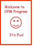
Using simple tools like markers and plain A4 paper, they produced 54 batches of cards. The quality of their cards was examined in terms of the shape of the box, the position of the happy face, and the symmetry/size of the text. The following table summarizes the defects detected:
| Sample number | Imperfect box | Face not centered | Big/skewed text |
|---|---|---|---|
| 1 | 1 | 0 | 0 |
| 2 | 2 | 1 | 1 |
| 3 | 0 | 0 | 0 |
| 4 | 0 | 0 | 1 |
| 5 | 3 | 2 | 2 |
| 6 | 0 | 0 | 0 |
| 7 | 1 | 0 | 0 |
| 8 | 0 | 0 | 0 |
| 9 | 0 | 0 | 0 |
| 10 | 0 | 0 | 0 |
| 11 | 0 | 0 | 0 |
| 12 | 0 | 1 | 0 |
| 13 | 0 | 0 | 1 |
| 14 | 0 | 0 | 0 |
| 15 | 0 | 0 | 0 |
| 16 | 0 | 0 | 0 |
| 17 | 0 | 0 | 0 |
| 18 | 0 | 0 | 0 |
| 19 | 0 | 0 | 1 |
| 20 | 0 | 0 | 0 |
| 21 | 0 | 0 | 0 |
| 22 | 0 | 0 | 0 |
| 23 | 1 | 1 | 0 |
| 24 | 0 | 0 | 0 |
| 25 | 0 | 0 | 0 |
| 26 | 0 | 0 | 0 |
| 27 | 0 | 0 | 0 |
| 28 | 0 | 1 | 0 |
| 29 | 2 | 0 | 0 |
| 30 | 0 | 0 | 0 |
| 31 | 0 | 0 | 0 |
| 32 | 0 | 0 | 0 |
| 33 | 0 | 0 | 0 |
| 34 | 0 | 0 | 0 |
| 35 | 0 | 0 | 0 |
| 36 | 0 | 0 | 0 |
| 37 | 1 | 0 | 1 |
| 38 | 0 | 0 | 0 |
| 39 | 0 | 0 | 0 |
| 40 | 1 | 0 | 0 |
| 41 | 0 | 0 | 0 |
| 42 | 1 | 0 | 0 |
| 43 | 0 | 0 | 0 |
| 44 | 0 | 0 | 0 |
| 45 | 0 | 0 | 0 |
| 46 | 0 | 0 | 2 |
| 47 | 0 | 0 | 0 |
| 48 | 0 | 0 | 0 |
| 49 | 0 | 0 | 0 |
| 50 | 0 | 0 | 0 |
| 51 | 0 | 0 | 0 |
| 52 | 0 | 0 | 0 |
| 53 | 0 | 0 | 2 |
| 54 | 0 | 0 | 0 |
Based on the above data:
Create a check sheet, a Pareto Chart for the defects, and a control chart and determine how the students’ production quality with respect to each variable (Box, Face, Text) changed over time.
“Managing Quality” from Introduction to Operations Management Copyright © by Hamid Faramarzi and Mary Drane is licensed under a Creative Commons Attribution-NonCommercial-ShareAlike 4.0 International License, except where otherwise noted.—Modifications: used section Tools for Quality Improvement, some paragraphs rewritten; added additional explanations.
“Statistical Process Control Methods: Control Chart for Variables” by Kajal Kiran from Operations Management by Vikas Singla is licensed under a Creative Commons Attribution Non-Commercial license.—Modifications: used section Introduction and beginning of section Control Charts for Variables, some paragraphs rewritten; added video.
“Statistical Process Control Methods: Control Chart for Attributes” by Kajal Kiran from Operations Management by Vikas Singla is licensed under a Creative Commons Attribution Non-Commercial license.—Modifications: some paragraphs rewritten; removed examples, images, and case study.
