6.9 World Energy Use
Learning Objectives
By the end of this section, you will be able to:
- Describe the distinction between renewable and nonrenewable energy sources.
- Explain why the inevitable conversion of energy to less useful forms makes it necessary to conserve energy resources.
Energy is an important ingredient in all phases of society. We live in a very interdependent world, and access to adequate and reliable energy resources is crucial for economic growth and for maintaining the quality of our lives. But current levels of energy consumption and production are not sustainable. Depending on the data source, estimates indicate that about 31–35% of the world’s energy comes from oil, and much of that goes to transportation uses. This is a reduction by a few percentage points from ten years ago. Oil prices are dependent as much upon new (or foreseen) discoveries as they are upon political events and situations around the world. The U.S., with 4.25% of the world’s population, consumes 21% of the world’s oil production per year.
Renewable and Nonrenewable Energy Sources
The principal energy resources used in the world are shown in Figure 6.26. The fuel mix has changed over the years but now is dominated by oil, although natural gas and solar contributions are increasing. Renewable forms of energy are those sources that cannot be used up, such as water, wind, solar, and biomass. About 85% of our energy comes from nonrenewable fossil fuels—oil, natural gas, coal. The likelihood of a link between global warming and fossil fuel use, with its production of carbon dioxide through combustion, has made, in the eyes of many scientists, a shift to non-fossil fuels of utmost importance—but it will not be easy.
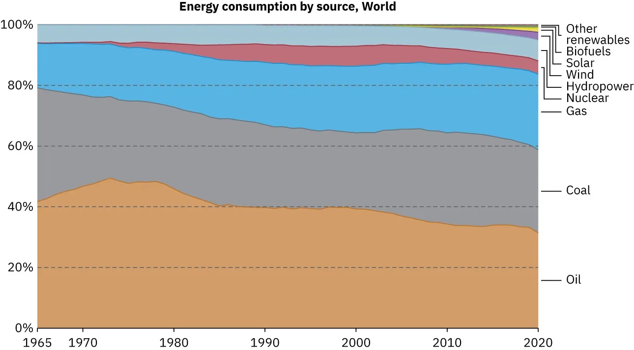
Figure 6.26 World energy consumption by source, in billions of kilowatt-hours: 2006. Image from OpenStax College Physics 2e, CC-BY 4.0
Image Description
The image is an area chart titled “Energy consumption by source, World” showing the global energy consumption percentages from 1965 to 2020. The y-axis represents percentages from 0% to 100%, while the x-axis shows years from 1965 to 2020. Different energy sources are represented by colored areas stacked on top of each other. Below is the breakdown of the areas and their corresponding colors:
– Oil (bottom layer, brown): This area is the largest throughout the timeline, indicating oil’s dominance in energy consumption.
– Coal (next layer up, gray): This remains substantial but shows a slight decrease over time.
– Gas (middle layer, blue): Maintains a steady share, slightly increasing.
– Nuclear (thin layer, pink): Remains relatively consistent but small compared to fossil fuels.
– Hydropower (thin layer, turquoise): Consistent small percentage of energy consumption.
– Wind, Solar, Biofuels, and Other renewables (very thin top layers, various colors): These new renewables show slight growth over the years but remain a small part of the total energy mix.
On the right side, there is a legend identifying each color with its respective energy source. Overall, fossil fuels (oil, coal, and gas) dominate the chart, with renewables and nuclear energy showing minimal shares.
The World’s Growing Energy Needs
World energy consumption continues to rise, especially in the developing countries. (See Figure 6.27.) Global demand for energy has tripled in the past 50 years and might triple again in the next 30 years. While much of this growth will come from the rapidly booming economies of China and India, many of the developed countries, especially those in Europe, are hoping to meet their energy needs by expanding the use of renewable sources. Although presently only a small percentage, renewable energy is growing very fast, especially wind energy. For example, Germany plans to meet 65% of its power and 30% of its overall energy needs with renewable resources by the year 2030. (See Figure 6.28.) Energy is a key constraint in the rapid economic growth of China and India. In 2003, China surpassed Japan as the world’s second largest consumer of oil. However, over 1/3 of this is imported. Unlike most Western countries, coal dominates the commercial energy resources of China, accounting for 2/3 of its energy consumption. In 2009 China surpassed the United States as the largest generator of [latex]\text{CO}_{2}[/latex]. In India, the main energy resources are biomass (wood and dung) and coal. Half of India’s oil is imported. About 70% of India’s electricity is generated by highly polluting coal. Yet there are sizeable strides being made in renewable energy. India has a rapidly growing wind energy base, and it has the largest solar cooking program in the world. China has invested substantially in building solar collection farms as well as hydroelectric plants.
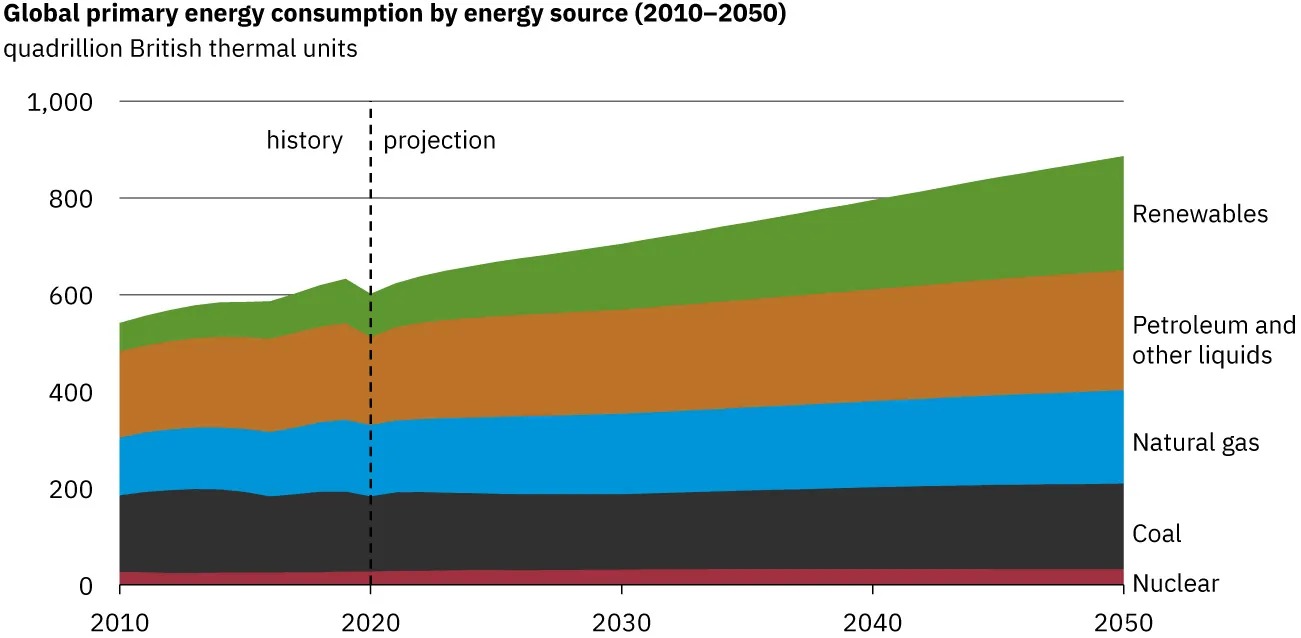
Figure 6.27 Past and projected world energy use Image from OpenStax College Physics 2e, CC-BY 4.0
Image Description
The image is a stacked area chart titled “Global primary energy consumption by energy source (2010–2050).” It shows the projected and historical consumption of energy in quadrillion British thermal units from 2010 to 2050. The time period is split into “history” and “projection” sections by a vertical dashed line around the year 2020.
The x-axis represents the years from 2010 to 2050. The y-axis represents energy consumption in quadrillion British thermal units, ranging from 0 to 1,000.
The chart displays consumption from different energy sources, with each source represented by a colored band:
– Green band for Renewables, showing a steady increase over time.
– Brown band for Petroleum and other liquids, maintaining a consistent width with a slight increase.
– Blue band for Natural gas, showing steady growth.
– Black band for Coal, with the width decreasing slightly over time.
– Red band for Nuclear, maintaining a thin, consistent width.
The chart visually indicates that Renewables are expected to see significant growth by 2050, while other sources show varying levels of growth or decline.
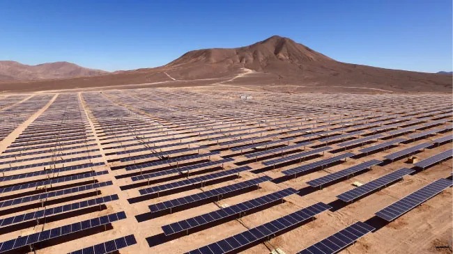
Figure 6.28 Solar cell arrays at a power plant in California Image from OpenStax College Physics 2e, CC-BY 4.0
Table 6.6 displays the 2020 commercial energy mix by country for some of the prime energy users in the world. While non-renewable sources dominate, some countries get a sizeable percentage of their electricity from renewable resources. For example, about two-thirds of New Zealand’s electricity demand is met by hydroelectric. Only 10% of the U.S. electricity is generated by renewable resources, primarily hydroelectric. It is difficult to determine total sources and consumers of energy in many countries, and estimates vary somewhat by data source and type of measurement.
| Country | Consumption, in EJ (1018 J) | Oil | Natural Gas | Coal | Nuclear | Hydro | Other Renewables |
|---|---|---|---|---|---|---|---|
| Australia | 5.6 | 1.8 | 1.5 | 1.7 | 0 | 0.1 | 0.5 |
| Brazil | 12 | 4.6 | 1.2 | 0.6 | 0.1 | 3.5 | 2 |
| China | 145.5 | 28.5 | 11.9 | 82.3 | 3.3 | 11.7 | 7.8 |
| Egypt | 3.7 | 1.3 | 2.1 | 0.0% | 0 | 0.1 | 0.1 |
| Germany | 12.1 | 4.2 | 3.1 | 1.9 | 0.6 | 0.2 | 2.2 |
| India | 31.99 | 9 | 2.2 | 17.5 | 0.4 | 1.5 | 1.4 |
| Indonesia | 8.1 | 2.8 | 1.5 | 3.3 | 0 | 0.2 | 0.4 |
| Japan | 17 | 6.5 | 3.8 | 4.6 | 0.4 | 0.7 | 1.1 |
| United Kingdom | 6.9 | 2.4 | 2.6 | 0.2 | 0.5 | 0.1 | 1.2 |
| Russia | 28.3 | 6.4 | 14.8 | 3.2 | 1.9 | 1.9 | 0.5 |
| U.S. | 87.8 | 32.5 | 30 | 9.2 | 7.4 | 2.6 | 6.2 |
| World | 557.1 | 174.2 | 137.6 | 151.4 | 24 | 38.2 | 31.7 |
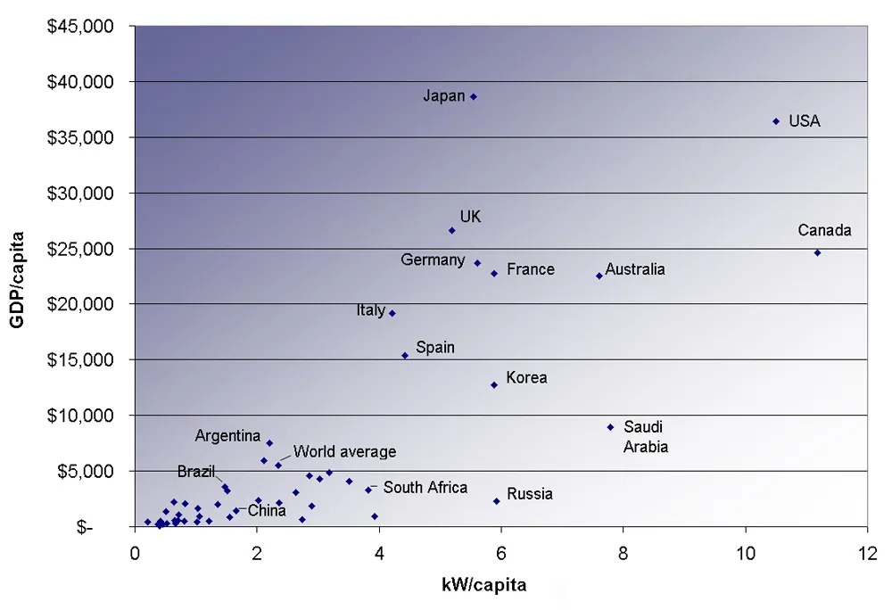
Image Description
The image is a scatter plot graph that compares GDP per capita to energy consumption per capita (kW/capita) for various countries. The background is gradient with a light to dark blue color from bottom to top. The x-axis represents “kW/capita” ranging from 0 to 12, and the y-axis represents “GDP/capita” ranging from $0 to $45,000.
Here is a description of the data points represented as an HTML table:
| Country | kW/capita | GDP/capita ($) |
|---|---|---|
| USA | 11 | Approx. 43,000 |
| Japan | 7 | Approx. 37,000 |
| Canada | 10 | Approx. 38,000 |
| UK | 5.5 | Approx. 32,000 |
| Germany | 6 | Approx. 30,000 |
| France | 5.5 | Approx. 30,000 |
| Australia | 6.5 | Approx. 30,000 |
| Italy | 4.5 | Approx. 22,000 |
| Spain | 3.5 | Approx. 18,000 |
| Korea | 5 | Approx. 18,000 |
| Saudi Arabia | 8 | Approx. 14,000 |
| Argentina | 1.5 | Approx. 8,000 |
| Brazil | 1.5 | Approx. 5,000 |
| World average | 2 | Approx. 7,000 |
| China | 1.5 | Approx. 4,000 |
| South Africa | 2.5 | Approx. 5,000 |
| Russia | 5.5 | Approx. 7,000 |
The graph shows a general trend that countries with higher energy consumption per capita also tend to have a higher GDP per capita.
Conserving Energy
As we finish this chapter on energy and work, it is relevant to draw some distinctions between two sometimes misunderstood terms in the area of energy use. As has been mentioned elsewhere, the “law of the conservation of energy” is a very useful principle in analyzing physical processes. It is a statement that cannot be proven from basic principles, but is a very good bookkeeping device, and no exceptions have ever been found. It states that the total amount of energy in an isolated system will always remain constant. Related to this principle, but remarkably different from it, is the important philosophy of energy conservation. This concept has to do with seeking to decrease the amount of energy used by an individual or group through (1) reduced activities (e.g., turning down thermostats, driving fewer kilometers) and/or (2) increasing conversion efficiencies in the performance of a particular task—such as developing and using more efficient room heaters, cars that have greater miles-per-gallon ratings, energy-efficient compact fluorescent lights, etc.
Since energy in an isolated system is not destroyed or created or generated, one might wonder why we need to be concerned about our energy resources, since energy is a conserved quantity. The problem is that the final result of most energy transformations is waste heat transfer to the environment and conversion to energy forms no longer useful for doing work. To state it in another way, the potential for energy to produce useful work has been “degraded” in the energy transformation.
