2.8 Graphical Analysis of One-Dimensional Motion
Learning Objectives
By the end of this section, you will be able to:
- Describe a straight-line graph in terms of its slope and y-intercept.
- Determine average velocity or instantaneous velocity from a graph of position vs. time.
- Determine average or instantaneous acceleration from a graph of velocity vs. time.
- Derive a graph of velocity vs. time from a graph of position vs. time.
- Derive a graph of acceleration vs. time from a graph of velocity vs. time.
A graph, like a picture, is worth a thousand words. Graphs not only contain numerical information; they also reveal relationships between physical quantities. This section uses graphs of position, velocity, and acceleration versus time to illustrate one-dimensional kinematics.
Slopes and General Relationships
First note that graphs in this text have perpendicular axes, one horizontal and the other vertical. When two physical quantities are plotted against one another in such a graph, the horizontal axis is usually considered to be an independent variable and the vertical axis a dependent variable. If we call the horizontal axis the [latex]x[/latex]-axis and the vertical axis the [latex]y[/latex]-axis, as in Figure 2.44, a straight-line graph has the general form
[latex]y = \text{mx} + b .[/latex]
Here [latex]m[/latex] is the slope, defined to be the rise divided by the run (as seen in the figure) of the straight line. The letter [latex]b[/latex] is used for the y-intercept, which is the point at which the line crosses the vertical axis.
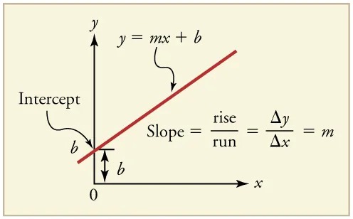
Figure 2.44 A straight-line graph. The equation for a straight line is [latex]y = \text{mx} + b[/latex] . Image from OpenStax College Physics 2e, CC-BY 4.0
Image Description
The image is a graphical representation of a linear equation in the slope-intercept form, which is expressed as \( y = mx + b \). Here’s a detailed description:
– Axes: The graph features an x-axis (horizontal) and a y-axis (vertical), both labeled accordingly. The origin is marked at the intersection of these axes with the point labeled as “0.”
– Line: A red line is drawn on the graph, demonstrating a positive slope. The line is labeled with the equation \( y = mx + b \).
– Intercept: The point where the line intersects the y-axis is marked and labeled as the “Intercept,” denoted by \( b \).
– Slope Representation: The slope of the line is illustrated alongside the line and noted as:
\[
\text{Slope} = \frac{\text{rise}}{\text{run}} = \frac{\Delta y}{\Delta x} = m
\]
This represents how the slope \( m \) is calculated as the ratio of the change in y (rise) to the change in x (run).
– Visual Indicators: Arrows are used to show the rise and run, providing a visual demonstration of how the slope is determined.
This graph provides an illustrative explanation of how a linear equation is composed in the slope-intercept form and what each component represents in the equation.
Graph of Position vs. Time (a = 0, so v is constant)
Time is usually an independent variable that other quantities, such as position, depend upon. A graph of position versus time would, thus, have [latex]x[/latex] on the vertical axis and [latex]t[/latex] on the horizontal axis. Figure 2.45 is just such a straight-line graph. It shows a graph of position versus time for a jet-powered car on a very flat dry lake bed in Nevada.
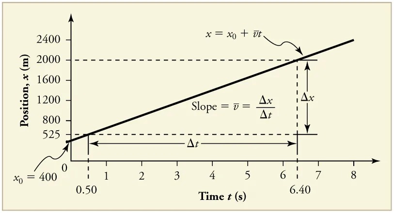
Figure 2.45 Graph of position versus time for a jet-powered car on the Bonneville Salt Flats. Image from OpenStax College Physics 2e, CC-BY 4.0
Image Description
The image is a graph illustrating the relationship between position and time, showing the motion of an object. Here’s a detailed description:
– X-Axis (Horizontal): Represents the time, \( t \), measured in seconds (s). It ranges from 0 to 8 seconds.
– Y-Axis (Vertical): Represents the position, \( x \), measured in meters (m). It ranges from 0 to 2400 meters.
– Graph Line: A straight line with a positive slope, indicating constant velocity. The line begins around the coordinates (0.50, 400) and extends to approximately (6.40, 2000).
– Starting Position: The initial position, \( x_0 \), is marked as 400 meters.
– Equation: The line on the graph is defined by the equation \( x = x_0 + \bar{v}t \).
– Slope Annotation: The slope of the line, which represents the average velocity \( \bar{v} \), is shown as \( \Delta x / \Delta t \).
– Dotted Lines and Arrows:
– Horizontal dotted lines indicate the change in position \( \Delta x \) from approximately 525 m to 2000 m.
– Vertical dotted line indicates \( \Delta t \) on the x-axis from 0.50 s to 6.40 s.
– Horizontal double-ended arrow marks the time interval \( \Delta t \).
– Vertical double-ended arrow marks the change in position \( \Delta x \).
The background color is a pale yellow, and the graph lines are in solid black.
Using the relationship between dependent and independent variables, we see that the slope in the graph above is average velocity [latex]\overset{-}{v}[/latex] and the intercept is position at time zero—that is, [latex]x_{0}[/latex]. Substituting these symbols into [latex]y = \text{mx} + b[/latex] gives
[latex]x = \overset{-}{v} t + x_{0}[/latex]
or
[latex]x = x_{0} + \overset{-}{v} t .[/latex]
Thus a graph of position versus time gives a general relationship among displacement(change in position), velocity, and time, as well as giving detailed numerical information about a specific situation.
The Slope of x vs. t
The slope of the graph of position [latex]x[/latex] vs. time [latex]t[/latex] is velocity [latex]v[/latex].
[latex]\text{slope} = \frac{Δ x}{Δ t} = v[/latex]
Notice that this equation is the same as that derived algebraically from other motion equations in 2.5 Motion Equations for Constant Acceleration in One Dimension.
From the figure we can see that the car has a position of 525 m at 0.50 s and 2000 m at 6.40 s. Its position at other times can be read from the graph; furthermore, information about its velocity and acceleration can also be obtained from the graph.
Example 2.17
Determining Average Velocity from a Graph of Position versus Time: Jet Car
Find the average velocity of the car whose position is graphed in Figure 2.45.
Strategy
The slope of a graph of [latex]x[/latex] vs. [latex]t[/latex] is average velocity, since slope equals rise over run. In this case, rise = change in position and run = change in time, so that
[latex]\text{slope} = \frac{Δ x}{Δ t} = \overset{-}{v} .[/latex]
Since the slope is constant here, any two points on the graph can be used to find the slope. (Generally speaking, it is most accurate to use two widely separated points on the straight line. This is because any error in reading data from the graph is proportionally smaller if the interval is larger.)
Solution
1. Choose two points on the line. In this case, we choose the points labeled on the graph: (6.4 s, 2000 m) and (0.50 s, 525 m). (Note, however, that you could choose any two points.)
2. Substitute the [latex]x[/latex] and [latex]t[/latex] values of the chosen points into the equation. Remember in calculating change [latex]\left(\right. Δ \left.\right)[/latex] we always use final value minus initial value.
[latex]\overset{-}{v} = \frac{Δ x}{Δ t} = \frac{\text{2000 m} - \text{525 m}}{6 . \text{4 s} - 0 . \text{50 s}} ,[/latex]
yielding
[latex]\overset{-}{v} = \text{250 m}/\text{s} .[/latex]
Discussion
This is an impressively large land speed (900 km/h, or about 560 mi/h): much greater than the typical highway speed limit of 60 mi/h (27 m/s or 96 km/h), but considerably shy of the record of 343 m/s (1234 km/h or 766 mi/h) set in 1997.
Graphs of Motion when [latex]a[/latex] is constant but [latex]a \neq 0[/latex]
The graphs in Figure 2.46 below represent the motion of the jet-powered car as it accelerates toward its top speed, but only during the time when its acceleration is constant. Time starts at zero for this motion (as if measured with a stopwatch), and the position and velocity are initially 200 m and 15 m/s, respectively.
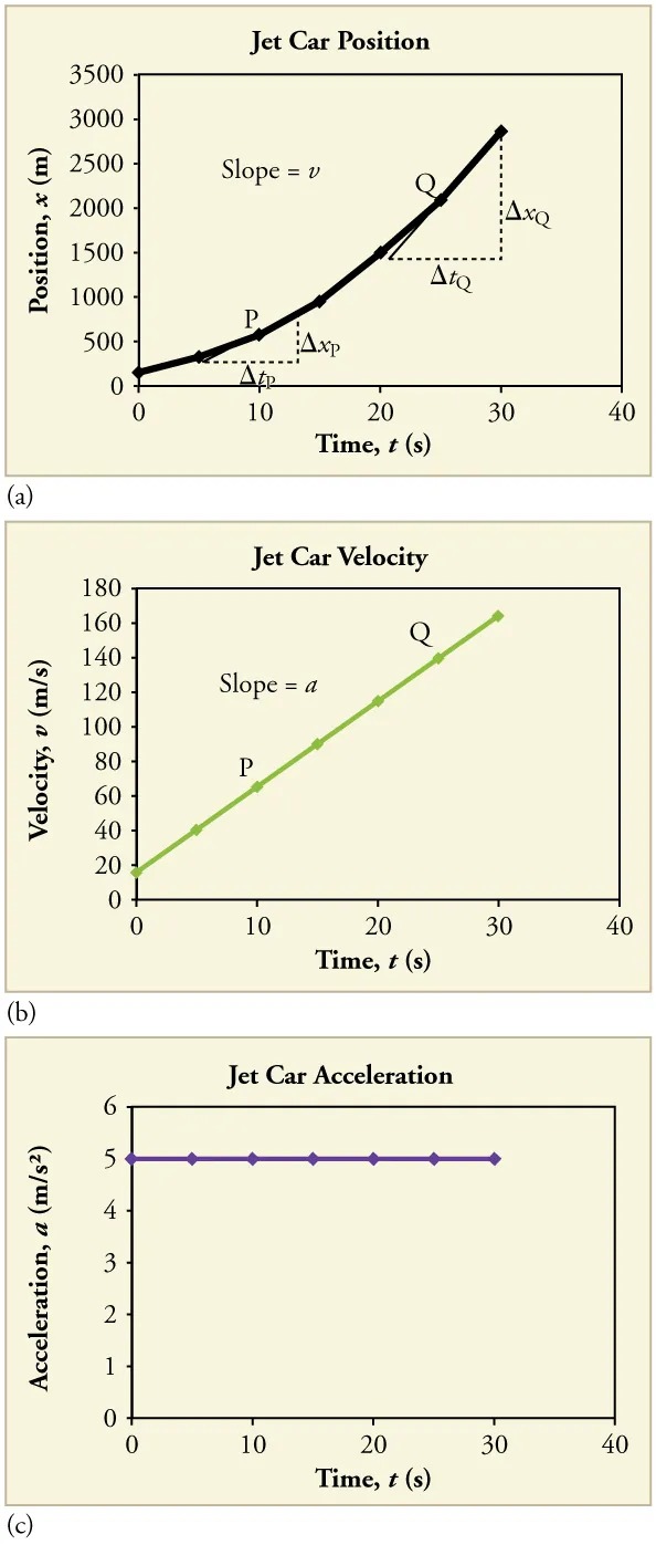
Figure 2.46 Graphs of motion of a jet-powered car during the time span when its acceleration is constant. (a) The slope of an [latex]x[/latex] vs. [latex]t[/latex] graph is velocity. This is shown at two points, and the instantaneous velocities obtained are plotted in the next graph. Instantaneous velocity at any point is the slope of the tangent at that point. (b) The slope of the [latex]v[/latex] vs. [latex]t[/latex] graph is constant for this part of the motion, indicating constant acceleration. (c) Acceleration has the constant value of [latex]5 . \text{0 m}/\text{s}^{2}[/latex] over the time interval plotted. Image from OpenStax College Physics 2e, CC-BY 4.0
Image Description
The image contains three separate graphs related to a jet car’s motion:
1. Jet Car Position (Graph a):
– Title: Jet Car Position
– Axes:
– Y-axis: Position, \( x \) (m)
– X-axis: Time, \( t \) (s)
– Description: The graph shows a curve that starts at the origin and rises steeply as time progresses, indicating an increase in position over time. Points \( P \) and \( Q \) are marked on the graph, and the slope of the tangent at these points is represented as \( v \) (velocity). Dotted lines show the changes \(\Delta x_P\) and \(\Delta t_P\), as well as \(\Delta x_Q\) and \(\Delta t_Q\).
2. Jet Car Velocity (Graph b):
– Title: Jet Car Velocity
– Axes:
– Y-axis: Velocity, \( v \) (m/s)
– X-axis: Time, \( t \) (s)
– Description: This graph shows a straight line with a positive slope, starting near the origin and rising steadily, indicating an increase in velocity over time. Points \( P \) and \( Q \) are marked on the line. The slope is labeled as \( a \) (acceleration).
3. Jet Car Acceleration (Graph c):
– Title: Jet Car Acceleration
– Axes:
– Y-axis: Acceleration, \( a \) (m/s²)
– X-axis: Time, \( t \) (s)
– Description: The graph plots a horizontal line, indicating constant acceleration over time. The line is at approximately 5 m/s².
Each graph illustrates different aspects of the jet car’s motion over a 40-second period, showing position, velocity, and acceleration.

Figure 2.47 A U.S. Air Force jet car speeds down a track. Image from OpenStax College Physics 2e, CC-BY 4.0
The graph of position versus time in Figure 2.46(a) is a curve rather than a straight line. The slope of the curve becomes steeper as time progresses, showing that the velocity is increasing over time. The slope at any point on a position-versus-time graph is the instantaneous velocity at that point. It is found by drawing a straight line tangent to the curve at the point of interest and taking the slope of this straight line. Tangent lines are shown for two points in Figure 2.46(a). If this is done at every point on the curve and the values are plotted against time, then the graph of velocity versus time shown in Figure 2.46(b) is obtained. Furthermore, the slope of the graph of velocity versus time is acceleration, which is shown in Figure 2.46(c).
Example 2.18
Determining Instantaneous Velocity from the Slope at a Point: Jet Car
Calculate the velocity of the jet car at a time of 25 s by finding the slope of the [latex]x[/latex] vs. [latex]t[/latex] graph in the graph below.
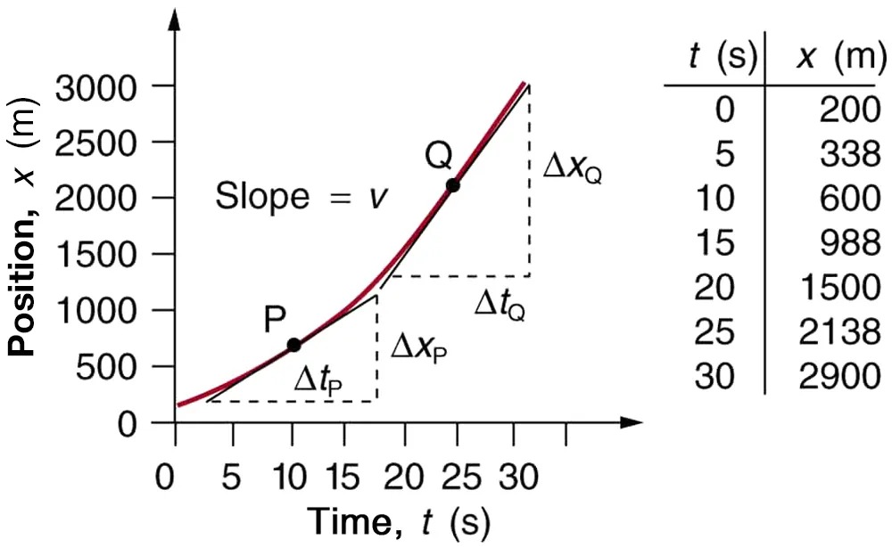
Figure 2.48 The slope of an [latex]x[/latex] vs. [latex]t[/latex] graph is velocity. This is shown at two points. Instantaneous velocity at any point is the slope of the tangent at that point. Image from OpenStax College Physics 2e, CC-BY 4.0
Image Description
The image contains a graph and a table along with annotations that explain a concept related to motion.
Graph Description
– The graph plots Position (x in meters) on the vertical axis against Time (t in seconds) on the horizontal axis.
– The x-axis ranges from 0 to 30 seconds, and the y-axis ranges from 0 to 3000 meters.
– A curve is drawn showing the relationship between time and position. It begins at (0, 200) and ends at (30, 2900).
– Two points, P and Q, are highlighted on the curve, each with lines forming right triangles.
– P is positioned at approximately (10, 600) and **Q** at approximately (20, 1500).
– The slope of the line connecting P and Q is labeled as “Slope = v”, indicating velocity.
– Horizontal lines labeled ΔtP and ΔtQ represent the change in time, while vertical lines labeled ΔxP and ΔxQ represent the change in position.
Table
A table on the right side provides specific data points:
| t (s) | x (m) |
|---|---|
| 0 | 200 |
| 5 | 338 |
| 10 | 600 |
| 15 | 988 |
| 20 | 1500 |
| 25 | 2138 |
| 30 | 2900 |
This visual aids in understanding motion, demonstrating how position changes over time, with a focus on the slope as velocity.
Strategy
The slope of a curve at a point is equal to the slope of a straight line tangent to the curve at that point. This principle is illustrated in Figure 2.48, where Q is the point at [latex]t = \text{25 s}[/latex].
Solution
1. Find the tangent line to the curve at [latex]t = \text{25 s}[/latex].
2. Determine the endpoints of the tangent. These correspond to a position of 1300 m at time 19 s and a position of 3120 m at time 32 s.
3. Plug these endpoints into the equation to solve for the slope, [latex]v[/latex].
[latex]\text{slope} = v_{Q} = \frac{\left(Δ x\right)_{Q}}{\left(Δ t\right)_{Q}} = \frac{\left(\text{3120 m} - \text{1300 m}\right)}{\left(\text{32 s} - \text{19 s}\right)}[/latex]
Thus,
[latex]v_{Q} = \frac{\text{1820 m}}{\text{13 s}} = \text{140 m}/\text{s}.[/latex]
Discussion
This is the value given in this figure’s table for [latex]v[/latex] at [latex]t = \text{25 s}[/latex]. The value of 140 m/s for [latex]v_{Q}[/latex] is plotted in Figure 2.48. The entire graph of [latex]v[/latex] vs. [latex]t[/latex] can be obtained in this fashion.
Carrying this one step further, we note that the slope of a velocity versus time graph is acceleration. Slope is rise divided by run; on a [latex]v[/latex] vs. [latex]t[/latex] graph, rise = change in velocity [latex]Δ v[/latex] and run = change in time [latex]Δ t[/latex].
The Slope of v vs. t
The slope of a graph of velocity [latex]v[/latex] vs. time [latex]t[/latex] is acceleration [latex]a[/latex].
[latex]\text{slope} = \frac{Δ v}{Δ t} = a[/latex]
Since the velocity versus time graph in Figure 2.46(b) is a straight line, its slope is the same everywhere, implying that acceleration is constant. Acceleration versus time is graphed in Figure 2.46(c).
Additional general information can be obtained from Figure 2.48 and the expression for a straight line, [latex]y = \text{mx} + b[/latex].
In this case, the vertical axis [latex]y[/latex] is [latex]V[/latex], the intercept [latex]b[/latex] is [latex]v_{0}[/latex], the slope [latex]m[/latex] is [latex]a[/latex], and the horizontal axis [latex]x[/latex] is [latex]t[/latex]. Substituting these symbols yields
[latex]v = v_{0} + \text{at} .[/latex]
A general relationship for velocity, acceleration, and time has again been obtained from a graph. Notice that this equation was also derived algebraically from other motion equations in 2.5 Motion Equations for Constant Acceleration in One Dimension.
It is not accidental that the same equations are obtained by graphical analysis as by algebraic techniques. In fact, an important way to discover physical relationships is to measure various physical quantities and then make graphs of one quantity against another to see if they are correlated in any way. Correlations imply physical relationships and might be shown by smooth graphs such as those above. From such graphs, mathematical relationships can sometimes be postulated. Further experiments are then performed to determine the validity of the hypothesized relationships.
Graphs of Motion Where Acceleration is Not Constant
Now consider the motion of the jet car as it goes from 165 m/s to its top velocity of 250 m/s, graphed in Figure 2.49. Time again starts at zero, and the initial velocity is 165 m/s. (This was the final velocity of the car in the motion graphed in Figure 2.46.) Acceleration gradually decreases from [latex]5 . \text{0 m}/\text{s}^{2}[/latex] to zero when the car hits 250 m/s. The velocity increases until 55 s and then becomes constant, since acceleration decreases to zero at 55 s and remains zero afterward.
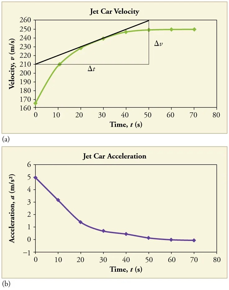
Figure 2.49 Graphs of motion of a jet-powered car as it reaches its top velocity. This motion begins where the motion in ends. (a) The velocity gradually approaches its top value. The slope of this graph is acceleration. It is plotted in the final graph. (b) Acceleration gradually declines to zero when velocity becomes constant. Notice in each of the three graphs that the acceleration drops down to zero and the velocity levels out. This results in a position-time graph that is almost linear. A close-up of the position time graph would show a slight curvature, as indicated in the velocity graph. Image from OpenStax College Physics 2e, CC-BY 4.0
Image Description
The image contains two graphs related to a jet car’s velocity and acceleration over time:
(a) Jet Car Velocity: This graph shows the velocity of the jet car on the y-axis, labeled as “Velocity, v (m/s),” ranging from 160 to 260 meters per second. The x-axis represents time in seconds, labeled as “Time, t (s),” with values from 0 to 80 seconds. A green curved line begins around 160 m/s at 0 seconds, rising sharply and then flattening towards 260 m/s beyond 70 seconds. A black straight line indicates a constant rate of increase over a segment, with Δv and Δt marked for change in velocity and time.
(b) Jet Car Acceleration: This graph displays the acceleration on the y-axis, labeled as “Acceleration, a (m/s2),” ranging from -1 to 6 meters per second squared. The x-axis again shows time, from 0 to 80 seconds. A purple line starts at around 5 m/s2 at time 0, decreasing gradually and approaching 0 m/s2 as time increases, showing a deceleration trend.
Example 2.19
Calculating Acceleration from a Graph of Velocity versus Time
Calculate the acceleration of the jet car at a time of 25 s by finding the slope of the [latex]v[/latex] vs. [latex]t[/latex] graph in Figure 2.49(a).
Strategy
The slope of the curve at [latex]t = \text{25 s}[/latex] is equal to the slope of the line tangent at that point, as illustrated in Figure 2.49(a).
Solution
Determine endpoints of the tangent line from the figure, and then plug them into the equation to solve for slope, [latex]a[/latex].
[latex]\text{slope} = \frac{Δ v}{Δ t} = \frac{\left(\text{260 m}/\text{s} - \text{210 m}/\text{s}\right)}{\left(\text{51 s} - 1.0 s\right)}[/latex]
[latex]a = \frac{\text{50 m}/\text{s}}{\text{50 s}} = 1 . 0 m /\text{s}^{2} .[/latex]
Discussion
Note that this value for [latex]a[/latex] is consistent with the value plotted in Figure 2.49(b) at [latex]t = \text{25 s}[/latex].
A graph of position versus time can be used to generate a graph of velocity versus time, and a graph of velocity versus time can be used to generate a graph of acceleration versus time. We do this by finding the slope of the graphs at every point. If the graph is linear (i.e., a line with a constant slope), it is easy to find the slope at any point and you have the slope for every point. Graphical analysis of motion can be used to describe both specific and general characteristics of kinematics. Graphs can also be used for other topics in physics. An important aspect of exploring physical relationships is to graph them and look for underlying relationships.
Check Your Understanding
A graph of velocity vs. time of a ship coming into a harbor is shown below. (a) Describe the motion of the ship based on the graph. (b)What would a graph of the ship’s acceleration look like?
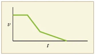
Figure 2.50 Image from OpenStax College Physics 2e, CC-BY 4.0
Image Description
The image is a graph on a light yellow background. It depicts a velocity-time relationship, where the horizontal axis is labeled “t” for time, and the vertical axis is labeled “v” for velocity. The graph consists of three distinct segments:
1. Horizontal Line: The graph starts with a horizontal line at a constant velocity level.
2. Descending Line: The line then slopes downward, indicating a decrease in velocity over time. This section is depicted in a green color.
3. Further Descending Line: Another green sloped line follows, descending at a different angle until it reaches the horizontal axis, where velocity becomes zero and is constant.
The plot demonstrates a reduction in velocity over time, eventually reaching a plateau.
Click for Solution
Solution
(a) The ship moves at constant velocity and then begins to decelerate at a constant rate. At some point, its deceleration rate decreases. It maintains this lower deceleration rate until it stops moving.
(b) A graph of acceleration vs. time would show zero acceleration in the first leg, large and constant negative acceleration in the second leg, and constant negative acceleration.
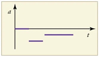
Figure 2.51 Image from OpenStax College Physics 2e, CC-BY 4.0
Image Description
The image shows a graph on a light beige background. The graph has two axes: the vertical axis is labeled “a” (most likely representing acceleration) and the horizontal axis is labeled “t” (likely representing time). The origin of the graph is at the bottom left corner.
Along the time axis, there are three horizontal purple line segments of varying lengths:
1. The first line segment starts from the vertical axis, indicating acceleration for a short time period.
2. The second line segment is positioned slightly lower on the vertical axis and starts later along the horizontal axis, extending for a medium length.
3. The third line segment is aligned at the same vertical height as the second, starting even further to the right along the time axis, and it extends parallel to the previous segments.
All three segments are parallel to the time axis, suggesting constant acceleration values during each period.
