Designing the Presentation
If your presentation includes slides and images, they must be clear, compelling and well-organized. In this chapter you’ll learn the basics of visual design, where to find great images, and how to storyboard your presentation.
Getting Started
Before starting on your slides create a storyboard that’s based on your presentation outline (for details on outlines see How to Structure Great Presentations [New Tab] in “Business Presentation Skills” by Lucinda Atwood and Christian Westin). The storyboard helps you organize and plan your slide deck, including the order slides appear and what text or images you’ll include on each slide.
We recommend using sticky notes to create your storyboard, with one sticky note representing one slide. Sticky notes help you organize your slides because they’re so easy to move around, edit and delete. They’ll save you lots of time!
In the example below you can see that you don’t need to be an artist or expert to make an effective storyboard.

Creating Slides
When making slides, make sure to include these five elements: organization, titles & text, visual design, content and user experience.
Need help making slides?
Georgian College students have access to free tutoring. The tutors can help you with PowerPoint, Google Slides and other apps. They won’t create your presentation for you, but they can help you get started, and answer specific questions.
Organization
Your slide deck must be logically organized to match the order of your presentation. Make sure that information is presented in a logical way. For example, if you’re talking about something that happens in a sequence, make sure it’s in the correct order in your slides. And present information based on its importance. The size and list format of key points, sub-points and sub-subpoints should be consistent with their importance.
Titles & text
Consistent—Throughout your slide deck, titles and text should be consistent in size, shape, placement, bullet and heading hierarchy, and formatting. If any of this does change, it should be an intentional design choice that reflects the presentation. Be especially careful with team projects—it’s easy to lose consistency when more than one person creates the slides.
Brief—Your slides are not a script. If you include too much information on them, your audience will be reading, not listening to you. Slides should reinforce your key points, highlighting only the most important information. Share the rest verbally—anecdotes, smaller details and extra information.
Tip
There are two great ways to help you keep slides brief: The 1-6-6 Method recommends that each slide have a maximum of 1 idea, 6 bullet points, and 6 words per bullet. The 1-3-5 Method is similar: it suggests 1 idea and 3 bullet points per slide, with 5 words per bullet.
Fonts—Your audience might have less than perfect vision or a small device, so make type easy to read. If you’re not sure which font to use, avoid fancy decorative fonts and use a standard font like Arial, Helvetica or Times. Unless you’re a trained designer, limit the number of fonts you use to about three per slide deck.
Use high-contrast colours for text, such as black on white, or white on navy blue. If you’re placing text on an image, use a solid background colour in the text box.
We recommend using at least size 32 for your text. If you’re using a font size smaller than 32, test your slides to make sure text is visible from the back of the room or an a small device.
Spelling & grammar—Check your spelling and grammar! (Most presentation apps include spell-check tools.) Typos and grammar errors make you look sloppy and unprofessional.
Animations—You can use the app’s animation tools to move objects and text on, off or around a slide. You’ve probably seen slides with bullet points that appear one at a time. Animations are useful when you want to gradually reveal information. For example, if you want the audience to focus on one point at a time, or when you want to ask a question before showing the answer.
Limit the number of animations you use, and avoid whimsical or unnecessary ones—they can make your slides annoying and unprofessional.
Transitions—You can use transitions, like fade-in or fade-out, when you’re moving from one slide to the next. To avoid distracting your audience, don’t use too many different types of transitions, and avoid overly dramatic transitions. Just like animations, a little goes a long way.
Visual design
You don’t have to be a designer to make professional slides; most apps include professionally designed templates, or you can start with a blank slide. Whichever you choose, make sure the visual design supports your content and strengthens your message. Slides should relate to each other visually: colours, layout, text and images should be consistent.
Consistent—All slides should have a consistent design as though they were created by one person, not cobbled together from multiple sources. If any of this does change, it should be an intentional design choice that reflects the presentation. Be especially careful during team projects—it’s easy to lose consistency when more than one person creates the slides.
Alignment—Keep slides looking clean and professional by aligning various text or image elements. For example, text is almost always left-aligned (except captions and titles). Space text and images so they’re balanced and visually pleasing. PowerPoint shows alignment markings to help with this.
Branding—Branded elements make your slides look professional. You can use your brand’s colours and logo on the title page, and/or at the top or bottom of each slide. Your branding may include fonts, text size and colour. Whatever you choose, make sure all text is easy to read and not distracting.
Images—Human brains love images! Include images in your slides to add interest and explain key points. Make sure every image is high quality, high resolution, relevant and appropriate, large enough to be easily seen from afar, not stretched or distorted, and free of watermarks. (More about watermarks in Using Other People’s Images below)
Single images are generally better than collages because you want slides to be uncluttered. No matter how cute they are, don’t include images that are unprofessional or unrelated to your subject—such as emojis, minion pictures and bad clip art.
Charts & graphs—Well-displayed information can enhance your audience’s understanding and help to convince them that you’re a professional expert. Charts and graphs are fantastic ways to show data, describe relationships, and help your audience understand a key point. Make sure the labels and titles are large enough to be easily read, and remove unnecessary details; you can verbally explain details and background information. If your presentation includes handouts, you can show the basic chart or graph on screen, and add a more detailed version in the handout. See Which Graph, Chart, or Visual Should I Use? below for examples and additional guidelines.
Content
Complete—Your presentation should include at least one slide for each key point. Make sure the most important information of your presentation is on your slides.
Makes sense—Information presented is well researched and makes sense. Your content should also be interesting or exciting.
Fits audience—Assume that your audience is smart like you, but doesn’t have specialist knowledge. Take the time to explain anything that the majority of people might not know.
Citations and references—For facts, quotes, or other statistics, you may want to include your source on the slide, especially if it adds credibility. Otherwise, sources (including for images) are listed in 1) the notes section; and 2) in a list of sources at the end of your presentation.
Authorship—Include your full name at the start of your slides. You may want to include your name and contact information on your last slide.
Engages the left & right brain—Audience members engage and remember better when you engage the “left brain” (logic, facts, science, numbers, and hard data) and the “right brain” (emotion, colour, artistic and sensory information like music, videos, and other media).
Audience experience
This element is a bit different from the ones above because it focuses on the live integration of your slides and your presentation.
Slides enhance the presentation—Remember that you’re the star of the show, and your slides are there to support your live delivery. For this reason, it’s important to ensure that you don’t use the slides as a teleprompter—always practice and know your entire presentation and slideshow thoroughly.
Number of slides is reasonable—As a general rule, 1–2 slides per minute is appropriate. Practise delivering your presentation to ensure you’re not rushing through too many slides, or forcing the audience to stare at the same slide for several minutes.
Agenda/Overview—Longer or more complex presentations often include an agenda or overview slide. Shorter presentations typically don’t use them.
Animations & transitions executed—When practicing your presentation, remember which slides have animations or transitions, and practice advancing your slides at the right time. Sometimes presenters get caught up in their content and forget to move the slides ahead. This is especially common during online presentations.
Using Other People’s Images
You can use your own images in your presentations. You can also use downloaded images, but be careful to use copyright-free images, and credit them properly.
Many images that you see online are copyrighted, meaning you can’t use them without the creator’s permission. A lot of those images have watermarks to make sure people don’t use them, or pay to use them. Don’t use watermarked images—it’s illegal and unethical. A watermark looks like this:

Where to find images
Many high-quality images are freely available online. Here are some places to find them:
- OpenVerse
- Pexels
- Unsplash
- Pixabay
- Flicker – Creative Commons license
- Google: Enter your search words and click Search. Then click Images, and Tools (underneath the search bar). Then click Usage Rights and select Creative Commons Licenses.
How to give credit
Always give credit to the creators of anything you didn’t create—including images, charts, graphs, video, audio and gifs. You don’t need to credit anything you made, but you might want to include a note so your instructor knows it’s your creation.
- List all your image credits on one blank slide
- Make it the last slide in the deck
- Select that slide and click “Hide Slide” so it won’t show during your presentation
A Chicago style citation for images can use any of these formats:
Photograph by [creator’s name] from [URL] For example: Photo by wsilver from https://ccsearch.creativecommons.org/photos/73d7b905-f5ee-4571-8056-6ccfd4e450cb
Or:
Image courtesy of [name of the organization] from [URL] For example: Image courtesy of wsilver from https://ccsearch.creativecommons.org/photos/73d7b905-f5ee-4571-8056-6ccfd4e450c
Or:
[Title and embedded URL of the Creative-Commons-licensed image] by [creator’s name] is licensed under CC BY [license type] For example: More Puppies by wsilver is licensed under CC BY Attribution 4.0 International (CC BY 4.0)
Which Graph, Chart, or Visual Should I Use?
You can easily make charts and graphs for your presentation, using Excel or Google Spreadsheets. Add the data to the spreadsheet, then decide which type of chart or graph to use.
No matter what type you use, always include a title, clear labels, and high-contrast colours that are visible to all users. For example, many people can’t see the difference between red and green, so avoid using them together.
Here the most common types:
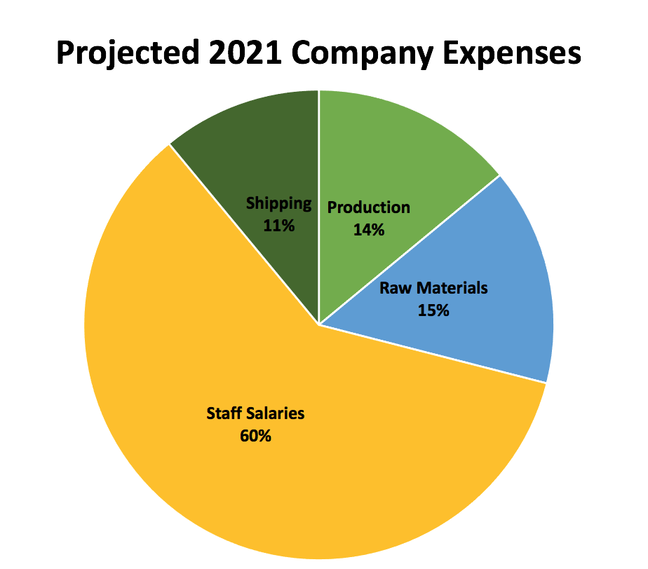
Pie chart: Shows percentages—portions of a whole. The total segments should add up to 100% or a complete whole. Pie charts are excellent for showing relationships. In the example below we quickly see that Staff Salaries are a huge portion of the company expenses.
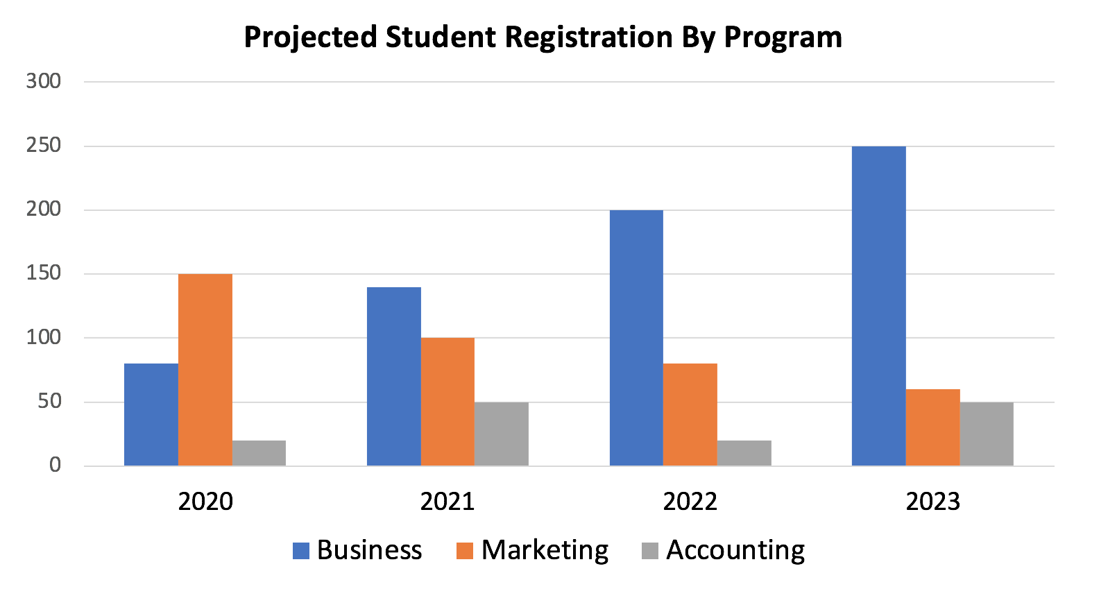
Bar graph: Allows comparison between different values, and can show changes over time (if the difference in values is large). The horizontal and vertical axis must always be labelled. This graph shows that the number of Business students is expected to rise, while the number of Marketing students will decrease.
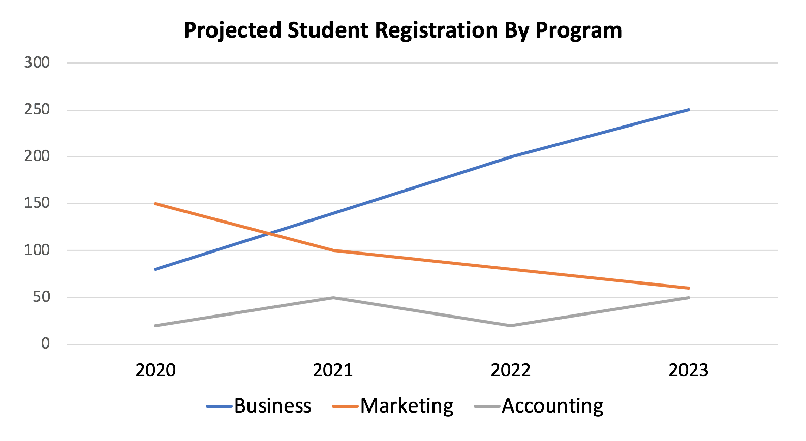
Line graph: Shows a trend or progress over time. They can show small changes over time better than a bar graph. Note that the example below shows the same data used in the chart above, but emphasizes the trend of business registrations growing, marketing registrations declining, and accounting registrations remaining low with a bit of fluctuation. This would be better if you wanted to focus on changes over time.
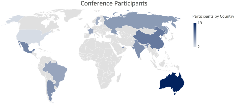
Heatmap chart: Uses colour to convey the magnitude of certain values. Examples include a risk management heatmap showing low, medium, and high risk based on the likelihood and impact of various outcomes, or an atlas heatmap as displayed below. Because heatmaps depend only on colour—not shape or size—be very careful to use colours that all users can see.
Which chart? An example
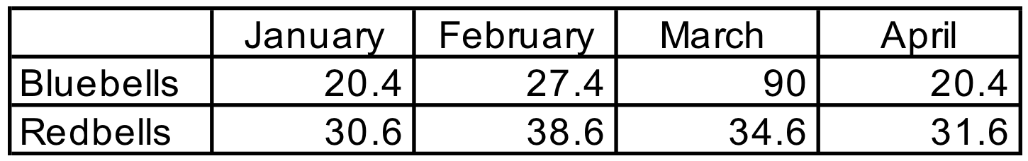
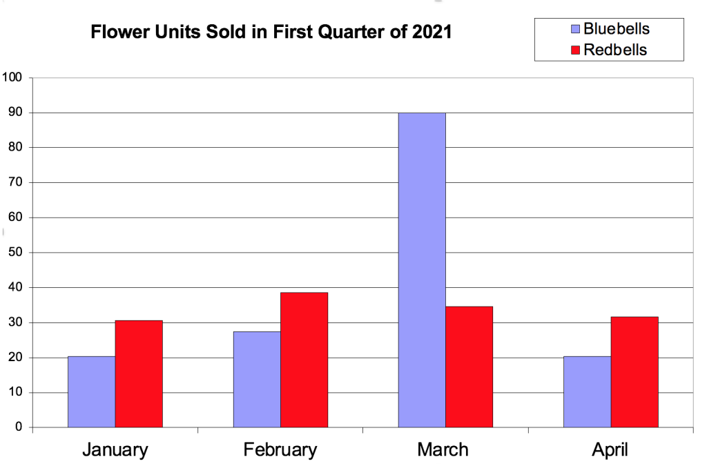
Imagine that our team is excited to share the success of our recent marketing campaign to promote bluebell flower sales during the month of March. Here are two ways we might display the data. Look at both and note your response: which one is easier to understand? Which do you prefer to look at?
Example 1
Example 2
Example 1 is harder to read because it’s not visual. There are lots of percentages, no hierarchy or colour, and the heavy lines compete with the content. It’s not easy for the viewer to quickly understand the information. This example also lacks a title or legend (a description of what the data is conveying).
Example 2 shows the same information, but in a way that’s easy to quickly understand. This version emphasizes the dramatic success of our marketing campaign, which boosted sales of bluebells during March. Also notice the inclusion of a title, legend, clear axis labels, and colour coding—all of which help the audience’s understanding.
Check your Understanding: Presentations
Presentations (Text Version)
- The first step in creating a presentation is:
- Ensuring you have selected the correct font and font size
- Finding images
- Designing charts and graphs for the slides
- Creating a presentation outline and storyboard
- Fill in the blanks using the following words:
- watermarks
- logos
- contrast
When considering visual design, you should ensure enough ________ between text and the background. Branding can also be incorporated into the slide design, including font, colour use, and _________ . When choosing images, avoid _______, which indicate that the image belongs to someone else.
-
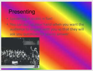
Image by Lucinda Atwood and Christian Westin, licensed under CC BY-NC 4.0. How could the slide above be improved? (select all that apply)
- Correct the spelling error
- Increase the contrast between the background and text & select a less distracting background
- Use a higher quality image, and enlarge and align it more uniformly
- Reduce the length of text used in the second bullet point
- True or false: You should use your slides as a script that you can read from during your presentation.
- When creating slides, the following elements should be considered first:
- Organization, titles & text, visual design, content, and audience experience
- Including as much text as is possible to demonstrate that you’ve done lots of research
- Using watermarked images
- Spelling, Brevity, Animations, Images
Check your answers [1]
Activity source: “Slides Quiz” by Lucinda Atwood and Christian Westin from “How to make slides & visuals” In Business Presentation Skills by Lucinda Atwood and Christian Westin, licensed under CC BY-NC 4.0./ Converted into text version.
Attribution & References
Except where otherwise noted, this section is adapted from “11 How to make slides & visuals” In Business Presentation Skills by Lucinda Atwood and Christian Westin, licensed under CC BY-NC 4.0.
-
- D
- When considering visual design, you should ensure enough contrast between text and the background. Branding can also be incorporated into the slide design, including font, colour use, and logos. When choosing images, avoid watermarks, which indicate that the image belongs to someone else.
- A, B, C, D
- False. Ideally, your slide text should be minimal, and should convey only your most important key messages. You are then available to convey additional details during your live presentation. Avoiding reading your slides is also important to ensure that you maintain proper eye contact with your audience.
- A
A visual outline of your presentation
Slide Deck: a group of slides. Also called a powerpoint, a presentation, or presentation slides
