Adult learning
ADULT LEARNING
In our modern technology-dominated era, we have many resources to make learning exciting. However, it is often time-consuming and hard to execute, which leads to the dependence on lectures. But is it really the best way to teach content? Can a lecture be truly effective, if the participants are not engaged, and how can one ensure the participation of the students? In this chapter, we will cover tips and tricks for successful presentation and audience engagement.
Guide to a successful presentation for adult learners:
#1 Creating an Aesthetic presentation and learning environment
Set the tone! One of the best ways to attract an audience and keep them focused is to create an eye-catching presentation and an environment that makes them feel comfortable and relaxed.
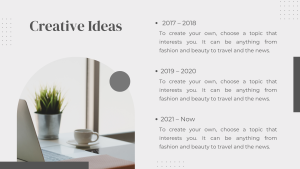
Presentations should have minimal text and should always be accompanied with pictures. This allows the audience to engage in both auditory and visual learning as the presenter is speaking. Too much text will most likely bore the participants, and not enough text may prevent the student from effectively retaining information. A good balance of the two would be to have bullet point text on one side and a picture on the other. Avoid using red, green or blue to accommodate those with color blindness. For a minimalistic presentation, white on black or black on white is usually recommended since it gives a professional, clean and sleek look.
Example:


https://www.ncbi.nlm.nih.gov/pmc/articles/PMC4189377/
https://www.ncbi.nlm.nih.gov/pmc/articles/PMC4005174/
When choosing a venue for the training session, places such as a conference room or hall, libraries, or any room with windows to the scenery outside can put the participants in a better mood. If they are happier, it makes them want to actively listen and participate in the training session. Stay away from rooms with dim lighting, for it often makes presentations hard to see and increases the probability that participants will fall asleep.
Office conference room: Library:


When choosing a venue for the training session, places such as a conference room or hall, libraries, or any room with windows to the scenery outside can put the participants in a better mood. If they are happier, it makes them want to actively listen and participate in the training session. Stay away from rooms with dim lighting, for it often makes presentations hard to see and increases the probability that participants will fall asleep.
#2 Present at a comfortable pace that all learners can follow
Often times, when a teacher is speaking too fast, the following happens:


Retaining information is not an easy feat, to make sure the students understand the content, make sure to slow down and ask if they have any questions after each topic. Try to incorporate discussion questions to promote thinking.
#3 Accommodate all learning styles
There are three types of general learning styles: Auditory, Visual and Kinesthetic.
Auditory learners can retain information from listening and they benefit from lectures and recordings. Visual learners retain information the best through looking at pictures, written text, graphs/charts, as and other creative images. Kinesthetic learners usually learn through hands-on experiences and physical activities such as arts/crafts and role-playing.
It may seem difficult to incorporate all three learning styles into your presentation, but it is most definitely doable.
Here are some examples:
Auditory
- Story-telling
- Audio/Video
- Music
- Discussions
Visual
- Videos
- Pictures
- Graphs/Charts
- Gifs/memes
- Written text on power point slides
- Pictionary
Kinesthetic
- Puzzles
- Mix and Match paper cut outs
- Arts/Crafts
- Role-Playing
- Charades
- Team-building physical activities
#4 Be enthusiastic!
Remember, if you are excited, they are excited! Students love listening to a teacher who is passionate about their work! It makes for an amazing, fun and engaging experience for everyone!
References: Palis, A. G., & Quiros, P. A. (2014). Adult learning principles and presentation pearls. Middle East African Journal of Ophthalmology, 21(2), 114. https://doi.org/10.4103/0974-9233.129748
Schmaltz, R. M., & Enström, R. (2014). Death to weak powerpoint: Strategies to create effective visual presentations. Frontiers in Psychology, 5. https://doi.org/10.3389/fpsyg.2014.01138

