Careful Use of Colours and Images
Just as we use visual and interactive activities to make online courses and resources more interesting and engaging for our students, we also seek to improve engagement by using images and colours to help reinforce meaning. For some users, this can create a barrier to their understanding of the content. Careful consideration of the use of colours and images can help to mitigate these issues. In some cases, even a very small adjustment to our use of colour will help to build a digital ramp, enabling more students to understand and absorb the meaning we’re trying to relay.
Questions to ask about the use of colours and images
While you may need a tool to assess all colour combinations, many issues of colour contrast and careful use of colour and images will be easy to see as you review OER content. Ask yourself the following questions about the use of colour and images in the OER you’re reviewing.
Colour contrast
- Is there text on the page that is difficult to read because of font colour or background combination?
- Are there images with very similar colours that are difficult to tell apart?
- Am I able to see the cursor when I move my mouse around the page or try to navigate using the keyboard?
Use of colour to convey meaning
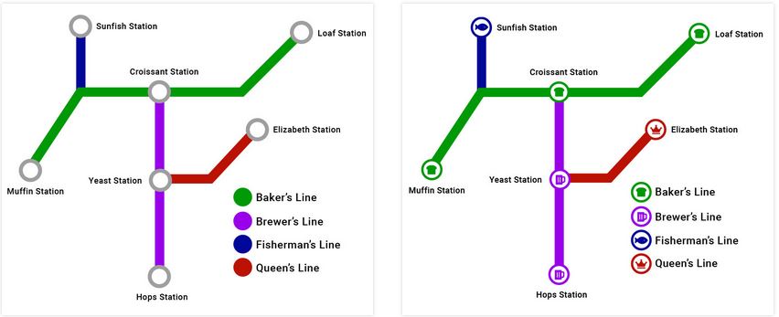
- Are there charts, maps, or other images that convey meaning using colour alone?
- Are there lists or other elements that are colour coded?
Complex images & charts
- Do you see charts, graphics, or other complex images that may require long descriptions?
- Are textual alternatives provided for infographics?
As you review a potential OER for inclusion in your course, consider the following issues the use of colour and images.
Poor Visibility or Contrast
Providing good contrast between text and the background on which it appears is important for a variety of reasons. For those with low vision, or for older readers, text may become unreadable if it does not contrast well with the background. Using an image as a background can also be problematic, particularly when content resizes and text moves over various shades of dark and light, making parts of the text difficult to read.
The visibility of the cursor’s focus indicator is also important when navigating using a keyboard. Someone with low vision who may have the screen magnified several times may find it easier to navigate with a keyboard than a mouse. If they are unable to see where the keyboard focus is located, keyboard navigation becomes difficult or unusable.
Use of Colour to Convey Meaning On it’s Own
You may come across a feature that uses a green start button and a red stop button. Some colour blind users or those with low vision may not be able to tell the buttons apart. Adding the words “Start” to the green button, and “Stop” to the red button provides the extra indicator in addition to colour.
You should not rely on colour as the sole means of conveying information and instruction. If the point you are making depends on colour to be understood, you will need to edit your materials so that concepts presented in the visuals are not lost to those who are colour blind or who require high contrast between colours.
Use Accessible Fonts & Colours
OER should be readable for those with disabilities related to color as well. Some best practices for ensuring that fonts and colors are accessible are described below:
- Use dyslexic-friendly fonts, such as Arial, Century Gothic, Open Sans, and Verdana. Your institution might recommend certain fonts for digital and print materials. These recommended fonts are usually chosen for ease of use and accessibility and may be a good fit for your needs as well.
- Make sure there is a clear contrast between colors (e.g. between the background and font color, or between separate colors on a graph). There are many free online tools available for checking color contrast, but we recommend WebAim’s Color Contrast Checker and ContrastChecker.com.
- Do not use color to communicate meaning without other markers of that meaning present. If you have color-dependent information in images or within the text of your resource, be sure that either alternative methods of recognition (such as differing patterns) are present, or that the contrast can be adjusted by users.
Complex images and charts
Complex images refer to substantial information that may be challenging to describe in a short phrase or sentence. Learners may not understand the images without a long description. Making complex images accessible for everyone can be challenging. It involves understanding the purpose, the content itself, the audiences, and the technology to create and access alternative formats.
Attribution & References
Except where otherwise noted, Careful use of Colour and Images by Jen Booth is adapted from:
- Poor Visibility, Contrast, or Use of Colour On Its Own is adapted from “Things to watch for” In Professional Web Accessibility Auditing Made Easy by Digital Education Strategies, The Chang School, CC BY-SA 4.0
- Use Accessible Fonts & Colors is adapted from Accessibility and Usability by Abbey Elder In The OER Starter Kit, CC BY 4.0.
- “Colour and contrast” by Niagara College Accessibility Hub, licensed under CC BY 4.0
- Complex images and charts and “Use of Colour” are adapted from OER Accessibility Toolkit by OpenUBC, CC BY-SA 4.0
Adaptation notes
Text was combined from the source materials. Questions to ask added.
