Text Styles, Colours, and Contrast
Text Styles
Accessible Use of Bold, Italics, and Underlines
Bold, italics, and underlines are commonly used to emphasize a word or phrase within a section of text. However, using default settings, bold, italic and underlined words and phrases are not spoken any differently by most screen readers. This means that the emphasis on that given word or phrase is lost for these users.
Does this mean bold, italics, and underlines should be completely avoided? No. Although the emphasis from bold and italics is lost on screen readers, they can still provide additional context to sighted users. Just remember, a sentence should not lose its meaning if the bold or italics are removed.
Bold, Italics, and Underlines Activity
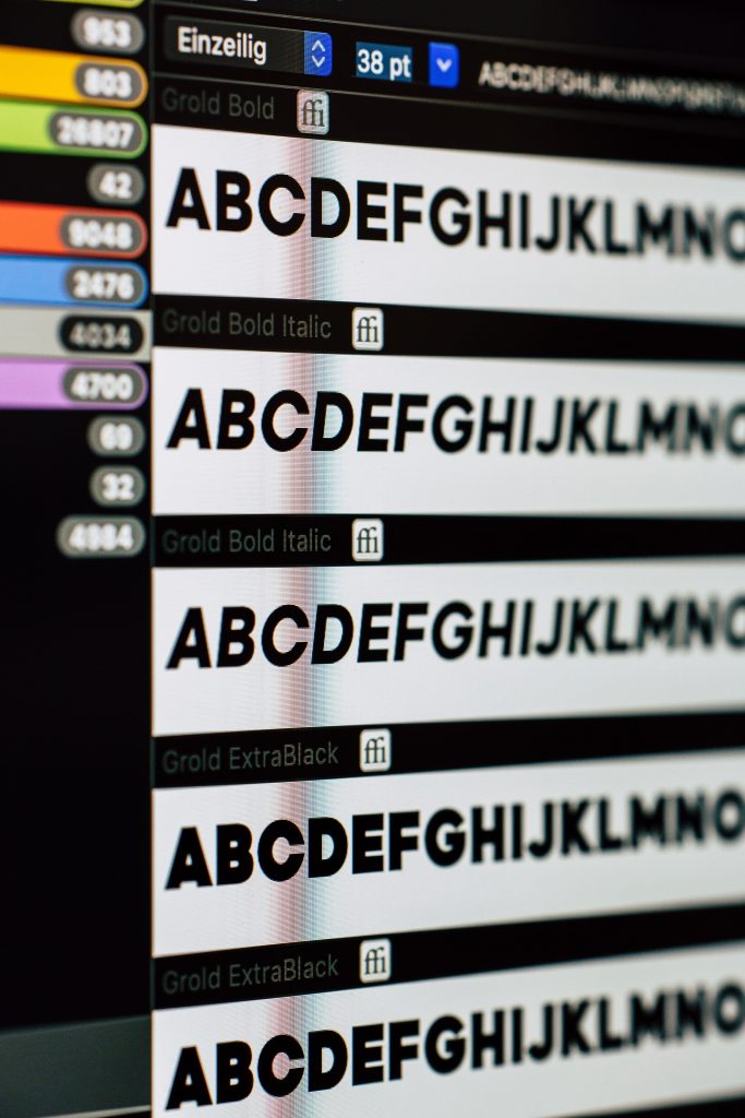
Accessible Font Choice
An accessible font is one which does not slow down readers who may suffer from vision impairment or reading disorders such as dyslexia.
Font choice is very important, as many fonts can be illegible to users who may have a vision impairment. Accessible fonts will help make content easier to read for users with vision impairments or dyslexia.
Here are a few accessible font choices to pick from. Using one of these will ensure users with vision impairments will not have difficulty reading your content.
- Tahoma
- Calibri
- Helvetica
- Arial
- Verdana
- Times New Roman
Colours and Contrast
Choosing accessible font and background colours ensures that all text will be easily readable, even for those with vision impairments or colour blindness.
It is important to note that while the use of colour can increase comprehension of the content for sighted users, it should not be used as a way to convey important information, as this information will be lost to colour blind and assistive technology users.
The contrast between the font colour and the background colour is very important. The ratios for accessible colour contrast on the web are found in the Web Content Accessibility Guidelines (WCAG), which is an international standard used to help create accessible content on the web. There are two sets of standards, a minimum AA standard, and a higher AAA standard. The minimum ratios for the WCAG AA standards are as follows:
- Text and images of text must have a minimum contrast ratio of 4.5:1
- Large text (font size of 18 px/14 point or larger) must have a minimum contrast ratio of 3:1
Note that these are the accepted minimum ratios. As seen in the examples below, sometimes the minimum ratio can be harder to read than other text. Try to aim for higher contrast ratios to keep text as legible as possible. The WCAG also has AAA standards for contrast, which requires a minimum contrast ratio of 7:1 normal text, and 4.5:1 for large text. Following AAA standards is preferable to just hitting the minimum AA standards, so always try to aim for as high of a contrast ratio as possible.
It is very difficult to tell with the naked eye if coloured content meets these accessibility standards. To be sure that the colours chosen have sufficient contrast ratios, you can use this tool: WebAIM: Contrast Checker (https://webaim.org/resources/contrastchecker/).
Contrast Examples
Below are some examples of colour ratios using both AA and AAA standards. In these examples, the names of the colours are followed by their corresponding hex code. All colours can be represented through a hex code, which is just six hexadecimal digits preceded by a pound sign. The first two digits represent the amount of red in a colour, the middle two digits represent the amount of green in a colour, and the last two digits represent the amount of blue in a colour.
WCAG AA Minimum Ratios
Below are some examples of colour ratios using the AA standard, which requires a 4.5:1 ratio for normal text, and 3:1 ratio for large text.
Normal Text Examples
- Gray (#767676) on a white background has a ratio of 4.54:1
- Purple (#CC21CC) on white has a ratio of 4.5:1
- Blue (#000063) on gray (#808080)
- Red (#E60000) on yellow (#FFFF47)
Large Text Examples
- Light Blue (#8585FF) on a white background has a ratio of 3.08:1
- Light Green (#32A72A) on a white background has a ratio of 3.13:1
- Orange (#E64D00) on a Light Green (#80FF80) background has a ratio of 3.04:1
- Purple (#610061) on a Red (#FF0000) background has a ratio of 3.12:1
Notice that even though these are accepted under the minimum ratio rule, some of the examples are much harder to read than others. Always aim for as high of a contrast ratio as possible to ensure your content is as readable as possible for everyone.
WCAG AAA Minimum Ratios
Below are some examples of colour ratios using the AAA standard, which requires a 7:1 ratio for normal text, and 4.5:1 ratio for large text.
Normal Text Examples
- Blue (#2E2EFF) on a white background has a ratio of 7.11:1
- Purple (#7300E6) on a white background has a ratio of 7.31:1
- Green (#7AFF9C) on a blue (#0000F5) background has a ratio of 7.12:1
Large Text Examples
- Brown (#854200) on a white background has a ratio of 7.56:1
- Dark Green (#006633) on a white background has a ratio of 7.12:1
- Yellow (#B3B300) on a dark purple (#400040) background has a ratio of 7.24:1
Contrast Activity
Here is an activity to show that judging if text has sufficient contrast ratio or not with your naked eye is harder than it may seem. Try and see if you can get them all correct!