Creating Digital Charts
Charts are a useful way to visually convey data, making it easier to interpret. Creating charts can be done in many applications, one of the most powerful ones include Microsoft Excel. When creating charts, ensure you select the most appropriate type for your data set. Also make sure you properly label your chart and data points. Below we have a set of difficulties to accommodate for each students experience in creating data charts.
For more detail see below.
Beginner
Software: Google Sheets
| Pros | Cons |
|
Easy to use (beginner friendly) |
Limited features compared to excel |
|
Free (with google account) |
Does not have as many data charts as excel |
|
Cloud saving is a major asset. |
Needs google account to access |
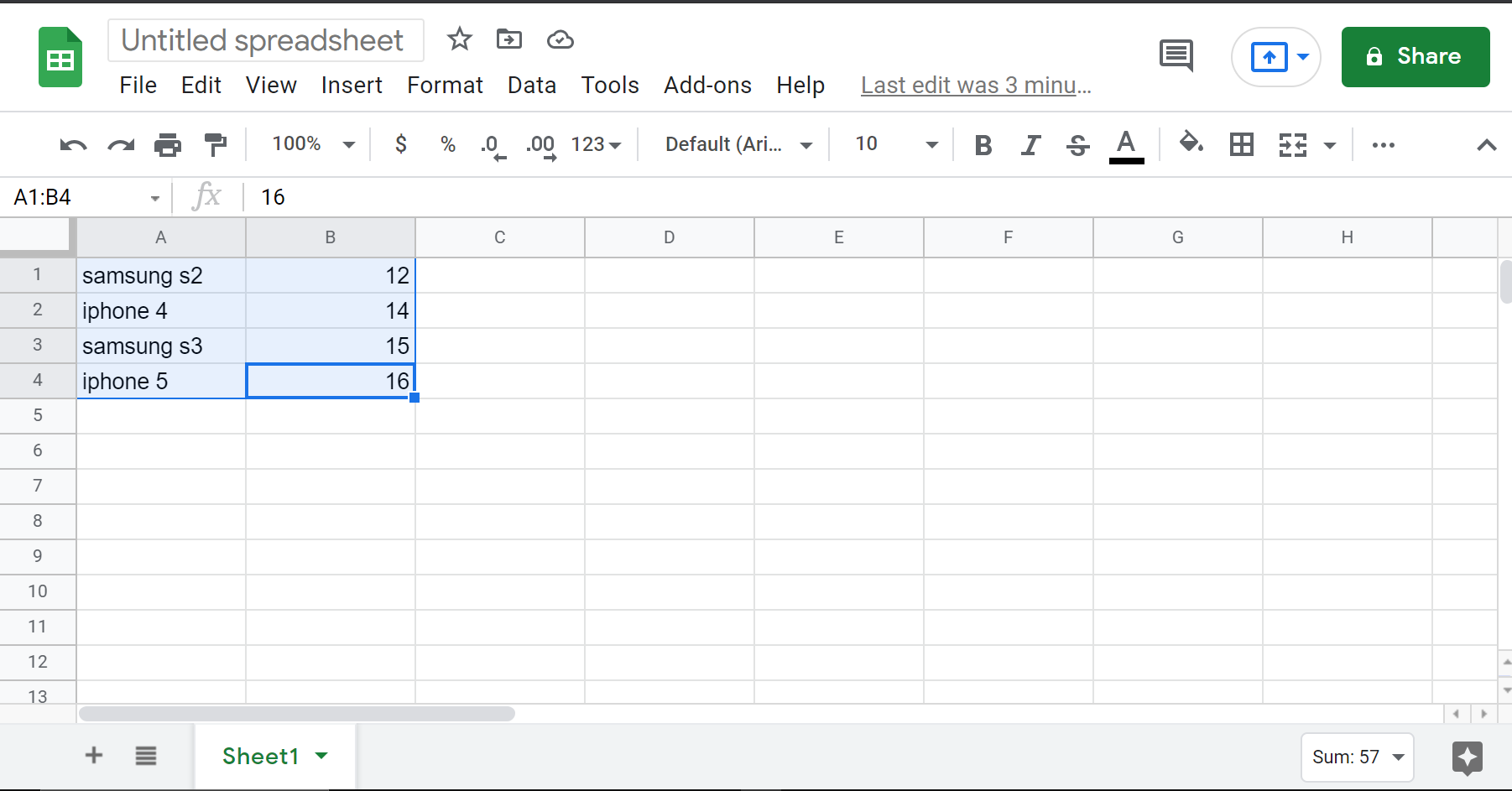
Google Sheets is a browser-based software that requires a Google account. It has many of the same functions as Microsoft Excel and is also saved to the cloud which lets you work on it across different devices. Compared to Microsoft Excel, Google Sheets is the easier software to use. No need for a table to turn your data into a chart, all you need is three easy steps.
Step 1: Highlight your data.
Step 2: Click the insert tab on the top menu.
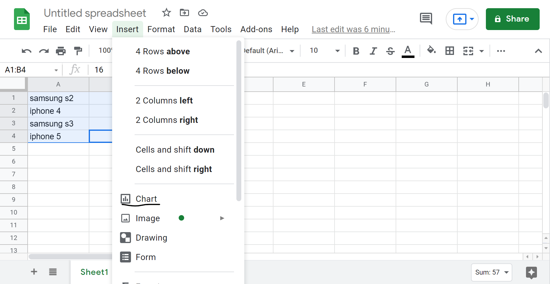
Step 3: Then you should see a drop down, look for the option that says charts and click on it.
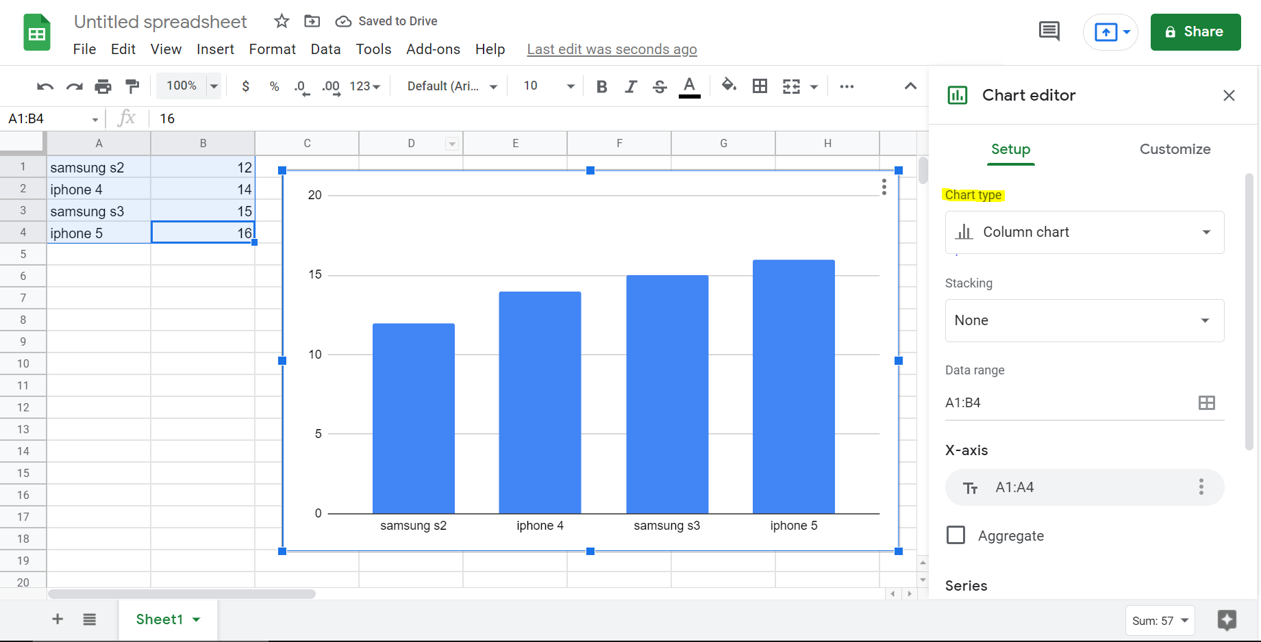
Your final product should look something like this. This should give you an automated chart and fill in the data for you (might not be a bar graph, you can change it by clicking on the chart type tab highlighted above). For a more thorough explanation check out this video here.
Intermediate
Software: Microsoft Excel

| Pros | Cons |
|
Powerful tool with more features than Google Sheets |
Have to pay for Excel (university of Windsor students have full access to excel automatically) |
|
Many different types of data charts |
Not as beginner friendly as Google Sheets |
|
Comes with Windows, every computer will likely have Excel |
Must meet certain formatting to create data charts (e.g. you must create a table to make a data chart) |
Excel can be used in both a browser and a desktop application. It is very versatile and provides many chart configuration options. Charts created in Excel can also be easily copied into Microsoft Word documents. Alternatively, charts can also be created in Word, which will bring up an Excel window.
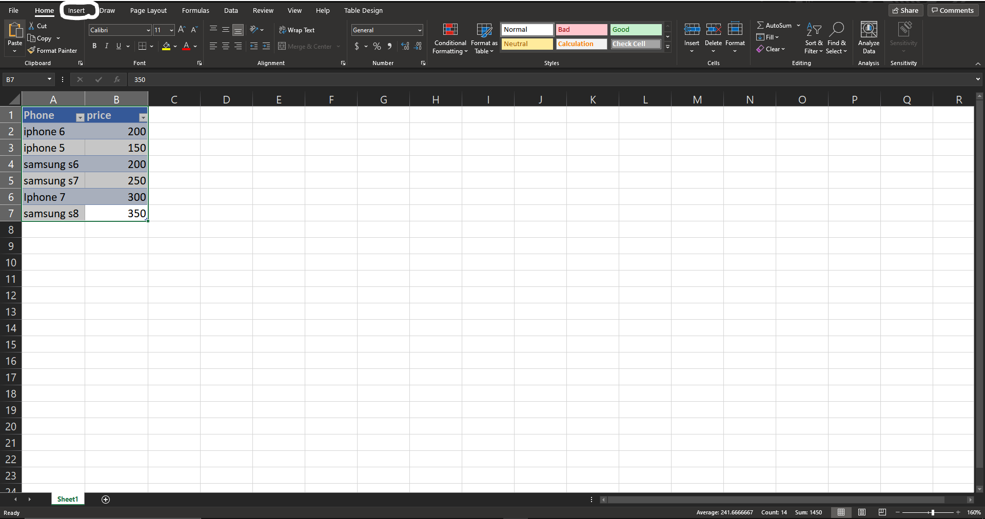
To create a chart in Excel, you must first create a table with data, otherwise excel will not recognize your data and give you an empty data chart. If you do not know how to make a table in excel, here is a quick 30 second video to help you get started. You can create these charts in three easy steps.
Step 1: Highlight the table then click on the insert tab on the top of the page.
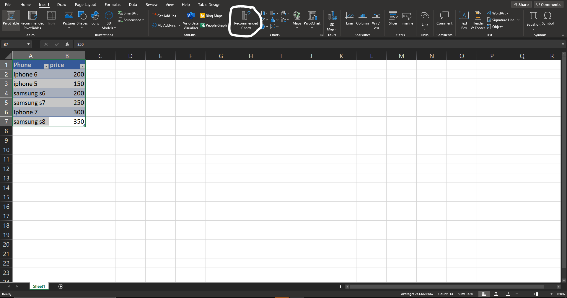
Step 2: Click on the recommended charts tab.
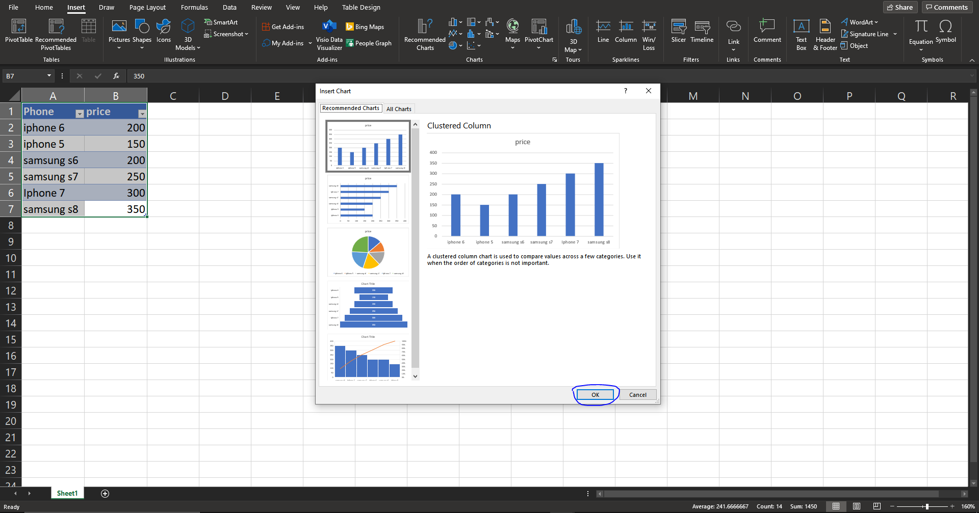
Step 3: You will see a pop up that shows multiple types of data charts (bar chart, line chart, pie chart) select the one that you prefer. Then hit “ok”.
Your result should look like this (may vary depending on the chart you choose).
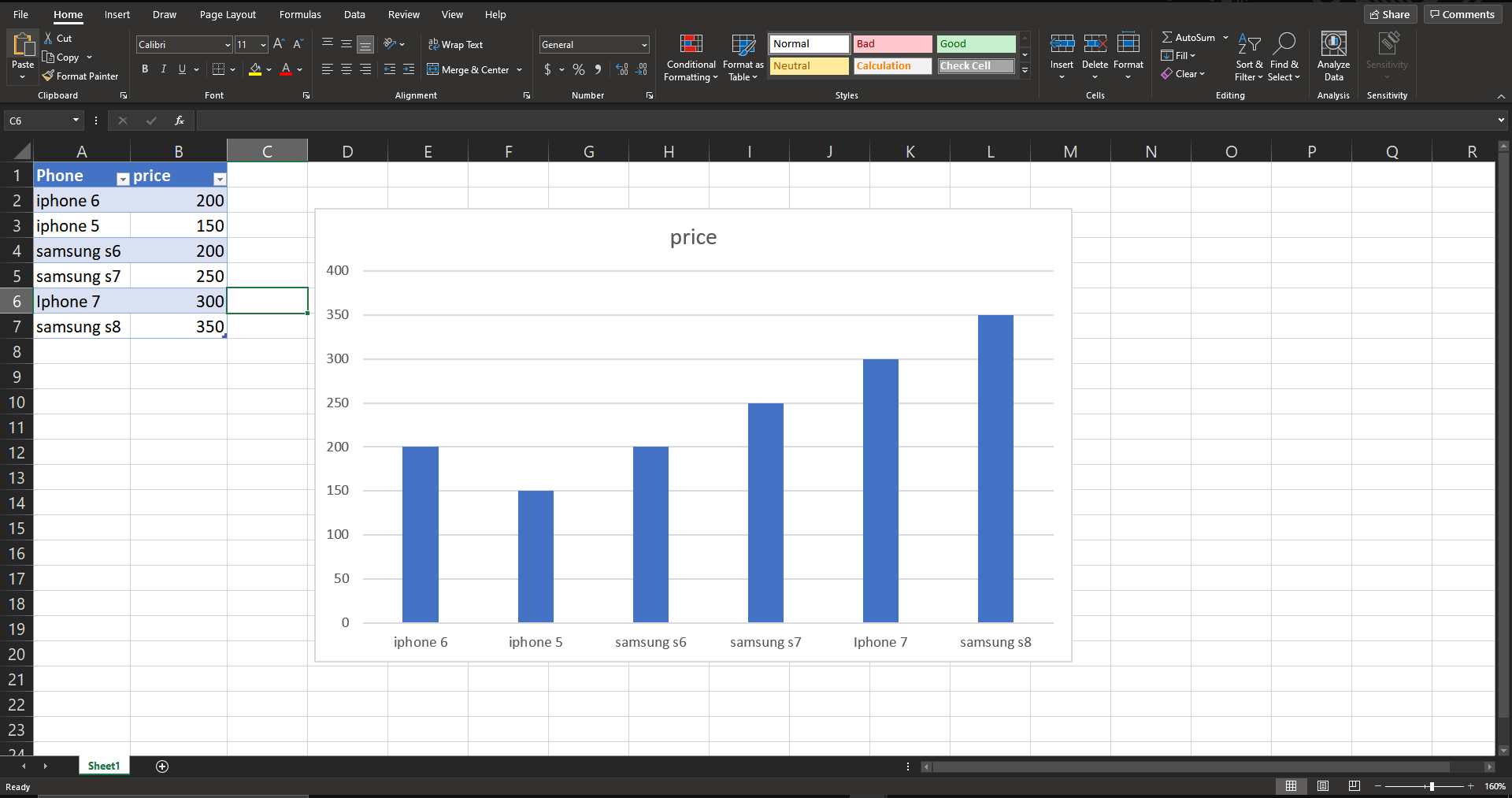
You can also change how your chart looks and customize things such as color, axis titles, and axis labels.
For a more thorough explanation on how to create data charts in Excel, check out this video here.
Advanced
Axis Labels and Titles
You can add axis labels/titles to your data chart using the steps below.
Step 1: Click on the “+” icon on the top right of your data chart.
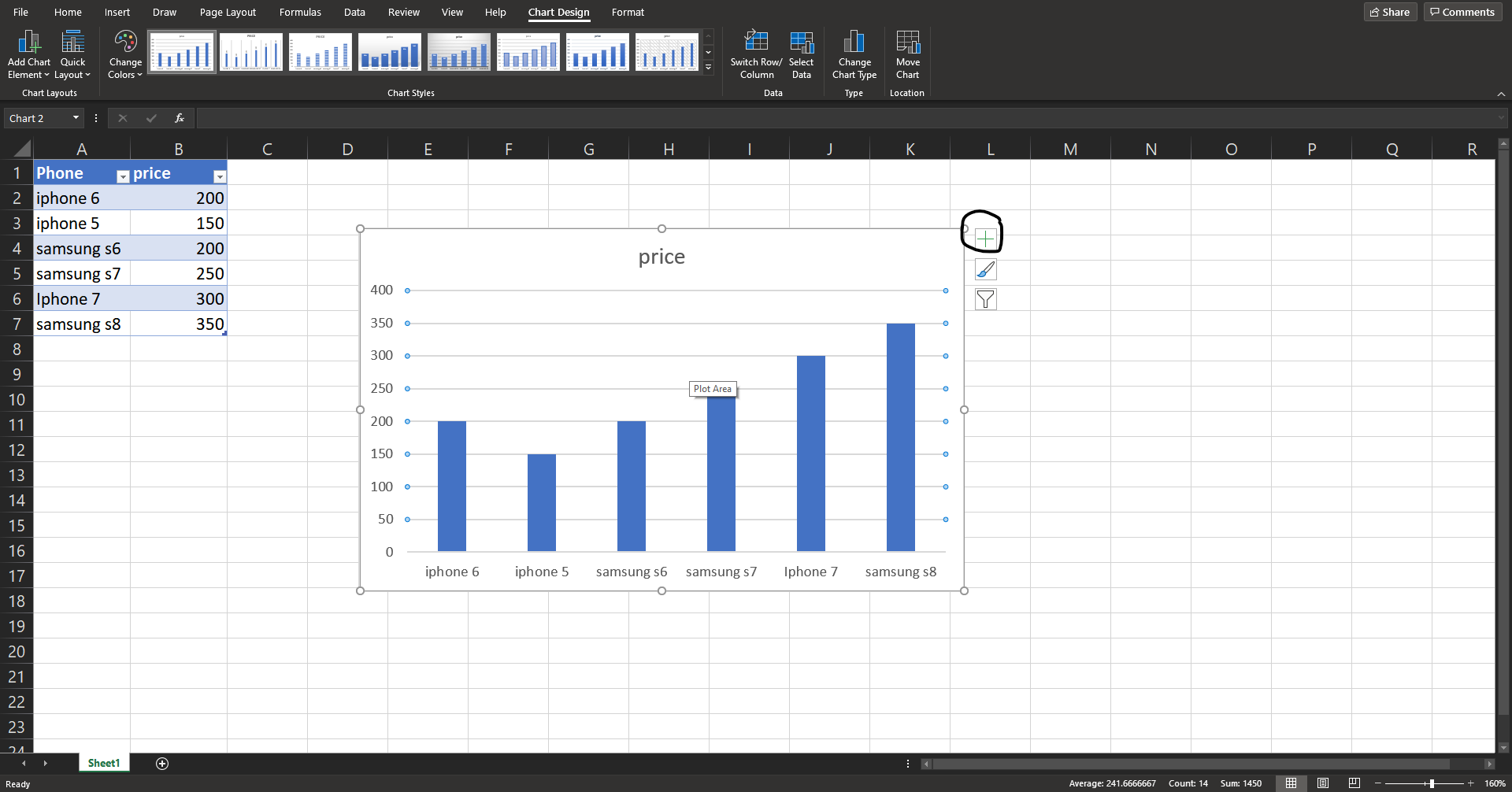
Step 2: You will see a drop down showing you multiple options, make sure “Axis” and “Axis Titles” to add a title and labels.
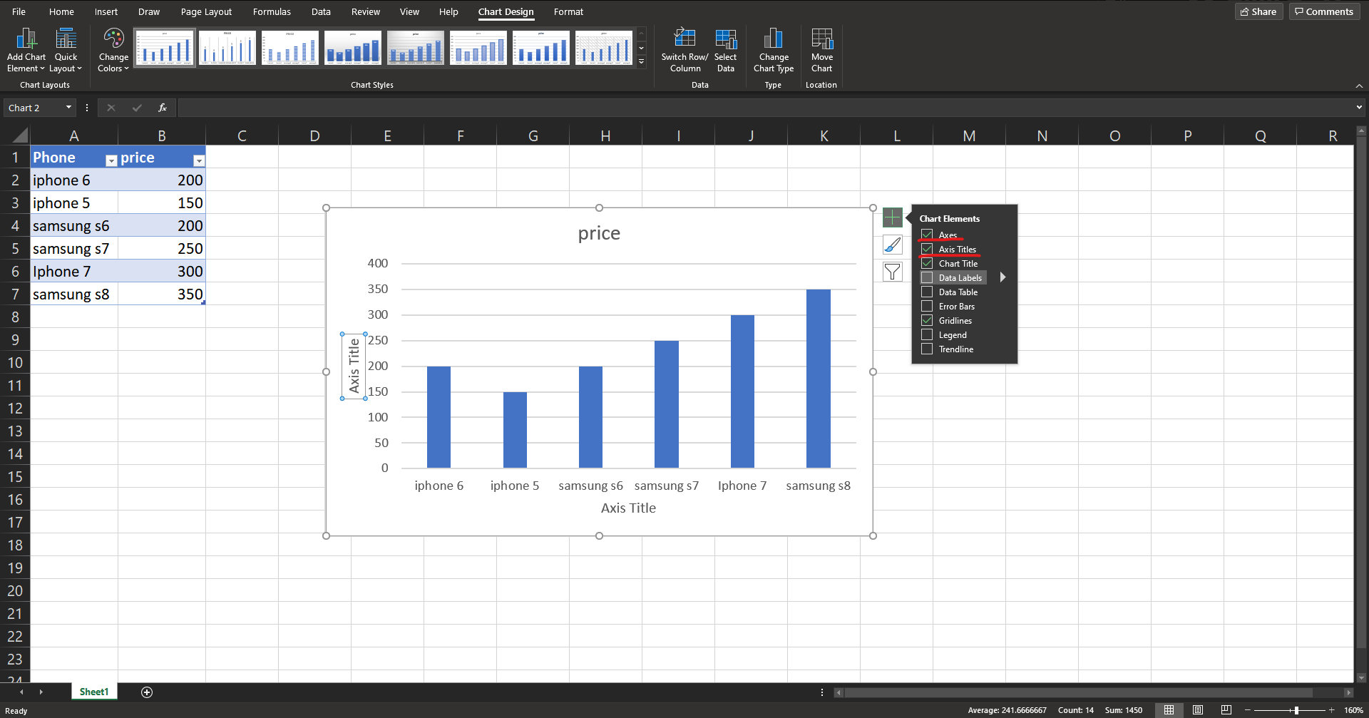
Step 3: You can double click on the three textboxes to edit them.
I changed the two Axis Titles to “Phone Model” and “Price” respective to the data it represents.
Changing The Colour of Your Data Chart
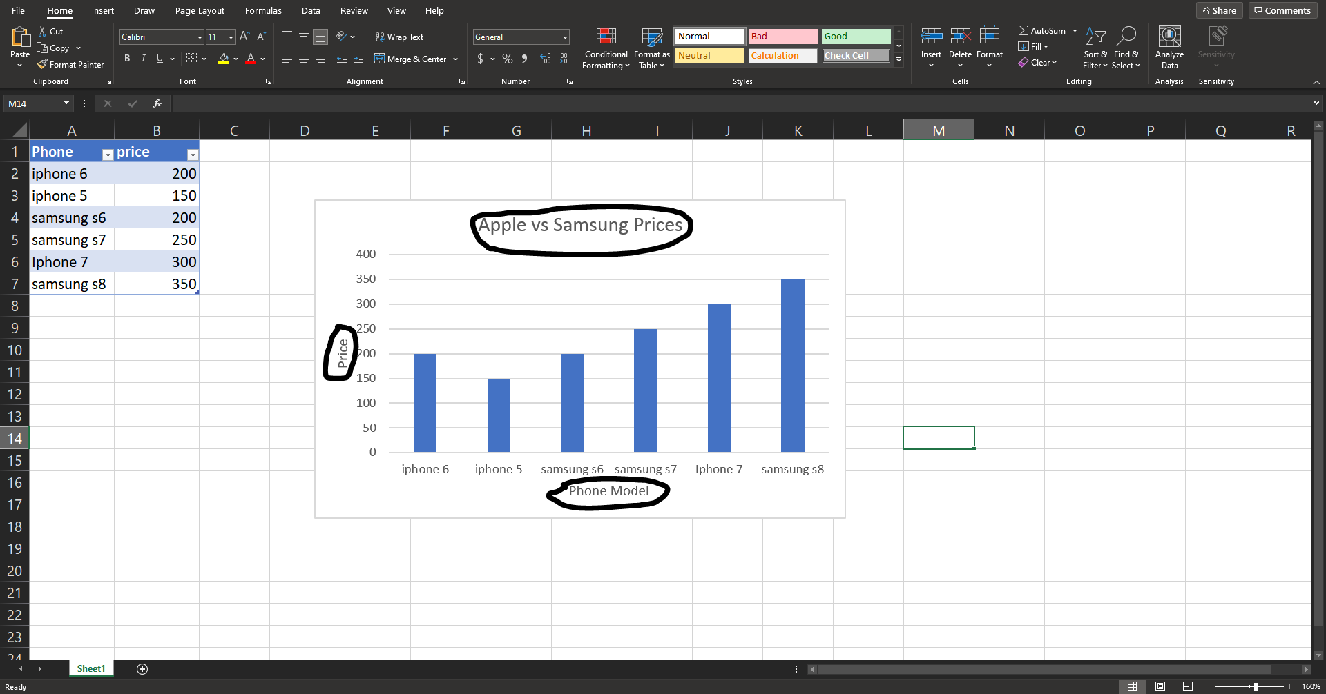
You can have colours correlate to certain sections, this makes your chart more organized and easier to look at.
Step 1: Triple click on the section that you want to change the colour of, once you selected your section right click.
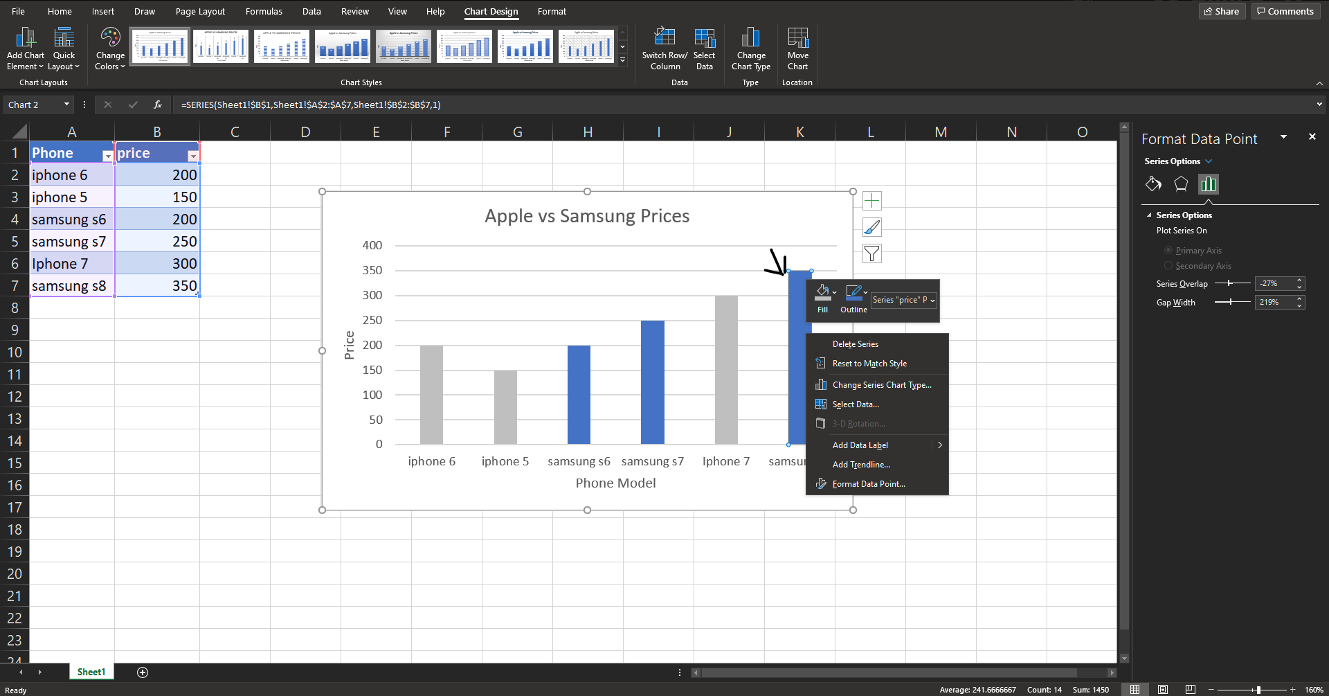
Step 2: Click on the “Fill” option and you will see a drop down with different colours, choose your colour.
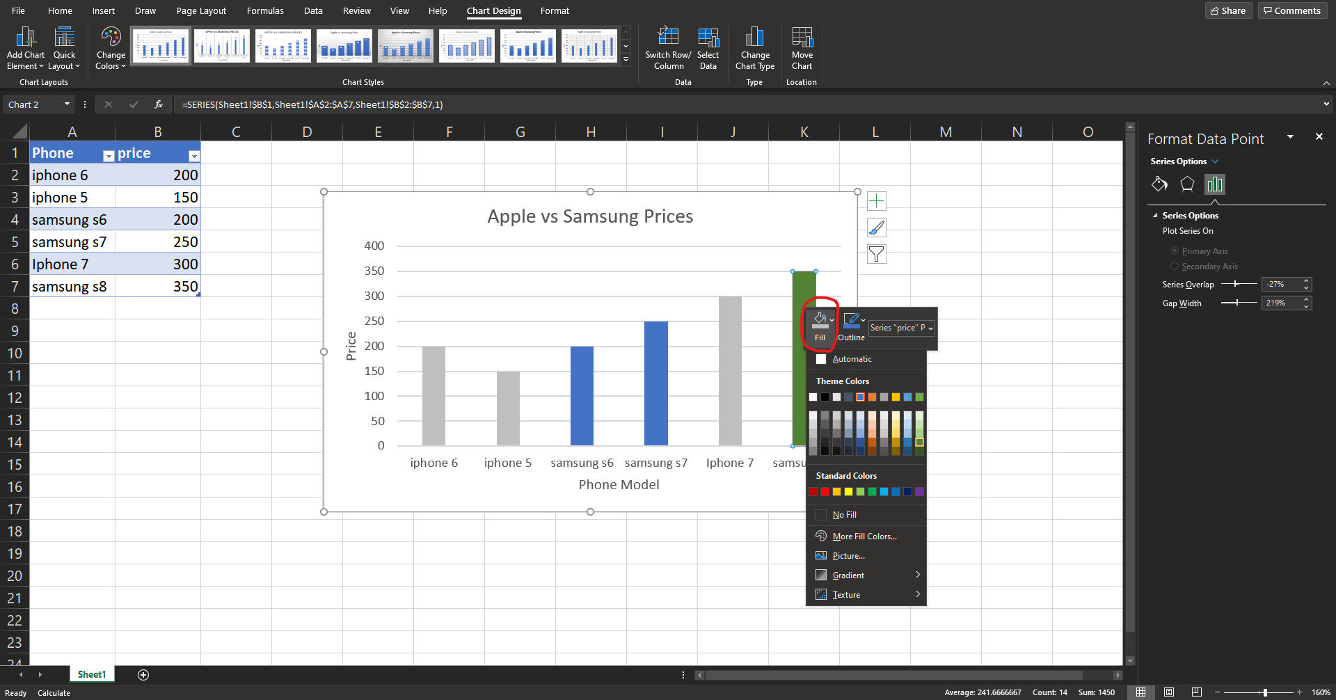
Now you can change the colour of each individual bar making your data chart more organized.
Previous Chapter l Next Chapter
Media Attributions
- Google Sheets © Google is licensed under a All Rights Reserved license
- Excel © Microsoft is licensed under a All Rights Reserved license
